


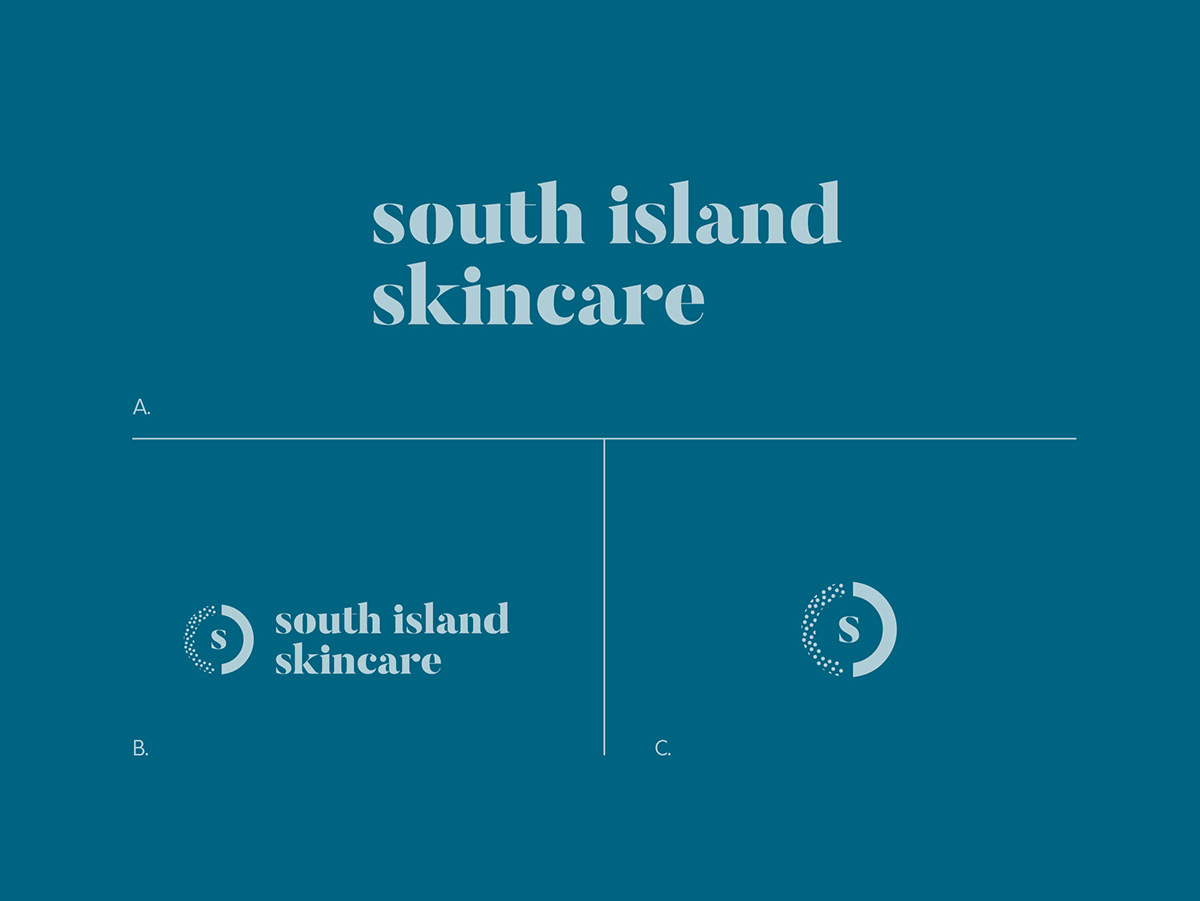


Branding / Graphic Design / Logo Design / Typography / Package Design
I was thrilled to be working on the branding for South Island Skincare, a product that uses serum derived from prickly pear oil grown off cacti that grow in Cyprus. I wanted to create something that looked elegant and luxurious, but at the same time could stand out on store shelves when shown amongst a sea of white and beige packaging. Sky blue and aquamarine is a color scheme that has a way with being both tropical and sophisticated at the same time.
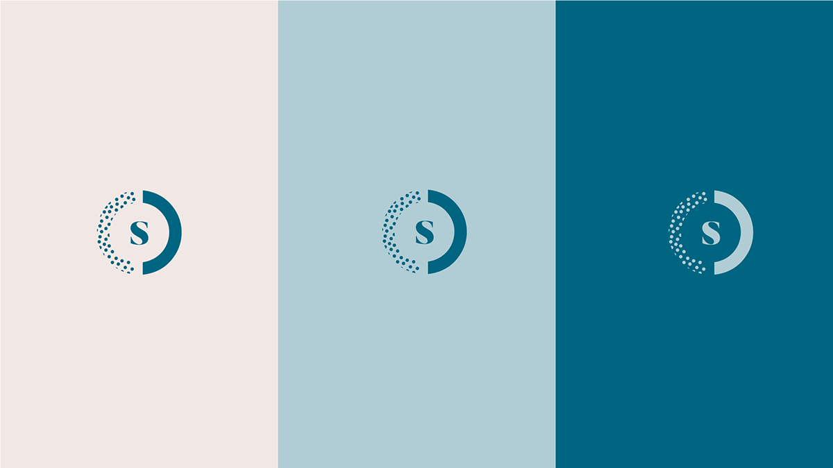
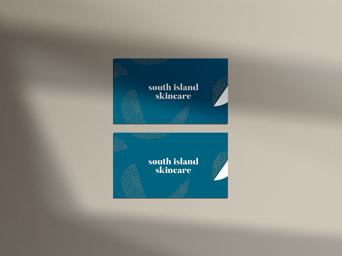
The logo mark is inspired by a surface going from rough to smooth using the serum. The dots also represent an abstract version of the prickly pear needles used to make the product. Patterns and icons in prickly pear shapes were used in tandem with the logo in different shade of the brand’s color palette. In addition, the needle texture is so important to the brand that on some pieces like the packaging, that gold foil was applied to each individual dot.
The patterns in the brand go along with the topography of Cypress, mixed with torn edges of paper and dotted textures. Another patter was created out of the shape of the prickly pear.
The packaging for the actual product, the bottle is very minimal, housed in an opaque amber dropper, with just the logo and information. The box itself is adorned with the beautiful South Island aquamarine pattern and gold foil was used for the cacti needles.
I’m really proud of how this turned out. The client was very happy and had me also do their packaging as well, which was a dream!


