


Explanation of the project ⤵️:
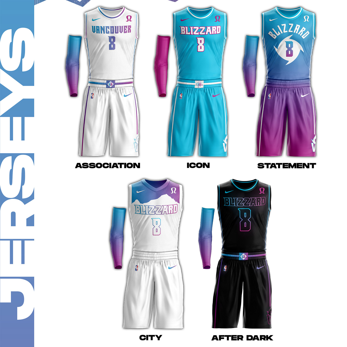
Uniforms/logos:
The blue-purple gradient is a main part of the branding and can be seen throughout the project. The main logo is a mountainscape with both the city and team name wordmarks. It also has a cyclone cutting through the team name as well. The alternate logos both make use of the cyclone with one being the cyclone itself, and the other having the cyclone cut into the letters ‘VB.’
The association jersey features the Vancouver wordmark in the gradient and ‘VB’ alt logo on the shorts, which is present in all the shorts except the city shorts. The icon jersey makes use of the blue and purple at the ends of the gradient and the Blizzard wordmark. The statement jersey uses the complete gradient from the top of the jersey to the bottom, and the cyclone to house the number on the front. Vancouver’s highest mountain peak, Golden Hinde, is present on the city jersey and the stripes and logos on the shorts were removed to simplify the jersey. Lastly, the After Dark jersey uses the elements on the icon jersey, but glows on a black colored jersey
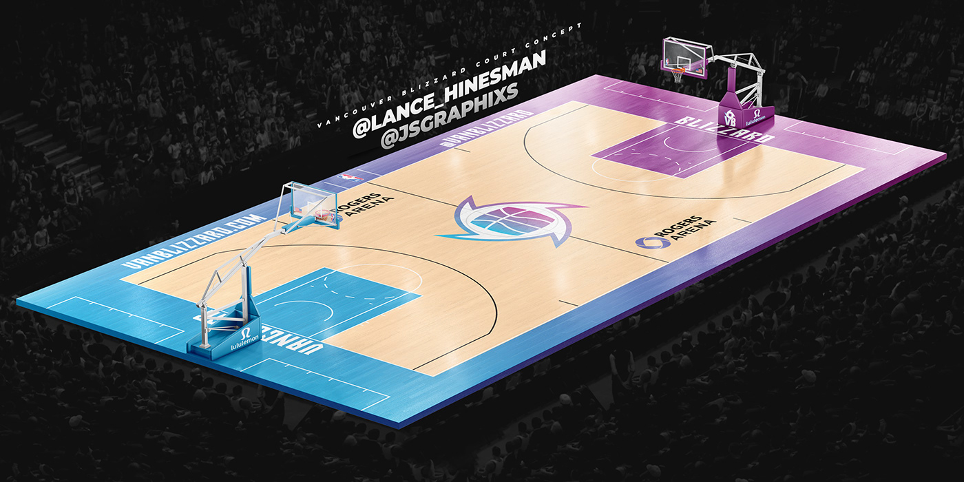
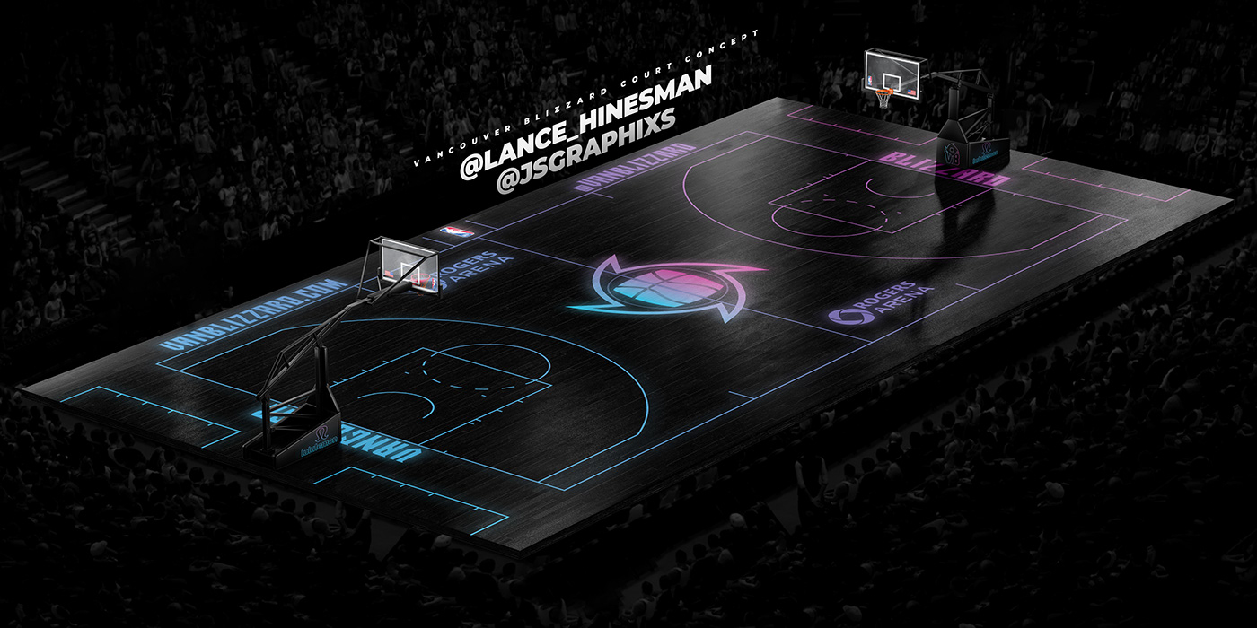
Courts:
Both courts use the cyclone alternate logo at center court and the gradient is used from end to end. However, the After Dark court removes most of the color and leaves glowing outlines on a black court


