We have a tendency when developing web pages to be obsessed with the fold. Not only is this notion becoming increasingly irrelevant when designing for mobile, tablet, and desktop, but being a slave to the fold just makes for bad design. At Adobe this problem is compounded by the fact that we have multiple stakeholders for each web page. Everyone wants their thing above the fold in the initial viewing space. If you accommodate these requests you end up with a content competition for your viewing eye. The user is left to sort through the damage to find relevant information.
We've been pushing through the idea lately that simple stories, curated, and told in the proper order to the proper audience is a far more effective communications strategy. What does that mean for the fold? F the fold. We've found that if your content is relevant users will scroll. By telling a more streamlined and focused story the content doesn't compete with itself.
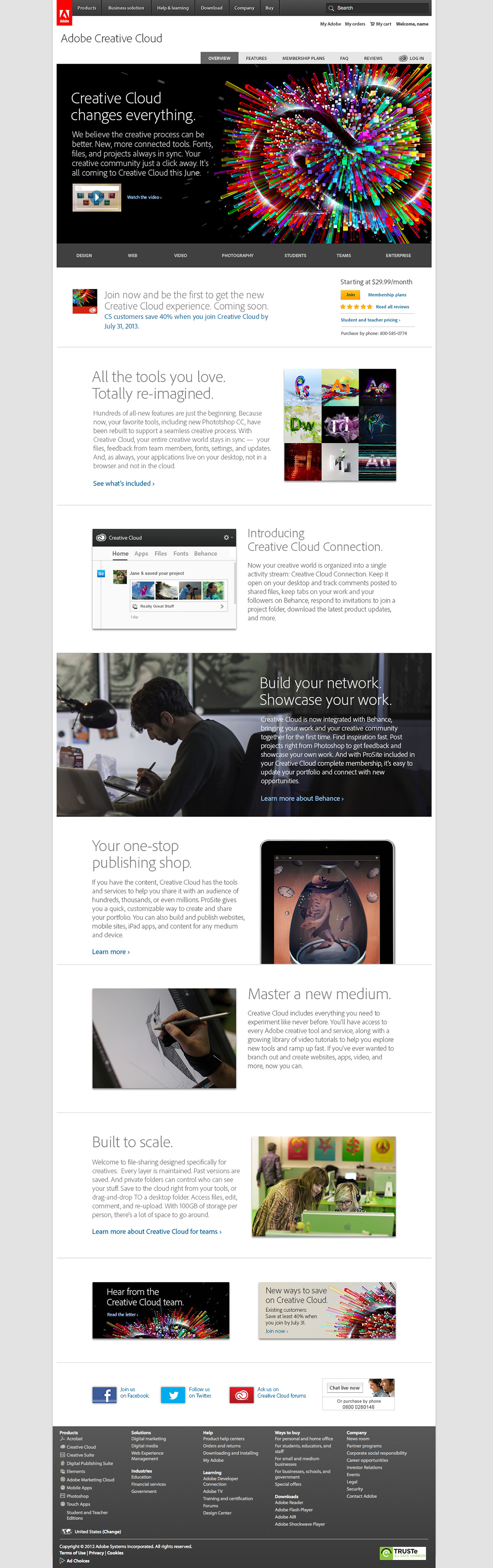
We recently tested a simplified, scrolling layout that tells a story one thought at a time against our existing pages where every piece of information is competing for your attention. Guess what? The curated experience had a significant RPV lift over the existing site. The kicker is that the buy button on the winning experience was below the fold on most screens.
Here are three recent projects that throw out the notion of a fold in favor of design by subtraction. Telling a story one thought at a time.