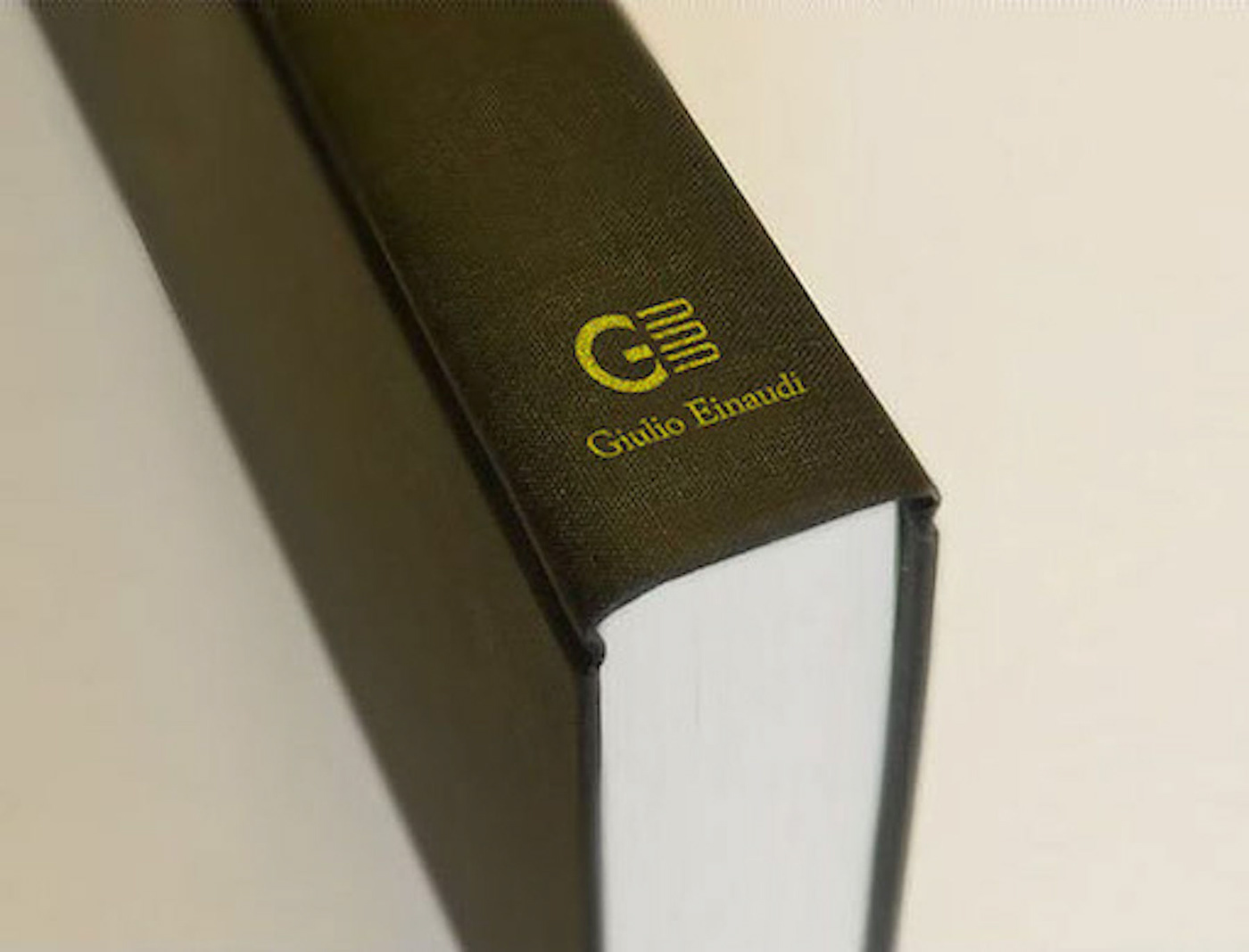
This is the logo redesign of Giulio Einaudi editore. In my opinion, a publisher logo must be concise, and must have high recognition. Using the same trait for design the letters G and E. And the letter E has the shape like three books.
Join Behance
Sign up or Sign into view personalized recommendations, follow creatives, and more.
or
Join Behance
Sign up or Sign in to view personalized recommendations, follow creatives, and more.