
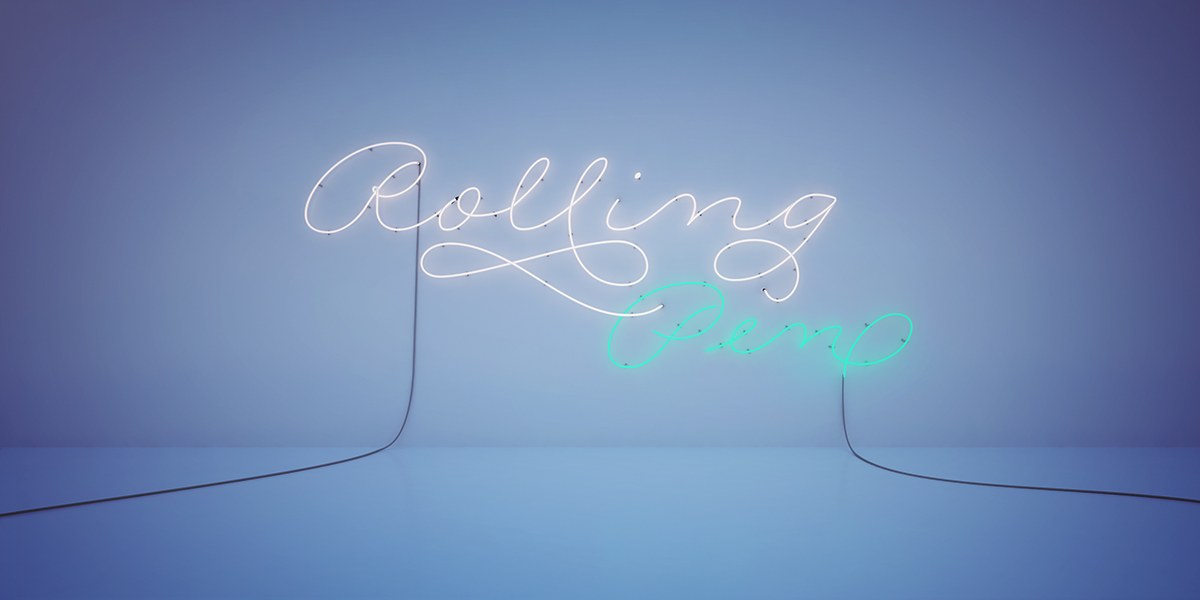
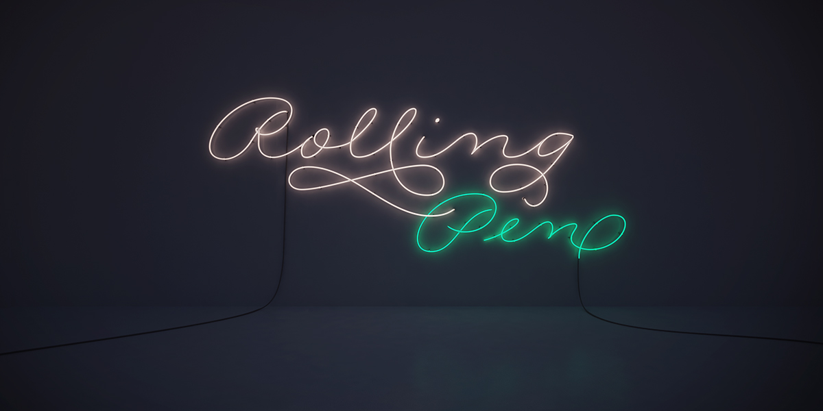
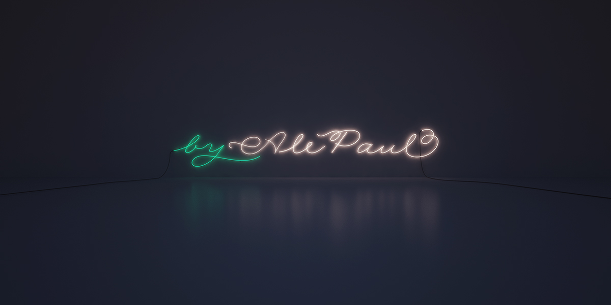
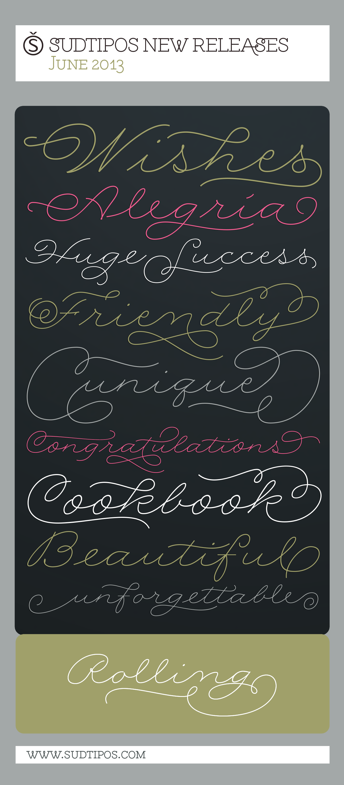
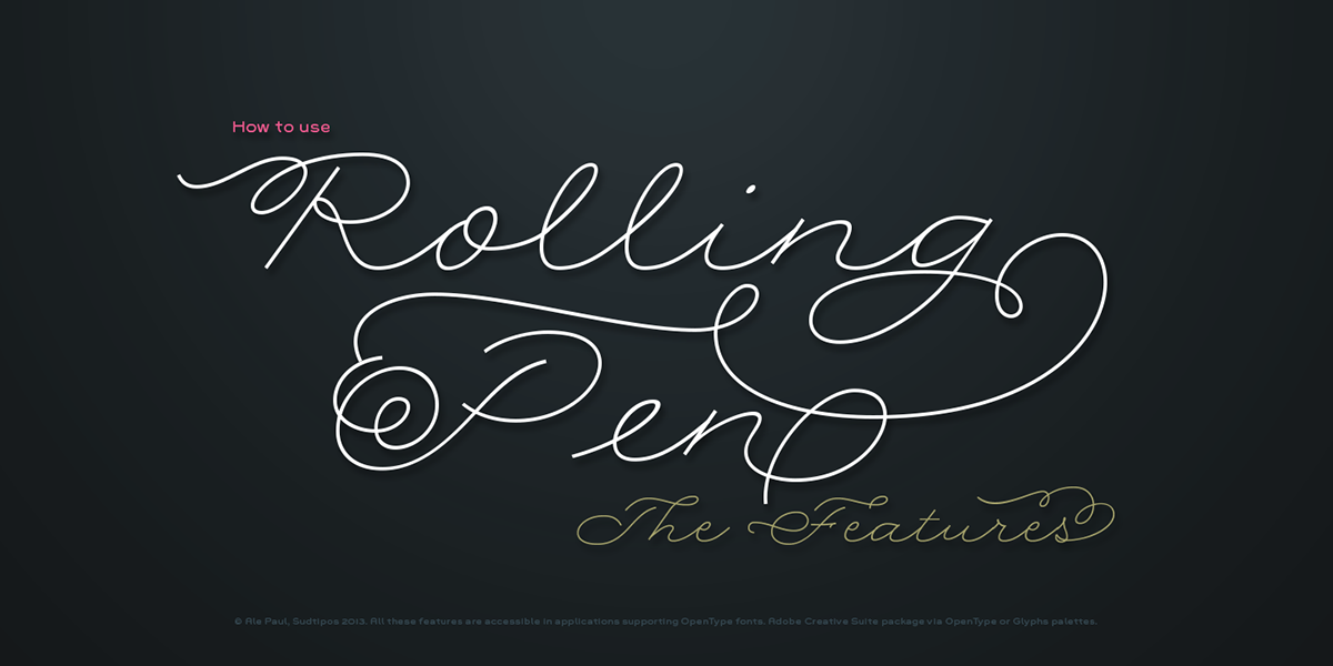
Rolling Pen. A new typeface by Ale Paul.
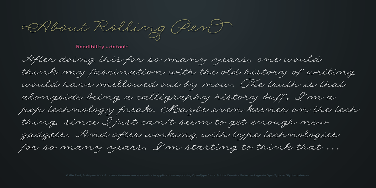
After doing this for so many years, one would think my fascination with the old history of writing would have mellowed out by now. The truth is that alongside being a calligraphy history buff, I'm a pop technology freak. Maybe even keener on the tech thing, since I just can't seem to
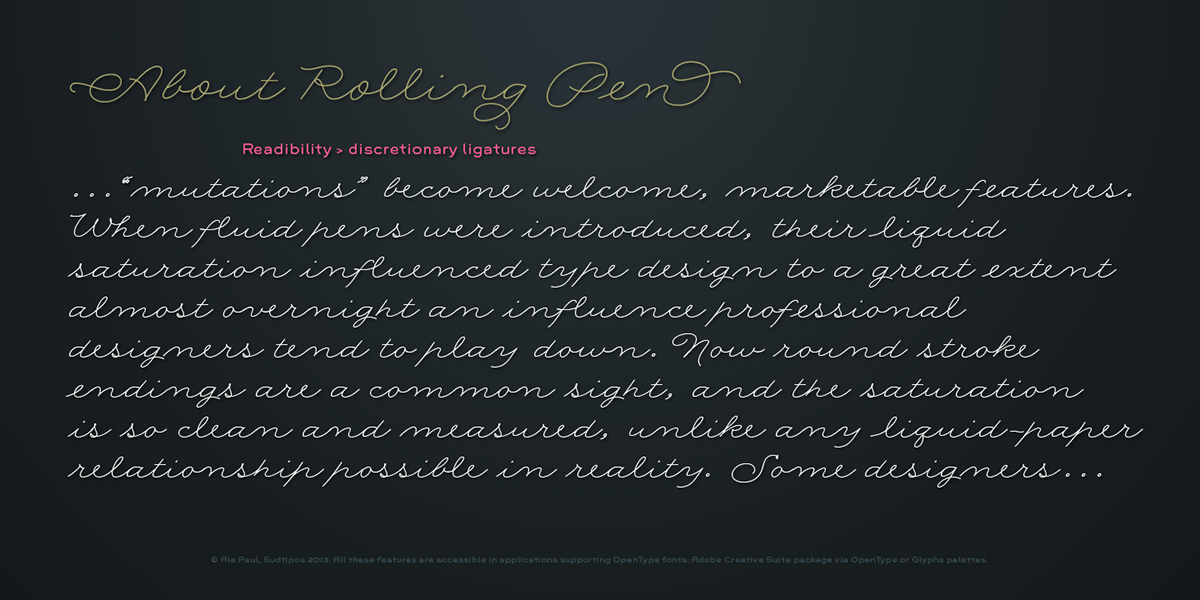
get enough new gadgets. And after working with type technologies for so many years, I'm starting to think that writing and design technologies as we now know them — we and now being about 2.5 post-computer generations — keep becoming more and more detached from what the very old humanity arts/tasks they essentially want to facilitate. In a world where command-z is a frequently used key combination, it's difficult to justify expecting a Morris-made book or a Zaner-drawn sentence, but accidental artistic "mutations" become welcome, marketable features. When fluid pens were introduced, their liquid saturation influenced type design to a great extent almost overnight — an influence professional designers tend to play down. Now round stroke endings are a common sight, and the saturation is so clean and measured, unlike any liquid-paper relationship possible in reality. Some designers even illustrate their work by overlaying perfect circles at stroke ends, in order to illustrate how "geometric" their work was. Because if it's measured with precise geometry, it's got to be meaningful design.
And once in a while, by a total freak accident, the now-cherished mutations prove to have existed long before the technology that caused them. Rolling Pen was cued by just such a thing: A rounded, circular, roll-flowing calligraphy from the late nineteenth century — seemingly one
of those experimental takes on what inspired Business Penmanship, another font of mine. Looking at it now it certainly seems to be friendlier, more legible, and maybe even more practical and easier to execute than the standard business penmanship of those days, but I guess friendliness and simplicity were at odds with the stiff manner business liked to present itself back then, so that kind of thing remained buried in the professional penman's oddities drawer. It would be quite a few years before all this curviness and rounding were thought of as symbolic of
graceful movement, which brought such a flow closer to the idea of fine art.
Even though in this case the accidental mutation just happens to not be a mutation after all, the whole technology-transforms-application argument still applies here. I'm almost sure "business" will be the last thing on people's minds when they use this font today. One extreme example of that level of disconnect between origin and current application is shown here, with the so-called business penmanship strutting around in gloss and neon.

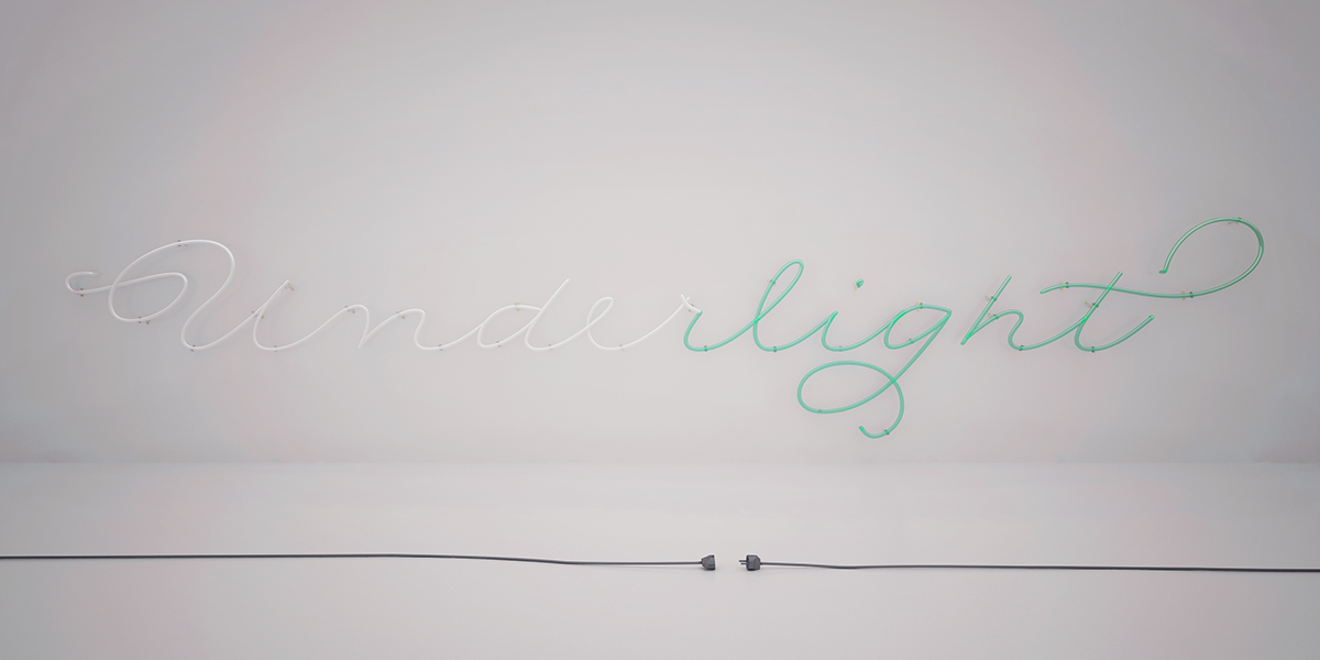
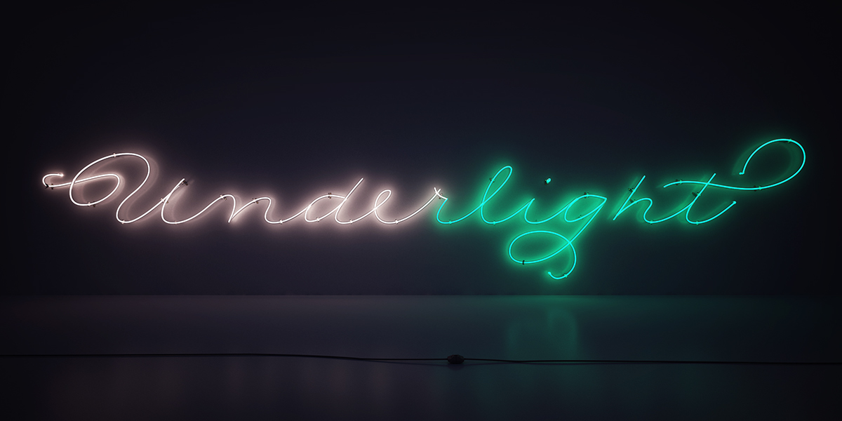
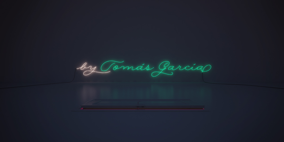
Underlight. Visual poetry by Tomás García.
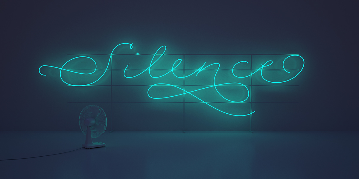
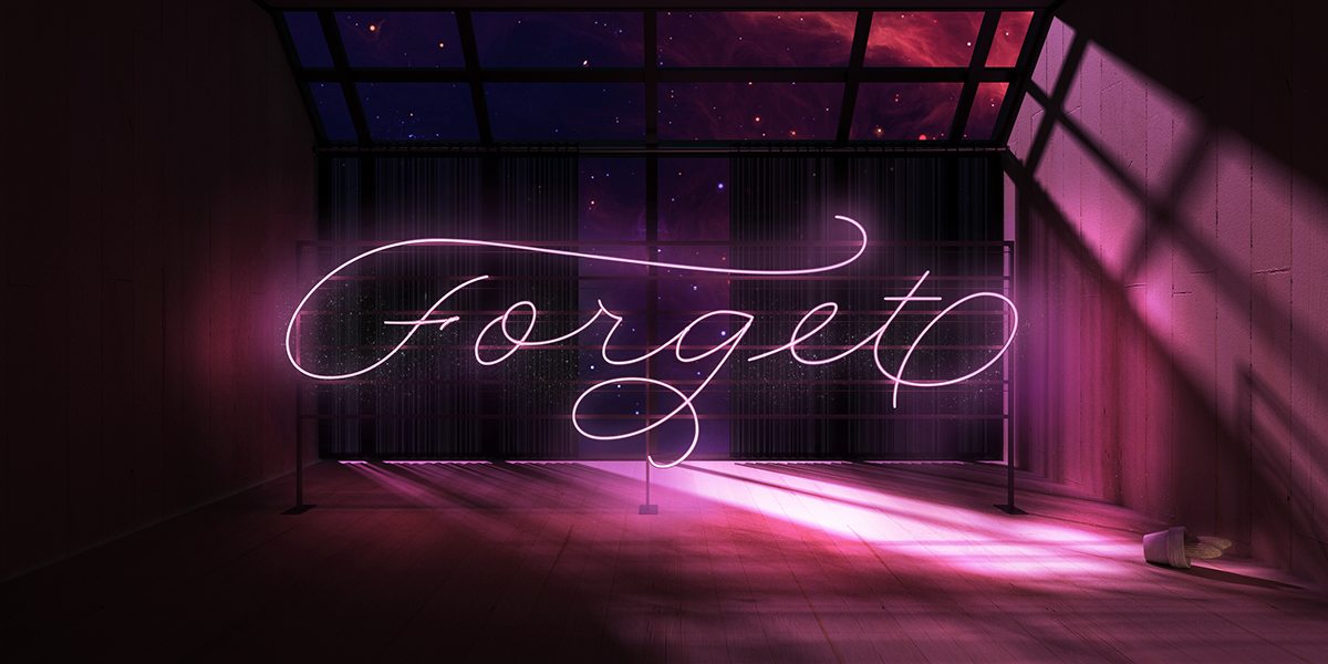
Tomas' approach on the reveal of Rolling Pen is inspired on the enlightenment given by neon lights in the dark, through the power of words.
The neon lights were originally created to conceptually narrate over darkness. That's why the collection has been coined "Underlight"; a way to represent light in neon form as the underliner of something important through light.
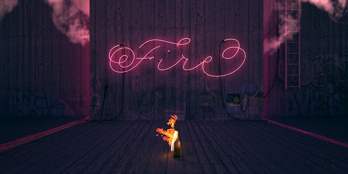
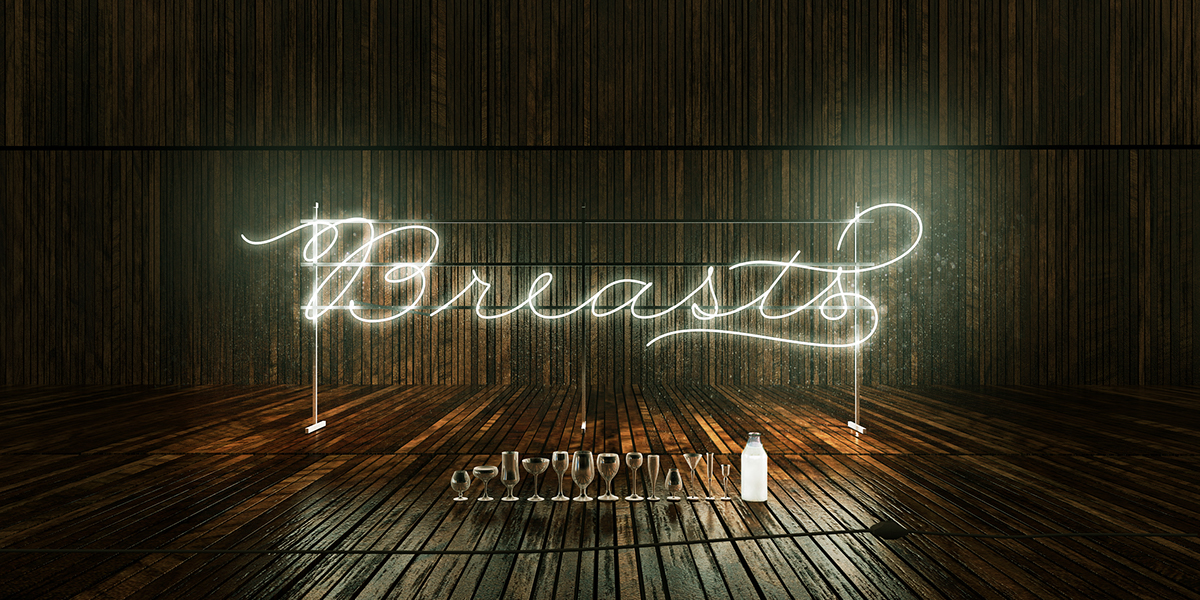
To embody this, he selected different words that enforce the eternal misbalance between darkness and lights, and that serve as a metaphor to narrate and reinforce the Concept.
Fire, Breast, Silence, Forget, & Happiness
Fire as energy, Breasts as diversity in birth, Silence as in the silent individual, Forget as evolution given by forgetfulness and Happiness, not as a goal, or achievement, but as a result of our lives, where light or dark don't particularly prevail.
Underlight is a poetry inspired by the battle between light and dark, struggling to generate a Concept.


Underllight now remixed in video by Author's Bay.
Rolling Pen.
We are proud to announce the latest addition to the Sudtipos library of fonts.
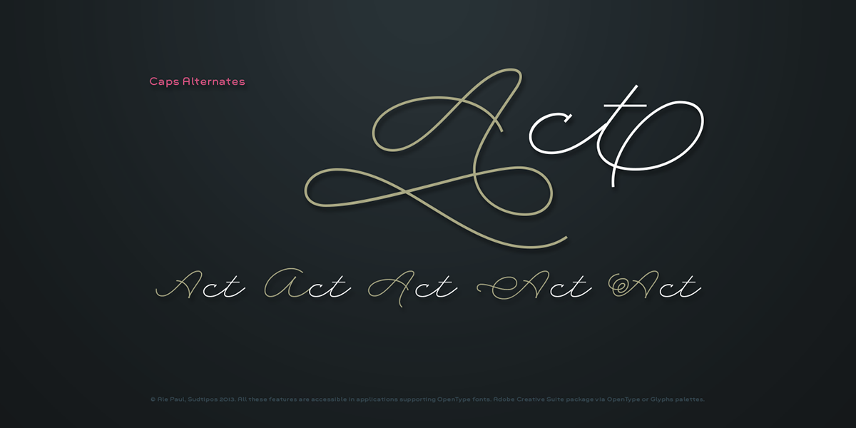
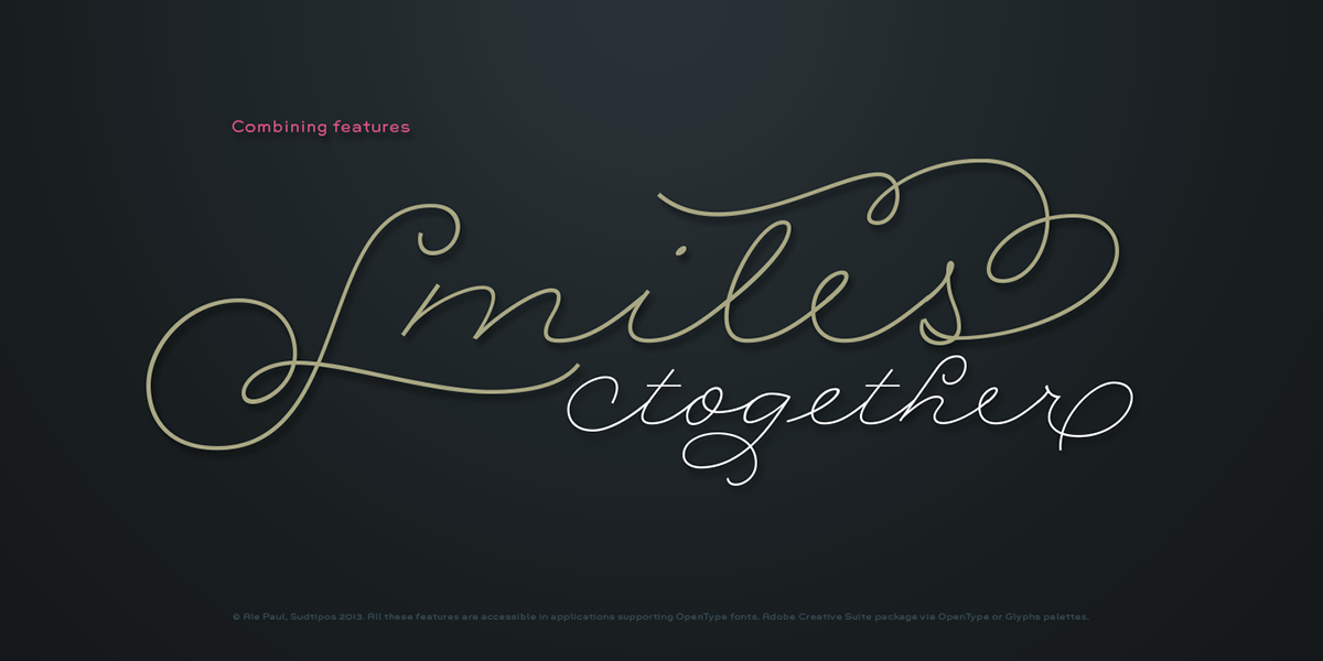
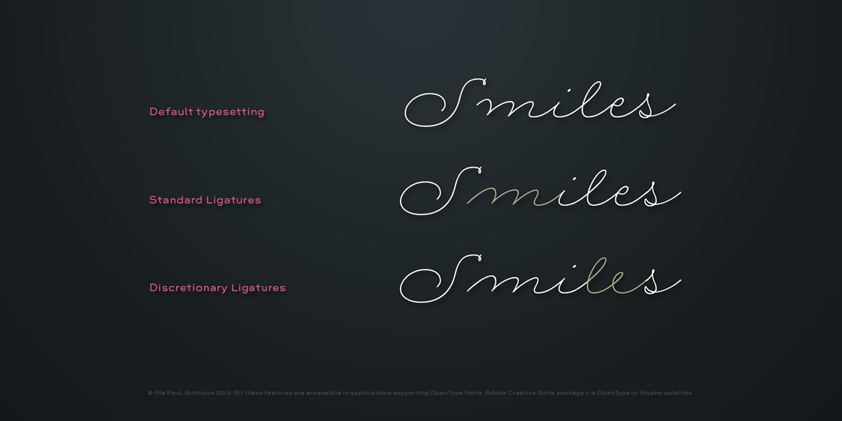
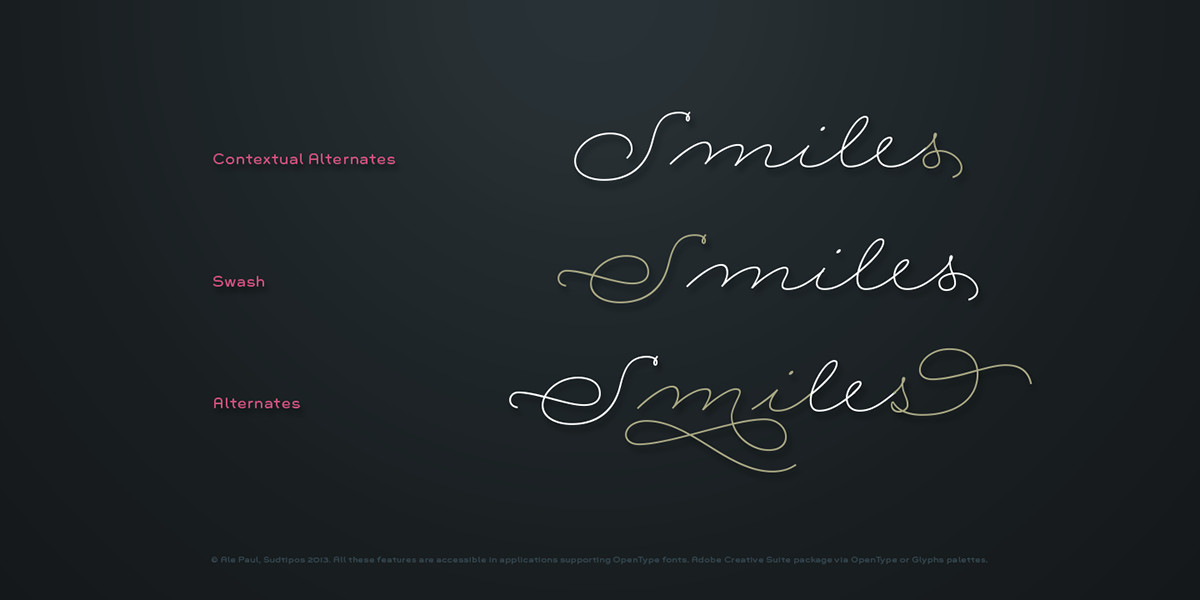
A How–to use guide.
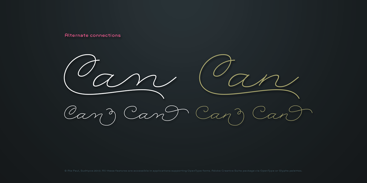
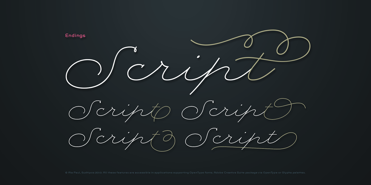
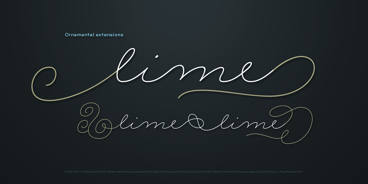
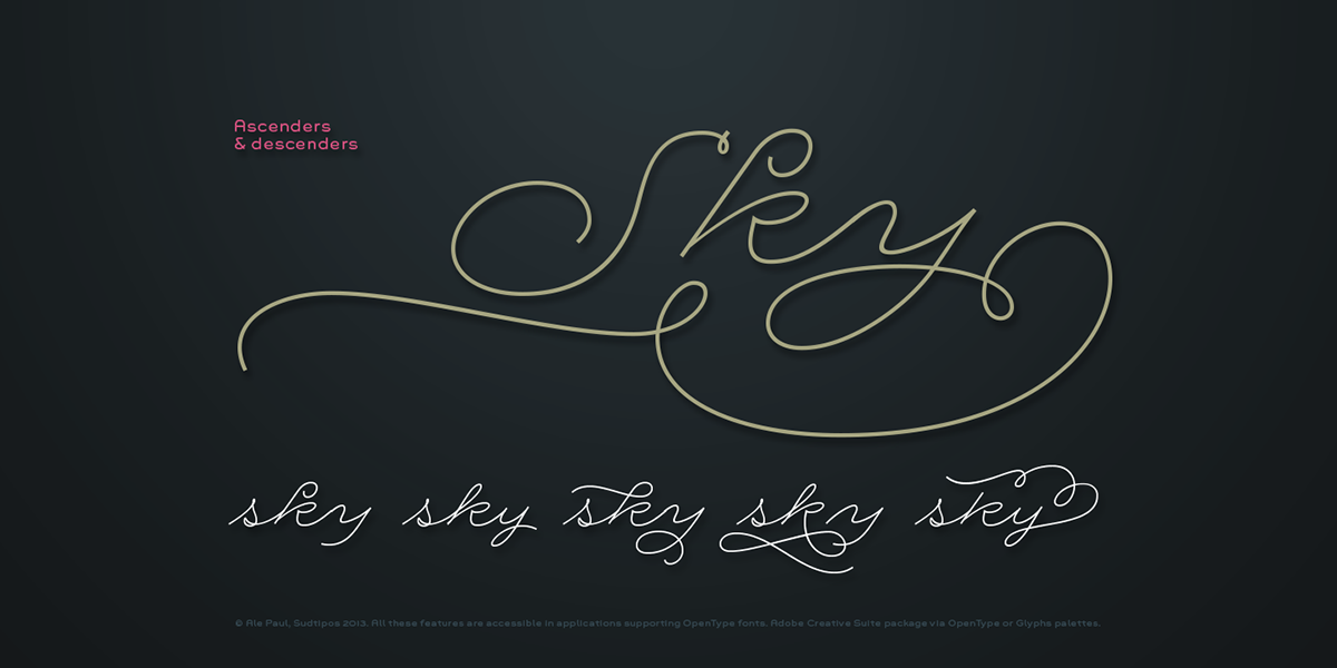
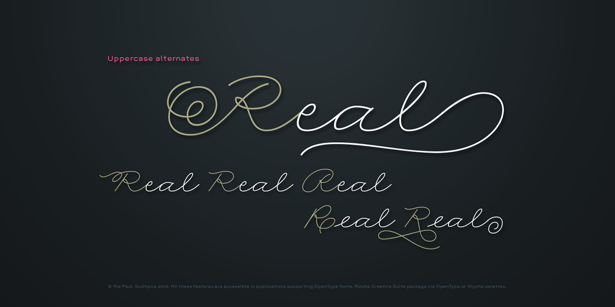
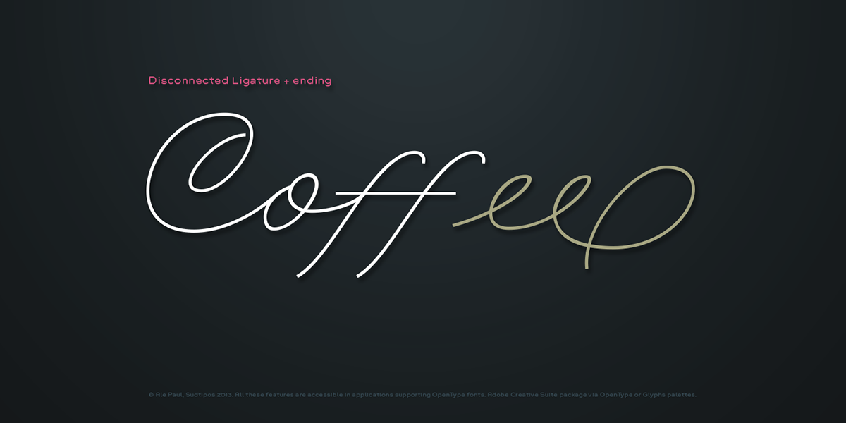
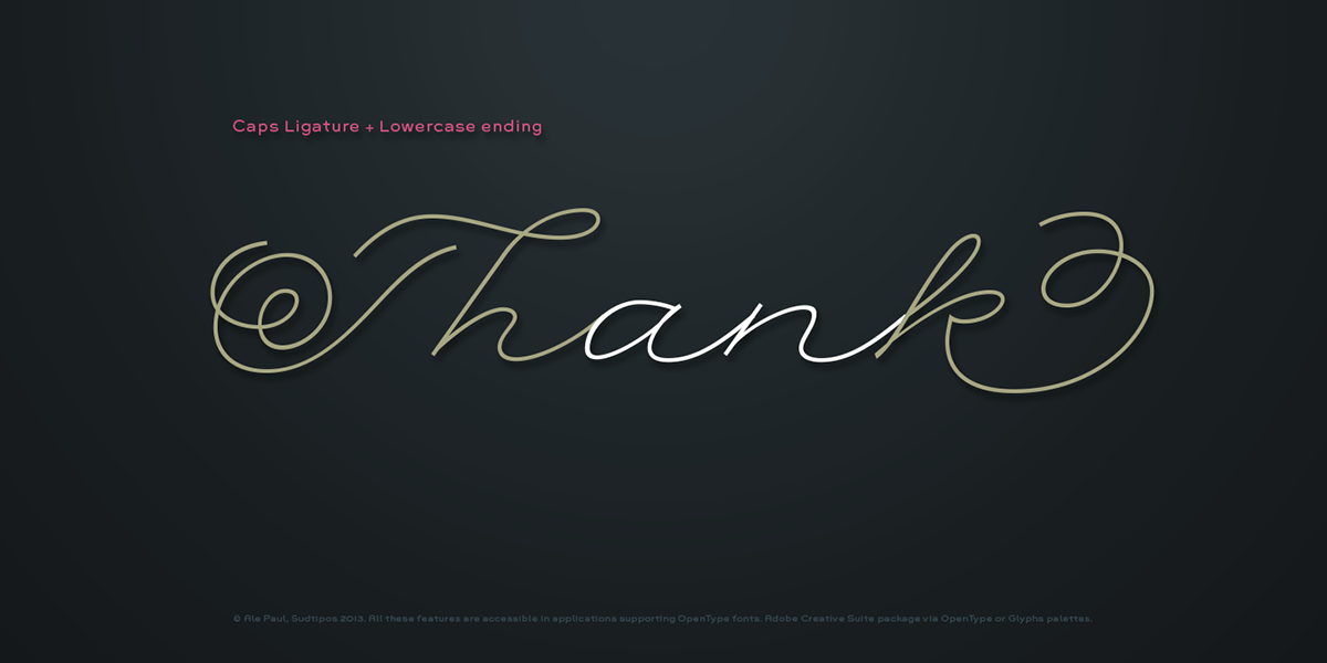
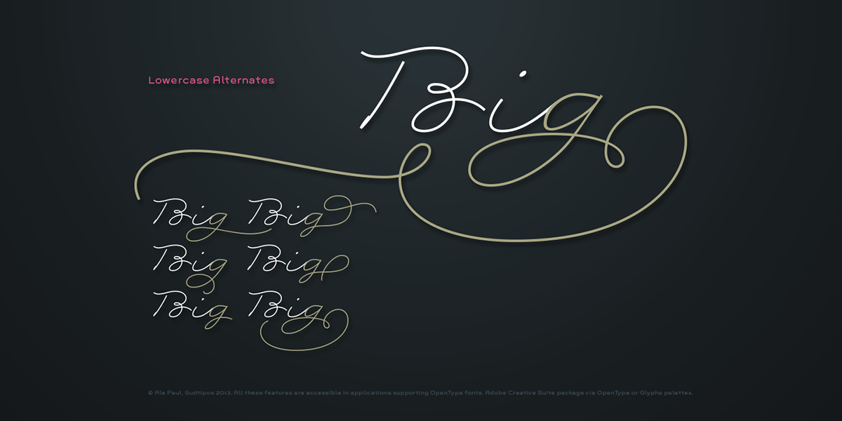
Rolling Pen is another cup of mine that runneth over with alternates, swashes, ligatures, and other techy perks. To explore its full potential, please use it in a program that supports OpenType features for advanced typography.

Visit Sudtipos & Tomás García


