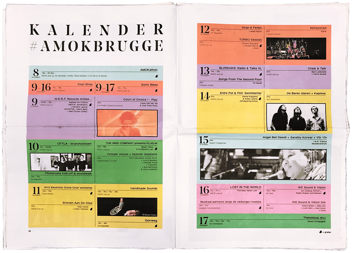
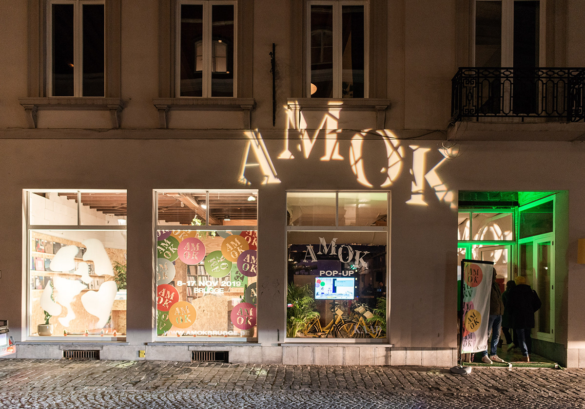
AMOK is a 10-day cityfestival in Bruges by artcentre KAAP. For their inaugural edition, KAAP approached me to develop an identity for a festival that doesn't want to be called a festival. A 10-day series of events, with music, talks and performances as it's foundation.
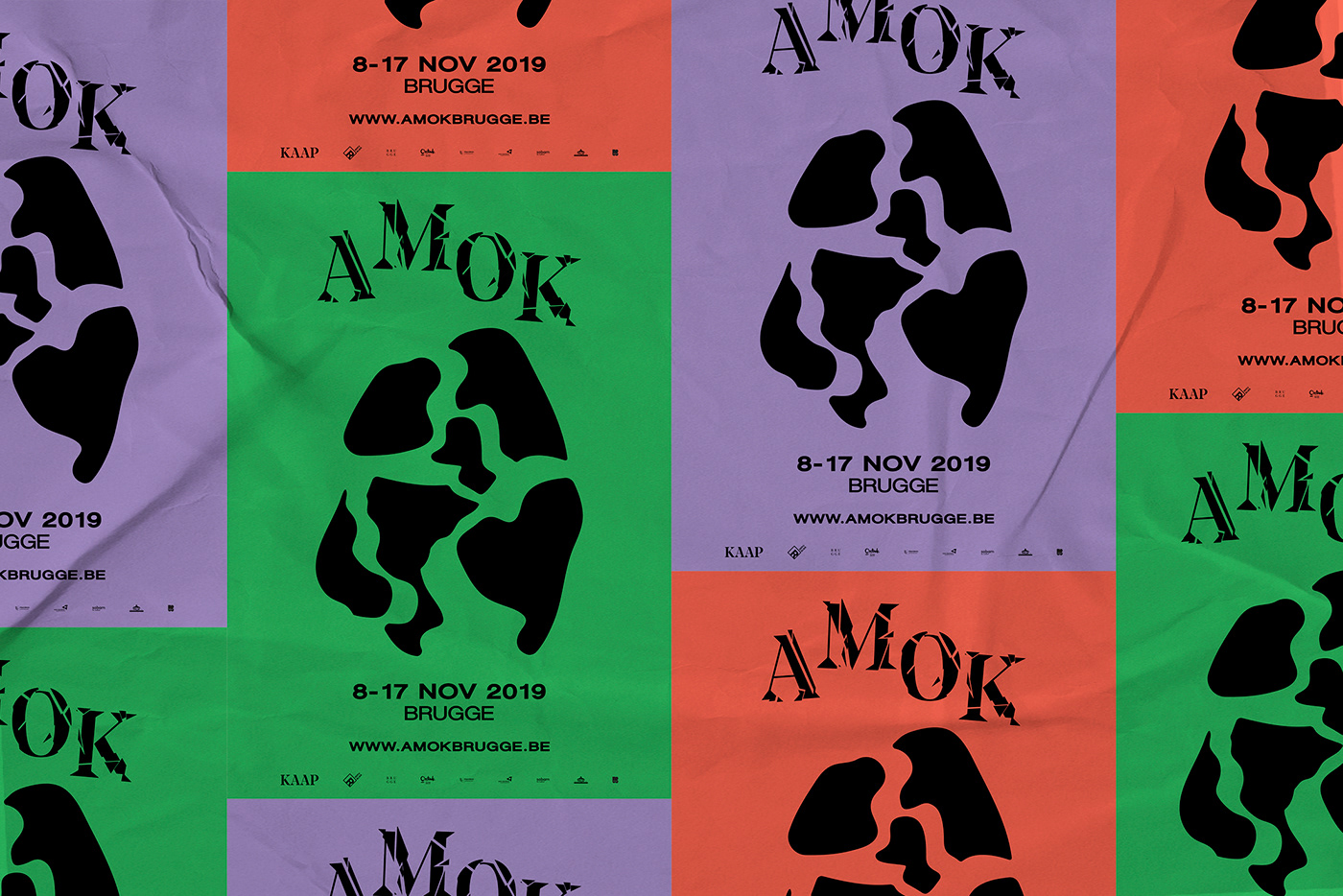
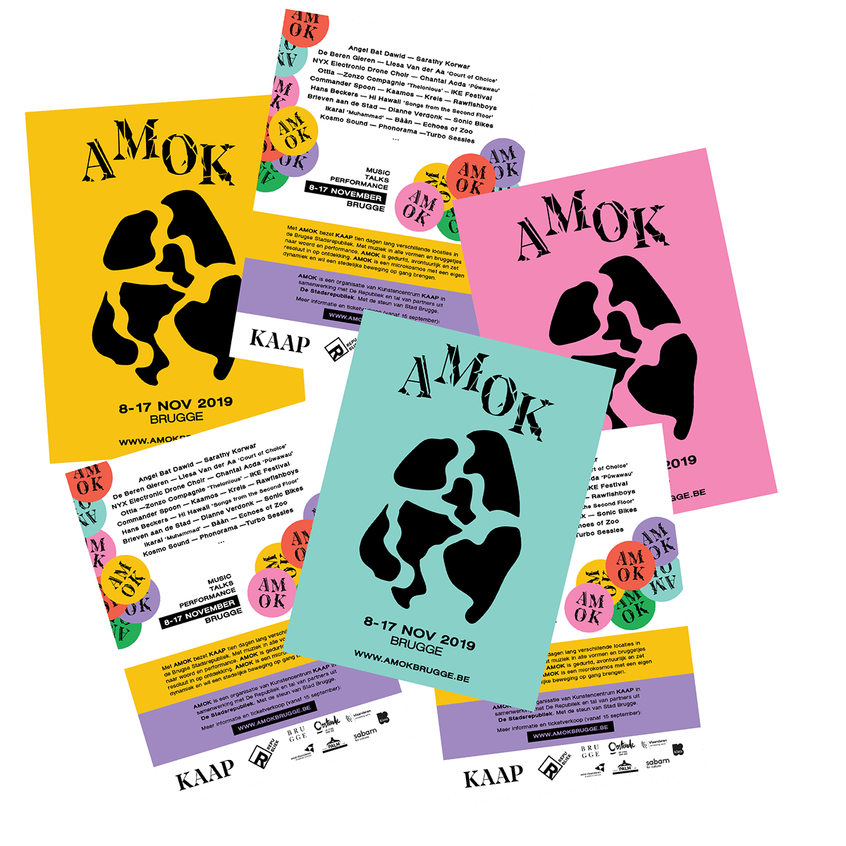
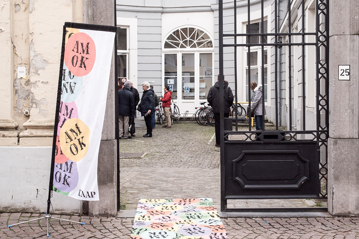
Hosting over 200 creatives/artists and over 50 performances at 15 different locations, AMOK aims to disrupt the ever so peaceful city-centre of beautiful Bruges by creating 'amok'. With disruption as my main inspiration, I created a wordmark based around KAAP's logotype, and destroyed it. Recreating the famous egg shape of Bruges, I destroyed that aswell, breaking it up into 6 pieces. The 6 pieces refered to the festival's original pillars being: music, talks, performance, city, experiment and discovery.
With 6 pieces of Bruges, I picked out 6 colors to come up with a vibrant color scheme. Only showing the content in black, and using the typography in a round circle in all colors, the assets proved to be very useful throughout the entire festival branding which ranged from posters to newspapers and everything inbetween.
CLIENT KAAP ROLE Graphic Designer YEAR 2019