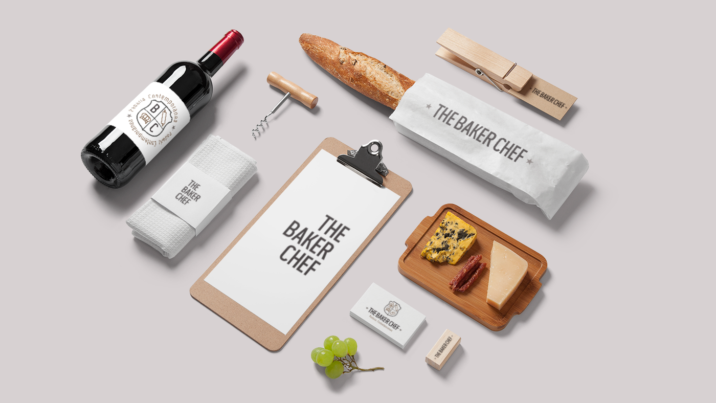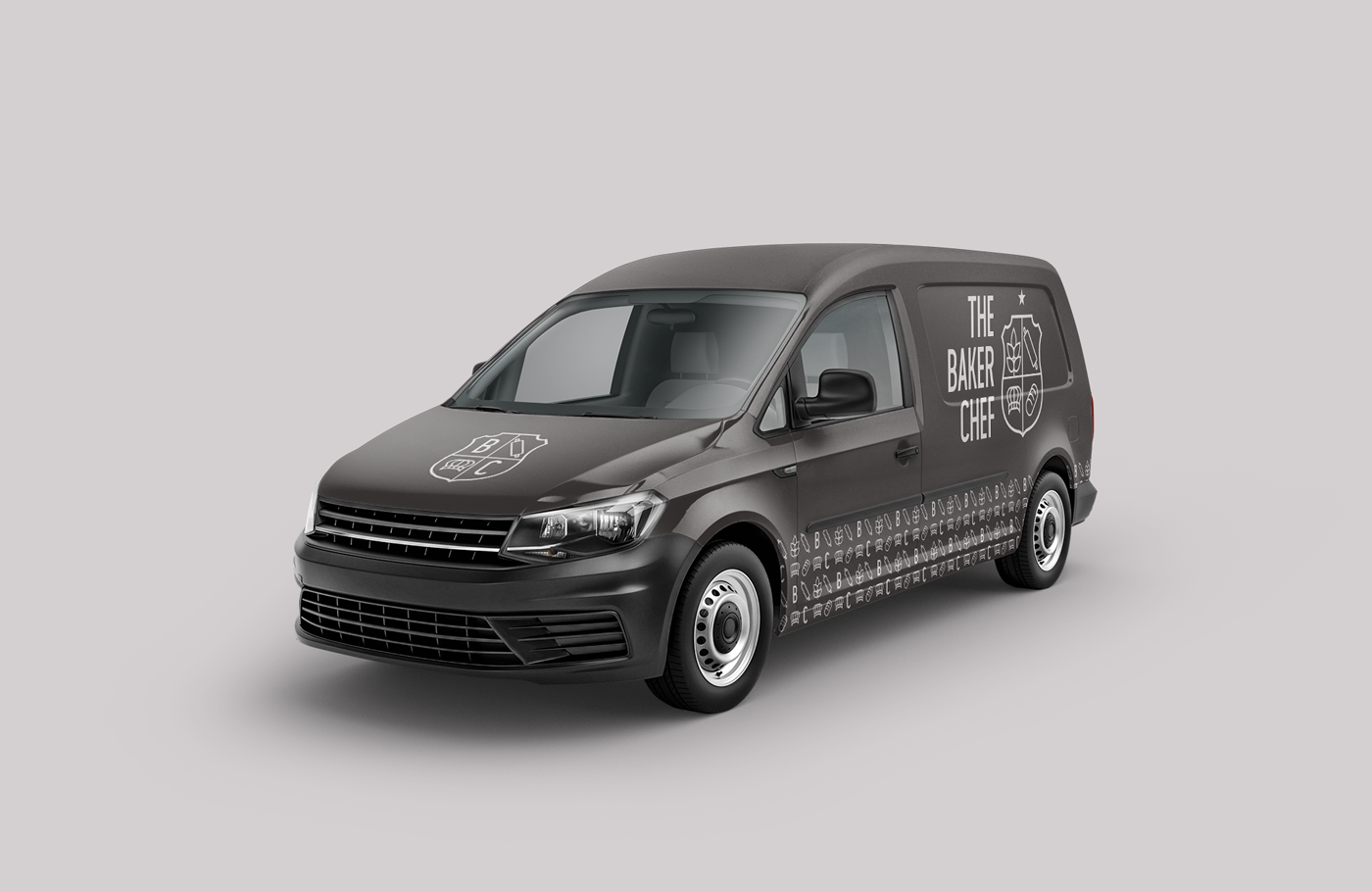

The Baker Chef is the newest contemporary bakery in the city of Recife, located in Setúbal, the southernmost neighborhood of Boa Viagem, bordering the city of Jaboatão dos Guararapes to the south. The bakery's proposal is to mix regional culture with haute cuisine, because in addition to offering a varied menu, The Baker Chef will bring a new high-quality experience, with sophistication, but without losing the "classic" footprint.


The project's initial inspiration was to "drink at the source" of the most classic elements of a bakery, be it traditional or contemporary.
Wheat, which gives rise to flour; the "hand in the dough", which takes shape with the rolling pin, the baker's main instrument; bread, one of the oldest foods of mankind, attributed to different meanings; and the great "conductor" of the kitchen, the one who commands the backstage of a great bakery: the chef baker ... Or rather, The Baker Chef!
Wheat, which gives rise to flour; the "hand in the dough", which takes shape with the rolling pin, the baker's main instrument; bread, one of the oldest foods of mankind, attributed to different meanings; and the great "conductor" of the kitchen, the one who commands the backstage of a great bakery: the chef baker ... Or rather, The Baker Chef!


The main challenge of the project was to create a concept that contemplated the "contemporary",
without losing the roots of the classic / traditional.
Creative guidelines:
HIGH STANDARD - SOPHISTICATION - CLASSIC - MINIMALISM
HIGH STANDARD - SOPHISTICATION - CLASSIC - MINIMALISM
Semantic search and connection:
BAKER - BAKERY - BREAD - FOOD - GASTRONOMY - KITCHEN - CHEF
BAKER - BAKERY - BREAD - FOOD - GASTRONOMY - KITCHEN - CHEF


All icons were drawn by hand and then vectorized in Adobe Illustrator. And to group them all, a shield / coat of arms was used, referring to both concepts used in the creative guidelines: minimalism and tradition. Nothing more traditional than using the coat of arms of the state of Pernambuco as a reference, where the bakery will be inaugurated.

Regarding the choice of the typographic family, the Wask New font was used, not only to compose the typography and tagline of the logo, but also for the other graphic pieces. It is a condensed, versatile font, it can be used both in digital and printed items, in addition to adding characteristics such as modern and classic, with subtle serifs in some characters.


The color palette uses dark tones and black as a base, referring to the scenario of inspiration above and concepts associated with sophistication and high standards, differentiating itself from the visual lines common to the bakery. The aim is to stand out in the market, adding value to the brand because it is a unique experience.

Set of brand variations and graphics


Brand visual identity


