Cicis Pizza is an American restaurant chain specializing in unlimited pizza. There are hundreds of Cicis franchised and corporately owned restaurants across the USA.
After a rebrand in 2015 that issued in a number of reproduction challenges, Cicis in-house creative team partnered with Ben Loiz Studio to develop a new, more considered mark for the brand.

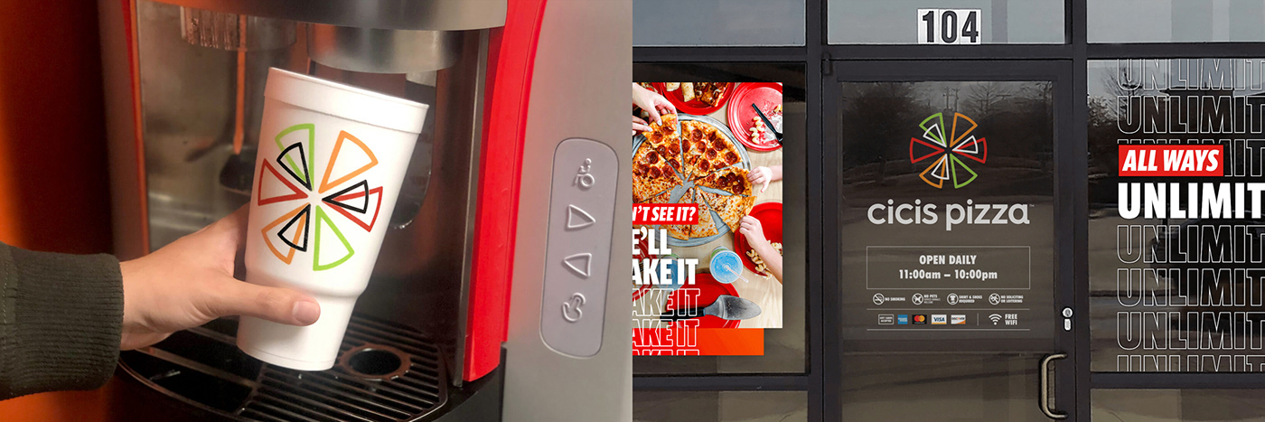
One of the challenges we set out to address was that of customer recognition. Historically the restaurants were known as Cicis Pizza, but in 2015 the prominence of the word Pizza was greatly reduced, and along with a new logo and a lighter red, customers were confused. Other reproduction problems became apparent as signage was being produced. The logo felt bottom-heavy on signs and the symbol was uneven and asymmetric which created a gap when updating circular signage structures that many of the restaurants had in place.

A “slice” was added to the symbol to bring symmetry, line weights were made uniform, and the angle of the symbol was fine-tuned to create balance. The type was adjusted for consistency, and to appear less distracting and compact. We straightened the bottom of the letterforms to increase legibility and the word Pizza was added back into the wordmark. The colors were also made more recognizable.
The new mark has begun to replace the previous one on the web and social media, in commercials, on signage, and in-store food packaging.