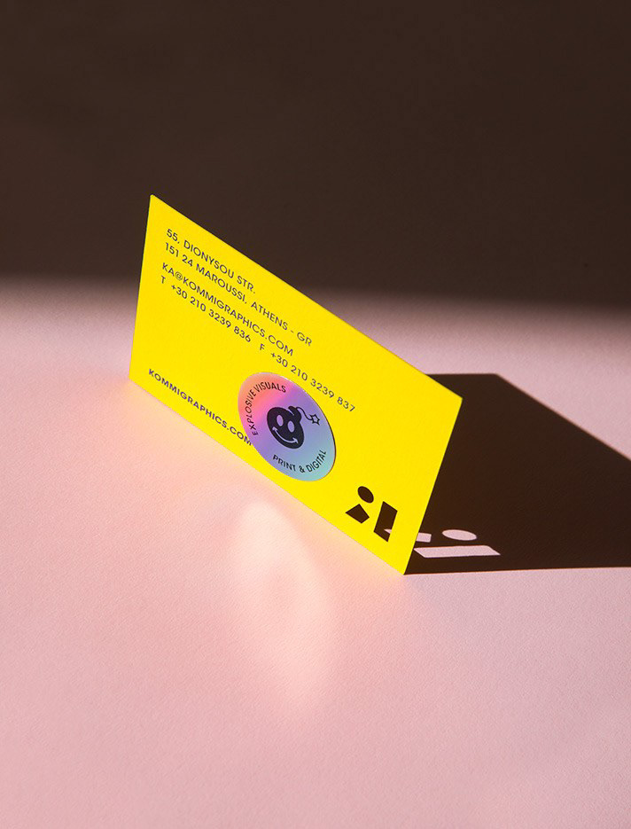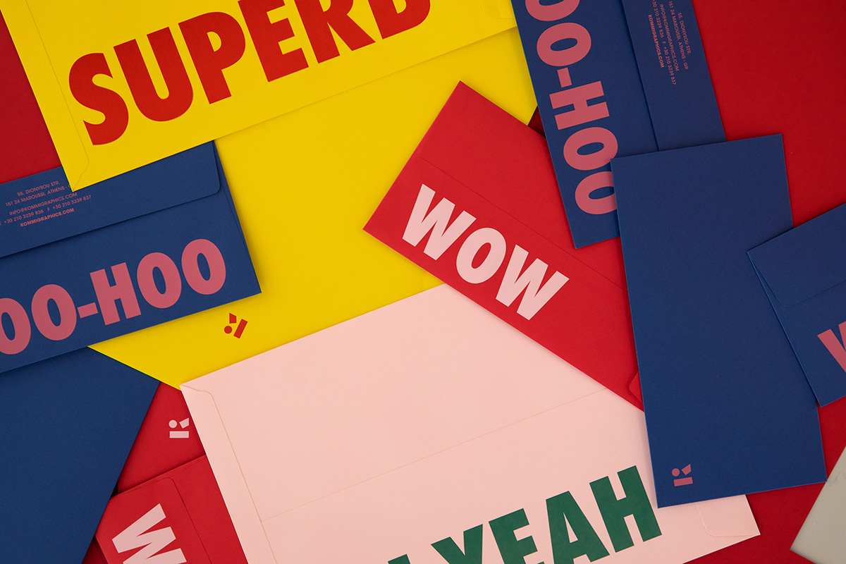
KOMMIGRAPHICS BRAND IDENTITY
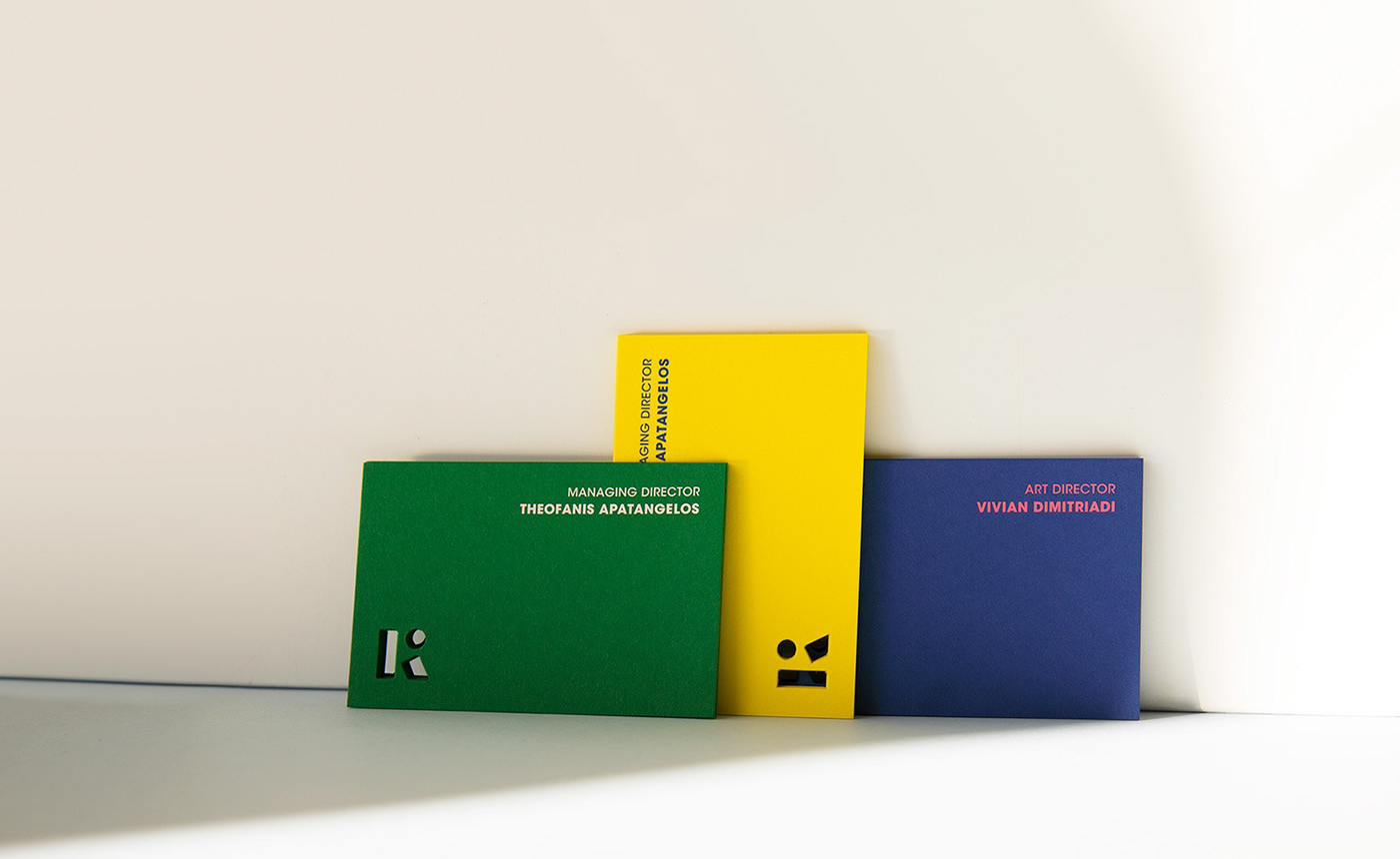
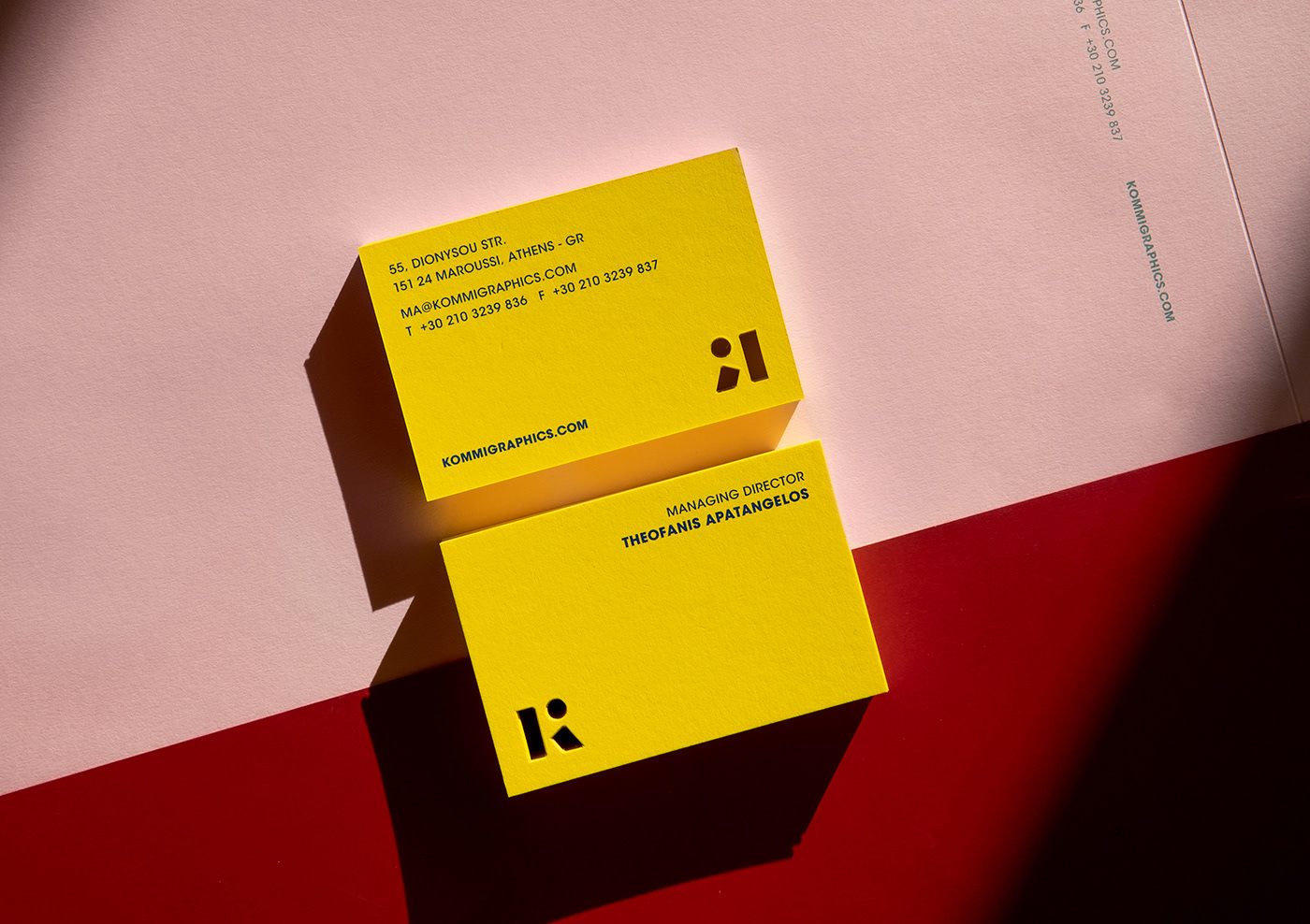
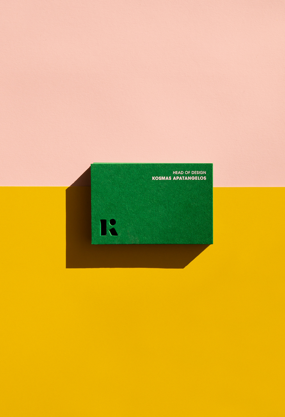
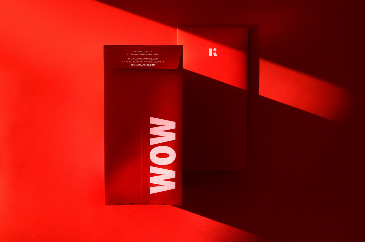
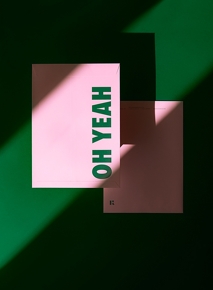
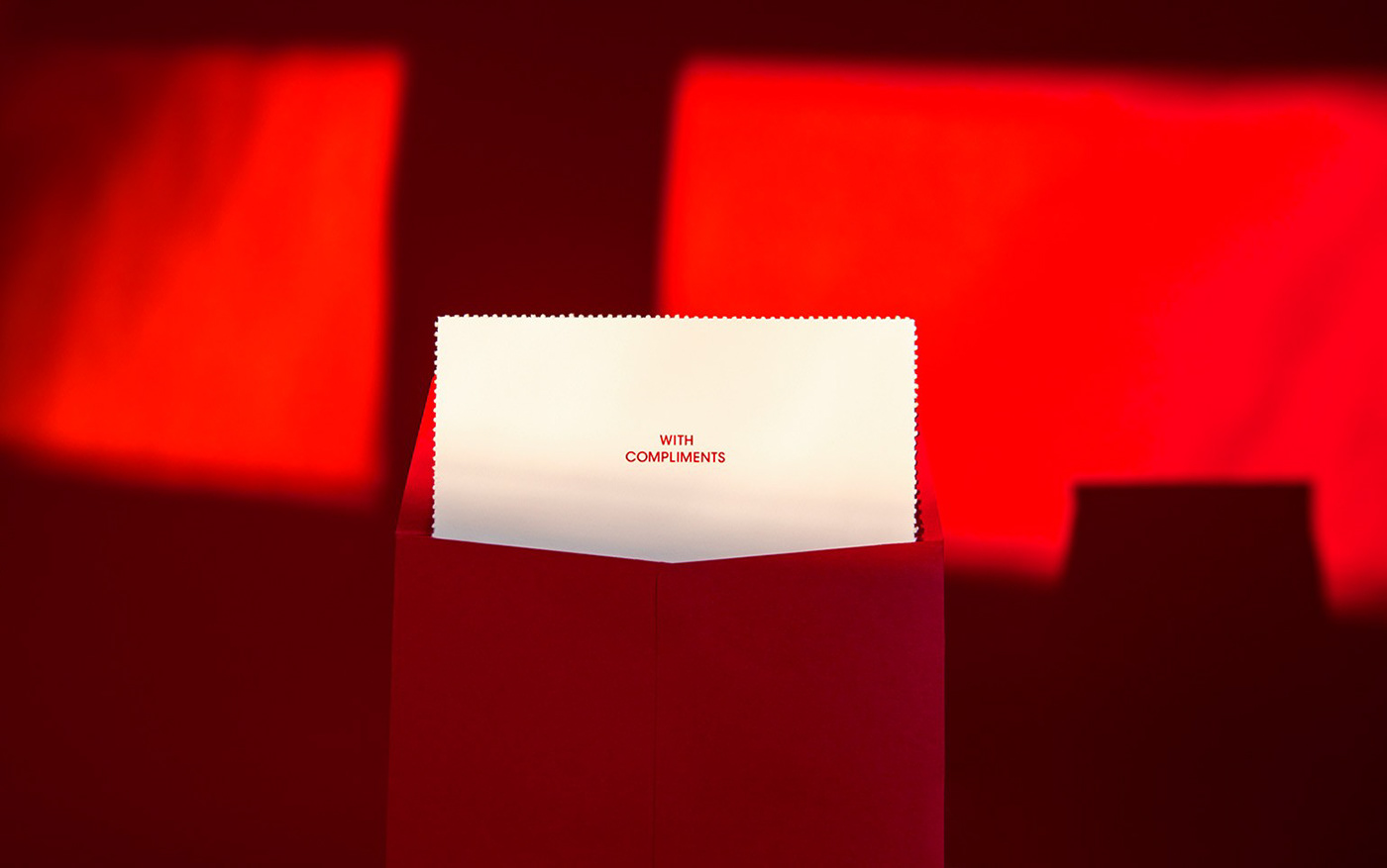
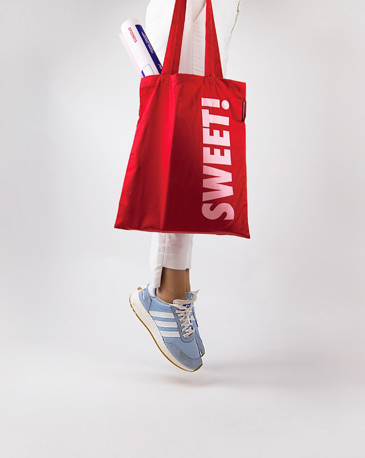
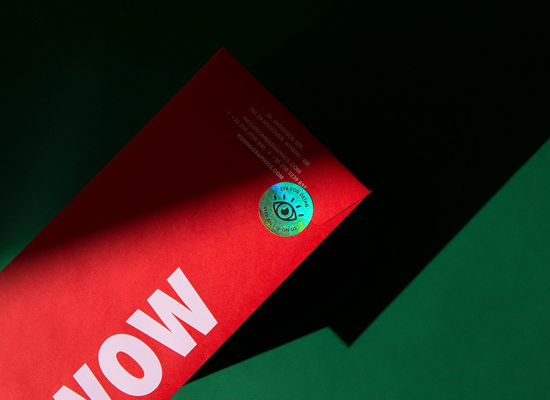
THE DIVERSITY OF THE PROJECTS WE IMPLEMENT AND THE BASIS OF OUR PHILOSOPHY FOR A PERFECT BALANCE BETWEEN CREATIVITY AND RESULTS, HAVE PROMPTED US TO CHOOSE FROM A VARIETY OF COLORS AND PRINTING TECHNOLOGIES, ELEMENTS THAT BLEND HARMONIOUSLY TOGETHER AND REINFORCE THE ORIGINAL IDEA OF DIFFERENTIATION AND EXPERIMENTATION.
Our creative approach to every project is honest, clear, direct and methodical, as we always seek ideas with unexpected interpretations, both on meaningful and emotional level.
That is why we chose implement expressions & exclamations of joy and reward, such as those we come across from our clients or what we aim for when delivering a project.
In addition, the sans serif typography and the different layouts applied, add a particular interest to the aesthetics of our visual identity.
The requirement was to come up with the correct combination of typography and graphic design in such a way that it perfectly expresses the style, philosophy and values of the company and on the other hand, is pleasing to its recipients.
Papers: Colorplan
Supplier: Perrakis Papers
Printing House: Xenos Printing