Pittsburgh Paints & Stains Exterior Stain Program
“Pittsburgh Paints & Stains offers a complete line of products formulated to protect any wood type against rain, sun and mildew stains for a beautiful, long-lasting finish at any budget.”
Key Objectives
• Expand the Pittsburgh Paints and Stains assortment at Menards and showcase innovation in the market through the introduction of a super high end stain program.
• Through the introduction of a differentiated product and accompanying program, improve overall consideration rate and elevate the quality perception of the Menards stain department.
• Get consumers to trade up and purchase their stain product from a luxury aesthetic approach.
• Increase sales by creating extremely effective aisle marketing signage.
Target Audience
• Primarily male age 45-65, affluent, midwestern
These consumers set high standards for themselves when it comes to the maintenance they do on their homes, always putting in the effort to really do the job right.
These consumers set high standards for themselves when it comes to the maintenance they do on their homes, always putting in the effort to really do the job right.
Brand Character/Personality
• Honest
• Innovative
• Beautiful
• Stylish
• Innovative
• Beautiful
• Stylish
List of Deliverables
• Packaging label design for Paramount line and Paramount Exterior Luxury Finish
• Kiosk design to display stain color chips and brochure materials
• Stain opacity/product brochures
• Conceptualization and creation of an aisle able to house the kiosk, marketing signage, and space for a high capacity of stain product.
• Kiosk design to display stain color chips and brochure materials
• Stain opacity/product brochures
• Conceptualization and creation of an aisle able to house the kiosk, marketing signage, and space for a high capacity of stain product.
Inspiration/Mood Board
The entire stain program is inspired by the great outdoors and evokes natural textures and colors, be it from a rough log or a cozy sunset.

1. Jewel tones/nature inspired
2. Finished product/ inspiration + aspiration
3. Attention to detail
4. Pop of color
5. Passion & protection
6. High-end qualities
7. Hints of gold
2. Finished product/ inspiration + aspiration
3. Attention to detail
4. Pop of color
5. Passion & protection
6. High-end qualities
7. Hints of gold
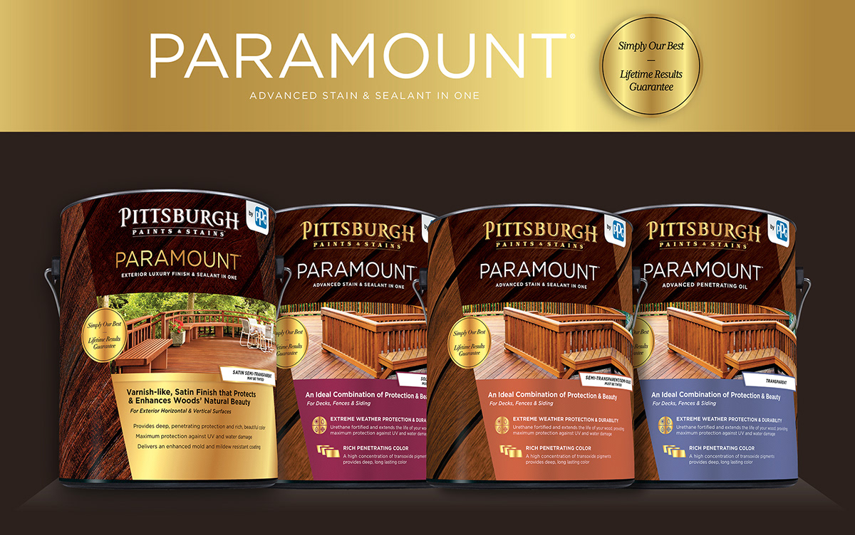
Family Shot of all Four Paramount Products
Flat Artwork Example

Design Cues: Paramount Exterior Luxury Finish

1. Rich brown to highlight the wood.
2. Decking is shown to communicate purpose, varnish and bringing the look of interior wood to your exterior deck.
3. Pushed out to express advanced style
4. Interlocking angles in opposite directions to symbolize protection.
5. Lifestyle image of a finished deck.
6. Multiple hits of gold to communicate luxury and high end quality.
7. Features and benefits section is uncluttered.
Design Cues: Paramount
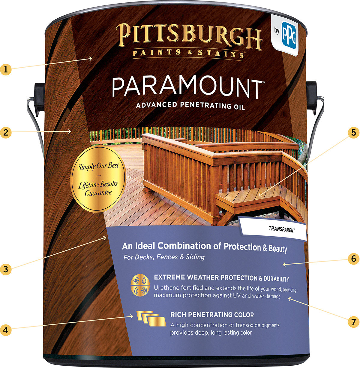
1. Rich brown to highlight the wood.
2. Decking is shown to communicate purpose, functionality and beauty.
3. Pushed out to express advanced style
4. Interlocking angles in opposite directions to symbolize protection.
5. Aspiration of a finished deck
6. Pop of jewel tone color correlates with opacity.
7. Features and benefits section is uncluttered.

New Stain Kiosk


OLD STAIN KIOSK
The previous Stain Kiosk was confusing to the consumer, clunky and outdated. Laying out the entire stain palette to look over all at once was daunting and overwhelming.
The previous Stain Kiosk was confusing to the consumer, clunky and outdated. Laying out the entire stain palette to look over all at once was daunting and overwhelming.
NEW STAIN KIOSK
The new look breathed new life into the center and by utilizing the skeleton of the existing kiosks, we were able to save money and shipping time.
• Curated color palettes to aid the consumer in stain color and opacity choice.
• Cohesive branding.
• Inspirational imagery is used to inspire and support the newly curated palettes.
• Product reinforcement next to each palette makes it easier for the consumer to decide
Gold, Hampton Walnut & Slate Grey
The use of these colors places the consumer in a premium space, which embodies the warmth and richness of wood and nature.
White
White is used to define the difference between products.
The use of these colors places the consumer in a premium space, which embodies the warmth and richness of wood and nature.
White
White is used to define the difference between products.
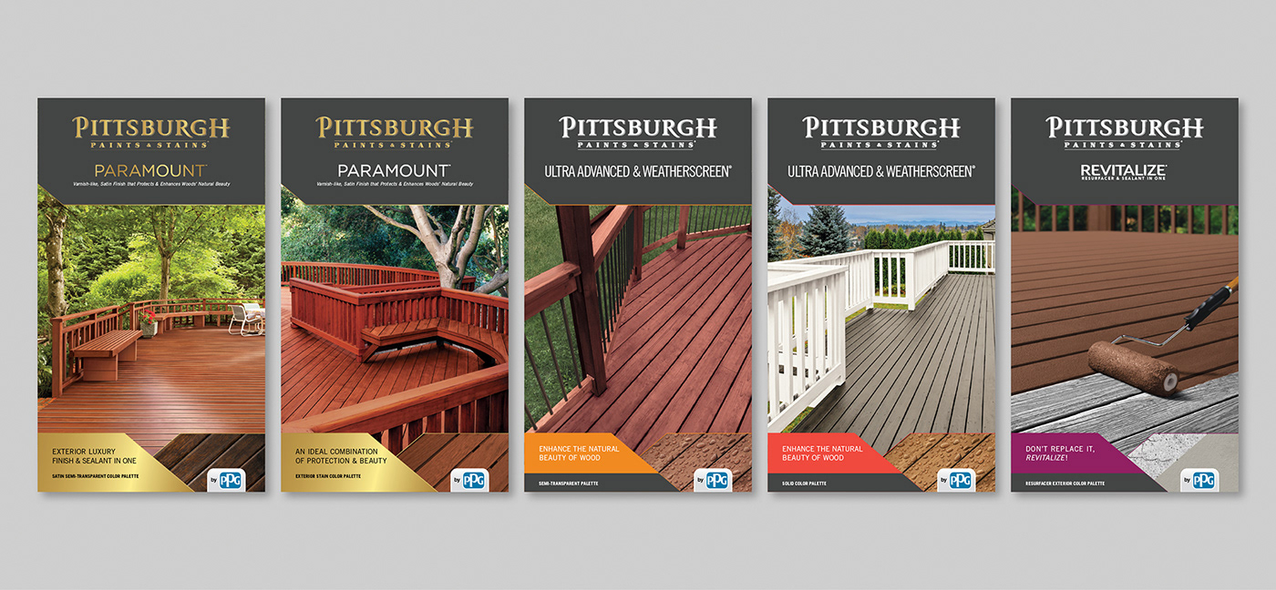
Exterior Stain Color and Opacity Brochures
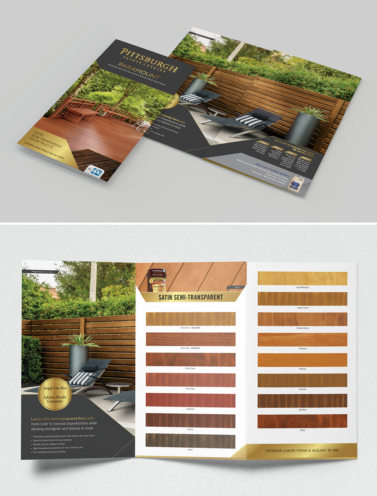


1. Landing area for the brand to feel grounded
2. Gold Pittsburgh Paints & Stains logo is used only with Paramount Fine Wood Finish, Paramount and the exterior woodcare project guide
3. Imagery ties back into the label design and acts
as project inspiration and functionality
4. Color block allows the viewer to quickly see which brochure correlates with each stain opacity
5. Grounds information and acts as a transition from lifestyle imagery into decking close up to show what the stain will look like and what it is capable of
Snippet of the inside
6. Color bar is used as a part of the header and footer
7. Macro decking image acts as an example of what the stain will look like on your decking
8. Stain chips
9. Strong angles reflect the packaging design
Menards Exterior Stain Power Aisle
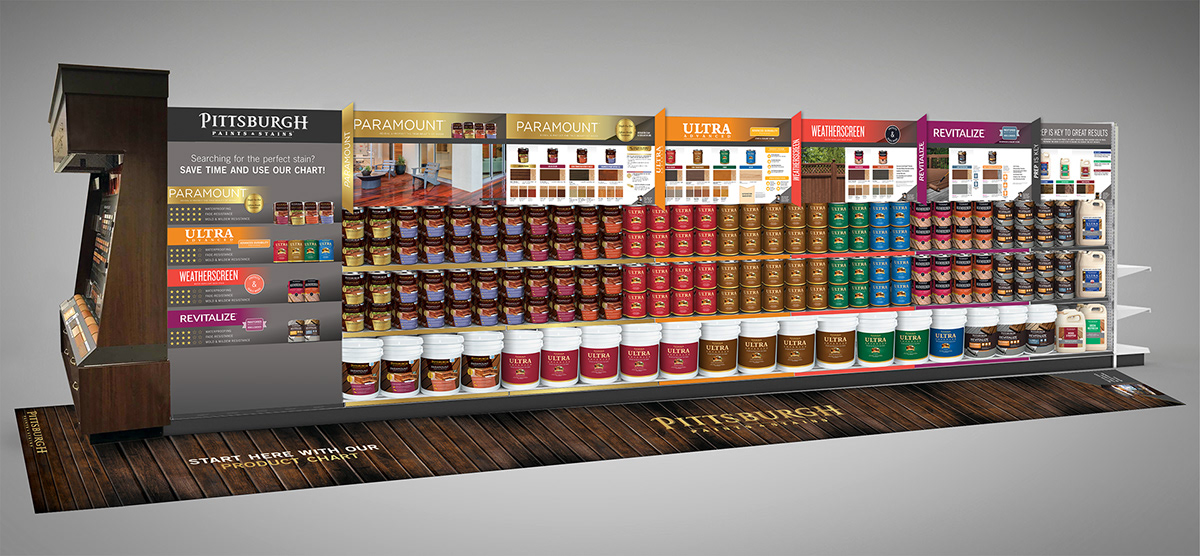
Initial Pitch
• The first board would act like a large door and be supported by hinges ( in order to store more product behind it). The Star rating & color coding system to help with sell up/sell down all in one place.
• Color coding throughout all the boards and aisle blades, which correlates with the first board to create a quicker shopping experience.
• Can cuts will help create a connection between the rating/colors to the desired product.
• Actual wood stained chips to showcase the product live.
• Inclusion of the Stain Kiosk to inspire and inform.
• Floor decal showing wood stained with Paramount Exterior Luxury Finish, to feel like you are standing on decking.

Final Pitch
• First board was shortened to meet the height of the other boards.
• Addition of a “Top 10 Stain Colors” board, with real wood stained pieces at a size of 3.5″ x 12″.
• Aisle blades have been removed.
• Addition of a “Top 10 Stain Colors” board, with real wood stained pieces at a size of 3.5″ x 12″.
• Aisle blades have been removed.


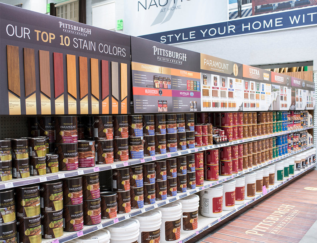
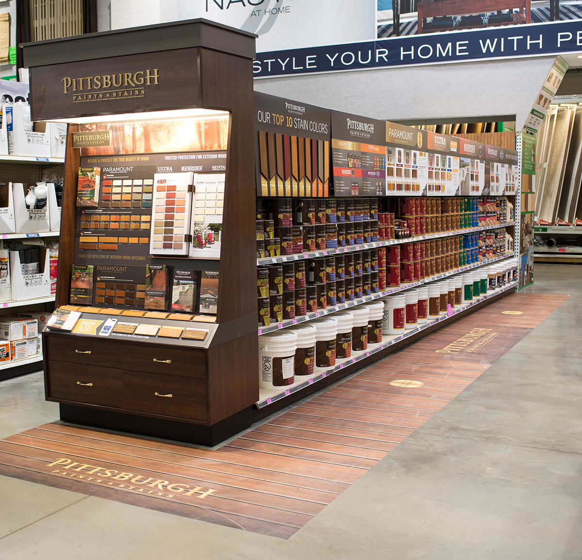
Complete aisle


