
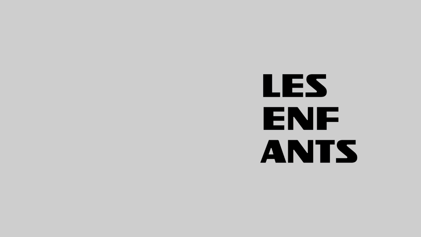

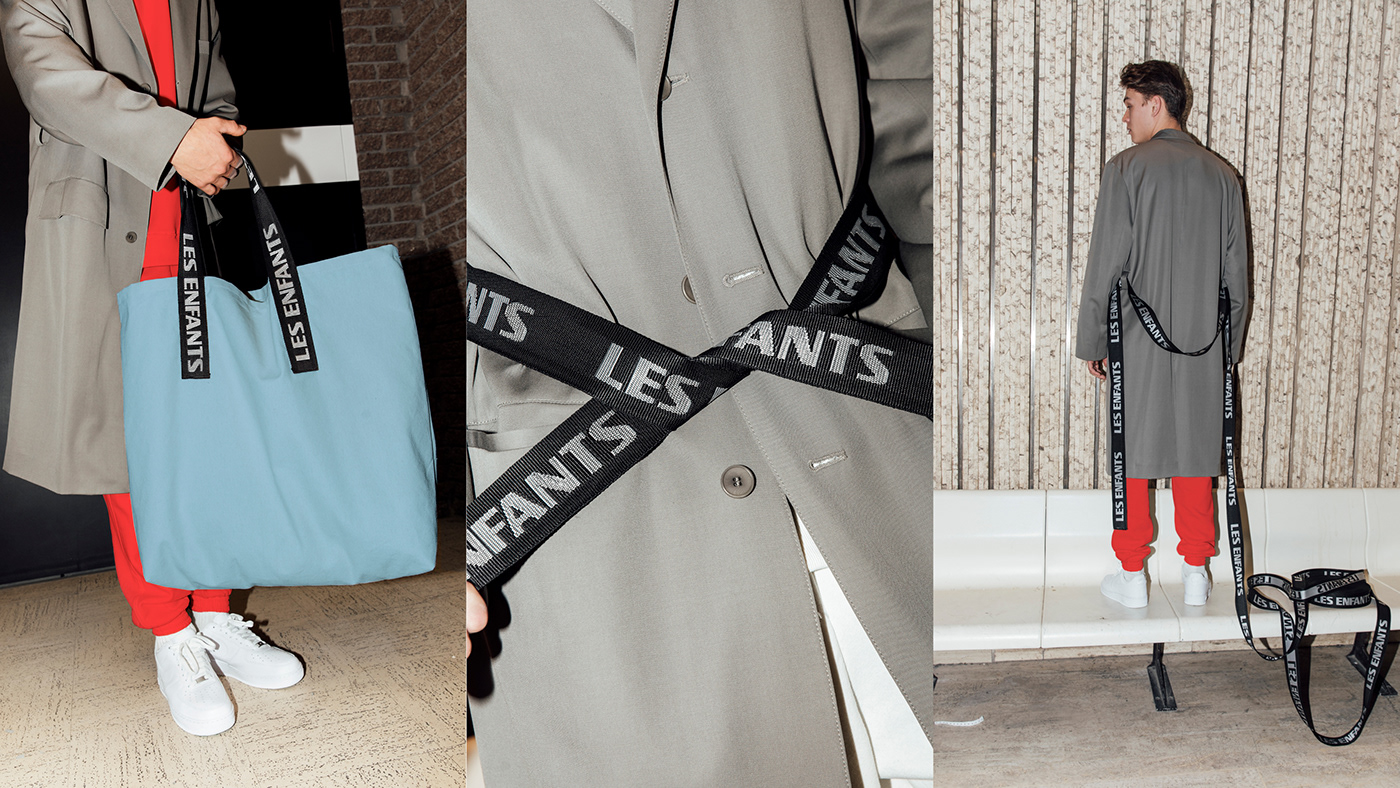


New graphic identity for the Commercial production house: LES ENFANTS. Use of a strong and simple font that contrast with the finesse of previous Logo. The difference between the upstrokes & downstrokes and the fines of the font ‘’ISOTOPE’’ brings a singularity. The palette of 14 colors selected to identify the 14 directors, applies to each one of them without being systematic. The symbol was created by two lines that represent the negative space of a Capital E. Numerous items where developed. The iconic beanies LES ENFANTS is now featuring the logotype with their Fax number. A way to make a humorous allusion at a past era. A giant ‘’tote bag’’ was tailored to create a unique piece. The straps marked with the Logo were vertically extended on the bag to recreate the symbol. Some Wine glasses and Wine boxes were developed for the event ‘’les Enfants boivent du vin’’. A colored and geometric graphic system allows us once again to play with the negative and positive space of the letter E, for a fun and playful use of the colorful palette on different elements.
Creative direction: Francis Desrosiers, Harrison Fun
Graphic design: Francis Desrosiers, Harrison Fun
Production: Lisa Arduini, Harrison Fun
Photos: Kelly Jacob
Model: Justin, Folio
Web development & programming: Le Séisme
2D animation: Nord Est Studio
Animated collage art: Vincent Bilodeau
