About Idol Kids
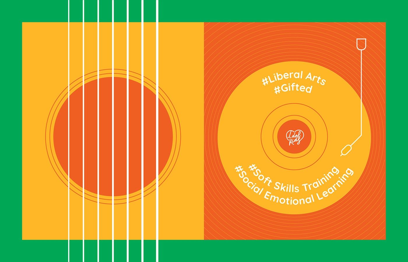
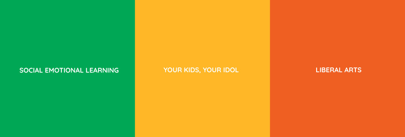
The program is built on the framework of the Social-Emotional Learning (SEL) program which is thriving in the education of advanced countries such as the United Kingdom, France, Australia, Switzerland, ... and the philosophy of Liberal Arts in Germany, USA. The program aims to train a generation of teenagers who are knowledgeable, proactive, confident, self-respect, brave, and strong enough to conquer life goals.
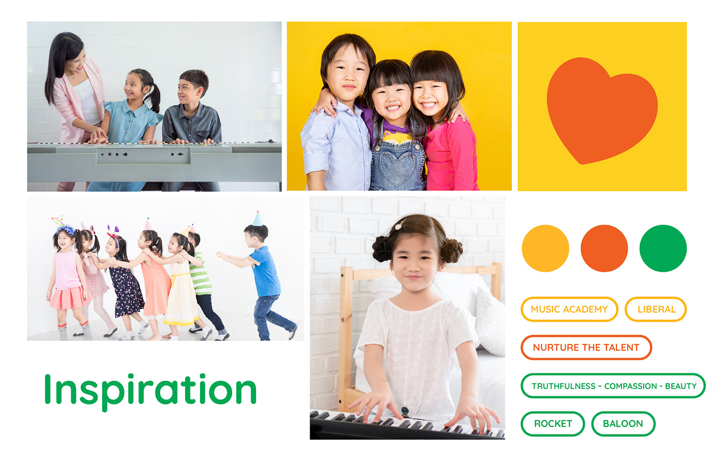
Challenge
Challenge: using the letter mark logo design to deliver the brand message of truthfulness – compassion - beauty


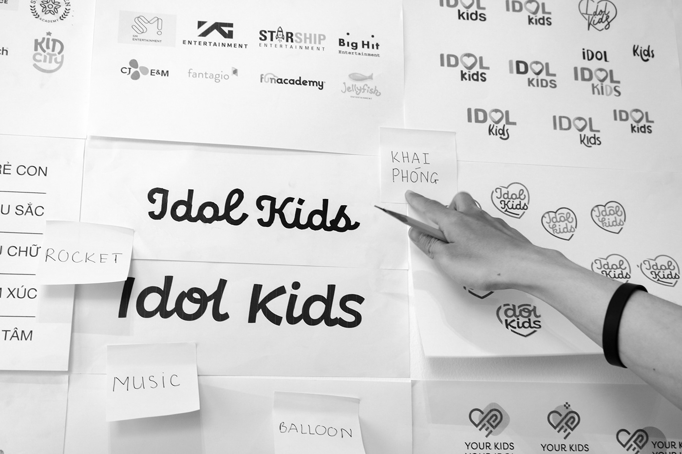


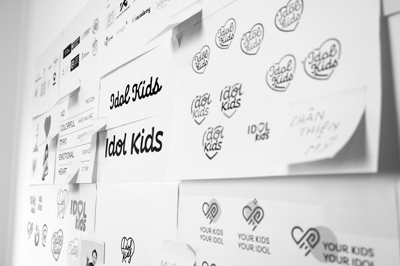
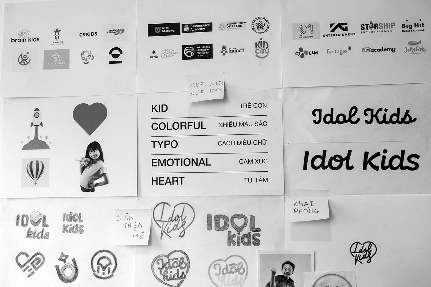

Logo meaning
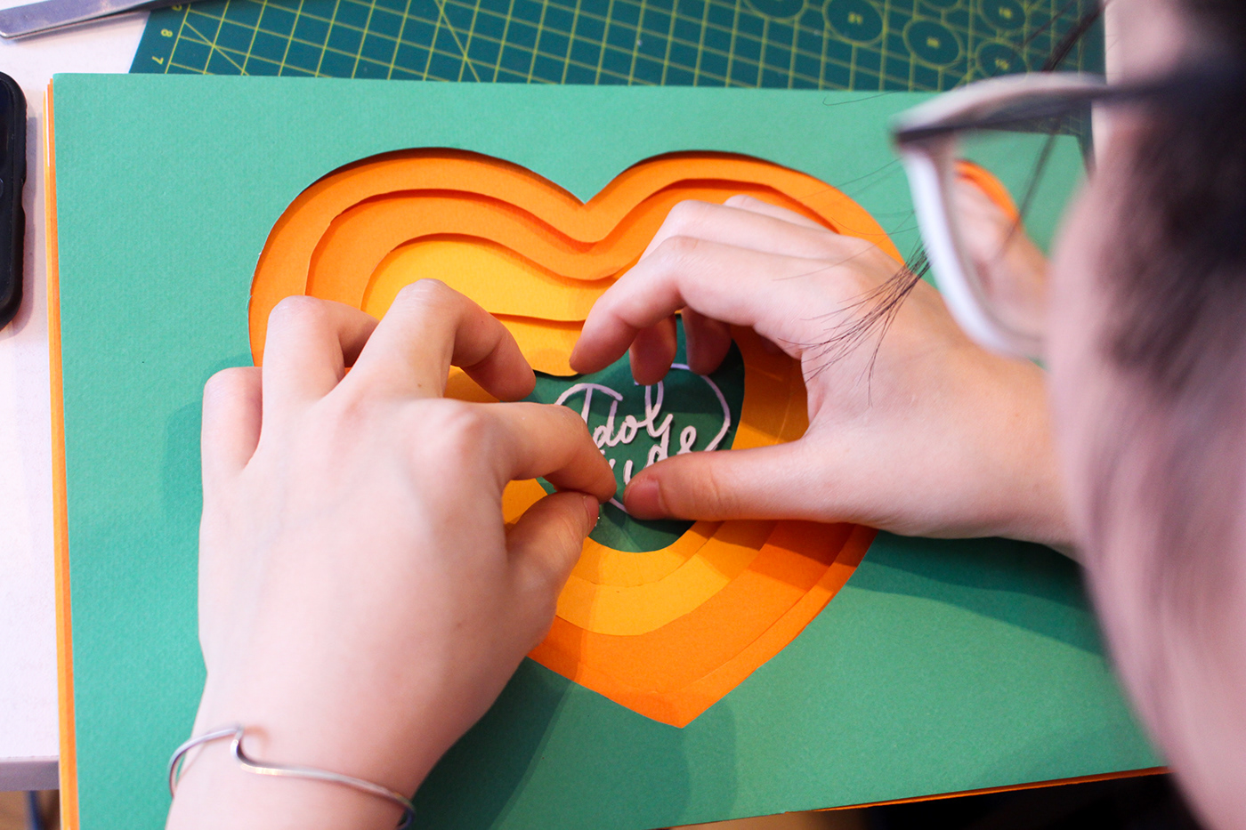
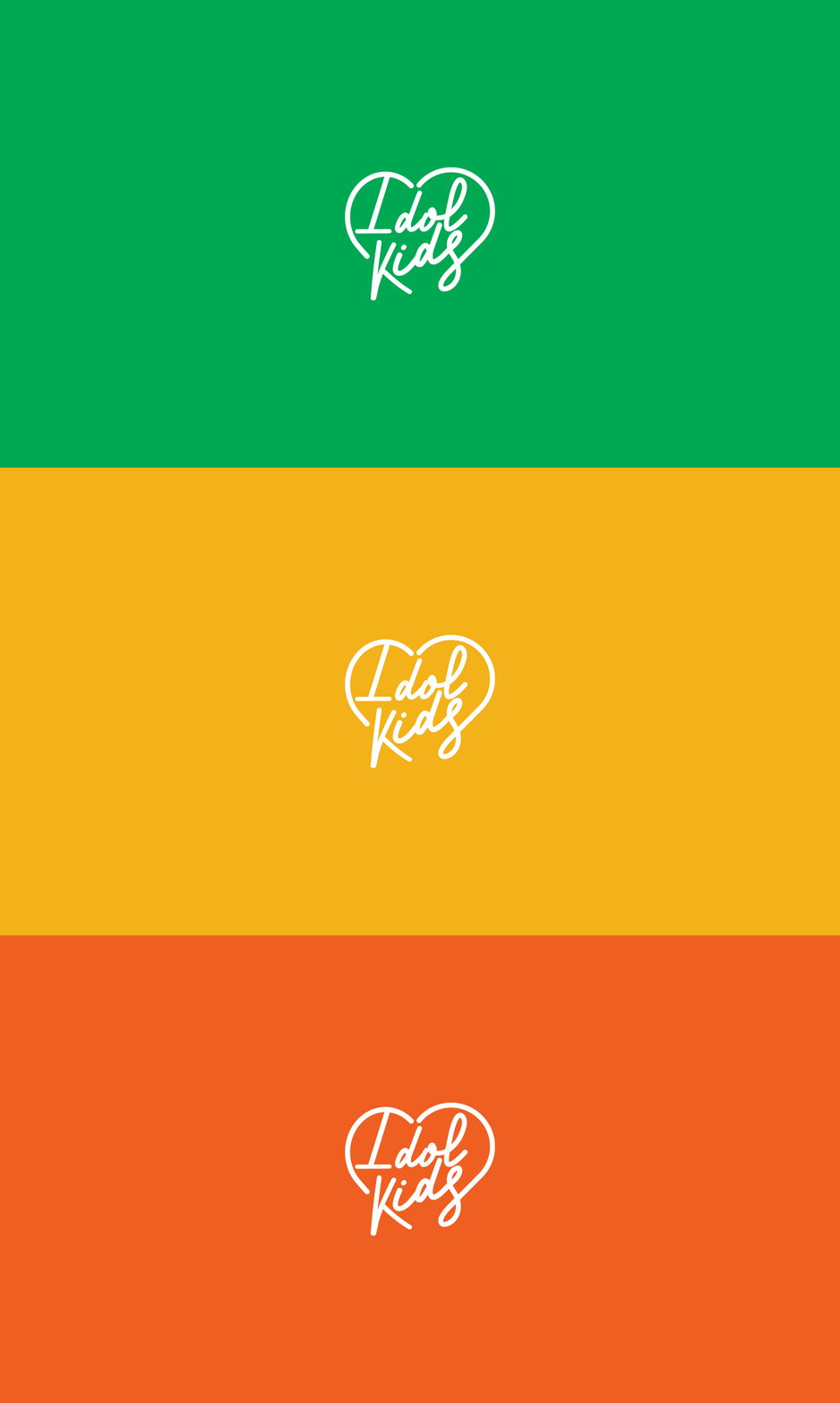
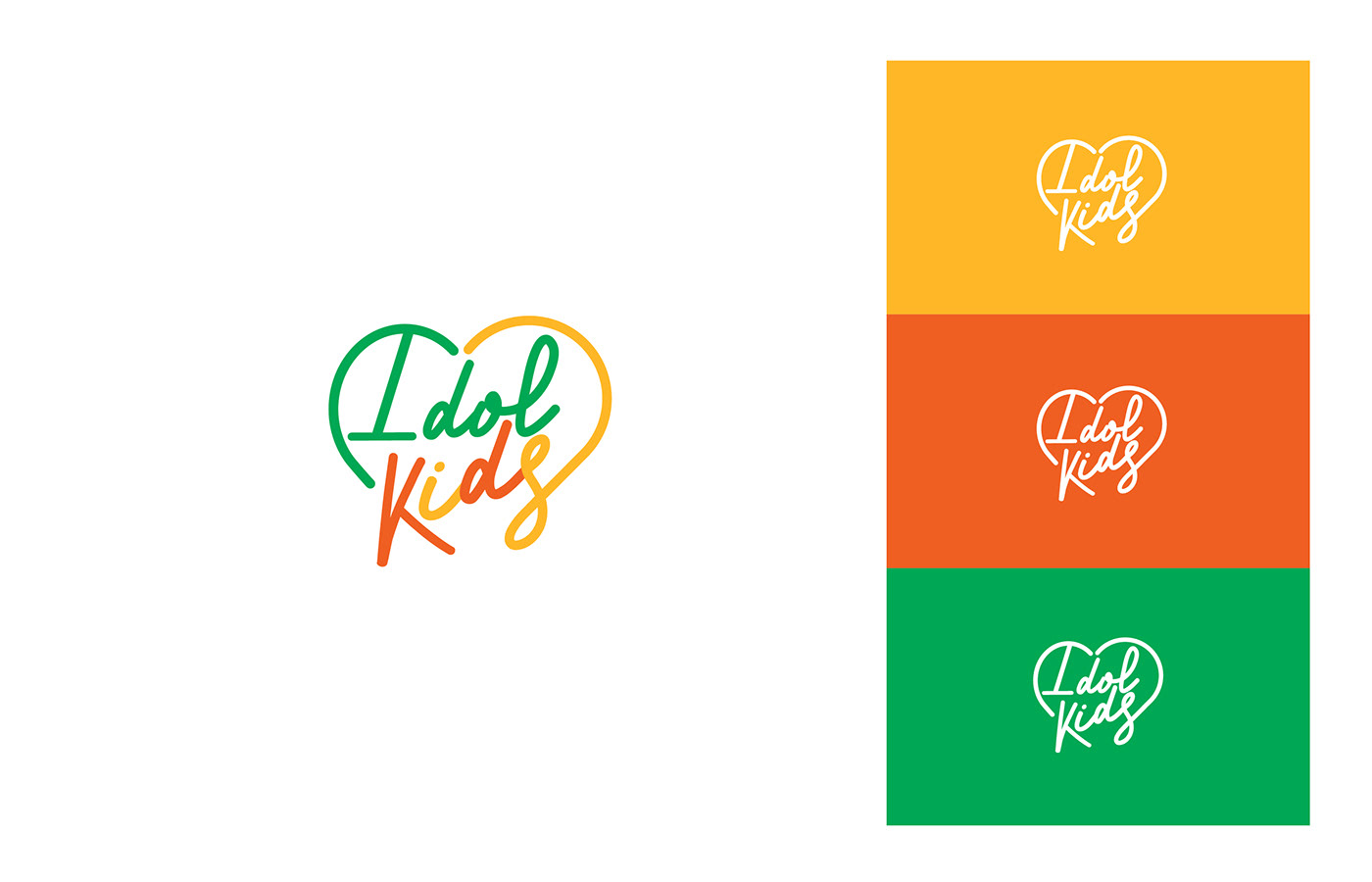
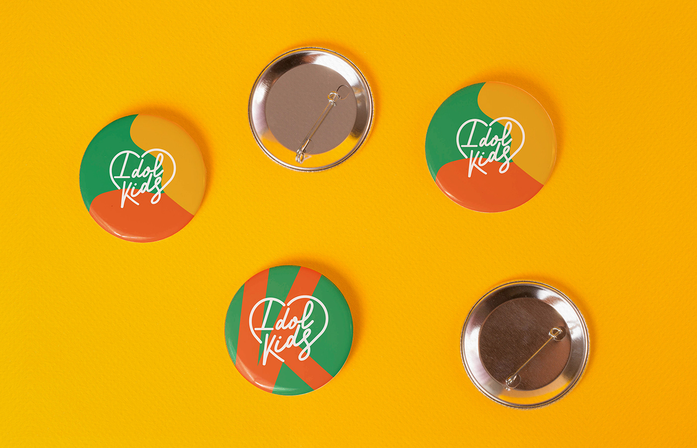
The stylized heart shape and Idolkids word are used to create the intimacy and connection with the children. The image perfectly matches with the brand focus on truthfulness – compassion – beauty.




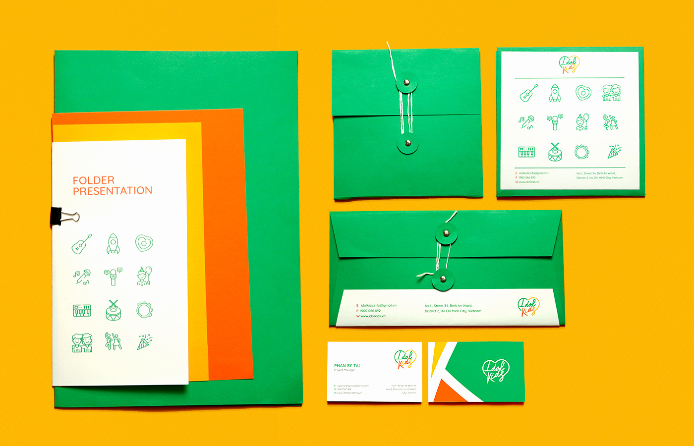
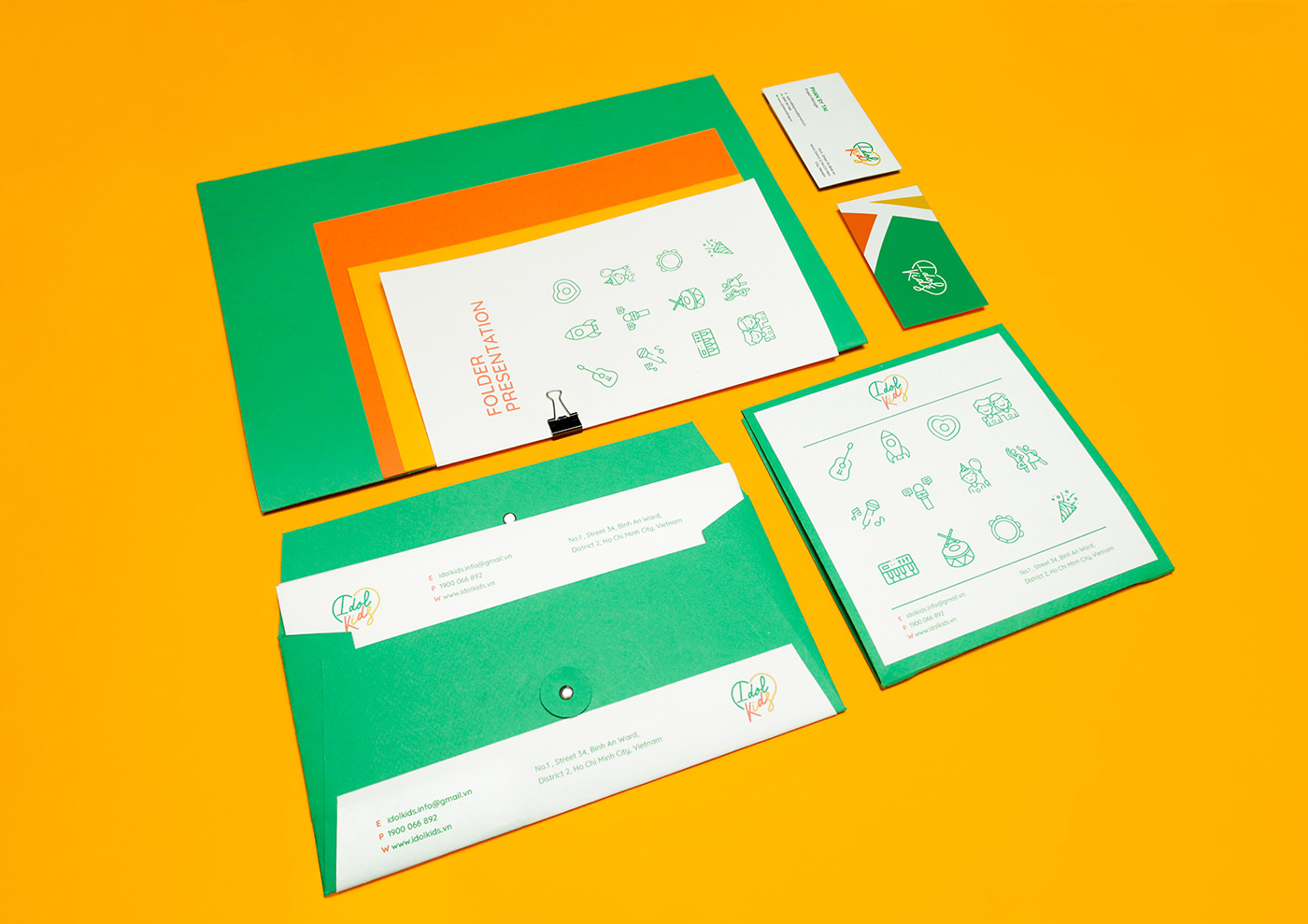
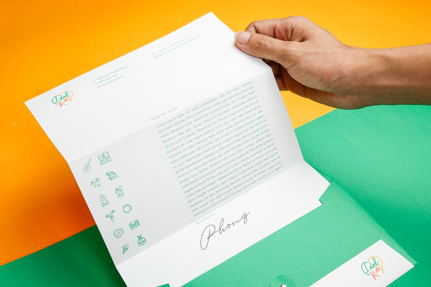

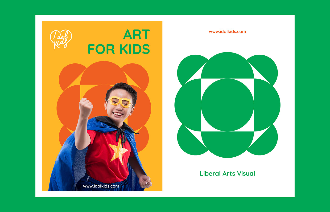

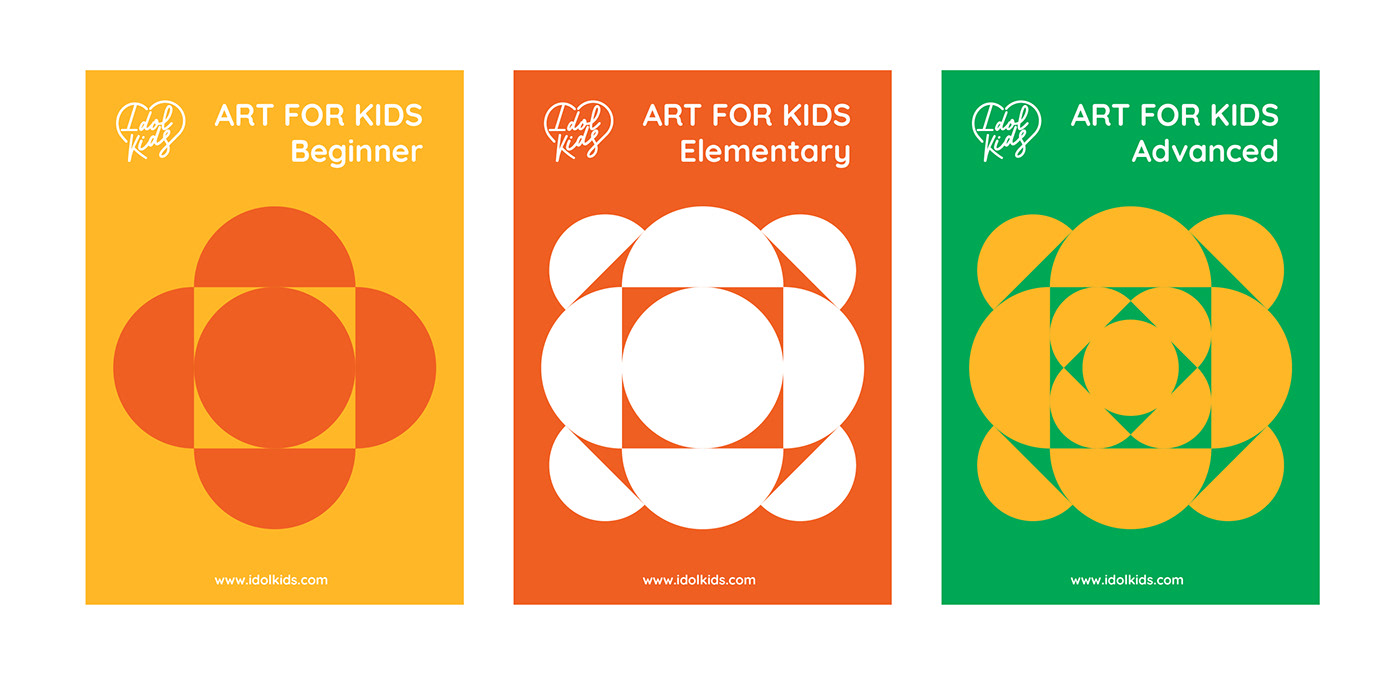

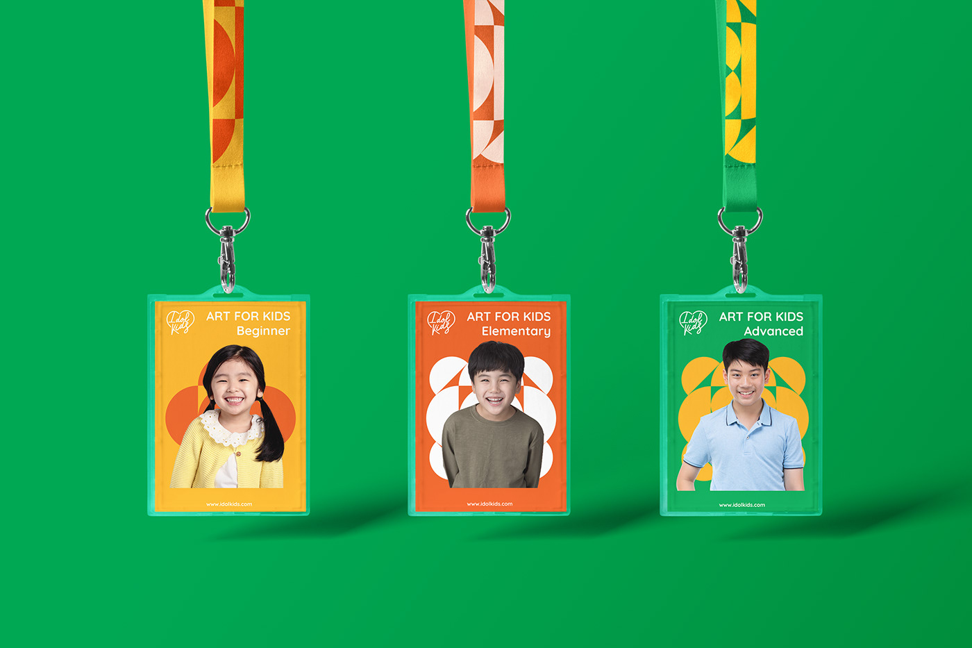
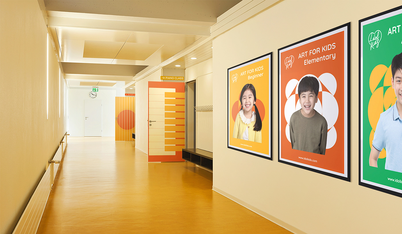
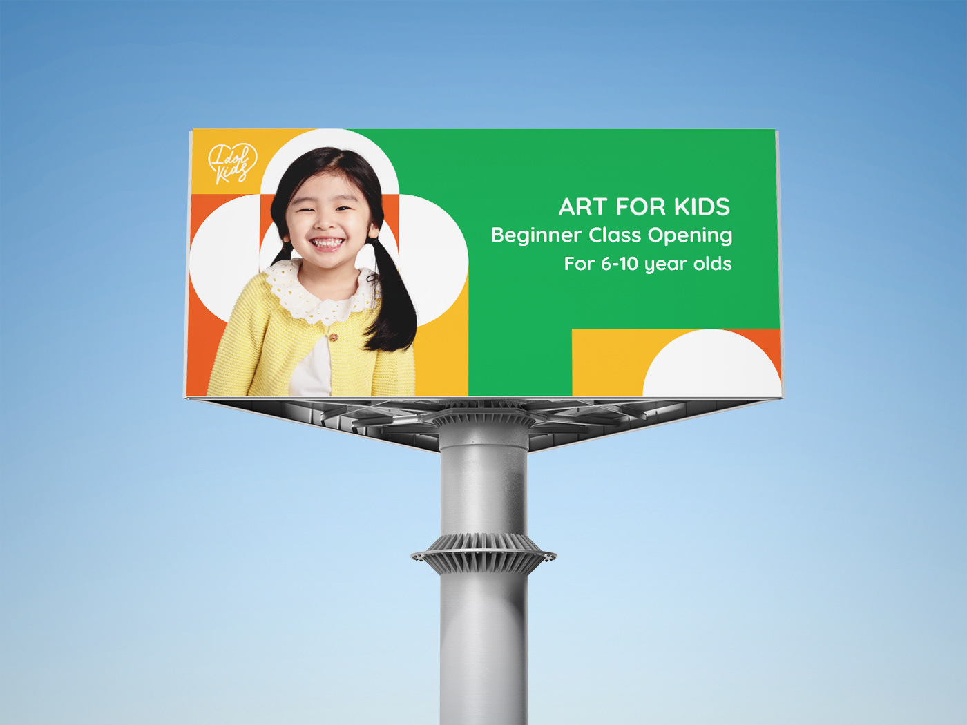


Idolkids is an educational program for elementary to high school students (6-18 years old). The school focuses on developing special talents of the youths, especially musical and artistic talents using the combination of Social and Emotional Learning method and Liberal Art teaching method.
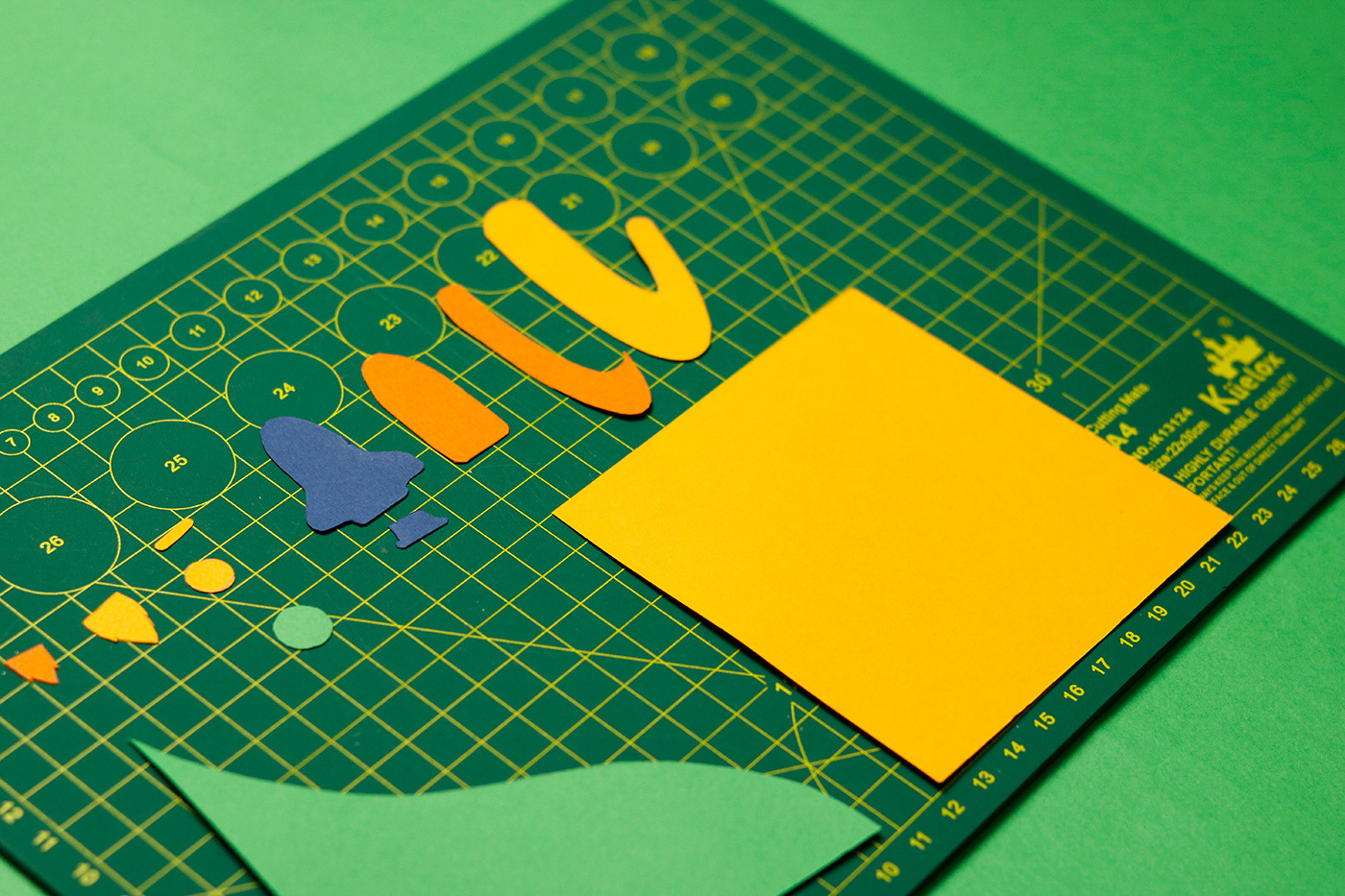
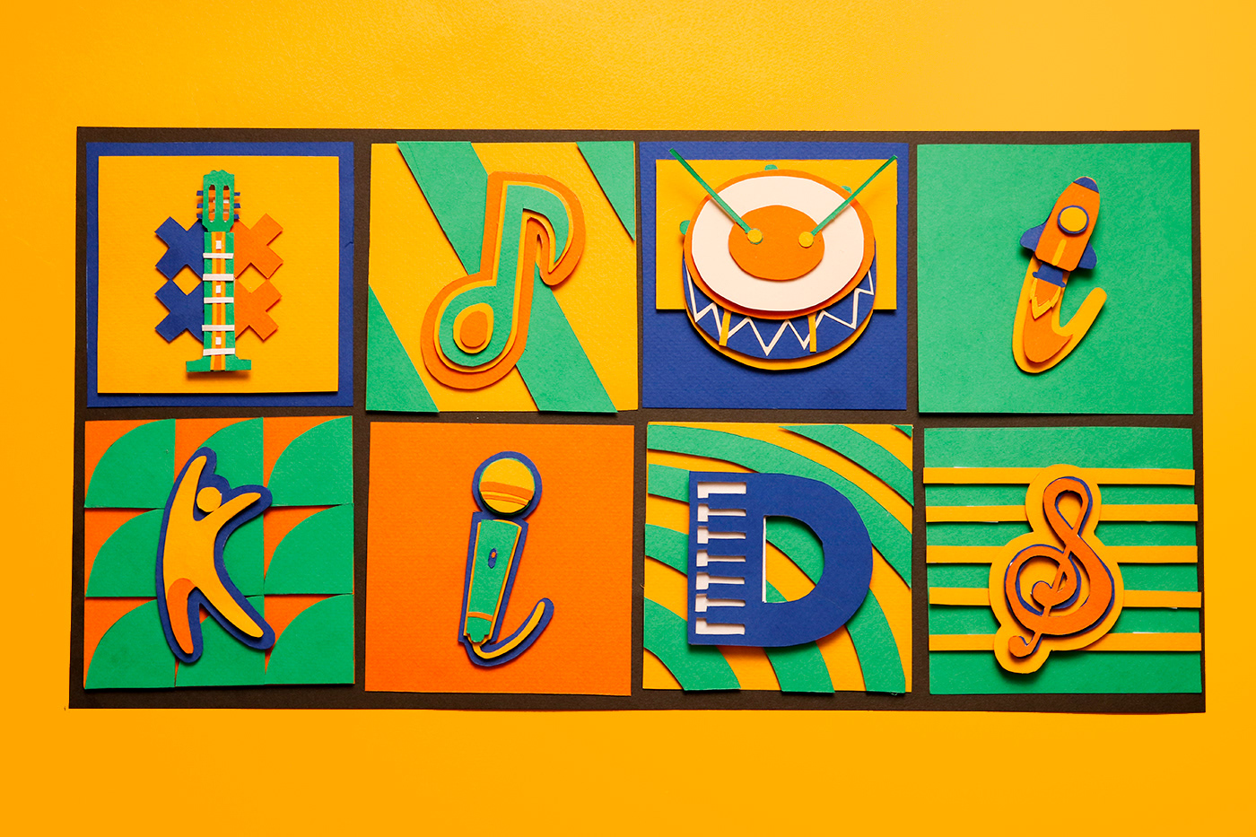
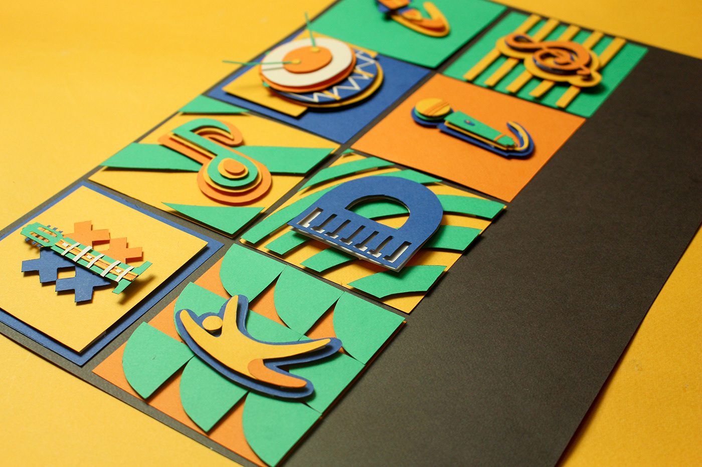
Idolkids’ brand message is delivered through the art of paper cutting which practice demonstrates the meticulousness and thoroughness of the artists, bringing the friendly experience and closeness for both the parents and children. In Vietnam, college is also taught in school.
