SQUEAKY CLEAN LLC
Visual Branding | Web Services for Local Cleaning Business

About
Squeaky Clean LLC, is a local small business serving the Montgomery county region of Maryland with residential cleaning. Most of their target customers are elderly and disabled people as well as busy people and single parents with long work hours as well as people who are moving to a new location.
It was a brand new business so struggled with understanding the brand building process as well as understanding the industry from a branding perspective and navigating the web as a tool to gain new customers. They also struggled with how to convey the company both visually and verbally in a way that was also differentiated. Ultimately the goal was to advance into commercial cleaning as well.
Competitors: Merry Maid, Molly Maid of Silver Spring, MaidsPrime, Atlantic Maids, Bright Home Solutions, etc
Design Approach
The project began with research into competitors who were other local cleaning businesses as well as their target customers. They were looking to advance into the commercial sector so I considered commercial cleaners as well in terms of their overall look and feel and the benefits that they conveyed through their branding.
The first insight I discovered was that blue was the most commonly used color in their industry(probably because of its association with water). The second was green and the third was pink so these colors had to be avoided. I also looked through dozens of customer reviews online to gain a better idea of what the clients customers were looking for as well as what they were dissatisfied with. All the info gathered helped to make sure the brand is as differentiated as possible from the visual identity to website and meets the industry standards to allow the client to compete at a higher level.
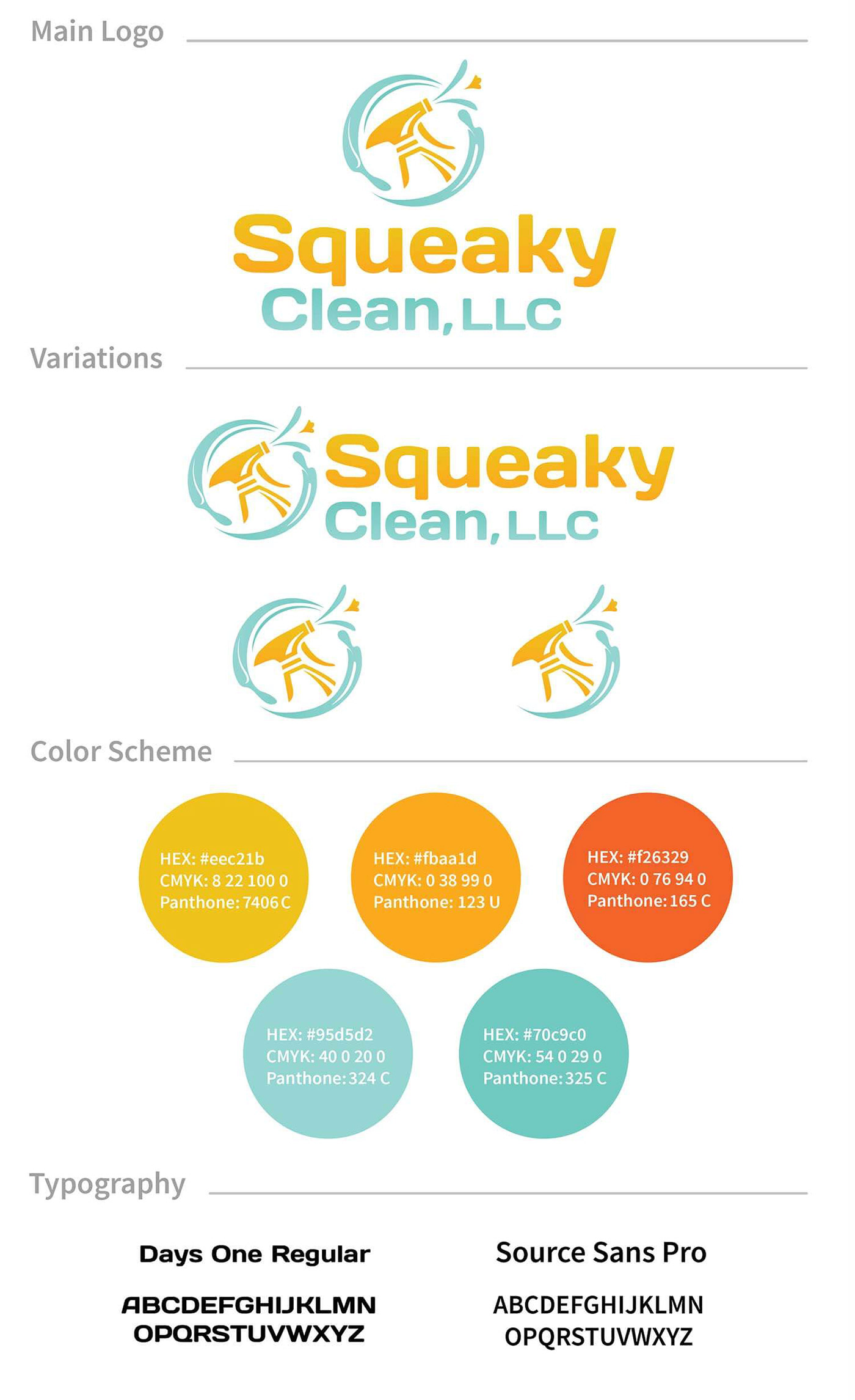
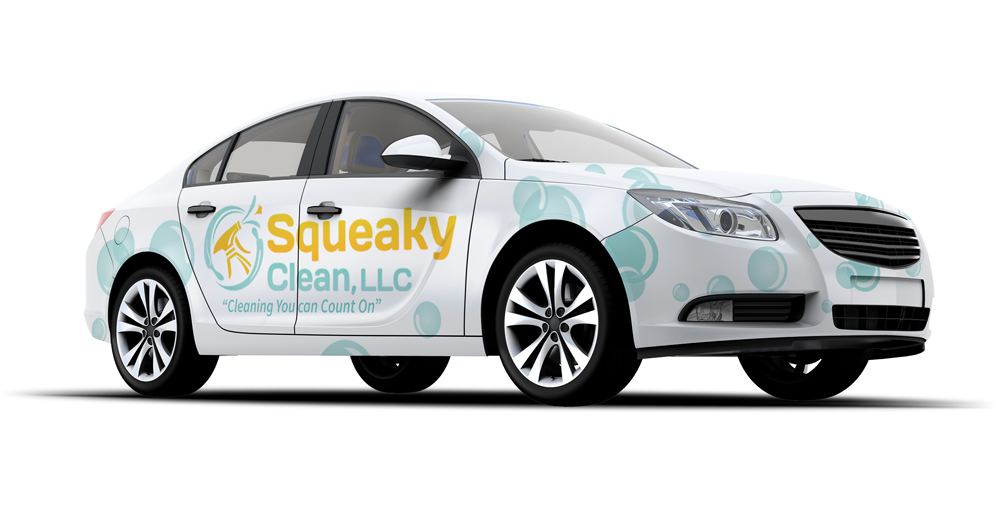
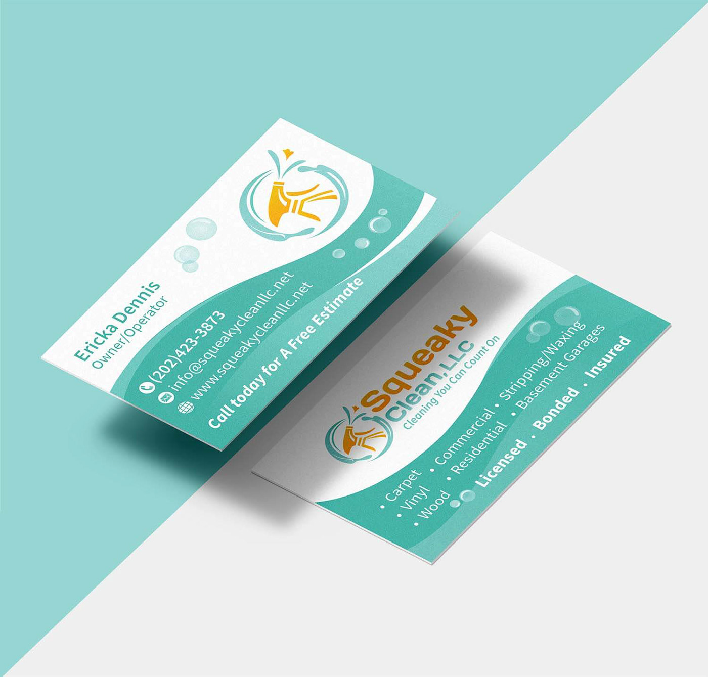
The light turquoise was chosen because it's a scheme that hadn't been used while the gold was also very rare among competitors. The turquoise allowed us to still create the association with water, freshness and cleanliness without using blue which was overused. The gold is used to convey the quality of the service as well as make the brand look more friendly and welcoming. The bright tangerine orange was more accessible and is used to create more contrast and draw peoples eyes to important elements like a call-to-action. It was also used for the uniforms because the tone was rarely used but easy to find among printers.
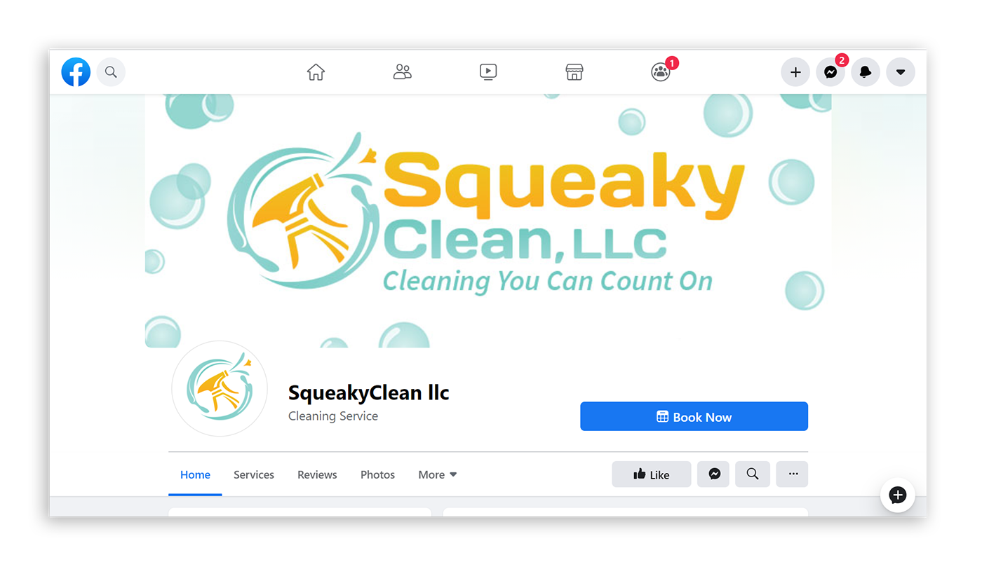
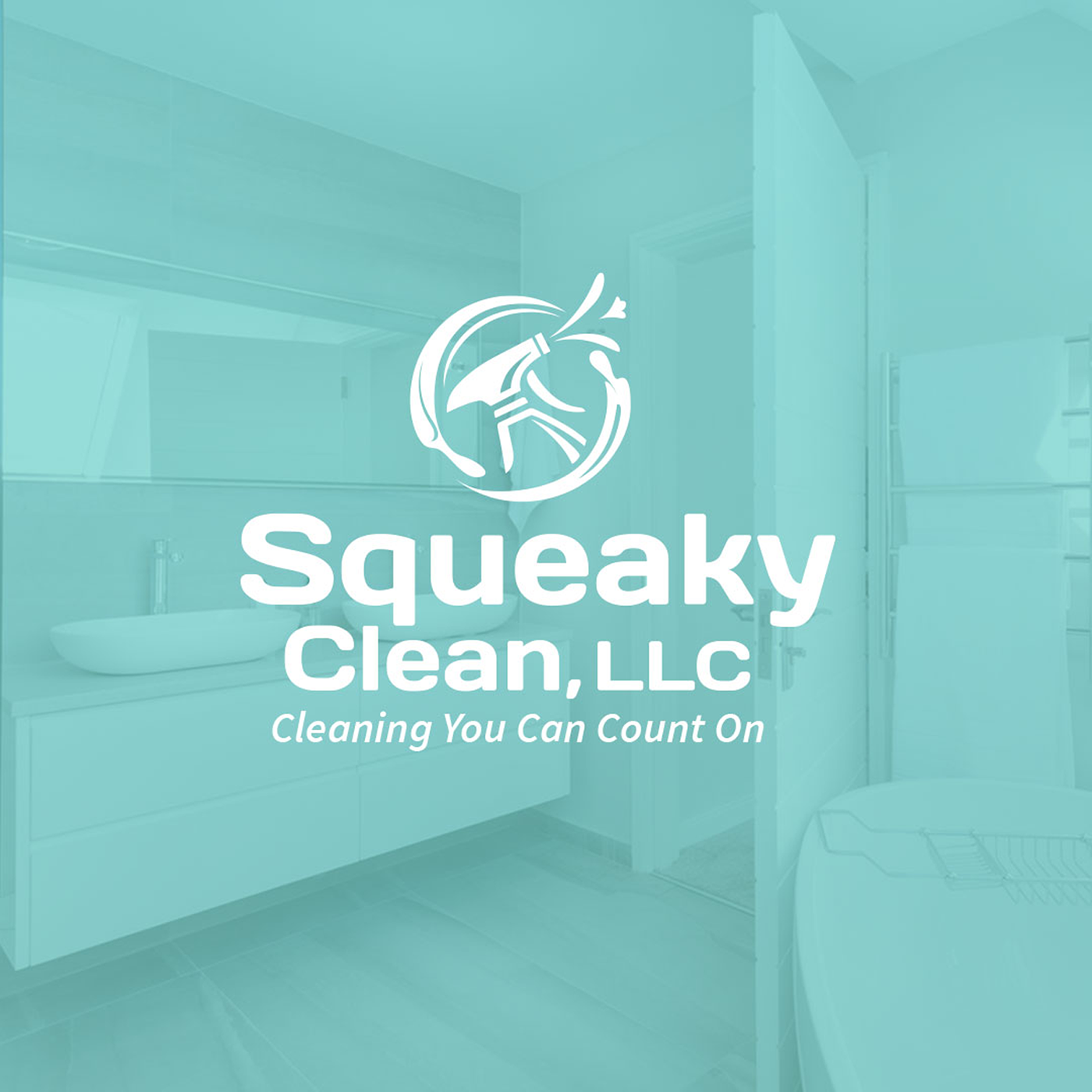
The logo incorporates an abstract flower into the splash coming from the golden spray to communicate the fresh fragrance in a subliminal way. The logo was also optimized for the various online channels from Facebook to Instagram, Yelp and Thumbtack. The tagline "Cleaning You Can Count On" is used to emphasize the trust because research showed that there was a lack of trust among customers.
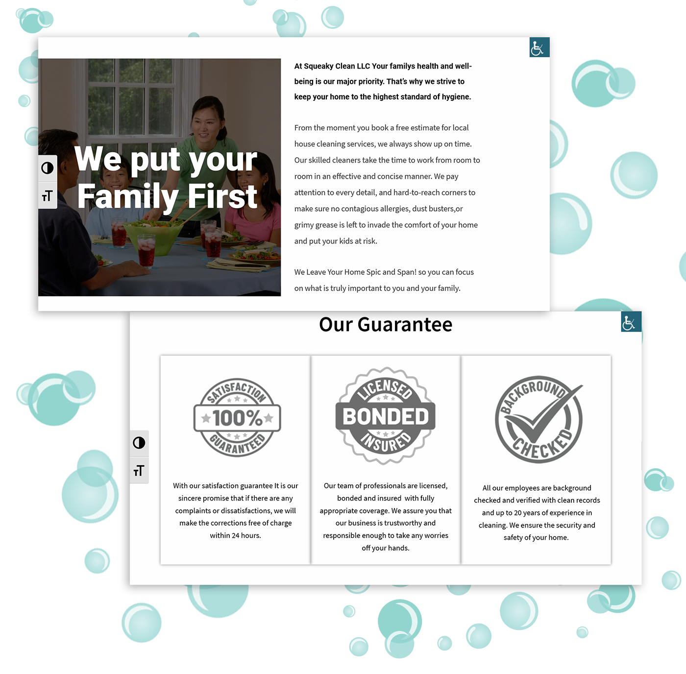
One major priority was accessibility because a lot of her target customers were older or disabled so they needed to be able to intuitively navigate through the site even if they use assistive technologies. A lot of the customers were also busy so the website needed to be kept simple and allow people to swiftly schedule a free estimate or find the number to call. The website also needed to be optimized for both mobile and desktop.
The website was developed with Wordpress using a theme that had accessible code built in. Other plugins were also integrated to the site to allow users to control the contrast and font size to make it more convenient for them. Every other creative or technical design decision was made with accessibility in mind from the color contrast to the use of alt tags. Google Analytics was also integrated to allow us to track how people interact with the site and optimize it over time.
I took the clients rough description of their company and developed it into content for the website in a way that allows the user to easily digest the information being presented and find what they are looking for. From research I found that most competitors were focused on talking about their company so in order to differentiate I designed the website to place more emphasis on the customer, family, and health.