


BEONT TYPEFACE
Beont is a display typeface inspired by the Saigon newspaper typography before 1985. The reason for this type design project firstly came from my admiration for the elegant typographic tittles of the contemporary newspaper, secondly from my frustration when using worldwide popular fonts but having bad Vietnamese support. With the hope to create a display typeface that as closed to the handwriting of Vietnamese as possible, Beont typeface was born.


The inspirations come from Saigon newspaper tittles


Initial Sketches

With high contrast between the thick and thin, the lowercase letters mimics the script writing but being less cursive. Capital letters are designed to be like the Copperplate script, the way of writing capital letters in Vietnam. I’m glad that it is still being taught nowadays to every students.


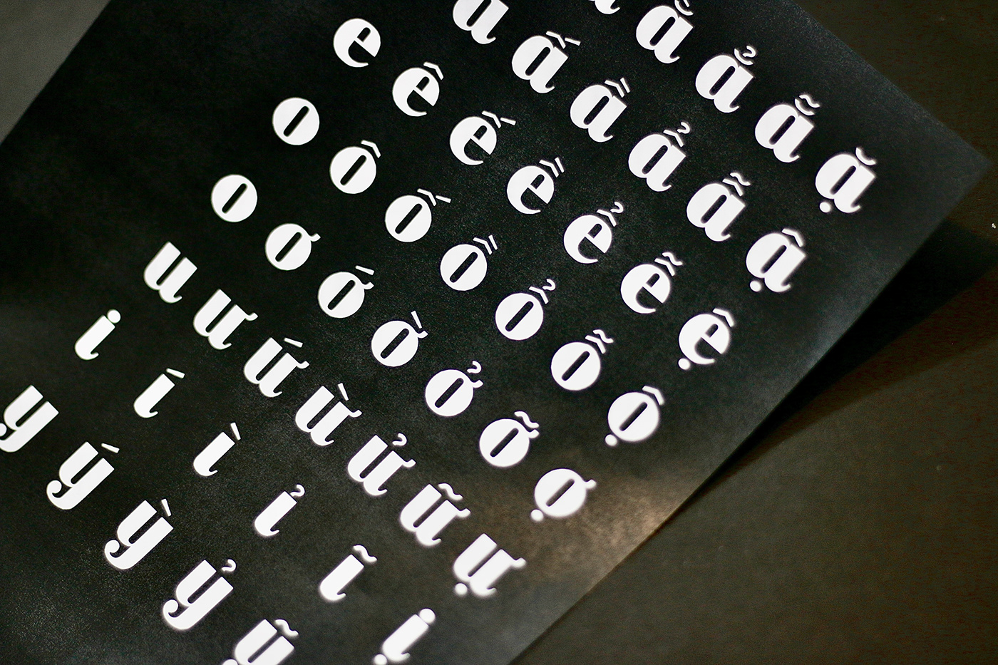
The most important thing about making Vietnamese typeface is that it’s the only language that has stacked diacritic. It means we have double marks. Therefore, the marks should be considerably modified when combined.


MUCH APPRECIATION FOR VIEWING THE PROJECT


