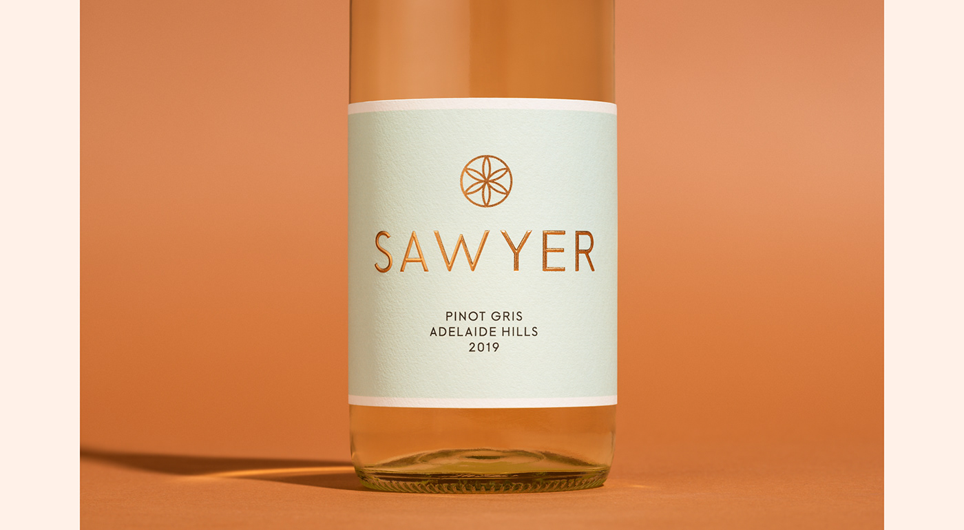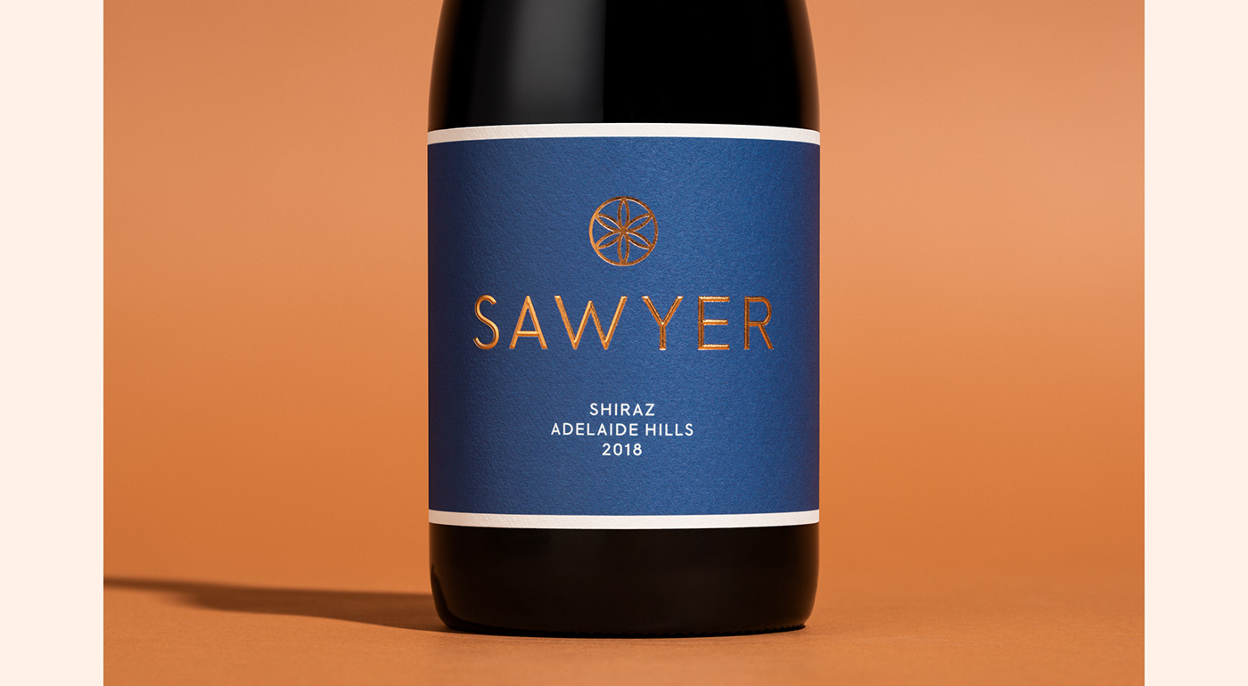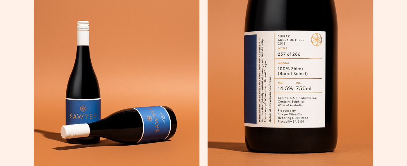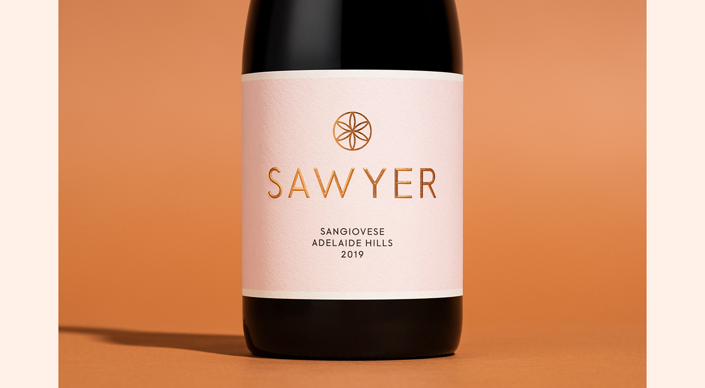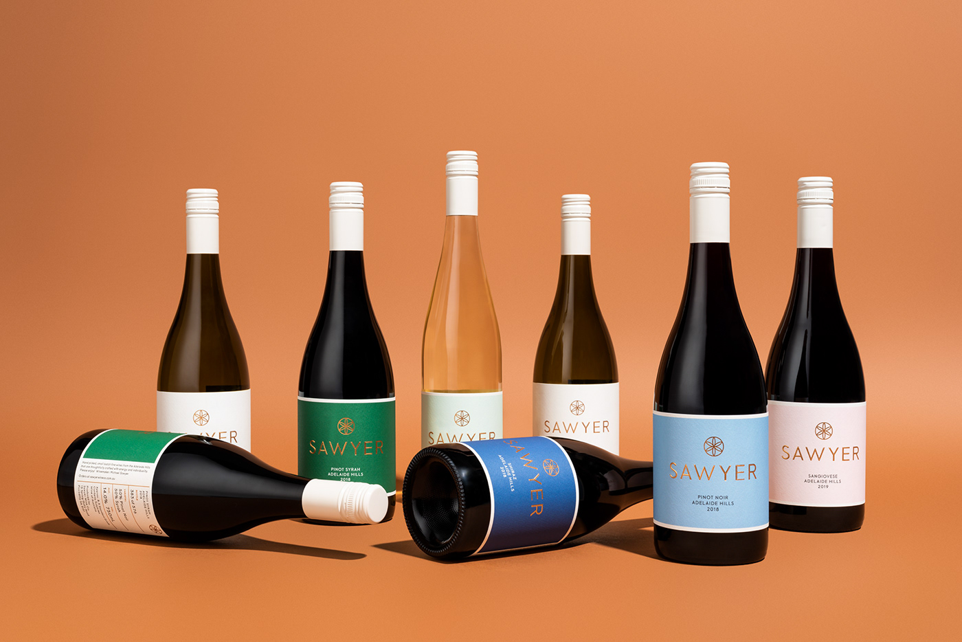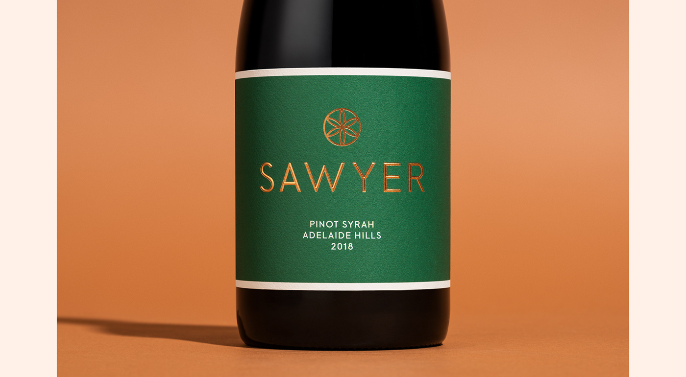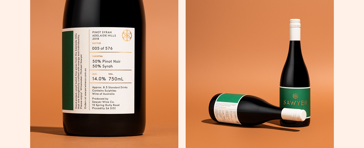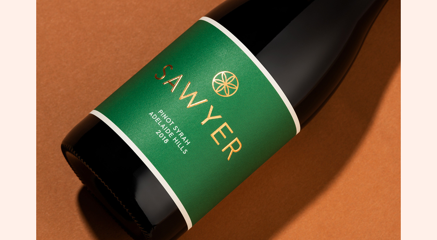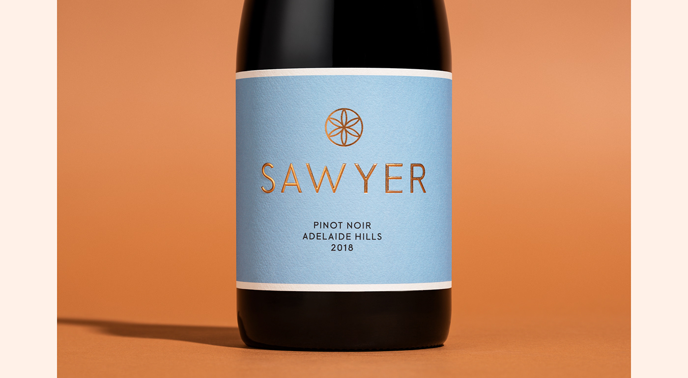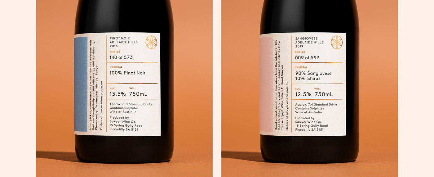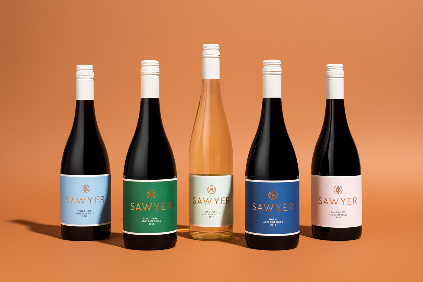
‘Crafted thoughtfully with bright energy and individuality’ not only describes the style of wine produced by Sawyer Wine Co., but the inspiration behind the brand identity for this young family winery based in Adelaide, South Australia.
The minimalist labels reflect the light, bright, and non-conformist nature of the wines – with a colour palette inspired by the flavour of the wine, not the varietal. Cotone Bianco Ultra White cotton paper, a bespoke geometric typeface and sculptured emboss combine to create a contemporary, yet classic feel.
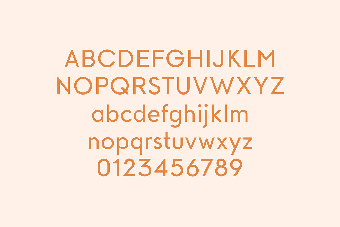
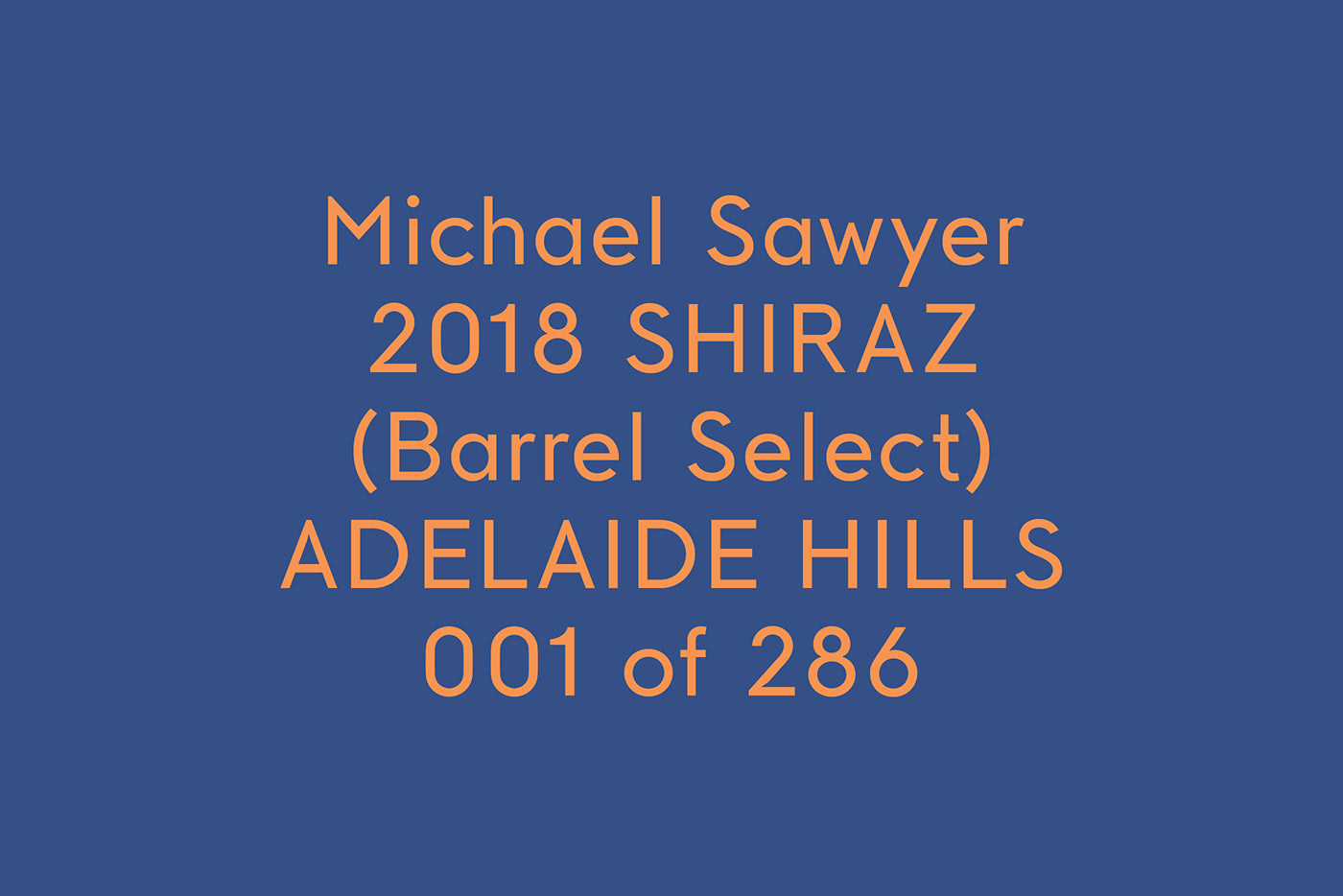
The custom typeface is influenced by modern Scandanavian graphic design. It features small, subtle details, showcasing just the right sense of playfulness and seriousness needed for these individually numbered labels.