
/ MAKING OF TOMORROW CHALLENGE 2019 /
GUNNAR ASPLUND’S STOCKHOLM PUBLIC LIBRARY
Entry by GUSTAVO CORREA

In this post I`m sharing with you the making-of of my entry in the archviz contest in the Ronen Bekerman forum in 2019.
I hope that this information is useful for you.
I hope that this information is useful for you.
Thanks for watching and dont doubt to share.
Conceptualization
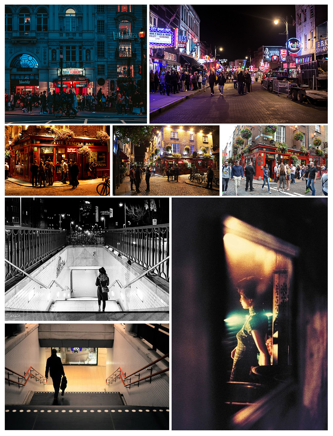
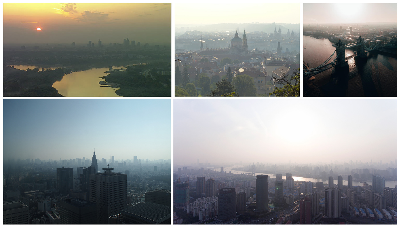
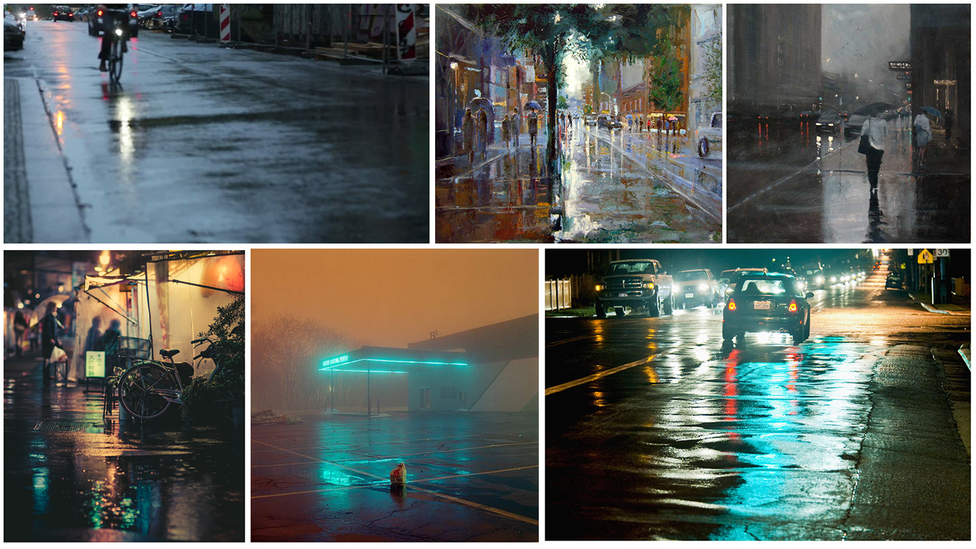
Generally, this is one of the points where most of the problems are generated, and these become more evident in the final result of the images. To face this I usually build in my head and in the files of my Pc, an enormous amount of graphic references as well as anecdotal and historical of the place, in this case the place was the public library of Stockholm. These references allow me to go deeper and familiarize myself with the commission that I'm going to carry out, besides it helps you getting out of that point where you don't have anything and you don't know how to approach this topic.
During the time that I am compiling my references, crucial images begin to appear that are connected directly with the building that we are commissioned to illustrate, in this case I came across images of people spending time together in the Falafel Kungen restaurant that is located in one of the entrances of the library, I immediately thought of the activities that take place inside the library and I imagined a story that would link these activities.

In this way I interpreted the value of friendship and how this is experienced by people in the streets. I imagined the moment at dusk when people leave the library and get together with friends, this with the purpose of conveying that sensation when people finish their daily activities and leave the library towards the street on a Friday feeling hopeful because it's the weekend and a little relaxation is coming. I thought it might be interesting to show the people who gather at the restaurant and that this place becomes a reference point for friends to meet there. I realized that this place fosters activities that are interesting around the main building, my idea was to make this obvious with characters that are both in the exterior and interior scenes. Each one of the three images is connected through the concept, I wanted to show the moment when people start living the public space that complements the building.
Art Direction
Having already made a small introduction now I'm going to talk a little about the commission for the Tomorrow challenge 2019. For this year the most specific conditions that the promoters of the contest announced was "We are looking for artists with technical problem solving skills combined with a strong artistic sense. The images should be natural and realistic rather than over-stylized", starting from these requirements it was evident that I should choose to have a very clear direction in terms of the artistic production where I could continue to explore my style and be natural and "realistic".
But how could I do this?... A first step would be to define my style: I wanted something within the cinematographic style but containing the essence of architectural illustration.
But how could I do this?... A first step would be to define my style: I wanted something within the cinematographic style but containing the essence of architectural illustration.
In order to achieve this, I always take into account the fundamental pillars of visual language, which for me are definitely the themes that make the difference. These, along with a clear idea, are key in any pictorial work.
I will try to explain each one of the three images with the main themes that address the visual language.
I will try to explain each one of the three images with the main themes that address the visual language.
COMPOSITION
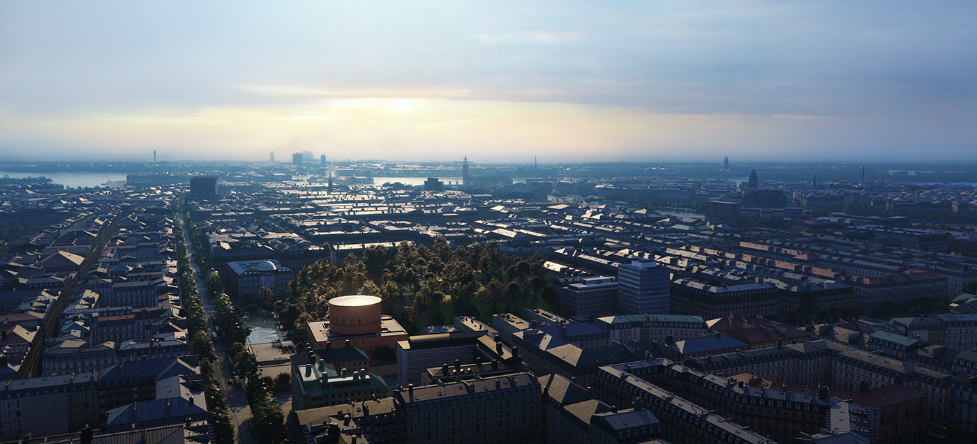
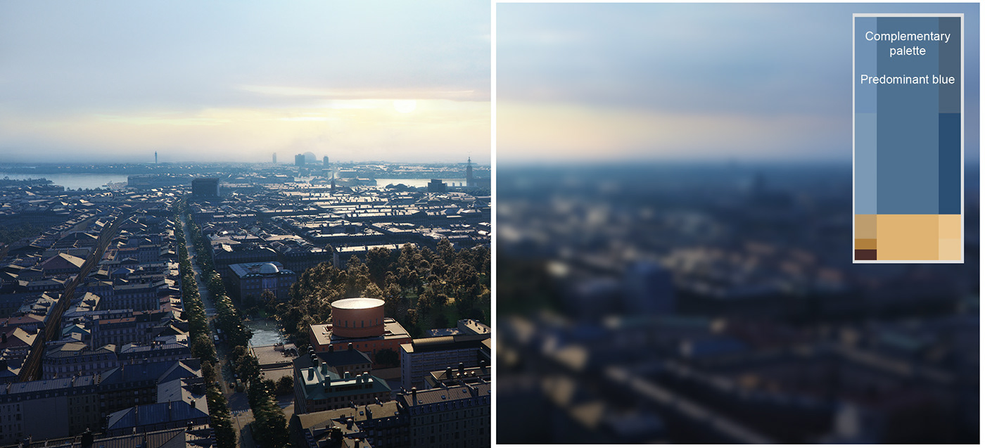
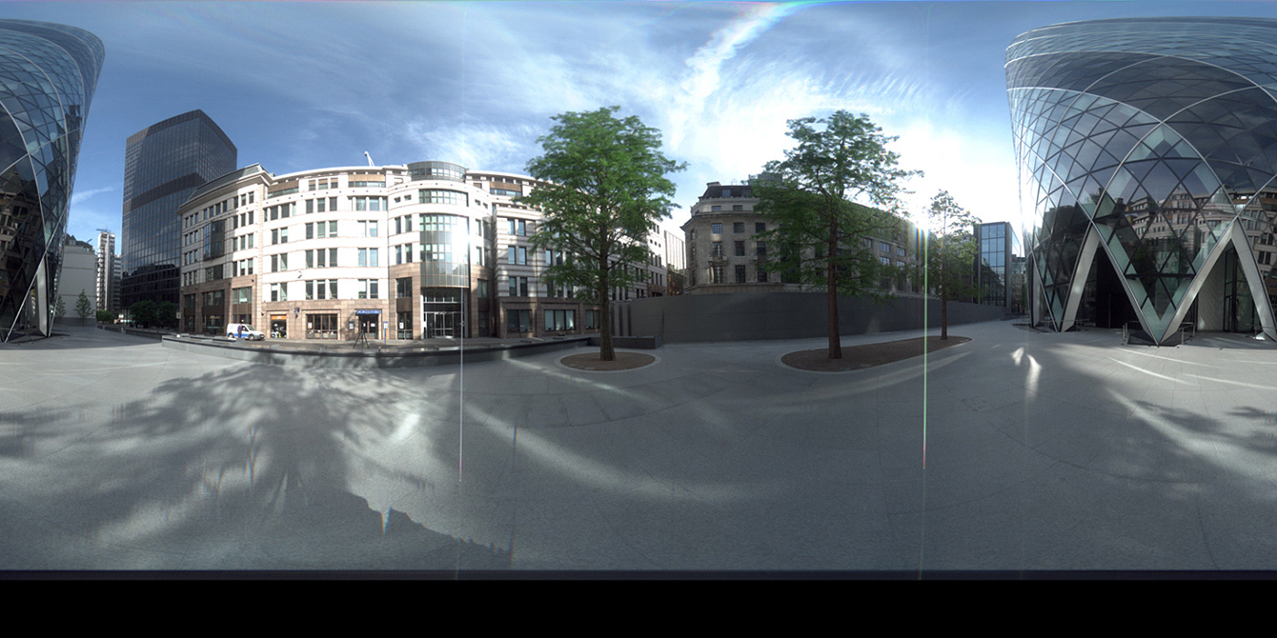
With the Aerial view, which is a panoramic view of Stockholm, I wanted to give an understanding of the whole place, as it is done in films, where there is a general shot that starts by showing the context in which the incidents will occur. In this view I chose to compose the image with the rule of thirds, the library is at the bottom left of the image and thus leaving the whole upper third free for the sky.
With the Aerial view, which is a panoramic view of Stockholm, I wanted to give an understanding of the whole place, as it is done in films, where there is a general shot that starts by showing the context in which the incidents will occur. In this view I chose to compose the image with the rule of thirds, the library is at the bottom left of the image and thus leaving the whole upper third free for the sky.
I chose this frame because it shows how the library is connected to the center of Stockholm via Sveavägen Street, while being located at the intersection point of the thirds of the image. I also wanted to make a little evident the water canals that are in the vicinity to reflect sunlight in the image, this was a challenge because the height of the camera was not the best to simultaneously show the library, the park and the street.

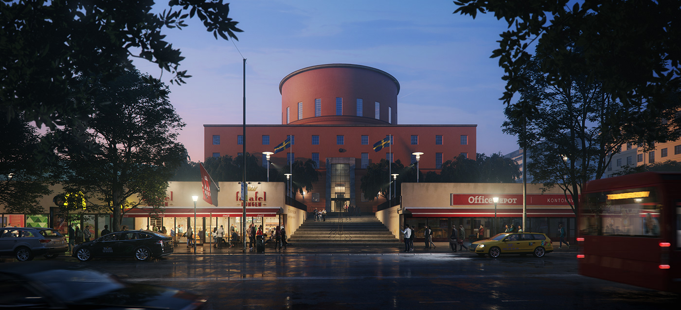
In the exterior image the first thing I did was a sketch of the elements (cars, people, vegetation) that could be used in the composition and help to balance it. In the frame, I wanted to reinforce the order that the architect had envisioned in the conception of the library’s design, as evidenced by its completely symmetrical architectural plan, for this reason the image is ordered in the same way regarding the main building.

At the same time, I wanted to highlight the relationship between the building and its exterior. For this I decided to show the street and cars moving through it, placing them so they frame the access to the building, something that I finished reinforcing with two trees in the foreground. Through the movement of the bus and the car, my intention was to generate a contrast of movement that would counteract the stationary frontal shot.
In the frame of the interior view what I was looking for was to place the camera where I could show the interior of the library, the lobby and the exterior, which is consistent with the idea of relating the interior-exterior since it reinforces the concept of how friendship is lived in the streets and how people are going to meet to share time outside the library. In this particular case the symmetry not only reinforces the order of the building as I mentioned earlier, but also gives stability to the image when the elements of the library itself, such as the book shelves are those that fill the space of the image.
In the frame of the interior view what I was looking for was to place the camera where I could show the interior of the library, the lobby and the exterior, which is consistent with the idea of relating the interior-exterior since it reinforces the concept of how friendship is lived in the streets and how people are going to meet to share time outside the library. In this particular case the symmetry not only reinforces the order of the building as I mentioned earlier, but also gives stability to the image when the elements of the library itself, such as the book shelves are those that fill the space of the image.
LIGHTING
In the aerial image, I used an almost frontal illumination coming from the sun, that is sifted because of the mist, giving the light a soft quality. This mist helps to give depth to the image. My intention with this lighting was that the reflections on the roofs became the main features and that the architecture of Stockholm would become evident. In the end, this light would touch the roof of the library which with its circular shape makes the difference compared to other buildings. At this point it was very important to have enough photographic references where this effect on the roofs of the buildings was evident. I also checked that the position of the sun made it look as similar as possible to these references.
In the aerial image, I used an almost frontal illumination coming from the sun, that is sifted because of the mist, giving the light a soft quality. This mist helps to give depth to the image. My intention with this lighting was that the reflections on the roofs became the main features and that the architecture of Stockholm would become evident. In the end, this light would touch the roof of the library which with its circular shape makes the difference compared to other buildings. At this point it was very important to have enough photographic references where this effect on the roofs of the buildings was evident. I also checked that the position of the sun made it look as similar as possible to these references.
For the exterior image, I used a twilight lighting that hits the building and shapes it. This lighting is just as relevant as the artificial light of the commercial area on the first floor, both reveal the important elements that I wanted to convey in this image, such as the library related to its commercial area towards the street. All of this also reveals the characters that interact in the urban and in the interior space. The secondary lighting comes in a diffuse way from the sky bathing the whole space of the scene and helps to understand the things that are happening, also generating light that interacts with the soft mist in the atmosphere, thus giving that slight sensation of atmospheric perspective.

Another important aspect that I want to mention is the effect of the reflected light on objects, in this particular case the one that happens on the wet pavement. This plays an important role when it is thought as an element that adds visual complexity by adding details and extra shines that lead to generate contrasts something that is perceptually pleasing to the eye.
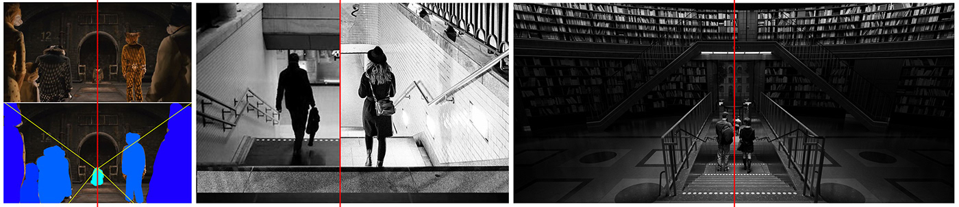
Now I am going to show you how the lighting of the interior image has a few particular conditions in which the artificial light becomes the principal character, just like in film’s interior locations, where the lights that the camera sees directly and the lights outside the camera are equally important, each one helping to reinforce an idea or a story. As the following images show.
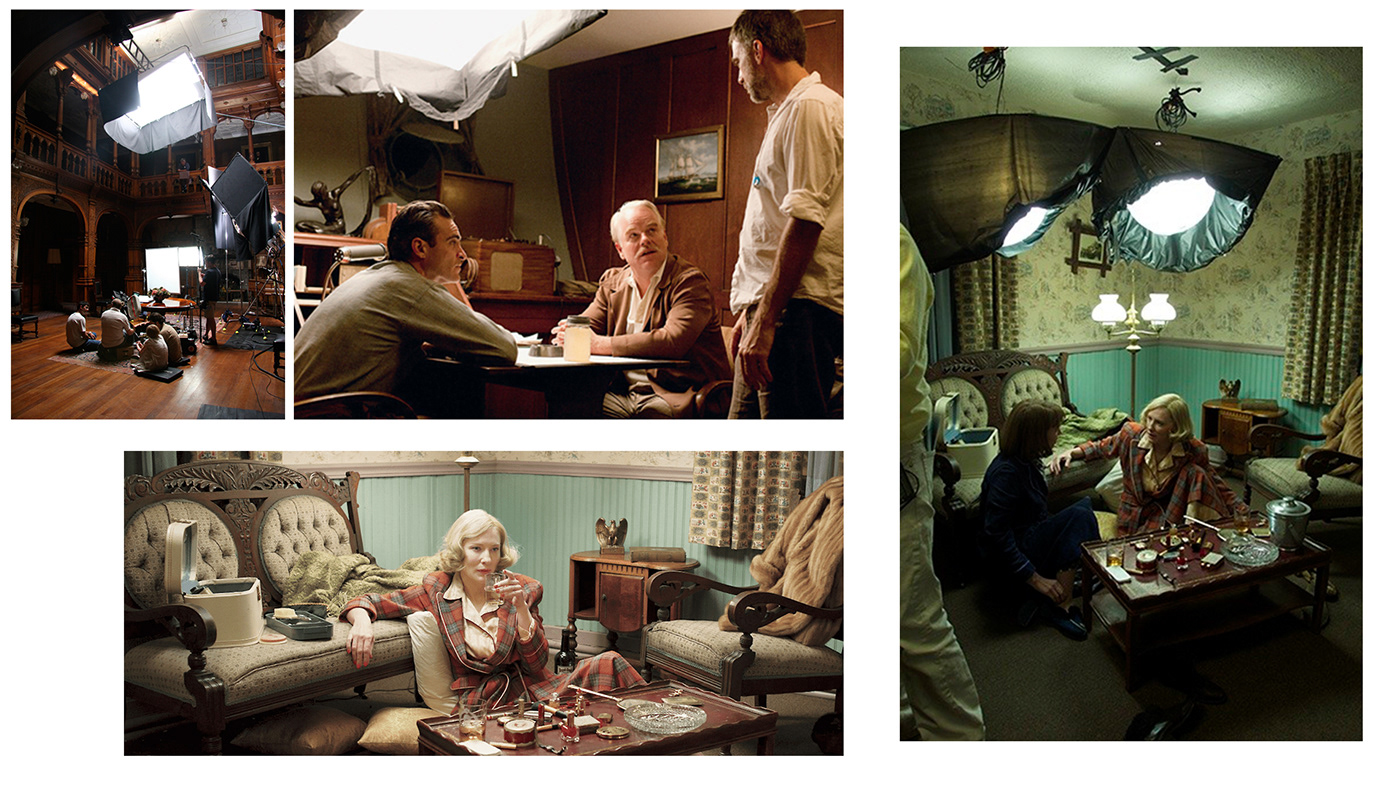
With these examples I want to suggest that there is a creative part when we plan to artificially illuminate scenarios. The formula is not always in the condition of light given by the sun or the typical artificial lights of the building, think of them as tools that help to generate contrasts, shadows, profiles, etc. My specific intention for the treatment of light in this scene was to give shine to the two characters that are walking down the stairs, for this I used a zenithal light on them with an intensity of light that allowed to understand their shape and colors, placing them in the space and reinforcing the other elements that focus them. On the other hand a secondary light that is generated by the lights that illuminate the shelves of the library in a very insinuating way leads to reveal details of the building.

COLOR
In the interior image, the extra light that illuminates the characters from above contrasts with all the brown in the library, creating contrast by color.
In the interior image, the extra light that illuminates the characters from above contrasts with all the brown in the library, creating contrast by color.
In the aerial image I used a monochromatic color palette with a predominant blue color. This time the excuse of putting a complementary color, to the one that the library has, was entirely intentional in the sense that it fits to be in one of the thirds of the image, this is completely reinforced with the slightly green tones of the trees that connect the street with the center of Stockholm and the library park.
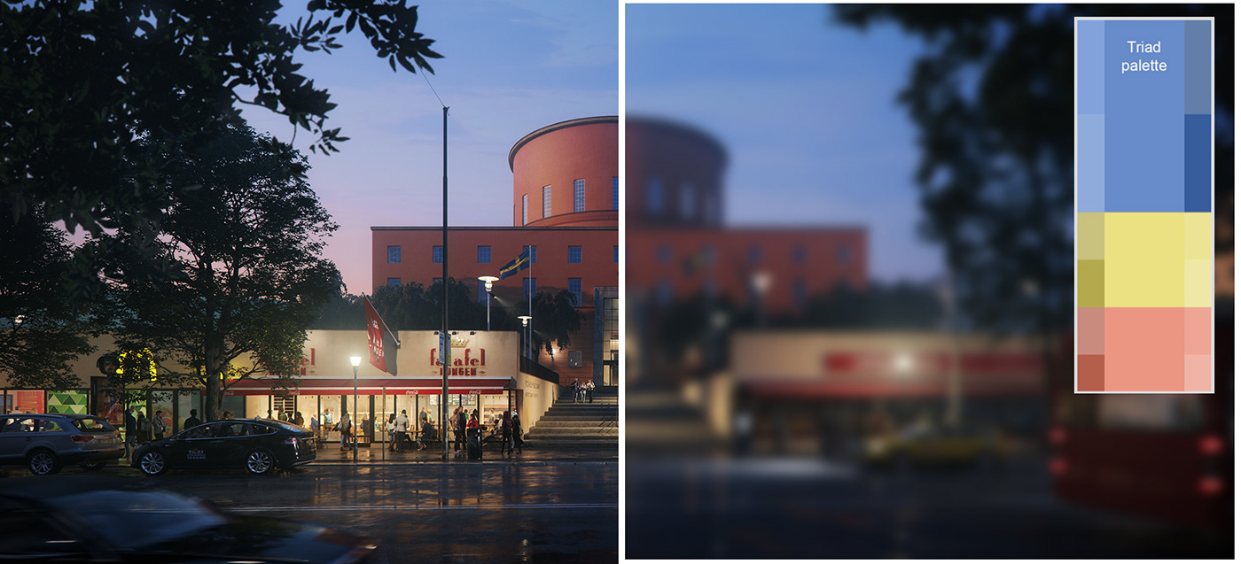
The exterior image features a triad color palette.
For this I took advantage of the sky’s color, the commercial floor and the building, and created a triad palette. From this point of view, the color reinforces the idea of a blue hour sunset which, in contrast to the warm light of the restaurant, helps to highlight the commercial activity
For this I took advantage of the sky’s color, the commercial floor and the building, and created a triad palette. From this point of view, the color reinforces the idea of a blue hour sunset which, in contrast to the warm light of the restaurant, helps to highlight the commercial activity
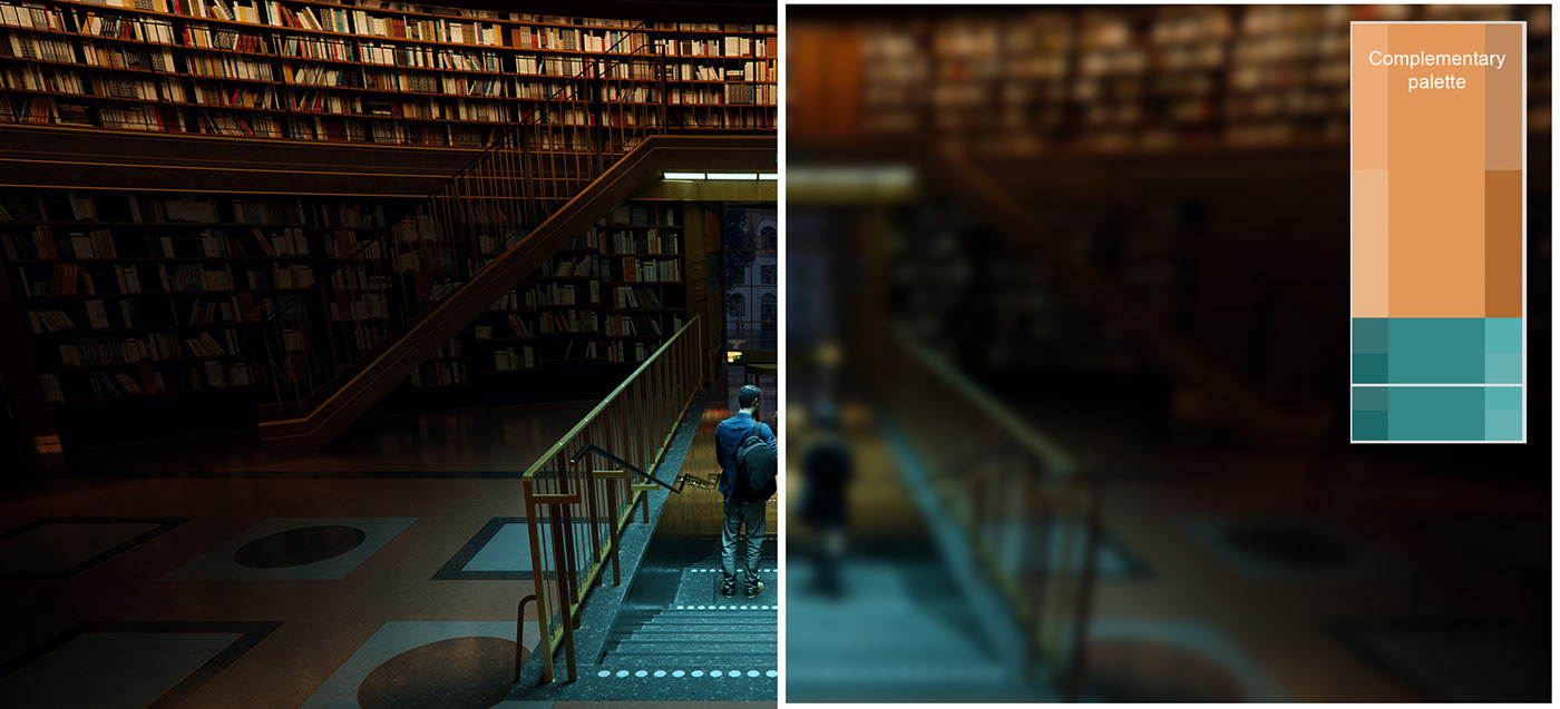
The interior scene uses an almost traditional complementary color palette, where the orange color of the materials inside the library, such as the wood and the marble floor are contrasted with the shades of blue from artificial light that emphasizes the characters from the top.
Character selection (population)
Choosing characters is a key aspect to give meaning to the global idea of the images. These people should not be generic, they should be people who can be found in that place so that the image is easily understood. Regarding these 3 images for the competition and taking into account my initial idea, these people should be casual, relatively young and in groups. In the interior image it is a couple that is leaving, which expresses that it is a more intimate relationship, two people that leave the library to enjoy the weekend.
In order to create images that generate an impact, it must be considered that each detail makes the difference and these elements must always be thought to reinforce the global idea.
WORKFLOW
This is a breakdown of the steps I followed to make the images. Normally I do several of these steps at a time, so it's not a rigorous or a chronological order to follow.
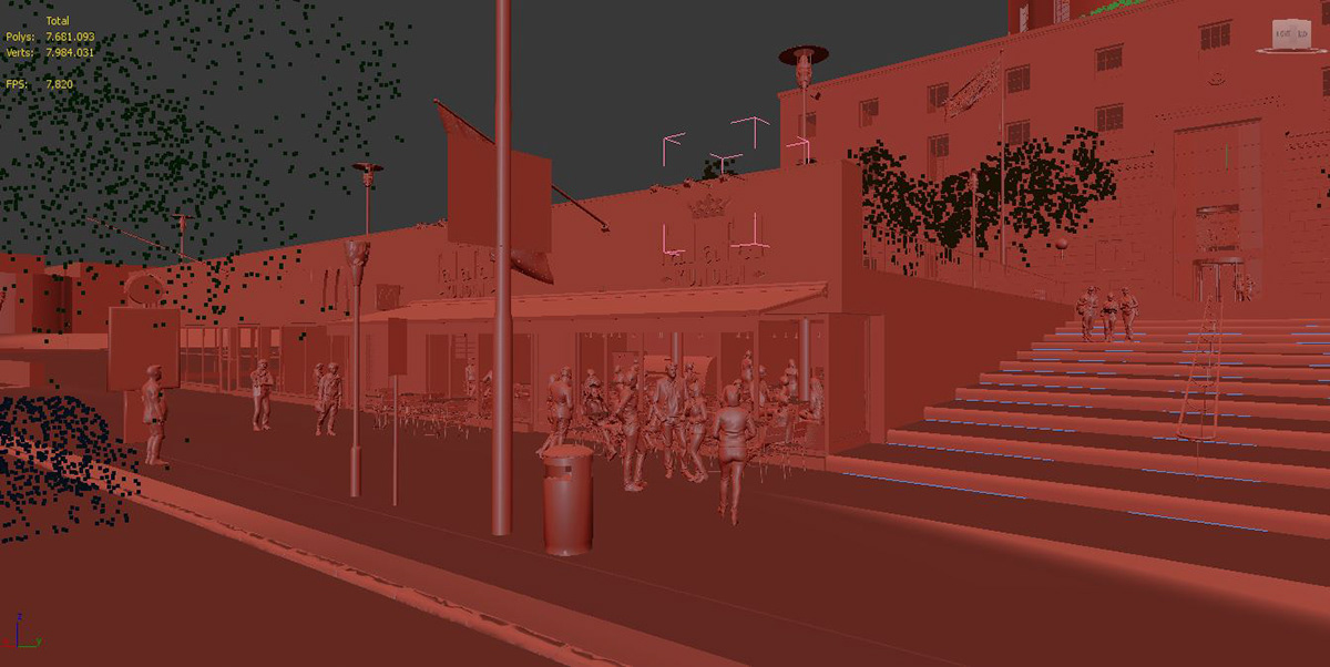
1. Review the provided model.
I determine if the details that actually exist match the model.
This image shows the 3D model given by Tomorrow.
Choosing characters is a key aspect to give meaning to the global idea of the images. These people should not be generic, they should be people who can be found in that place so that the image is easily understood. Regarding these 3 images for the competition and taking into account my initial idea, these people should be casual, relatively young and in groups. In the interior image it is a couple that is leaving, which expresses that it is a more intimate relationship, two people that leave the library to enjoy the weekend.
In order to create images that generate an impact, it must be considered that each detail makes the difference and these elements must always be thought to reinforce the global idea.
WORKFLOW
This is a breakdown of the steps I followed to make the images. Normally I do several of these steps at a time, so it's not a rigorous or a chronological order to follow.
1. Review the provided model.
I determine if the details that actually exist match the model.
This image shows the 3D model given by Tomorrow.

2. 3D file organization
For this project I created two files, one for the interior and exterior view and the other one for the general view. The organization of the layers in both files was essential to be able to navigate in the viewport and to manage the file easily. On the other hand, I created Corona proxies to reduce the amount of polygons in the viewport to speed up the rendering process.
For this project I created two files, one for the interior and exterior view and the other one for the general view. The organization of the layers in both files was essential to be able to navigate in the viewport and to manage the file easily. On the other hand, I created Corona proxies to reduce the amount of polygons in the viewport to speed up the rendering process.

3. 3D Modeling
3.1 Surroundings of the main building
Some buildings in the surrounding area were modeled, as they were necessary for the aerial and the exterior view. I chose to refine these details since these buildings are the closest to the main building and they can be seen in two of the cameras.
3.1 Surroundings of the main building
Some buildings in the surrounding area were modeled, as they were necessary for the aerial and the exterior view. I chose to refine these details since these buildings are the closest to the main building and they can be seen in two of the cameras.


3.2 Looking for 3D items in Google Earth
For the aerial view it was important that it was understood that it is Stockholm, the architecture and some buildings that stand out in the city were downloaded from Google Earth. In the following link I show how to import the KMZ models to CityEngine.
For the aerial view it was important that it was understood that it is Stockholm, the architecture and some buildings that stand out in the city were downloaded from Google Earth. In the following link I show how to import the KMZ models to CityEngine.
3.3 Modeling the city of Stockholm (City Engine)
I used City Engine to recreate the city and some details that were required for the frame that was chosen, I did it in a procedural way so that it could be a more agile process.
I used City Engine to recreate the city and some details that were required for the frame that was chosen, I did it in a procedural way so that it could be a more agile process.
3.3.1 I also added some extra details such as chimneys, antennae, trees on the hill, etc., which were distributed with Corona Scatter.

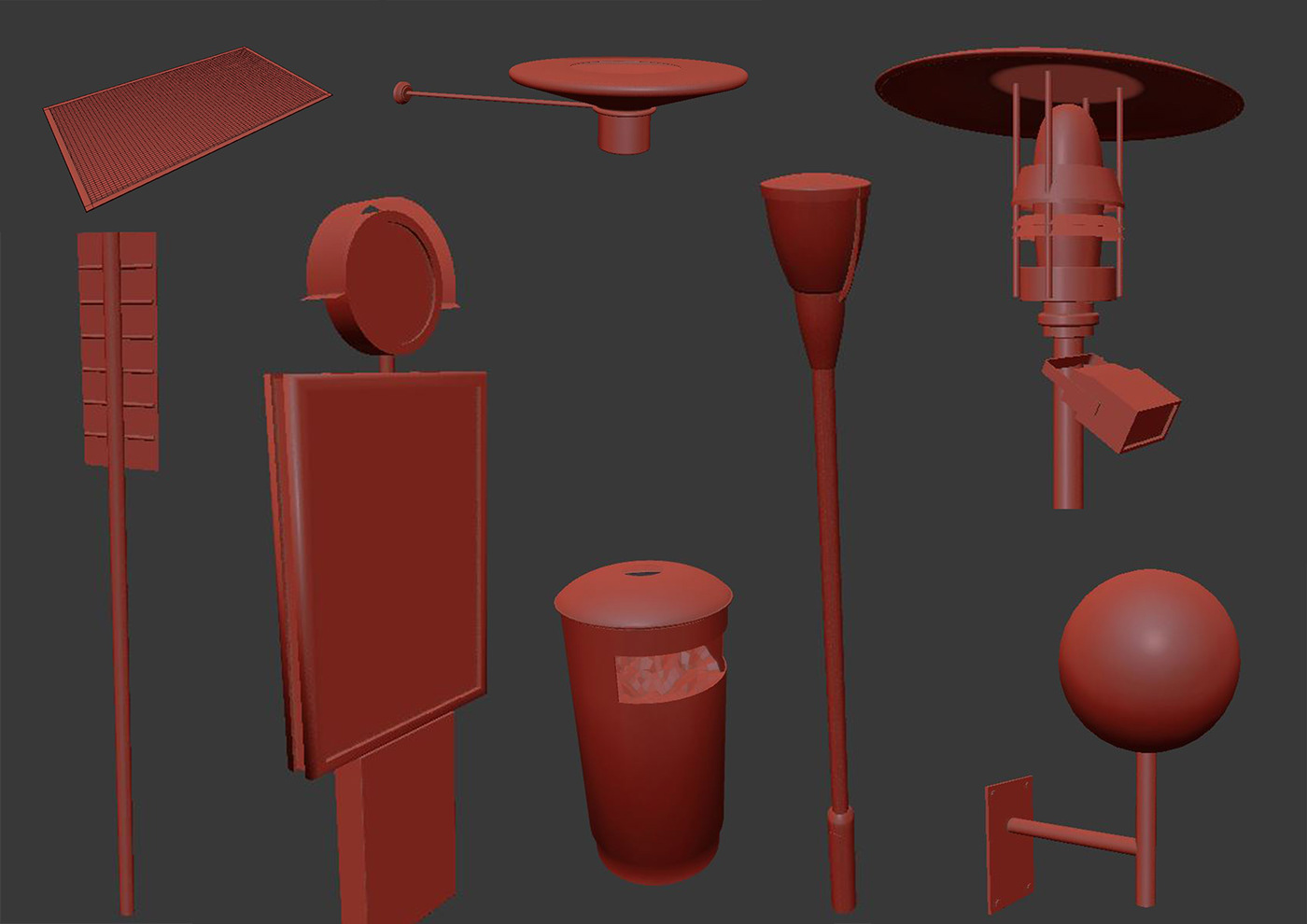
3.4 Props
I modeled some of the elements found on the street and in shops such as posts, flags, some interior details, etc.
I modeled some of the elements found on the street and in shops such as posts, flags, some interior details, etc.
I decided to model the trees at the entrance taking into account that these are very particular. To do this I used Speedtree with the purpose of making something closer to reality. In the following link you can find a timelapse of the process for creating a tree inside Speedtree:
3.5 Modeling precise details of the existing building
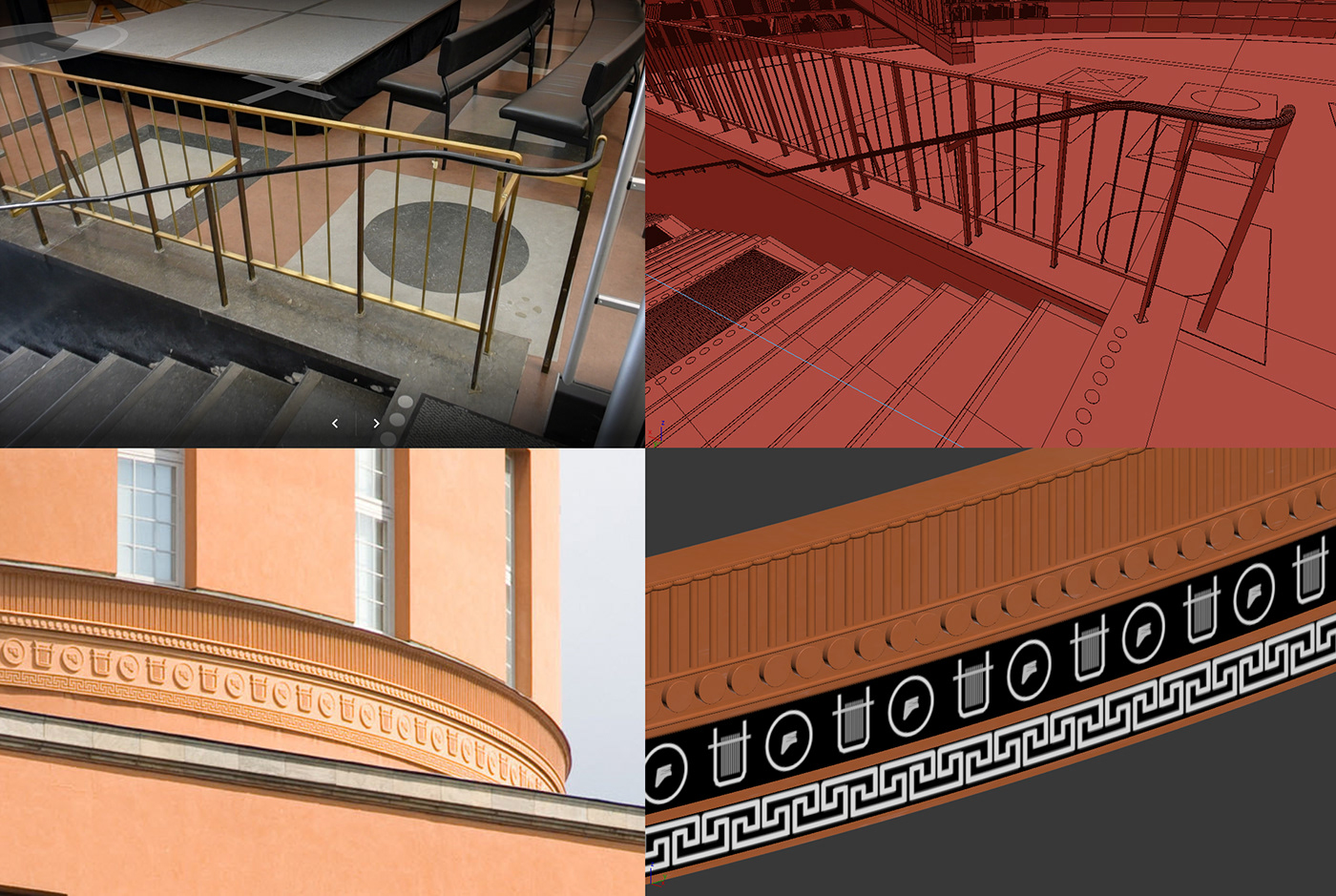
After knowing which frames I was going to use for each image, I observed and explored some images of reference found on the internet looking for the details of the main building that are necessary for each view. Usually there are details that are geometry inside the file, but sometimes it is better to do some details with displacement maps as is the case of the library moldings.
After knowing which frames I was going to use for each image, I observed and explored some images of reference found on the internet looking for the details of the main building that are necessary for each view. Usually there are details that are geometry inside the file, but sometimes it is better to do some details with displacement maps as is the case of the library moldings.
4. Materials (Quixel mixer)
To make the materials I began to explore Quixel Megascans and Quixel Mixer, since my purpose was to carry out a more agile process in the creation of materials. In this process I used some 3D texture scans from Textures.com, I took them to Quixel mixer and created some custom shaders as a base for the materials I was going to do for the scene, as it is shown in the following video.
To make the materials I began to explore Quixel Megascans and Quixel Mixer, since my purpose was to carry out a more agile process in the creation of materials. In this process I used some 3D texture scans from Textures.com, I took them to Quixel mixer and created some custom shaders as a base for the materials I was going to do for the scene, as it is shown in the following video.
I also used the base materials from the Corona library, which I made more complex by adding color and texture variations directly from the 3dsmax materials editor so that they would work correctly according to the references.
Here’s an example of the structure of a material used in the exterior walls.
Here’s an example of the structure of a material used in the exterior walls.

From the beginning the fundamental idea is that the material behaves in a physically correct way so that the lighting works in the same way. For this I am always checking the albedos and reflections of the materials, which are two indicators that soon give a clear idea of how approximate is the material to the reference.
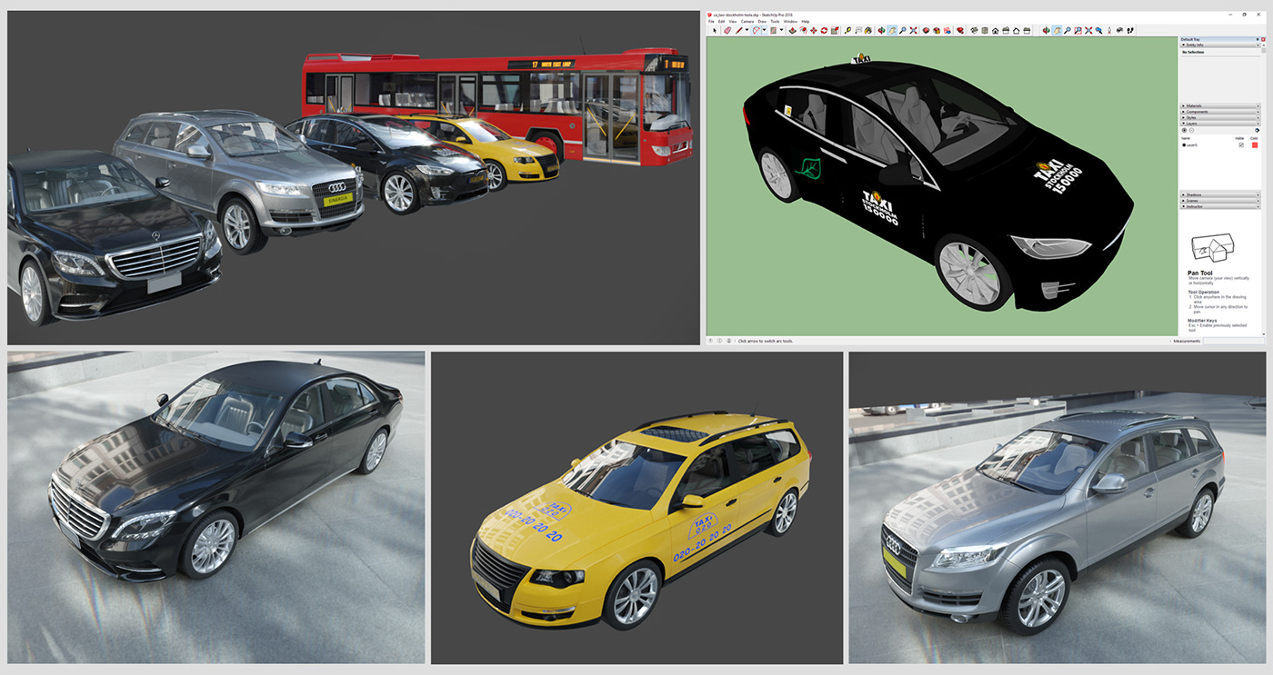
4.1 I checked the textures of some props such as cars and buses.
When I take assets from different sources, the best thing for me is to check each one of them, I like to know precisely how the materials were created and in many occasions I like to assign the new materials one by one, in this way I have everything under my standards and I am sure of what I am importing to my scene.
In this manner, I tested each of the vehicles in a separate scene.
This HDRI was the one that I used to illuminate the test scene where I worked on the car shaders:
Here is a basic example of a car paint material in Corona Render that was used in one of the vehicles in the scene.

Some of the models are part of the Evermotion library and some objects, like the Tesla Taxi, were found in the 3Dwharehouse of Google Sketchup.
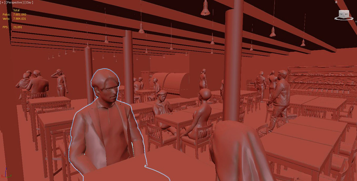
5. 3D People
Both in the exterior and interior view I added some people in 3D to speed up the post-production process. When you have scenes so populated with people it is always a good alternative to use these assets for medium or distant shots, they help you to populate large areas.
Both in the exterior and interior view I added some people in 3D to speed up the post-production process. When you have scenes so populated with people it is always a good alternative to use these assets for medium or distant shots, they help you to populate large areas.
6. Review phase
During this phase I render the images with the final resolution when I go to bed and the next day I review the images in detail. Then I do the list again of the really important details that need to be corrected or added. In this phase I always try to be very careful that the materials and objects have their corresponding masks so that in the post-production phase the selections are very easy and precise.
7. Retouching / Photoshop
Usually this process is focused on adjusting/correcting or equalizing some elements within the images, either its color or brightness but in some specific cases I use it to overpaint inside the image, add more details that can create imperfections for the final render.
In the following video that shows a timelapse of the exterior image, some of these adjustments can be seen.
These two videos show the breakdown of the aerial and interior view, I hope they are helpful to understand the issues I will mention below:
7.1 Composition and adjustments
In this phase I upload all the files in a stack inside the file and later I separate the channels of the masks. I create a folder for the adjustments that I am going to make. Also I adjust the brightness and color of some elements.
7.2 Color Gradation
This phase is focused on making a general adjustment of color and contrasts in the image. I do this according to the references and to what is proposed in the art direction considering how I want the final images to be.
7.3 2D People
I put some 2D people who were part of the main idea in the exterior image. I adjusted the lighting and color of each one of these people so that they could integrate correctly to the image, so it can be said that it is important to take into account at this point the characteristics of the render itself and features that should be added to the characters at this stage, such as direct and indirect light that affect them, contact shadows and shadows projected on other surfaces, without forgetting to copy photographic aspects such as the definition on the edges of the characters and image noise.
Motivations to participate of a competition of this kind
I really like personal challenges, they always lead you to break the limits and it is a good incentive to see your advances in time, it helps me to know if my personal vision is going the way I had planned previously.
I really like personal challenges, they always lead you to break the limits and it is a good incentive to see your advances in time, it helps me to know if my personal vision is going the way I had planned previously.
Participating in this kind of competitions also helps me know at what level my work is. It's also interesting to see how other people interpret the same type of project.
Participating in a challenge like this one allows you to do something different from what you do every day, it allows you to do something that is not directed to a client, so it is possible to explore other possibilities when making the images. In general, doing the competition has several benefits, during this process you refine techniques, ideas and it is a good excuse to develop your portfolio. At the same time, you interact with other artists, which is an opportunity to get to know each other's work.
Participating in a challenge like this one allows you to do something different from what you do every day, it allows you to do something that is not directed to a client, so it is possible to explore other possibilities when making the images. In general, doing the competition has several benefits, during this process you refine techniques, ideas and it is a good excuse to develop your portfolio. At the same time, you interact with other artists, which is an opportunity to get to know each other's work.
Time management
This task is not necessarily related to 3D but it is really a part of being able to manage and achieve the goals in the development of your projects. Much of the process is about being able to review your progress on your own and to know that in the end you will be able to deliver the assignment with the standards you set from the beginning.
This task is not necessarily related to 3D but it is really a part of being able to manage and achieve the goals in the development of your projects. Much of the process is about being able to review your progress on your own and to know that in the end you will be able to deliver the assignment with the standards you set from the beginning.
During the process you are so focused on "doing" that sometimes you overlook to review your own work and be self-critical, for this I usually make a list of specific tasks for each image, I try to give them an estimate of time and know how many of those tasks I'm going to be able to accomplish in a normal day (8 hours), well it's usually more than 8 hours hahaha. So in the end I can estimate how many days it should take me to do a project.
In this process it means that new lists of activities are created after you see your images rendered in a first revision. And this increases your working hours depending on which phases you assign the completion of some tasks. At this point I usually keep in mind which process I want to perform in 3D and which in the postproduction phase (2D).
For this specific case as these were several images, I decided that a large percentage of the time was invested in 3D production by almost 90% and only 10% in the fun work of Photoshop.
Archviz Competitions
In my opinion one of the key issues in any type of competition is the projection with which you see this type of challenge. When you consider devoting time and effort to a goal, it's crucial to think about all the possibilities, even not winning. For this reason it is important for me to think that the time invested in this type of project has a greater scope.
In my opinion one of the key issues in any type of competition is the projection with which you see this type of challenge. When you consider devoting time and effort to a goal, it's crucial to think about all the possibilities, even not winning. For this reason it is important for me to think that the time invested in this type of project has a greater scope.
Now, the way to see this can be the difference between playing and staying on the bench, an example with which I could compare it is with an average player who goes to a game and simply plays according to the requirement that the same game gives, while on the other hand there is a player who gives everything he has in the game and is always focused on constantly overcoming his skills and sees the game as a possibility to do so. Sometimes in these games there are headhunters, people who are watching the players, if this were the case, what player do you think this headhunter would call?
It's about always doing the best you can, and if that involves hard work, that's all you have to do, sometimes you think that doing the least you're asked is enough, but in this case it's about trying to achieve good images that will affect the audience and no matter how much they want to simplify it, it will never be like that.


