Genius Kids - English School
Brand context
Genius Kids is an itinerant English school for children from 02 to 11 years old. It believes that it is very valuable and important for children to learn the language so that they can, in the future, be able to take advantage of professional opportunities that may arise.
The goal of Genius is to build a better future for its students. This construction involves learning in a light and fun way, which is outside the traditional teaching model that uses books and tests.
The company changes the perception of contact with English by teaching children in a playful way in which they build their own didactic material in the classroom and use the methodologies that best suit them. Through group play, mutual help between students, and individualized attention, Genius creates bonds so that the children will trust her.
The result of this way of teaching is that students become true geniuses when they realize they can learn a new language.
With its activities started in 2014, Genius has plans for national and international expansion.
Genius' target audience is very broad: mostly women, but with a very diverse age range, social class and location.
The company already had a logo, but it did not represent the essence of the brand. Despite the existence of a logo, there was no visual identity. The challenge was to create a brand identity design that reflected the personality of the company, made it easy for people to recognize and remember it, and was prepared to support its expansion plan.
Another challenge was to disentangle the personality of the company's founder from the brand personality, to identify Genius' traits and register them to be represented by the visual identity.

The strategy
The immersion in the business through the stages of diagnosis and analysis resulted in the identification of the personality of Genius Kids that should be reflected in the design.
The product of this immersion resulted in information that supported the creation of a strong, uncomplicated and fun logo and the choice of a color palette that reinforces the aspects of a fun, playful and agile brand.
To give more dynamism to the graphic pieces that will be used in the communication of Genius and favor the memorization of the brand, two characters were created.
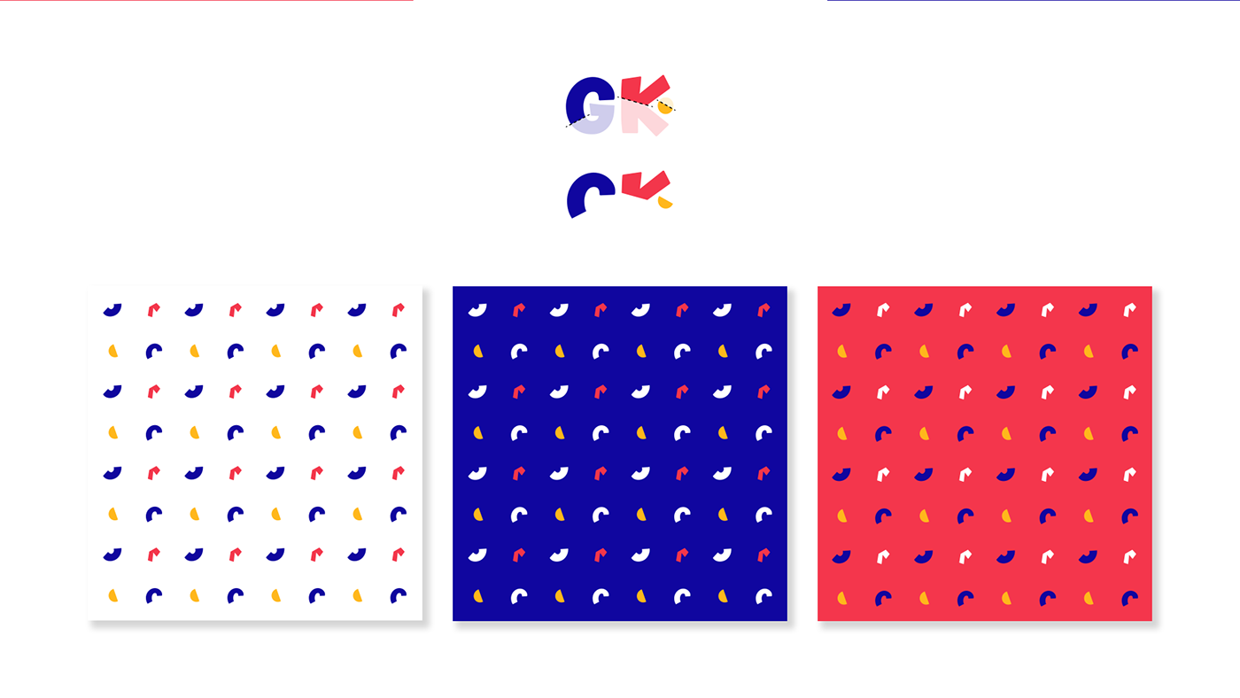
A graphic pattern was also created with shapes generated from cuts made on the Genius icon.


Customer evaluation of the project
Incredible!!! Paulo was able to understand the essence of GK and transmit it in our visual identity! Just thank you!