Mobil Oil Corporation
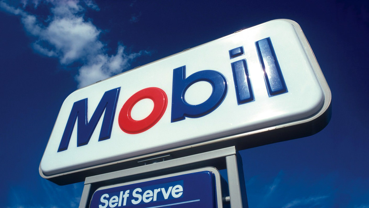
The idea of the red O reinforces a design concept to use circular canopies, pumps,
and display elements for a distinctive and attractive look. It also serves to help people pronounce the name correctly (Mo-bil, not Mo-bile), and of course to add a single memorable and distinctive element to an otherwise very simple lettering style. At the
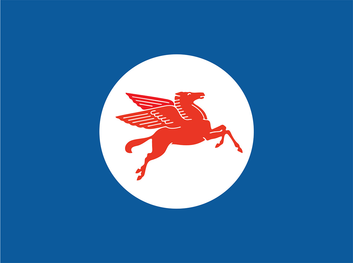
same time, the redrawn flying red horse is placed at a large size on the service station building itself.

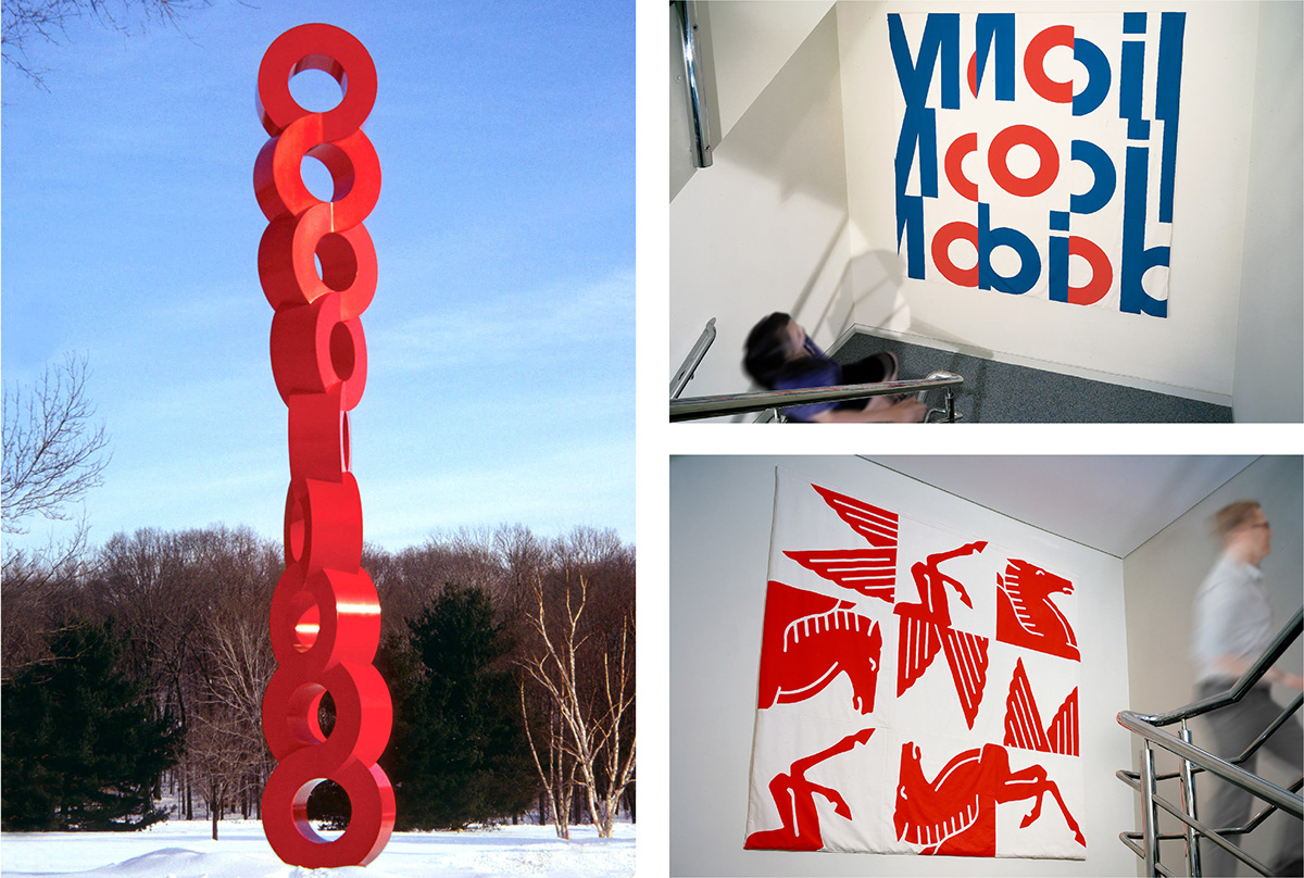
Our firm developed a complete corporate identification program for Mobil, built around the logo, a specially designed alphabet, the redrawn pegasus, a clear policy for color, and a comprehensive design approach that integrated new graphics with the architecture. It included design of product packaging, vehicle markings, print material, posters, and all design, packaging, and sign standards for facilities throughout the world.