
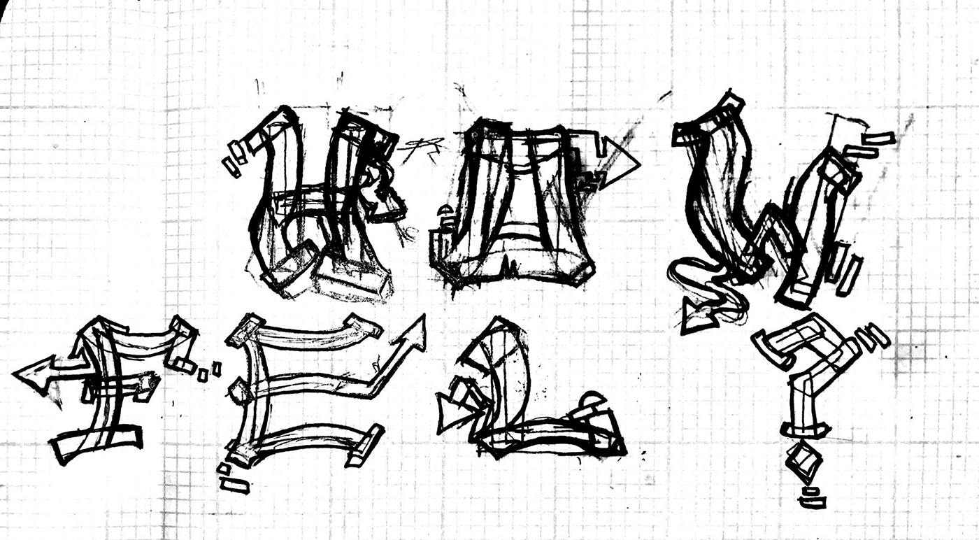
The words "How", "Feel" were hand drawn in pencil in the style of wild-style graffiti.

My name Aileen was hand drawn then filled with a permanent marker in the style of tagging. The letter "U" was hand drawn in the style of bubble letters.

I scanned all the words and uploaded them to Adobe Illustrator. I then started to trace them with the pen tool and transforming them into shapes. I added details, such as the bubbles on the edges of the letters, to have more of the wild-style graffiti feel to it. My tagged name is in the bottom because that is how tags are positioned, they are not the main focus. To tie it all up I decided to mess with the brush tools and make something that reminds me of graffiti, which is what came to be the abstract shape in the background. It is all-over the canvas and abrupt, and I believe that is what makes the design stand out more.


