Passport
Brand Identity, Print Design & Web Design
Brand Identity, Print Design & Web Design
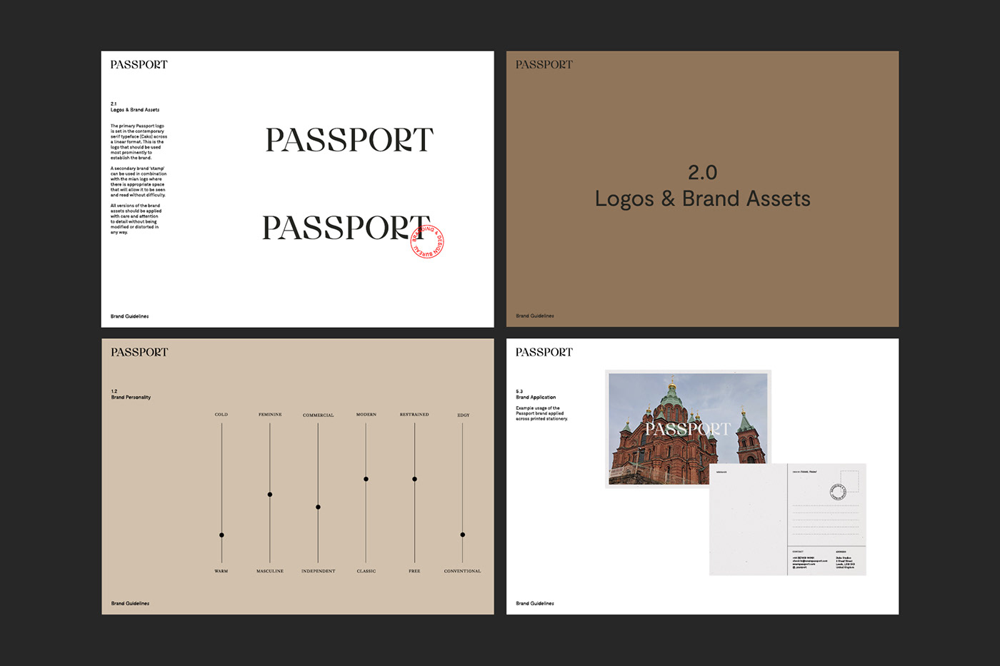
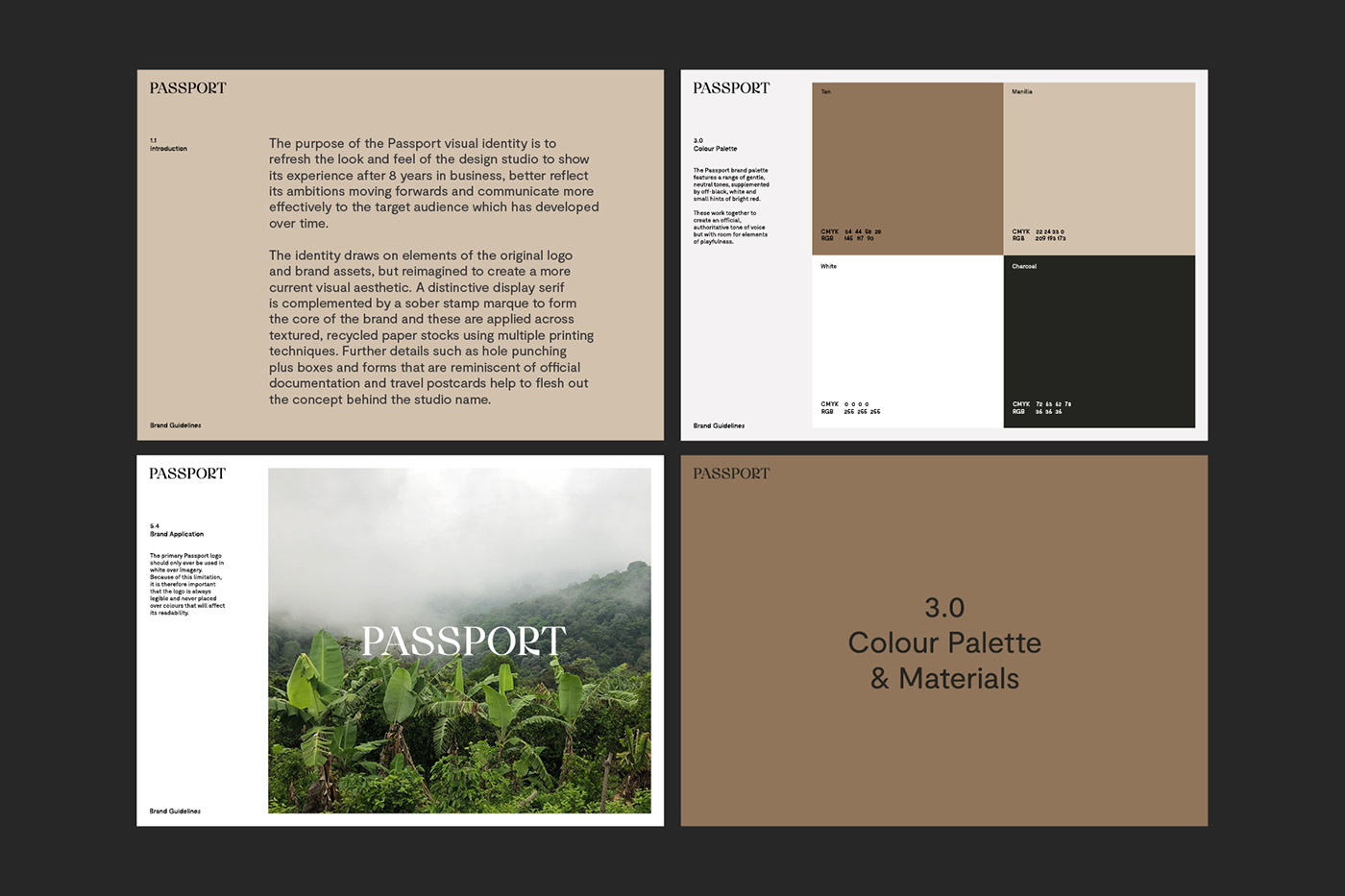
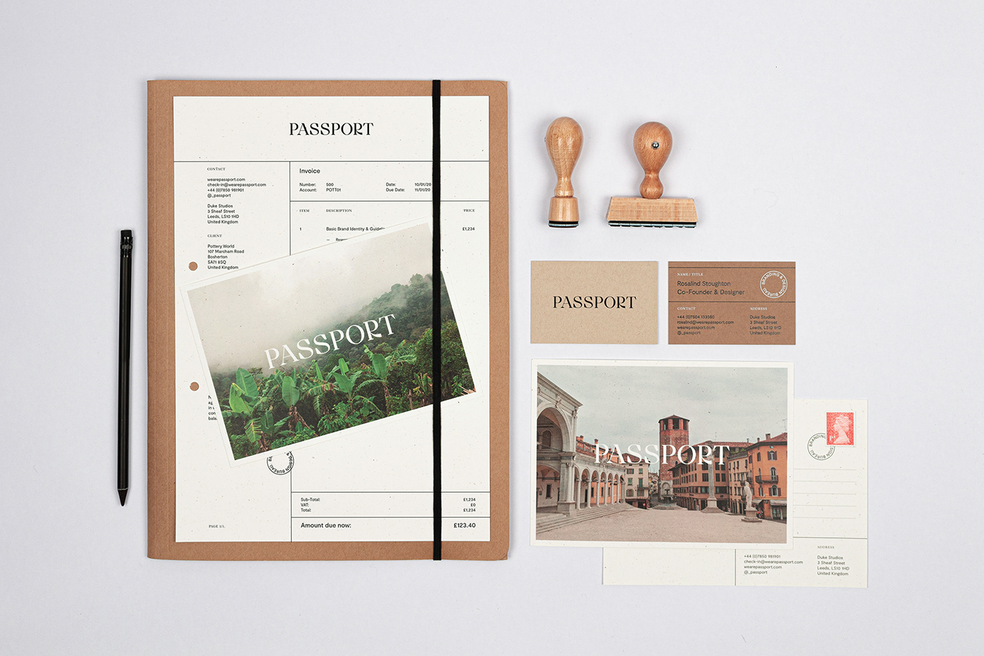
As Passport approaches its 8th birthday, we decided to revisit our own brand identity, which has changed little since the studio was set up back in 2012. There were many elements that we still enjoyed from our original brand however, we have completely refreshed and reimagined these to better reflect the experience we have gathered so far, as well as our aims and ambitions moving forward.
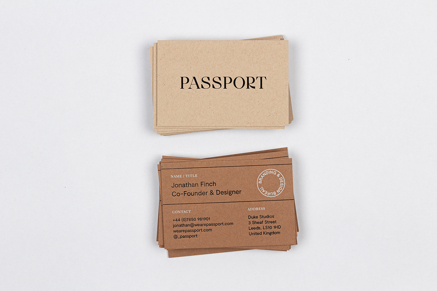
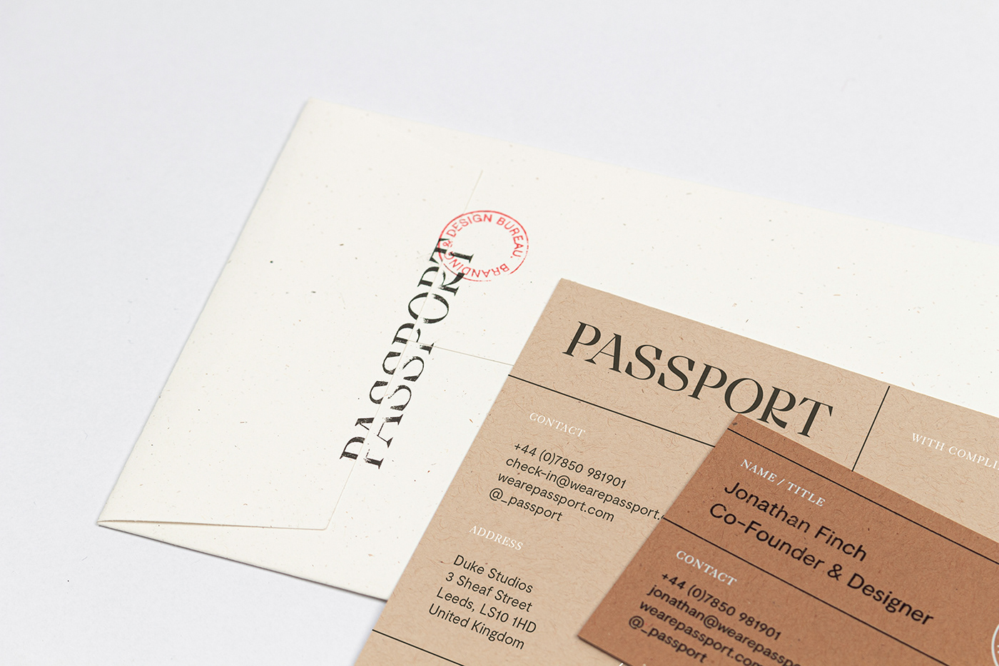
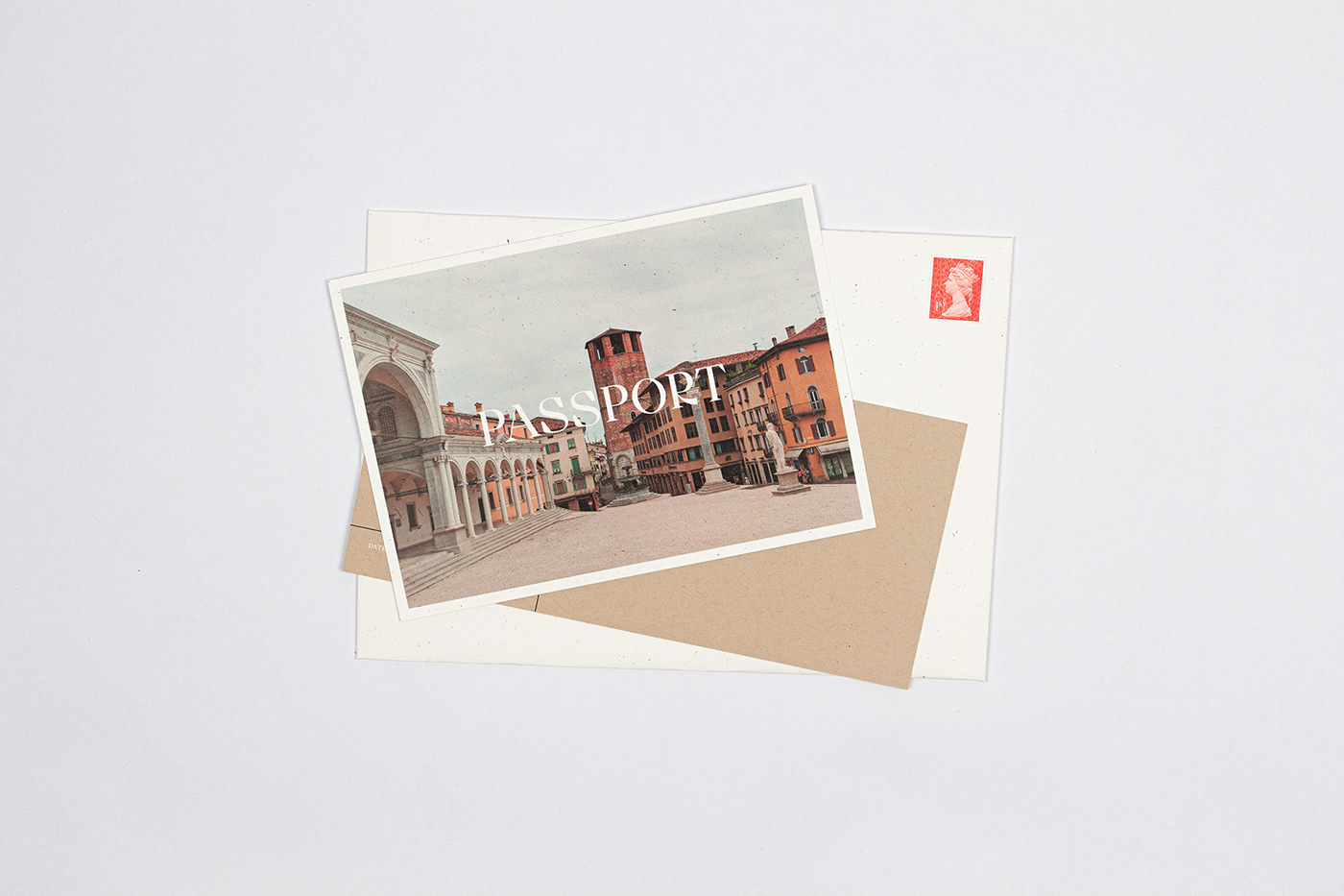
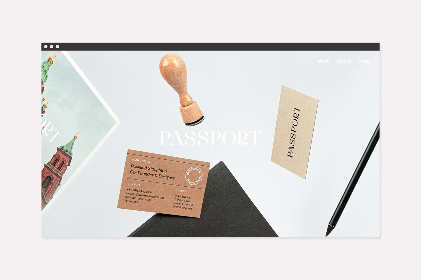
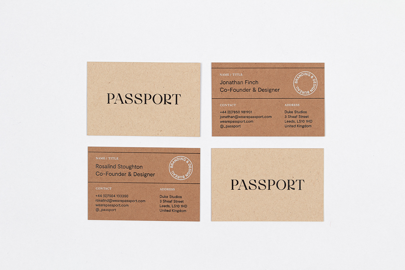
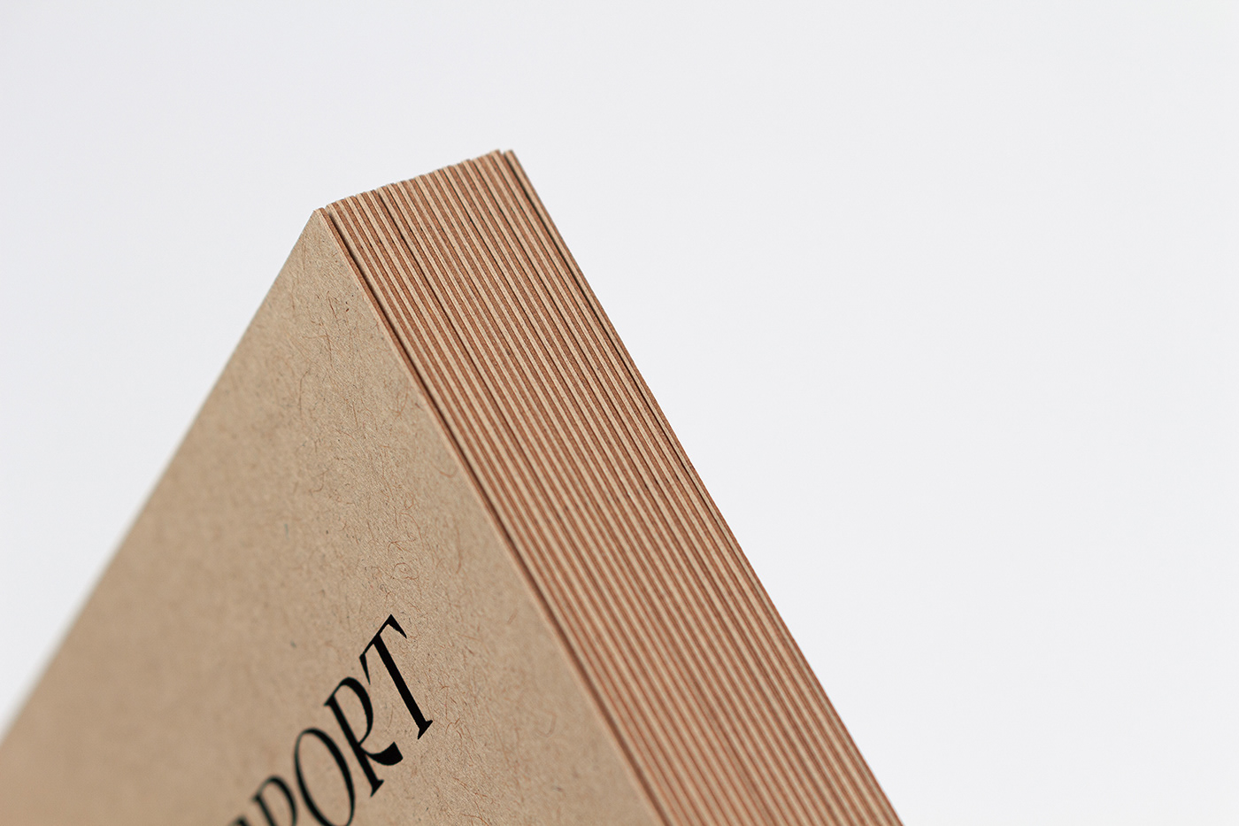
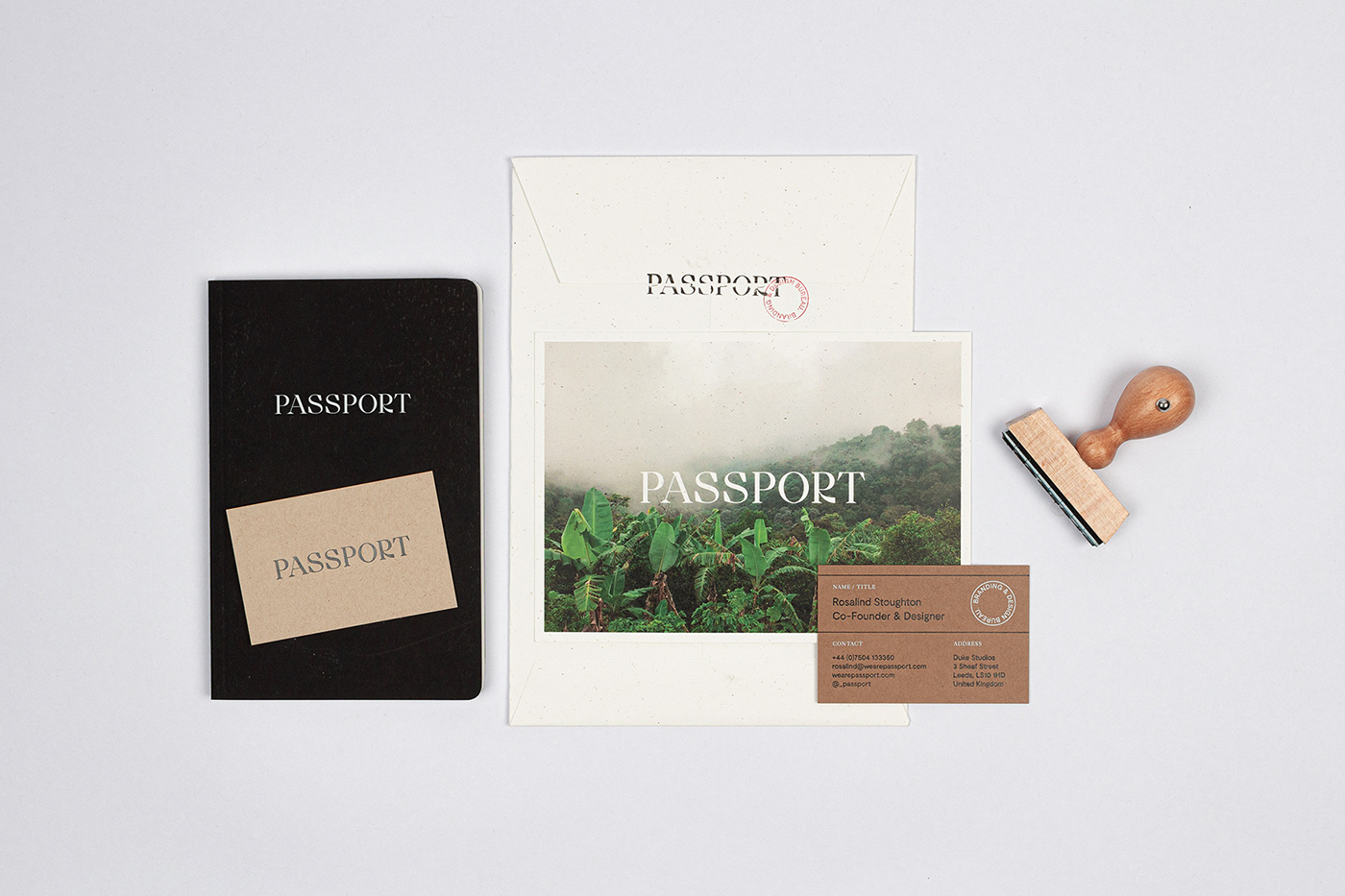
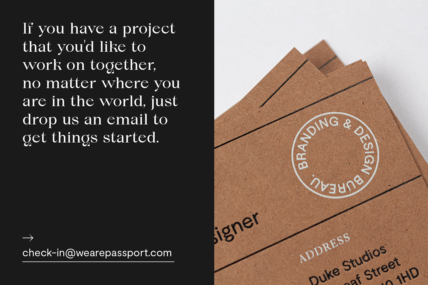
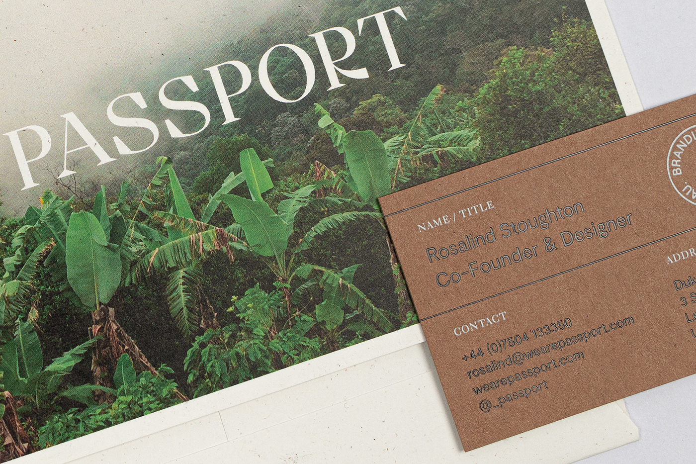
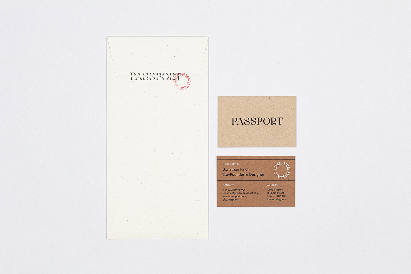
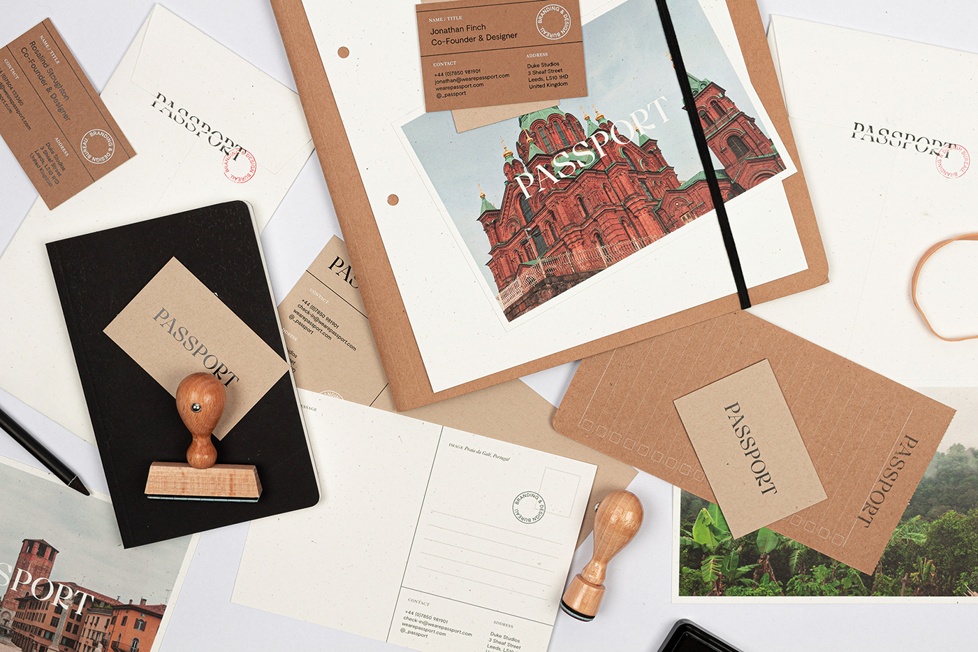
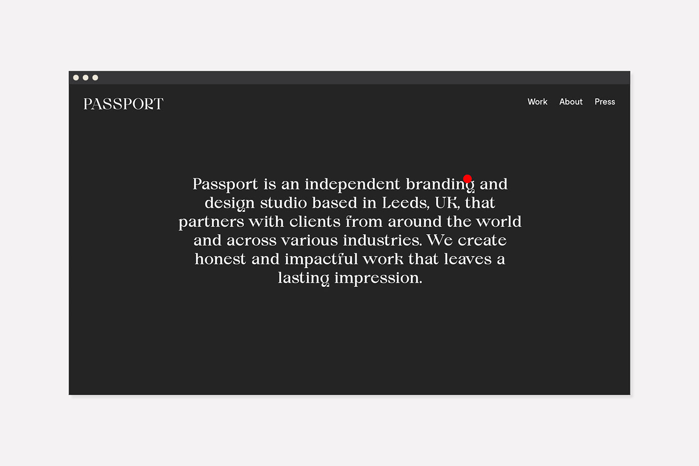
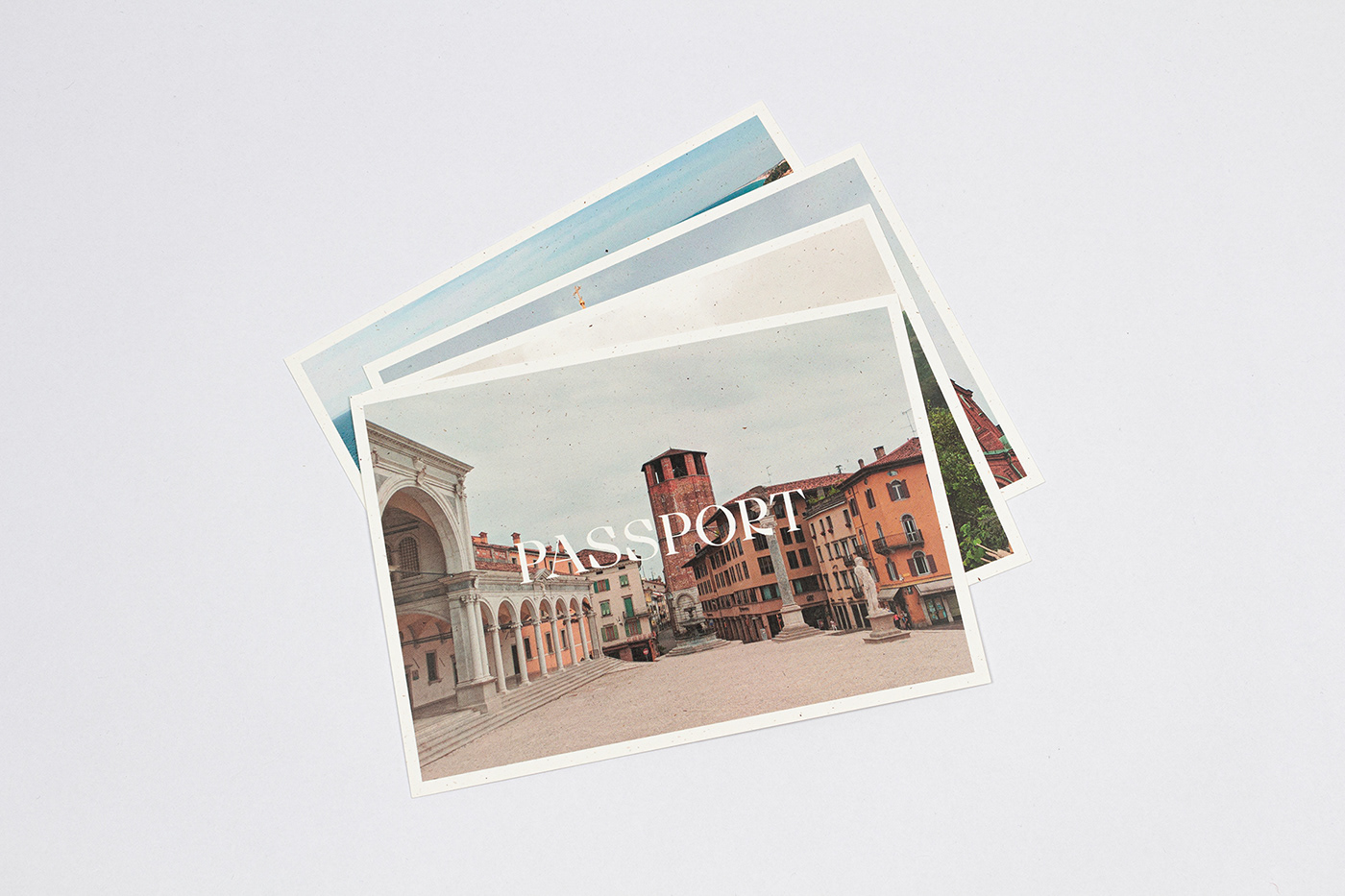
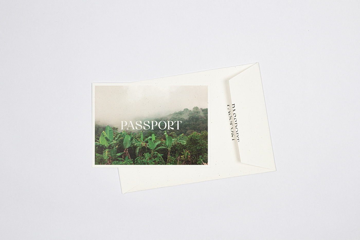
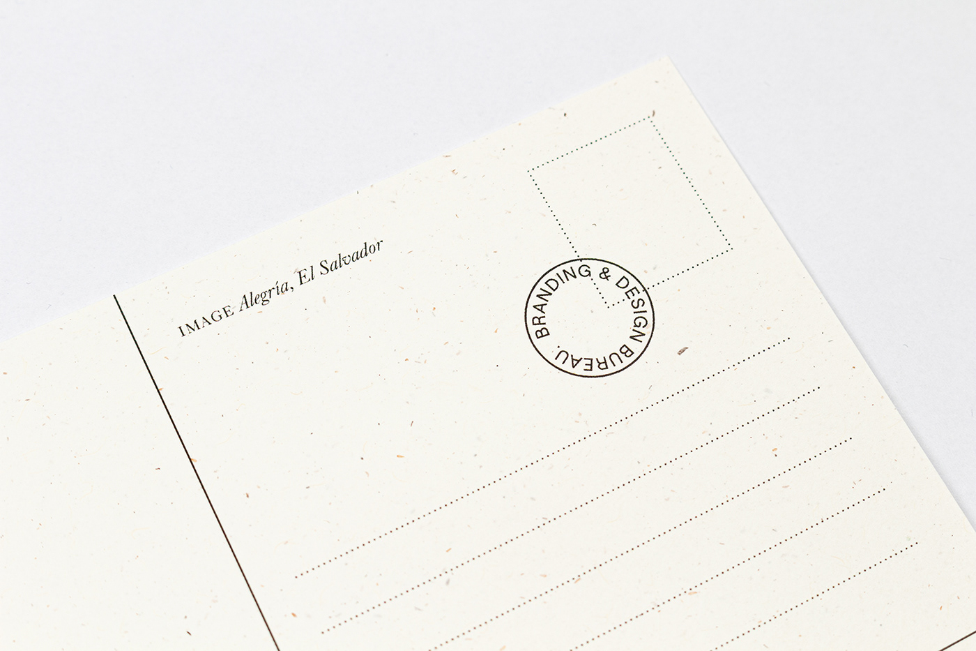
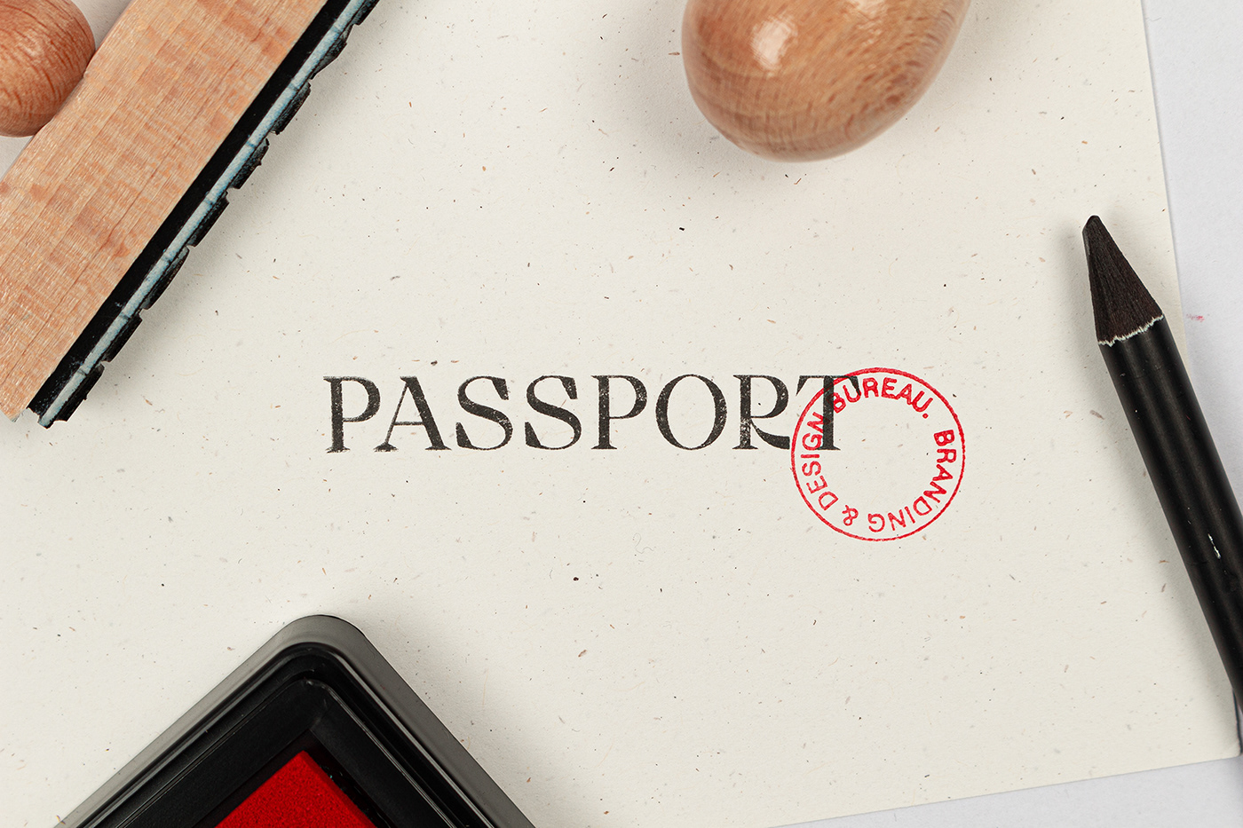
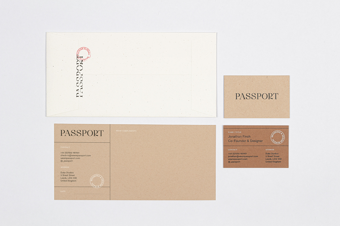
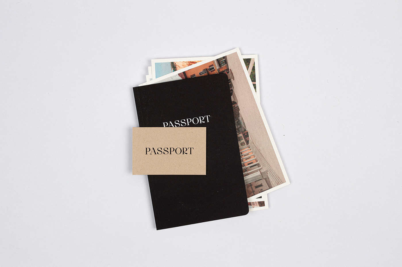
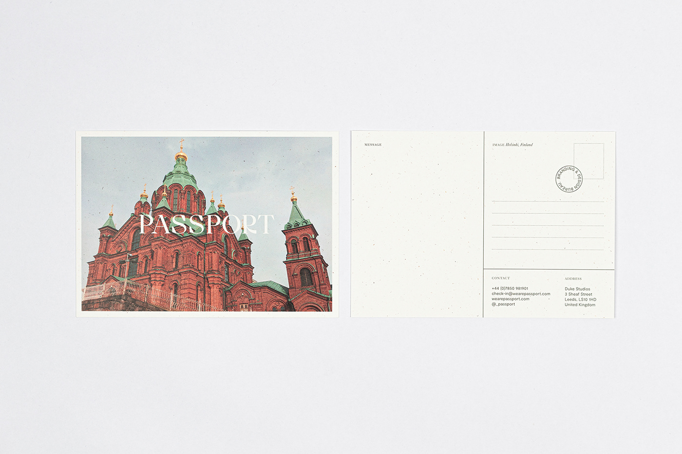
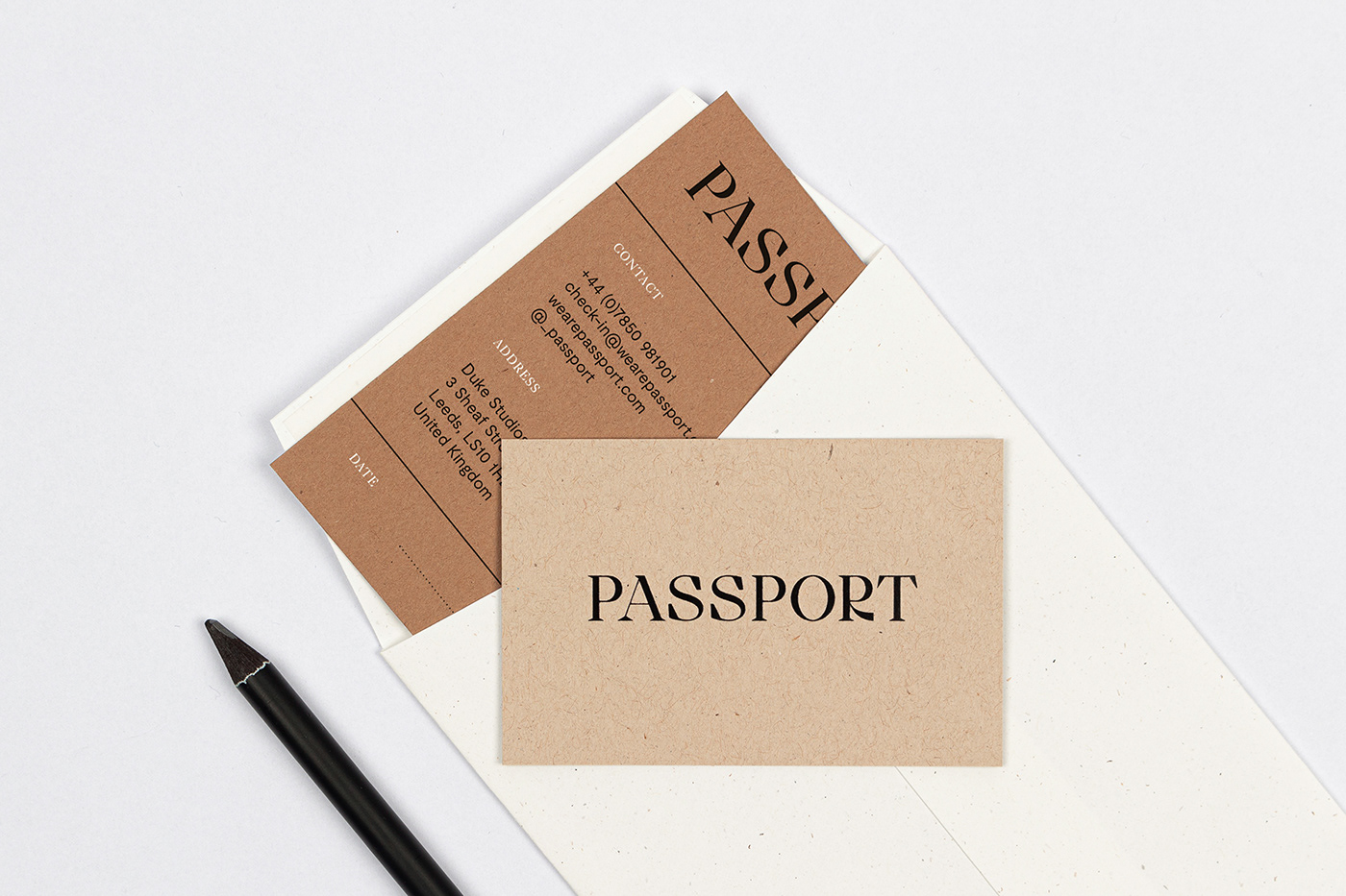
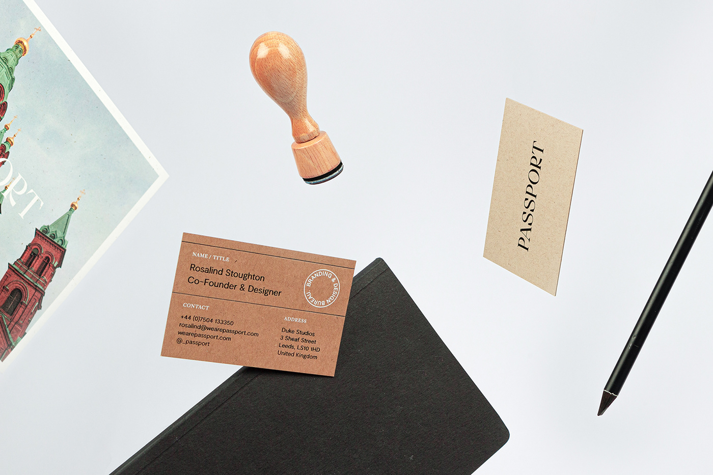
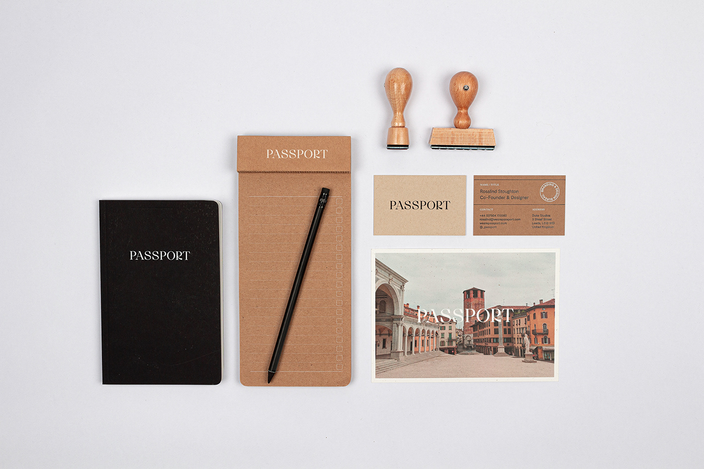
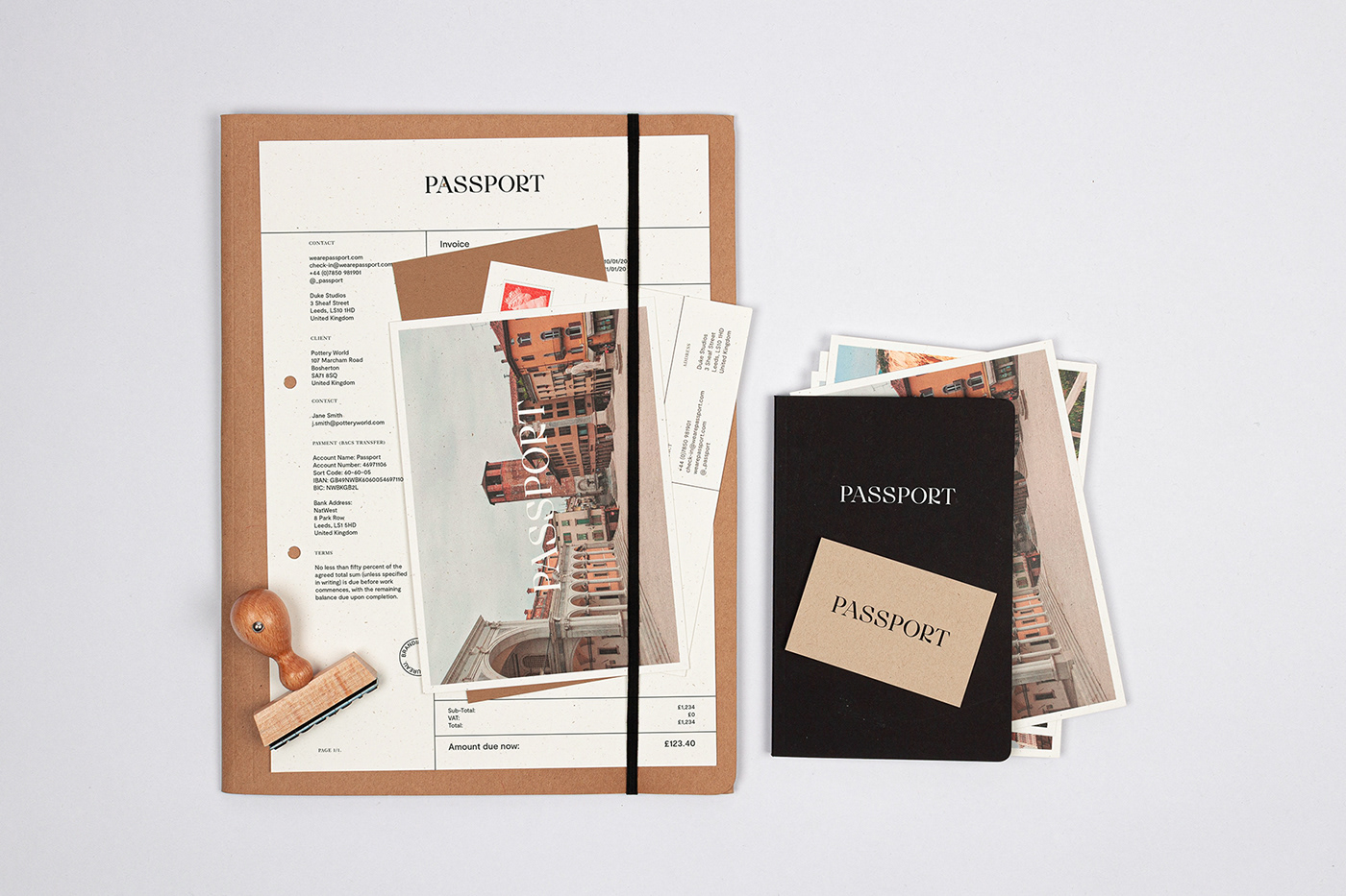
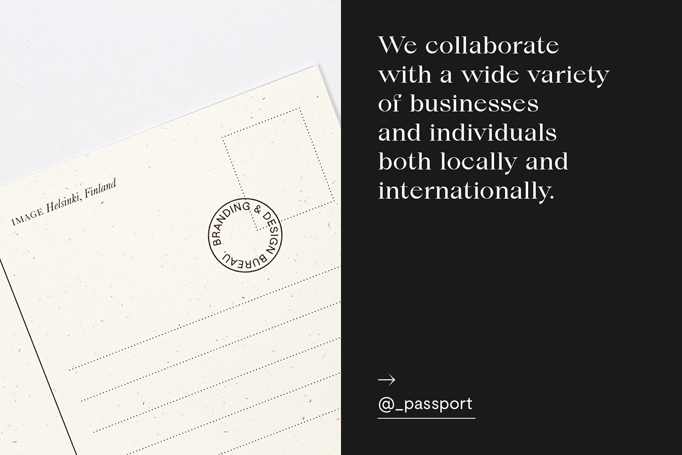
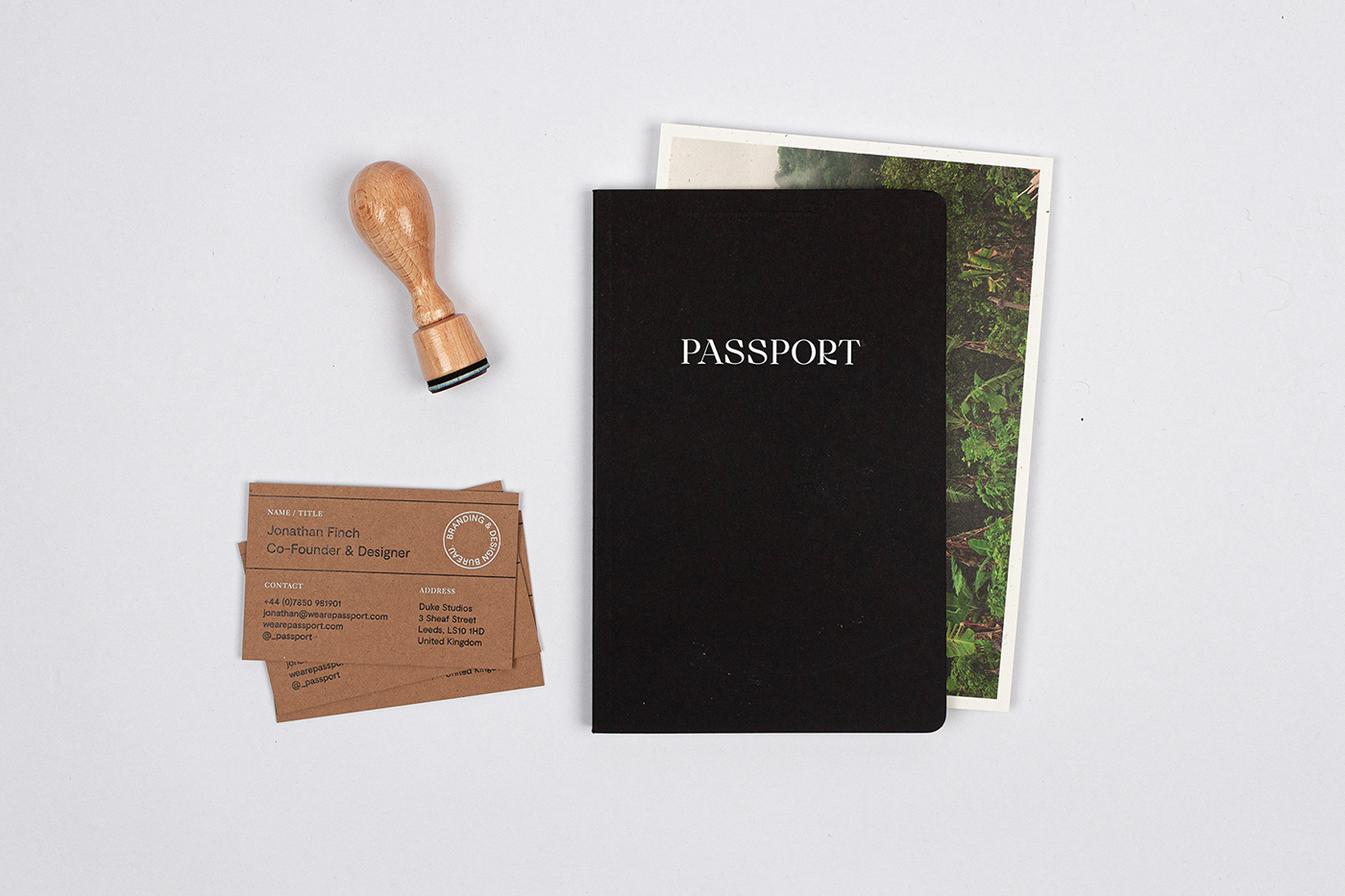
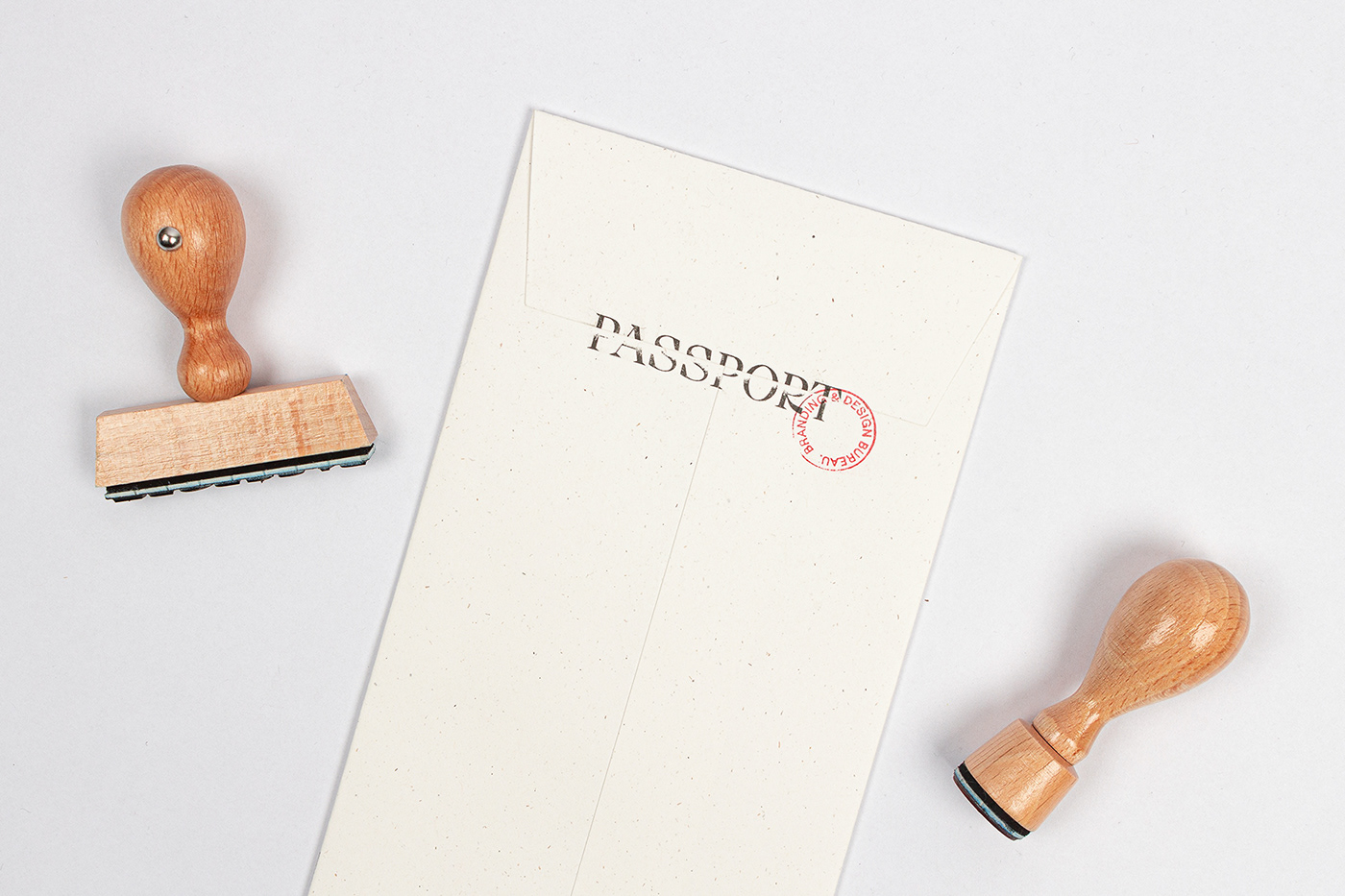
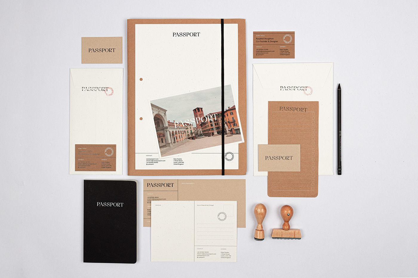
We began by designing a new logotype set in a beautiful display serif typeface. To complement this, and further build out the concept that stems from the studio name, we have also developed a visual language that takes its cues from the styling of official travel documentation. This includes layouts that use boxes to create fields for data input and rudimentary detailing by way of hole punches and rubber stamps. Materials and substrates were kept to a neutral palette which again is reminiscent of sober, utilitarian stationery, and these have been combined with high end print finishes such as foil blocking. Finally, the addition of travel photography across branded postcards adds some splashes of colour but also a personal element that contrasts against the earnest and restrained typography.
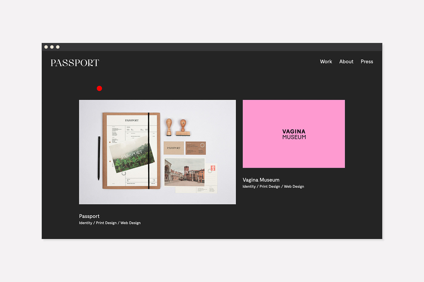
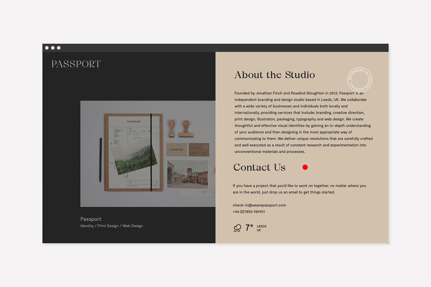
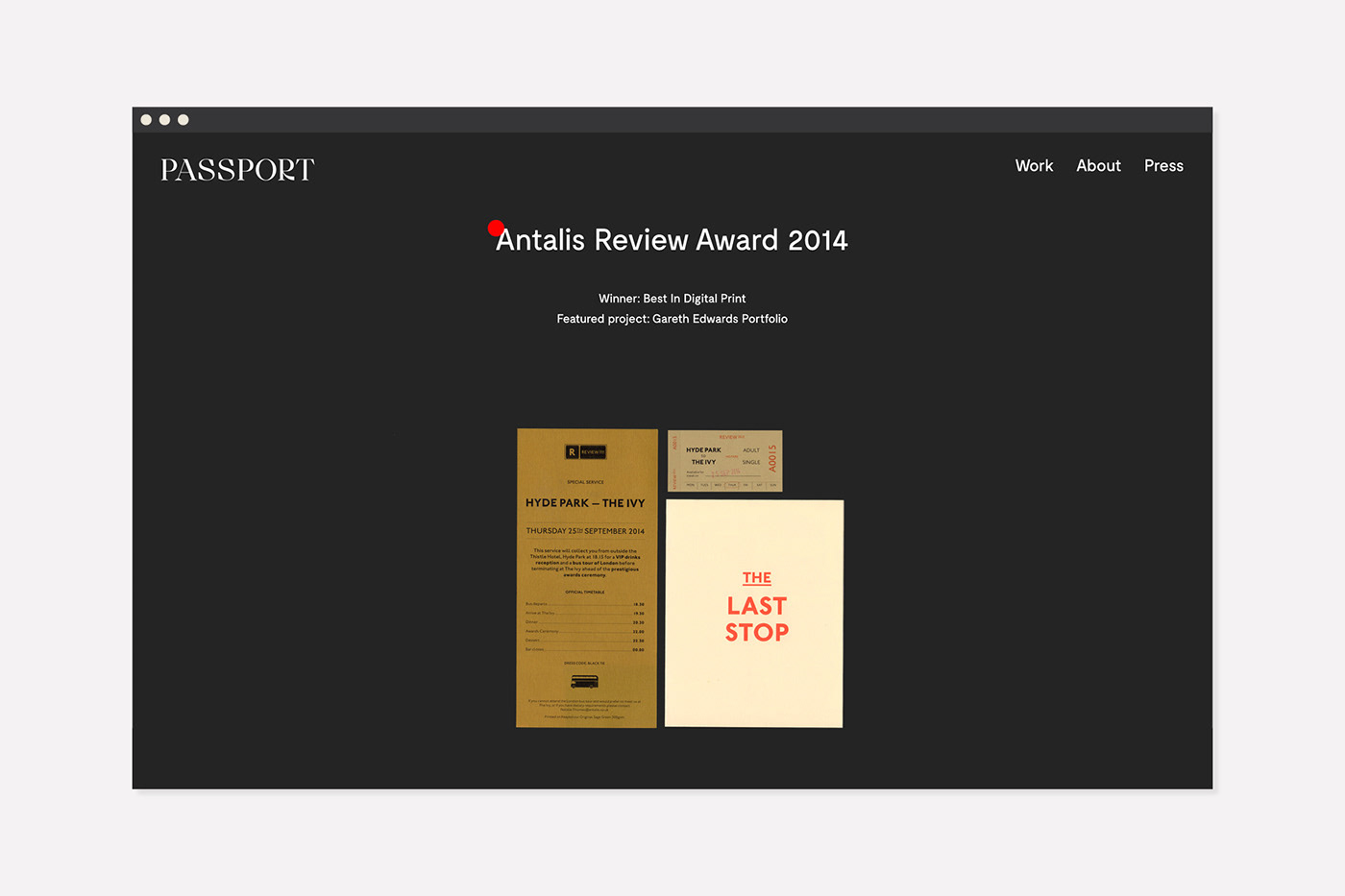
The new identity has been applied across a large range of printed collateral and a brand new website which you can view here