

Logo design for Mountain High Consultant
Client
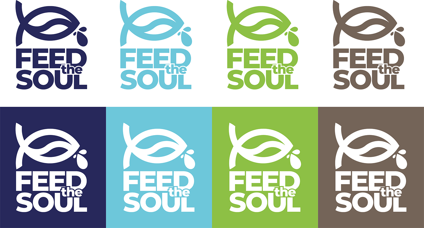
Feed The Soul
Services
Logo Design - Flyer Design - Brochure Design - Icon Design
Logo Design - Flyer Design - Brochure Design - Icon Design
The Mission
Create a logo design for a charity called Feed the Soul that was founded with the aim to improve the living standards of some of the most vulnerable communities throughout the world by providing water wells and sanitation solutions. People at Feed the Soul Foundation believe everyone deserve to have clean drinking water.
The Output
I have redesigned their current logo design. Their identity needed a major update as it was outdated comparing to their competition. As the organization has strong christian values we developed the logo design based on these values.
The Impact
Finally, the Feed The Soul brand has a strong identity. Also, the logo design and the other brand elements are give a consistent look throughout all the channel they are using promoting their generous cause.


Many values
compressed
in small
symbol.
compressed
in small
symbol.
Logo Design for a Charity
Firstly, I have researched the organization and the industry as it is very competitive. Feed The Soul brand has strong Christian values and the idea of the company came from 40 days fasting. The logo design had to reflect company core purpose what is, to provide clean water, but it should also factor in their long-term goal of growing self-sufficient communities through agriculture. The challenge was there. Compress a lot in a simple logo that is reflecting all the values and still not overwhelmed like their old badge. I had some idea in my head so started my process. First and foremost, as all my logo design this started on a paper too.
During the idea generation phase I wanted to explore the route of combining the water and Christianity in one symbol. This is how I ended using a fish/ichthys symbol. In addition, I tried many ways of merging the water element into the design. As a result of this process I came up with the above idea. Also, I have added three water drops to the logo mark. The number 3 is a significant element in the Bible.
Last but not least, finding the best typography that is supporting the logo is not an easy decision. To support the ichthys mark I have settled with bold sans serif font that complement the logo design. Furthermore, it gives a sense of a strong and well-established brand.
The logo now reflects the values and core purposes of the brand and also aligned with their slogan. “We never look down on someone unless we are helping them up”
To see more examples of my logo design work look at my logo design portfolio, or use the contact form if you are interested in a logo being designed for you and your business.


Color & Material
As the company main purpose is to provide water I wanted to use shades of blue. The deep navy blue colour gives the strength and the light blue complement it with a soft feeling.


Web and Logo Designer Leicester, Oakham, Rutland, Logo Design UK


