GNN is a network of specialists about immunization that operates within WHO.
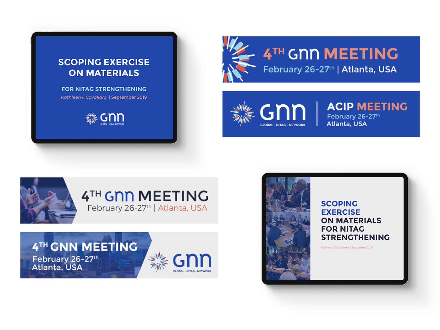
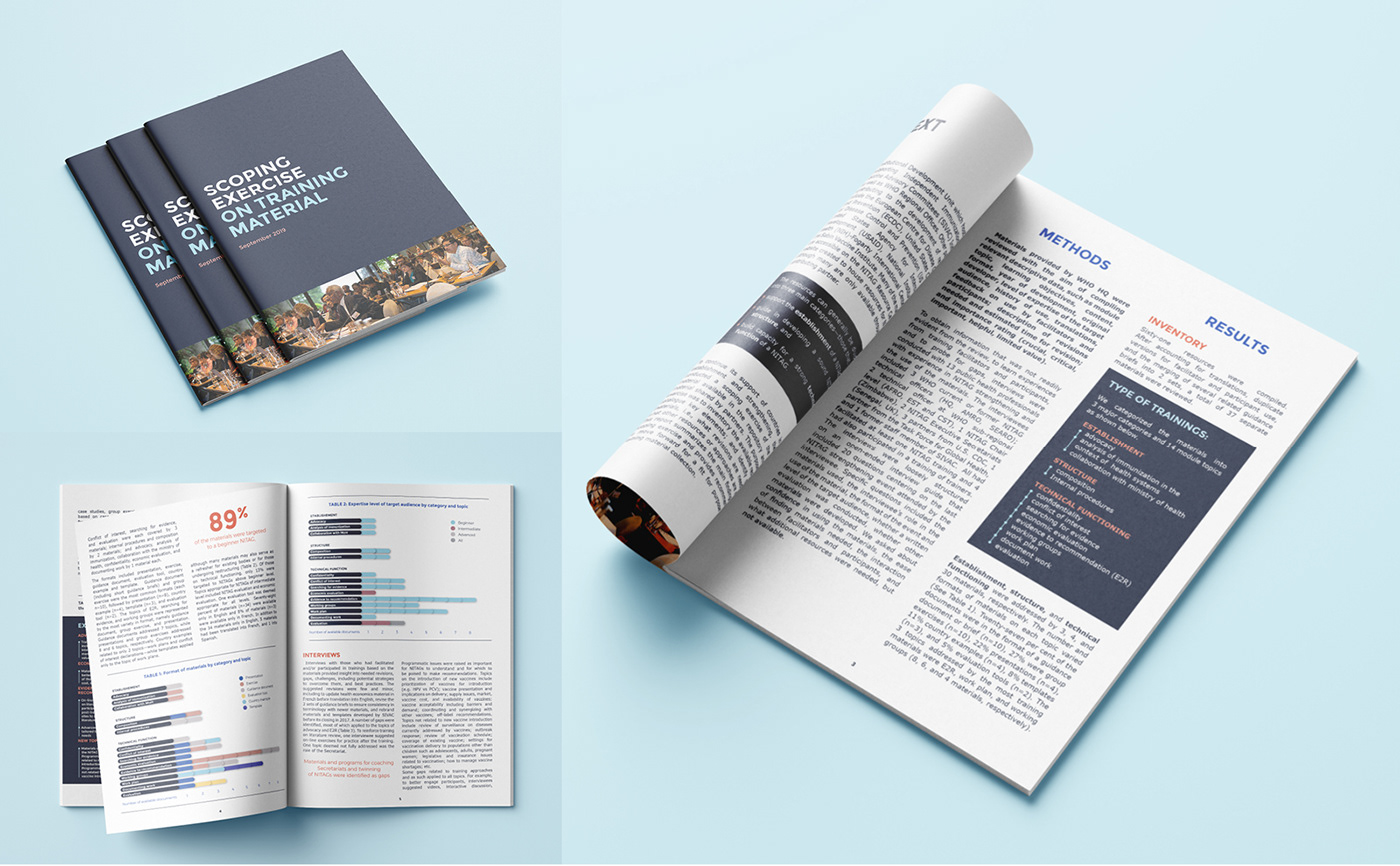
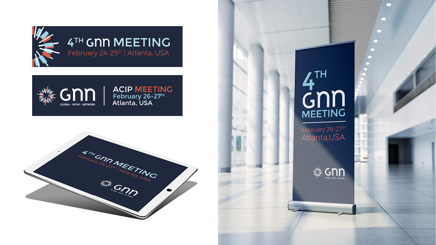
New visual identity (logo, media support...) for the internal communication (rapports, presentations, meetings...).
New visual identity (logo, media support...) for the internal communication (rapports, presentations, meetings...).

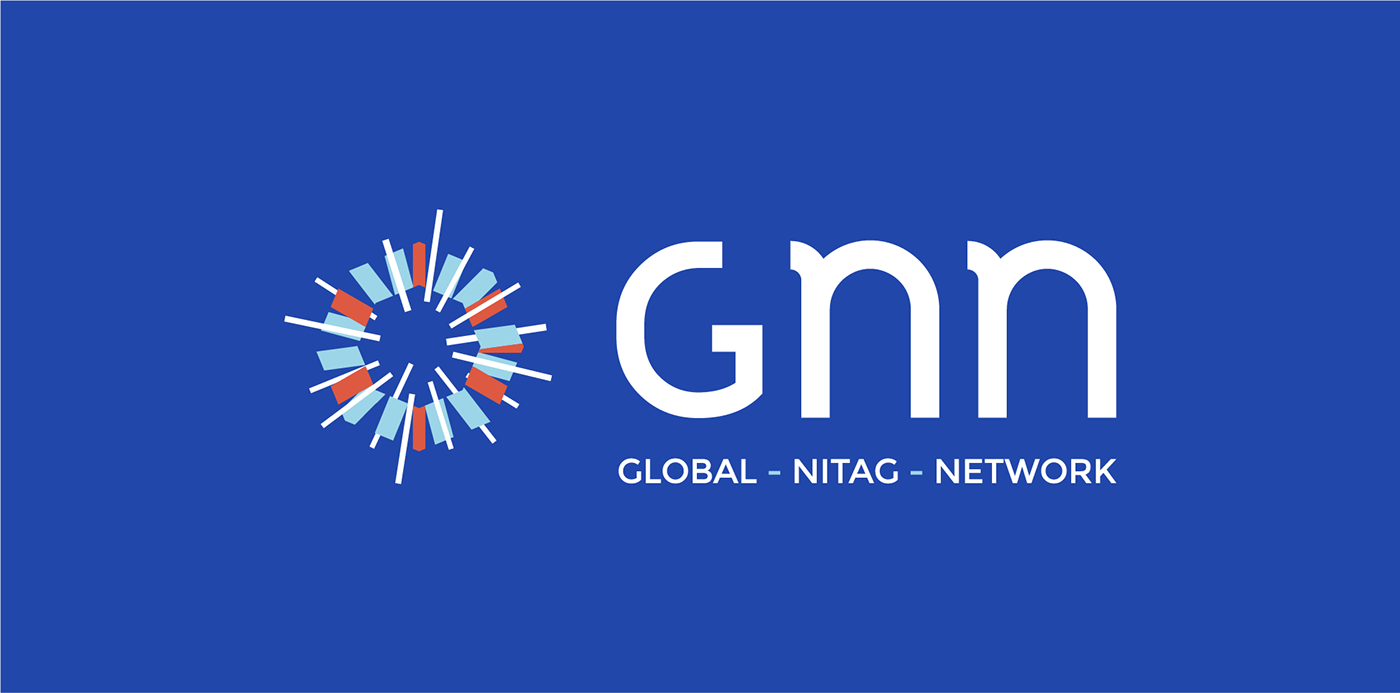
The icon: the polygon shape evokes the science aspect and the versatility. The lines pass through and emerge from the polygon to bring a dynamic effect. It shows the exchanges of knowledge and the action, influence and radiance.

The font: the G is in capital letter (serious, strong and global), the two Ns are in lowercase to bring a human feeling. The custom font makes also the logo name recognizable without the icon.

The color palette represents the medical world, science and the institution (by the shade of blue), the orange brings the action feeling.