
GEMFLAVOR FOOD 金輝煌食品
Gemflavor Food is an enterprise with a long history in Zhanjiang City. With the strategic development of the brand in the national market, the brand image is upgraded correspondingly.
The outlook of five colors is the representative of the concept of Chinese colors. They have gradually evolved from everything in nature, dyeing, weaving and craftsmanship to the colors we see today. Red represents fire in the five elements, originating from blood and sun and implying“creation”. “Fire Red”, a new brand color of Gemflavor Food managed by the father and the son, represents“passing down from generation to generation” and reflects the dedication for the products and the hope for the future.
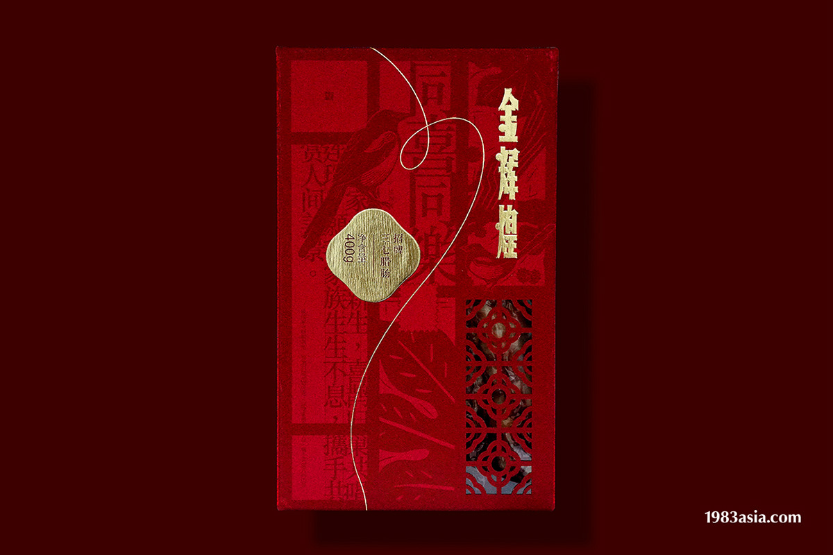
Gemflavor Food tells the story about “affection”. Brand label is based on the artistic calligraphy of the Republic of China and symbolizes the solid foundation of the enterprise. In the heavy label, calligraphy is written with lines in an overlapped manner. It not only condenses the affections of two generations but also reflects the possibilities that the brand develops with the changes of the times. Then, the unique self-value is found from the market.
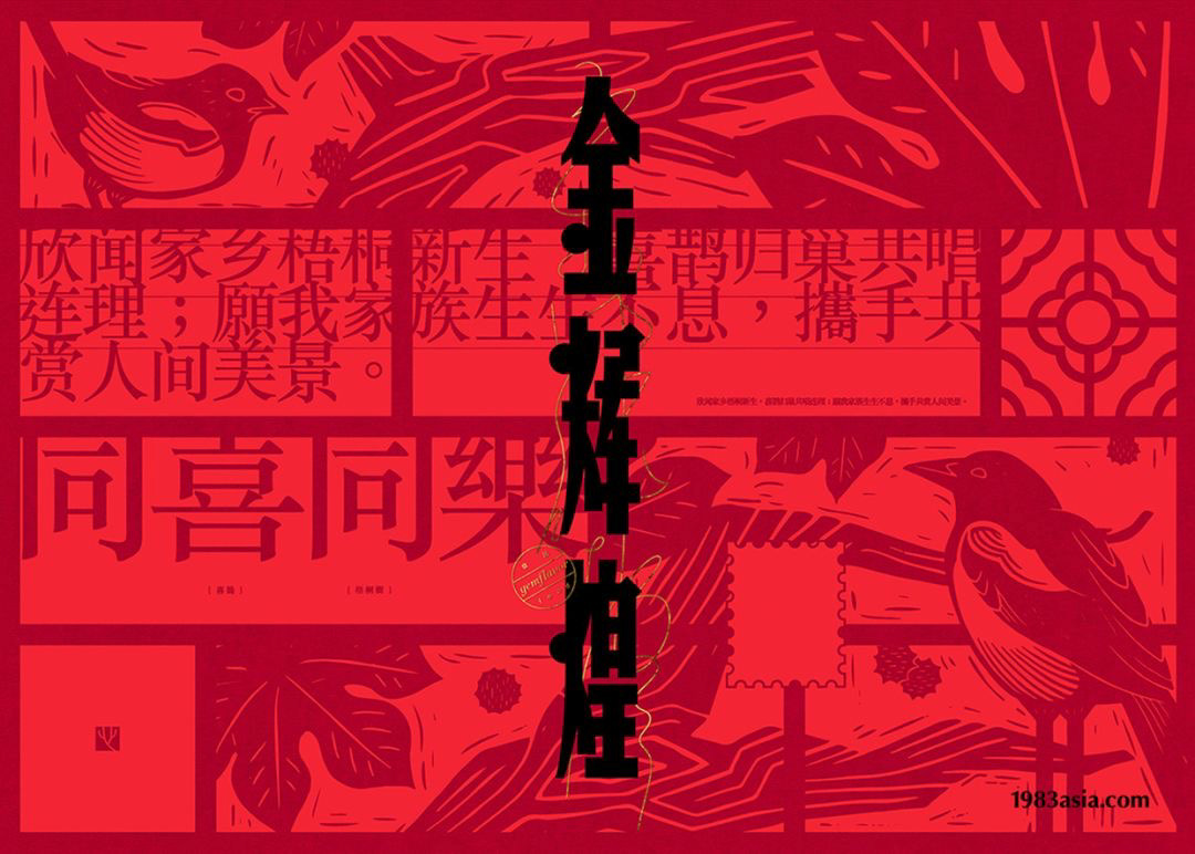
Chinese aesthetics is inseparable from “homophonic meaning”, which is a kind of romance conveyed by introverted orientals. Taking“sharing happiness together” for example, the ancients used the patterns of “Chinese parasol” and “magpie” to express good wishes for their families. They used“the white-headed for richness”, “Chinese pulsatilla” and “peony” as love congratulations. They used“longevity”, “cat” and “butterfly” to express their wishes to the elderly. In the vision, the pattern of “the cabinet” is used to divide the picture, and the perception of “affection”from the brand owner is cleverly transformed into texts. Combining such elements as “heart-shaped” chops, paper-cuttings and stamps, it generates a unique, sustainable and visual form of Gemflavor Food. Like a letter from home, people have their affections filled between the lines, getting slowly across mountains and rivers, witnessing time passage and experiencing the beauty from“slowness” and the joy from waiting.
Spread out the letter paper, let time pass by, write down the extraordinary with a pen and inherit it for a hundred years.
金輝煌食品,是湛江歷史悠久的企業,隨著品牌邁向全國市場的戰略發展,品牌形象也隨之升級。
五色觀是中國色彩觀念的代表,從自然萬物到染織、工藝等逐漸演變成今天所見之色。紅,脫胎於赤,五行屬火,源自血液、太陽;寓意「創造」。金輝煌食品全新的品牌色「薪火紅」,除了是品牌主理人父子的「薪火相傳」外,更是品牌對產品的用心,還有對未來的寄情。
金輝煌食品講述的是關於「情」的故事,品牌字標取材民國美術字,象徵企業堅實的基礎;在厚重的字標以線條的形式重疊書寫書法,除了凝聚了兩代人的感情,更體現品牌隨著時代變化而發展出更多的可能性,從市場中找尋到獨特的自我價值。
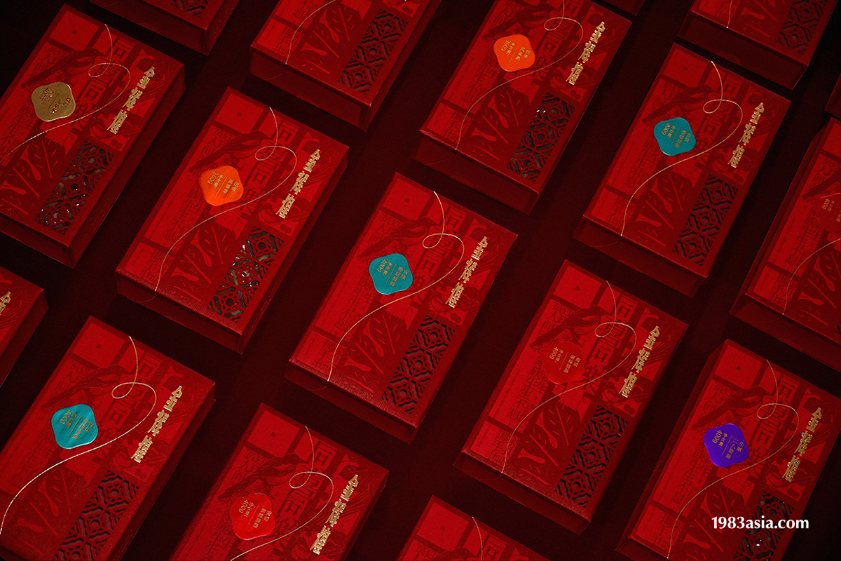
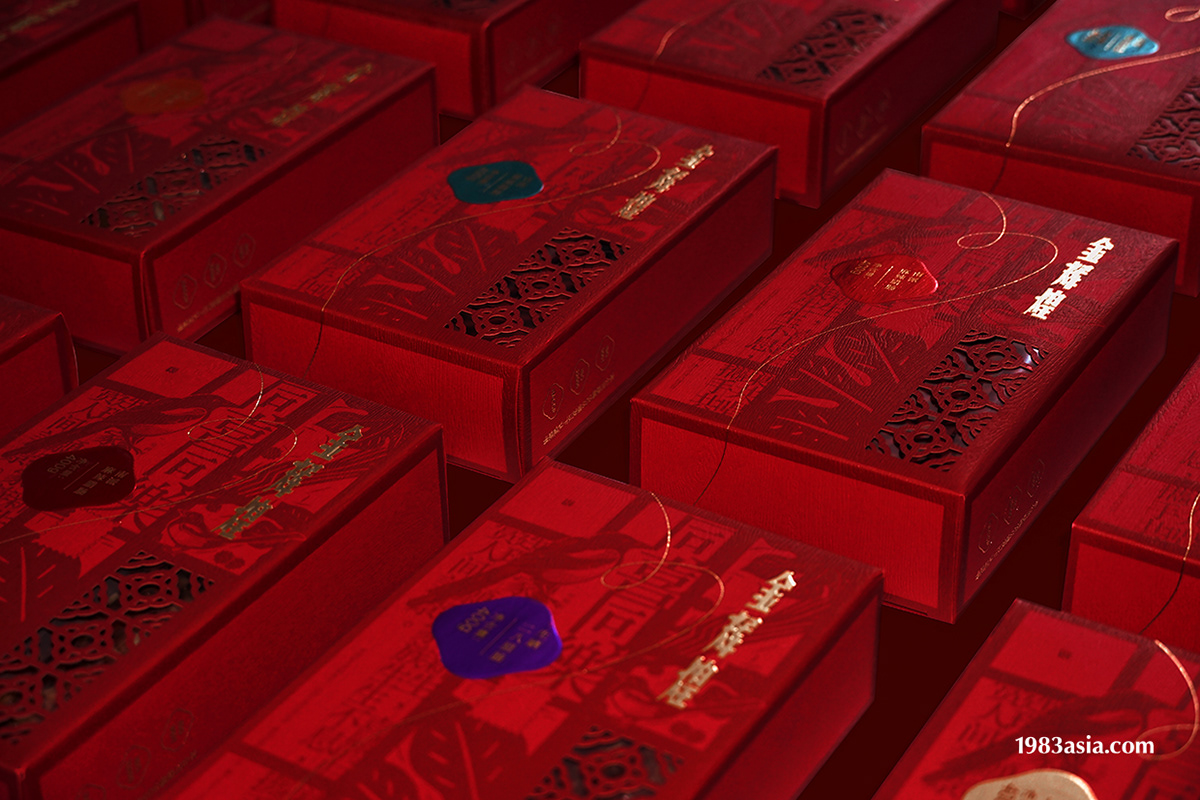
中國美學離不開「諧音取意」,這是內斂的東方人傳遞感情的一種浪漫。例如「同喜同樂」,古人會以「梧桐」和「喜鵲」的圖案蘊含對家庭美好的祝福;會以「白頭富貴」,「白頭翁」與「牡丹」為愛情祝喜,會以「壽居耄耋」,「貓」與「蝶」向長輩寄意。在視覺以「百子櫃」的格局進行畫面分割,巧妙的將品牌主理人對「情」的感悟轉化成文字、融合「心」之章、窗花、郵票……等元素,形成金輝煌食品獨特的、可持續延展的視覺形式;像一封家書,字裡行間浸潤著情,緩慢的從走在山河大川,走在時代更替,重溫「慢」所帶來的美好,一份等待的喜悅。
攤開一卷信紙,研磨時光,執情為筆,寫下非凡歲月,傳承百年薪火。
CATEGORY|PACKAGE DESIGN 包装設計 AGENCY|1983ASIA DESIGN DIRECTOR|YAO & SUSU 楊松耀 & 蘇素 EDITOR|JERRY 黃雲澤 DESIGN & ILLUSTRATION|YAO, SUSU, HE JING, LI HONG YU, CAI XIU LING, ZHANG YU RONG, , JAMES BOND 楊松耀、蘇素、賀靜、李鴻宇、蔡秀玲、張鈺榕、凡人 EDITOR|JERRY 黃雲澤 PHOTOGRAPHER | AWING CHEUNG 張雅穎 YEAR|2019 COUNTRY|CHINA, ZHAN JIANG 中国, 湛江


1983ASIA
WEB:www.1983asia.com
WECHAT:1983亚洲造
MAIL: the_1983@foxmail.com
TEL: +86-0755-86233262
ADD:中国深圳华侨城创意园北区B3栋东侧604
604, B3 building, OCT loft north area, Nan Shan district, 518000, Shen Zhen, CHINA.


