


Very close to paradise
Redesign of a magazine about the people and life in the Tegernsee Valley
for Münchner Merkur


For more than a decade, the magazine “Seeseiten” has stylishly presented the Tegernsee Valley’s attitude to life with sophisticated stories and emotional imagery.


All the stops were pulled for the anniversary edition: from the creation of special graphics to the exclusive finishing of the title.

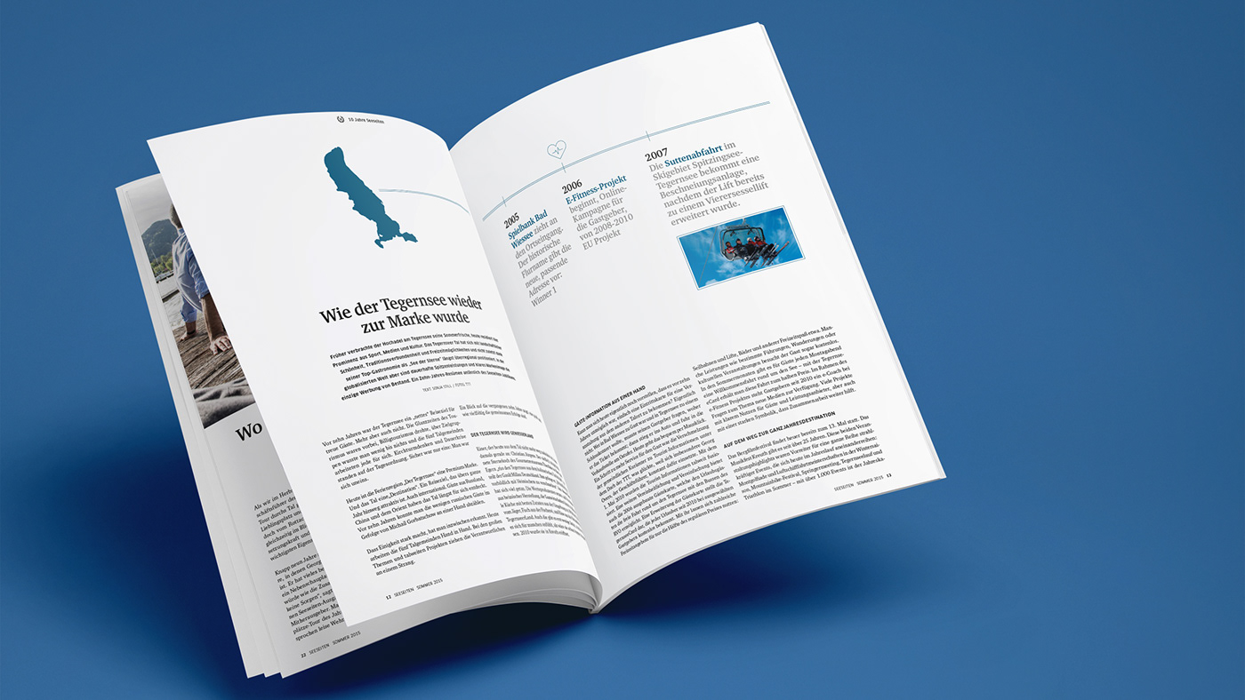


The Seeseiten are an institution in the Tegernsee Valley. Despite the high density of competition, the combination of authentic stories and emotional imagery was able to win over both locals and visitors.
In order to secure its role as market leader, Zeitungsverlag Oberbayern/Münchner Merkur approached us to redesign the magazine, which at that time we had already successfully laid out over several years, and thus to lead it into the next chapter of its eventful history.
The redesign brought about profound changes and modernisations in the typographic approach as well as in the visual language and production of the magazine. Even the advertising concept was revised in order to put the regularly published magazine on a secure financial footing.
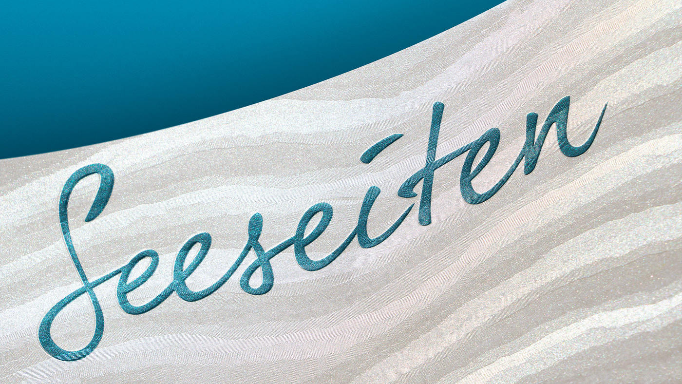
In order to celebrate the 10th anniversary of the Seeseiten in a fitting manner, a correspondingly elaborately designed special edition was developed in cooperation with the renowned Gmund handmade paper mill.
Credits
Editorial office Annette Lehmeier
Photography Thomas Plettenberg
Print Amper Druck
Paper Büttenpapierfabrik Gmund
This project was developed in cooperation with Soul Markenagentur


