
UI / UX Design for Swapit
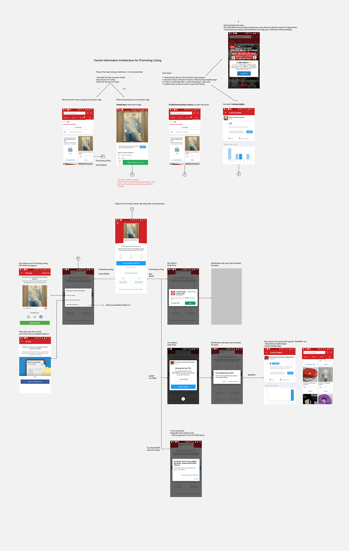
There was a need for sellers to post their listed items for sale to boost their chances of being seen by buyers. A competitor analysis was done between Carousell and Swapit, as Carousell introduced 'Bump' feature that enabled people to promote their listing via social media sharing, buying a '3-day bump', drop selling price for free bump, or wait for a week to get another free bump.
Based on the existing user interface of Swapit App in AOS and iOS, we posted a question on how and where to add a CTA within the existing user interface to enable sellers boost the chances of their items being seen by buyers.
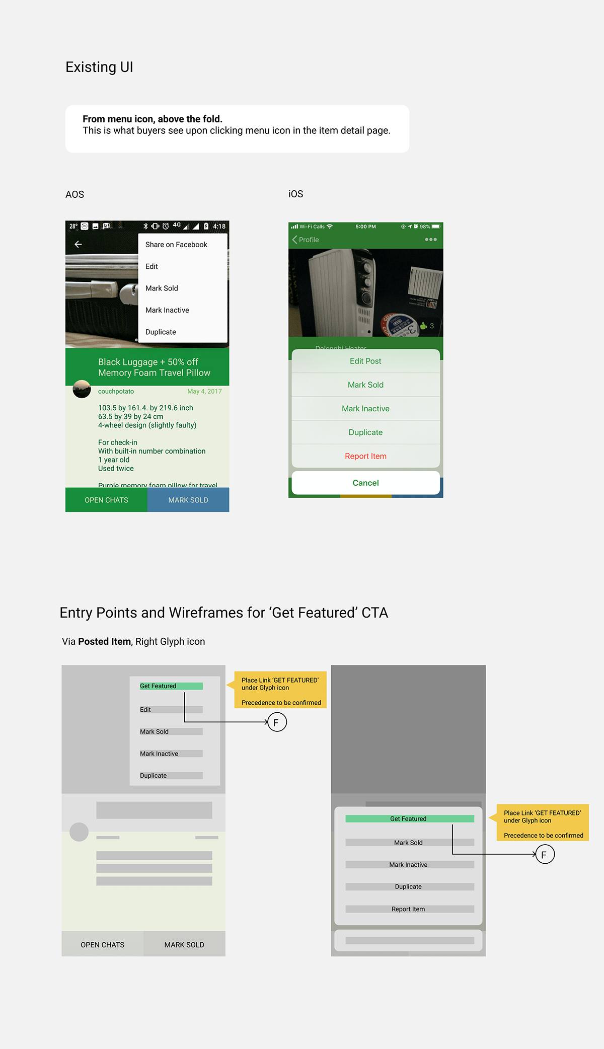
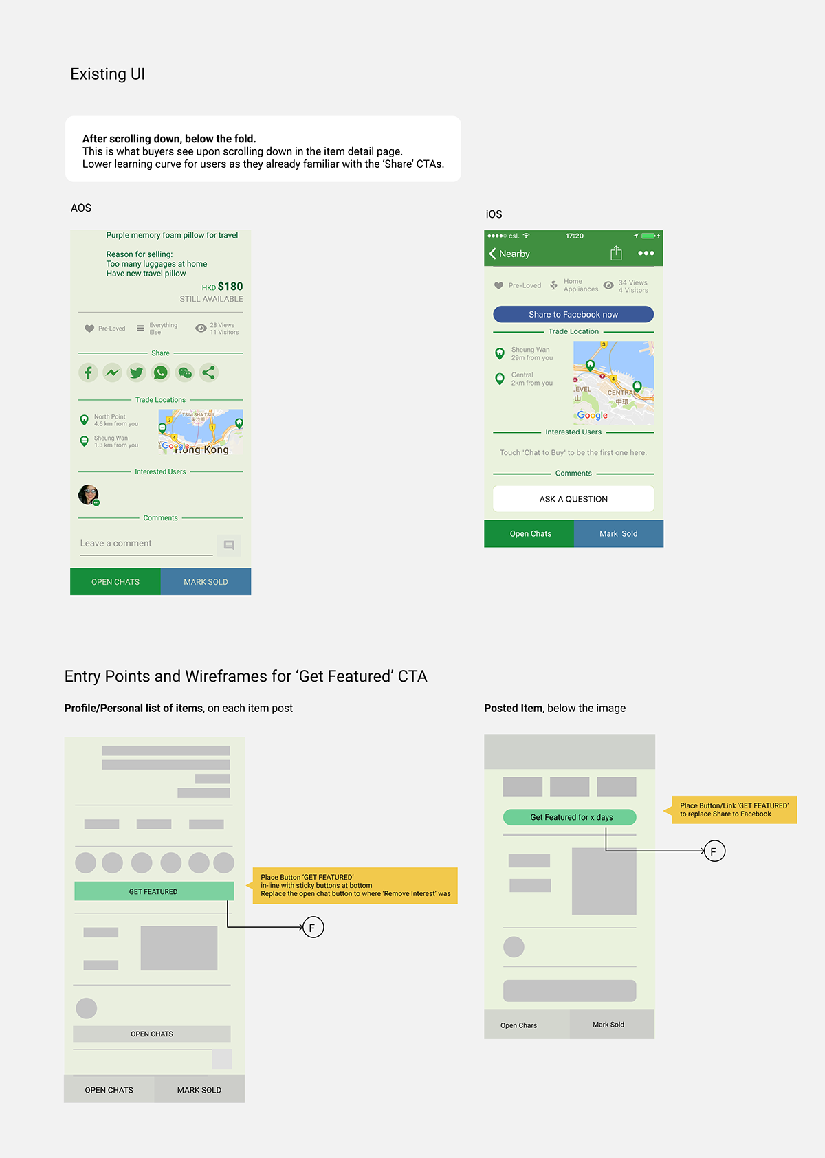
Several strategic entry points were identified to make it convenient for sellers to take an action via clicking a 'Get Featured' CTA. Please refer to all the identified entry points in the image below, from left to right.
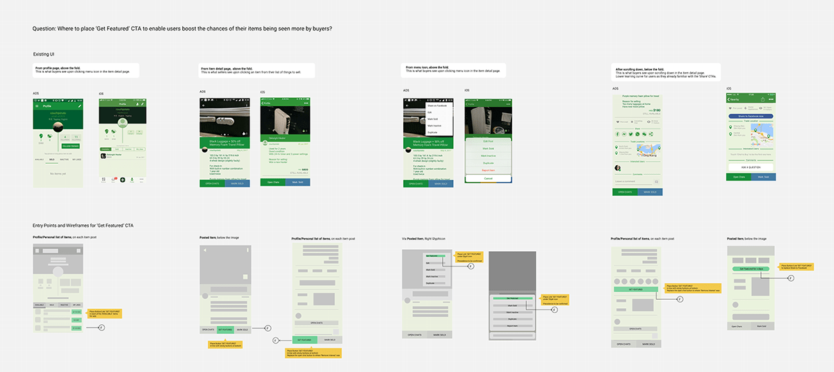
All identified entry points from existing UI
Let us discuss these entry points one by one:
From the user profile screen 'Available' tab, a seller could see the items listed for sale. As this has been identified as one of the first places a seller visits when using the app to check the whereabouts of his or her listings, this was chosen as an entry point for 'Get Featured' CTA. Refer to image below:

Entry point from Profile/Personal list of items for sale
Upon clicking a listed item under 'AVAILABLE' tab, the app goes to a screen that shows the details of the listed item. With the assumption that the 'Get Featured' is as important or even more important than 'Open Chats' CTA to users, as well as to increase the visibility of 'Get Featured' CTA, entry points were added as one of the sticky buttons found below the item detail page.

Entry point in-line with the sticky buttons, or to replace one of the sticky buttons
When a user taps on the menu icon found in the upper right of an item detail page, a list of secondary actions are shown (e.g. Share in Facebook, Edit, Mark Sold, etc.). Adding a 'Get Featured' CTA was also an entry point option. However, there is a slight discoverability issue, as the CTA is hidden inside the menu icon and might not be immediately visible to users compared to the previously mentioned.
When scrolling further down in an item detail page, a user can choose to share the listing via tapping any of the social media icons. Sellers already know these means as a channel for them to boost their chances of selling an item, there is a lower learning curve for people to discover this as an entry point for 'Get Featured' CTA. However, putting the CTA here might visually indicate that it is one of the ways to share outside of the App, unless CTA copy specifically says 'Get Featured in Swapit'.
The chosen CTA location for 'Get Featured' was in between 'Open Chats' and 'Mark Sold'. As a form of visual feedback to users after clicking the 'Get Featured' CTA, a modal was designed to further gain trust and to provide more information about the purchase to be made.
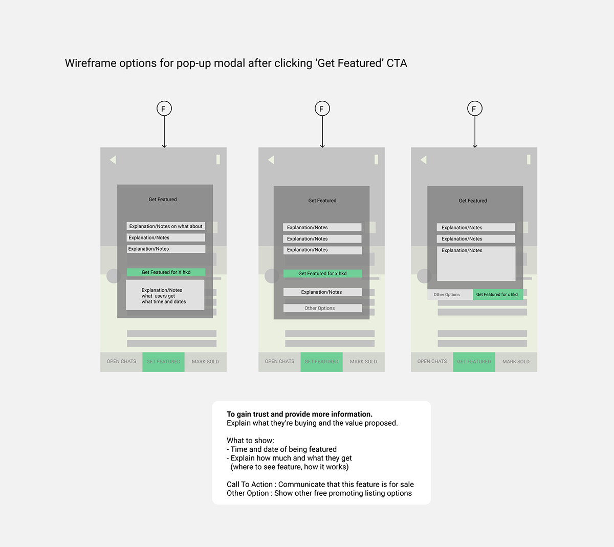
The final user flow delivered for Swapit users includes the CTA 'Feature' and a pop-up modal that encourages people to try bumping their items for 8HKD and to enter a coupon code for free.

About a year before, user feedback indicated that sellers requested to have a means to repost similiar items. The 'Duplicate' CTA was added to the list of actions that a user can select from the menu icon from the item details page that has been for sale. With the intention of enabling users to take less time to post a similar item and increase ease-of-use, "duplicating" an existing item for sale will generate a screen with a pre-filled content similar to the selected item for sale.
Through user interview for 'Feature' CTA, some users find the coupon to be fun but they did not feel the need to come back to pay for promoting their listing. User interview also revealed that a seller would rather create a new entry and post the same item because it would be for free. When asked about the 'Duplicate' CTA, it was not easily visible to the sellers. Upon letting sellers know about the 'Duplicate' CTA, it would be more preferable to them than to pay for promoting a listing.
Final takings on this case study
It was observed that the functionality of 'Duplicate' and 'Feature' led to the same outcome for sellers. It would be interesting to know if users will find more value to being featured if the price was set to a lower price, given that the sellers could not justify the value proposed versus the set price. Also, if 'Duplicate' and 'Feature' CTAs were compared with similar discoverability (e.g. being placed on the same location at the same time), an A/B testing could be prepared to make further findings.
Sometimes, it is best to not add a feature just because a competitor did so. However, it is always a good practice to understand as to why and how a certain feature could make or break the user experience of people who are using a digital product. This case study has taught us how a discoverability of a single CTA (e.g. 'Duplicate) could have a great impact on a seller's user experience.


