The Client
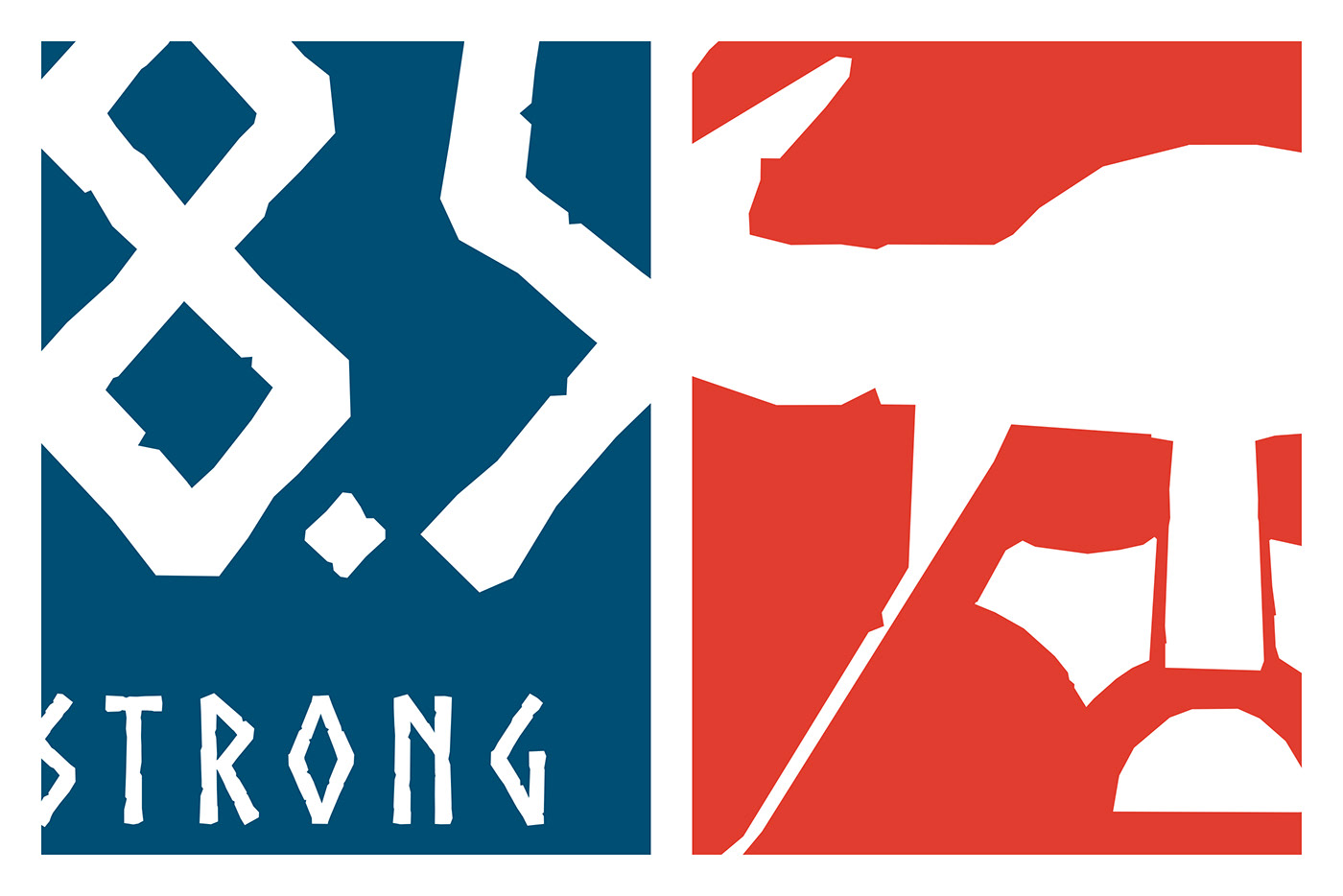
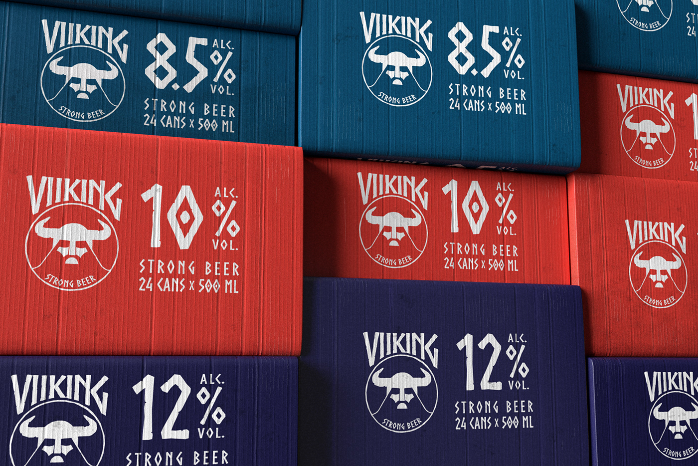
VIIKING is danish brewery Harboe’s Strong Beer brand consisting of three variants: 8,5%, 10% and 12%, mainly sold in closed cartons.
The Objective
Create a simple and easy to understand/use identity & packaging for VIIKING.
The Solution
The most important with strong beer brands is, of course the alcohol volume, so it was naturally to build the packaging design around this. Besides that, with the name VIIKING, the design pretty much created itself: Rough, strong and maskulin. Using only three elements, one colour, a distinctive typeface and the logo, the design is simpel and Scandinavian minimalistic while the roughness of the font and logo, gives the feeling of runes and rocks.