Project assignment :
Rebranding project for Beyond Social Services
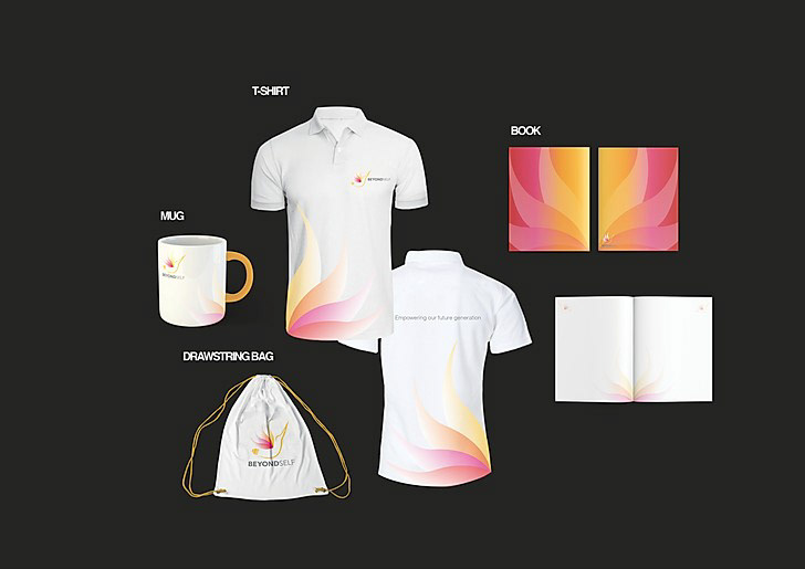
• To create a brandmark, stationery set and 3 other applications to the given company.
• To produce the company’s brand identity guidelines
Proposed logo :
The font used for "Beyond" is Helvetica bold as it is a thick and clear font and the letters are displayed boldly and confidently in nature, signifying the company's strengths which are to be strong and unwavering in what they do with their goal at hand. The goals of helping the youths and volunteers with their specialities which they are determined to do so. The font used for "Self" is Helvetica light and it brings a slightly more elegant and stylistic look to it, making it look like a professional self which we want people to feel when they come on board to help others. As we want all our volunteers and teenagers to feel as if they are part of the "Beyond" thus the same font is used. By using these fonts and styles of the same for both Taglines and Words, we are able to clearly showcase what we stand for as it is a clean and versatile look towards it and what we will achieve in the success of our time.
The tagline is in a Helvetica "light" font, it says "Empowering Our Future Generation." Beyond self is a group of volunteers who will educate the future by working together and caring for the future generation by motivation and nurturing them into better individuals. It is to hold the heavy weight of the future, and being in our hands we should and must care for what we can while we still have the chance to change and shape the future for a better and brighter one like the Humming bird's light bulb body. All in all, the tagline was created with the intention of making the company and ideas we have last till long in the future, that we can "empower" our future generations into a much better and brighter outcome.