The basic idea of this project was to create a brand that stood out from the others in the market, maintaining an aspect of nobility associated with simplicity.
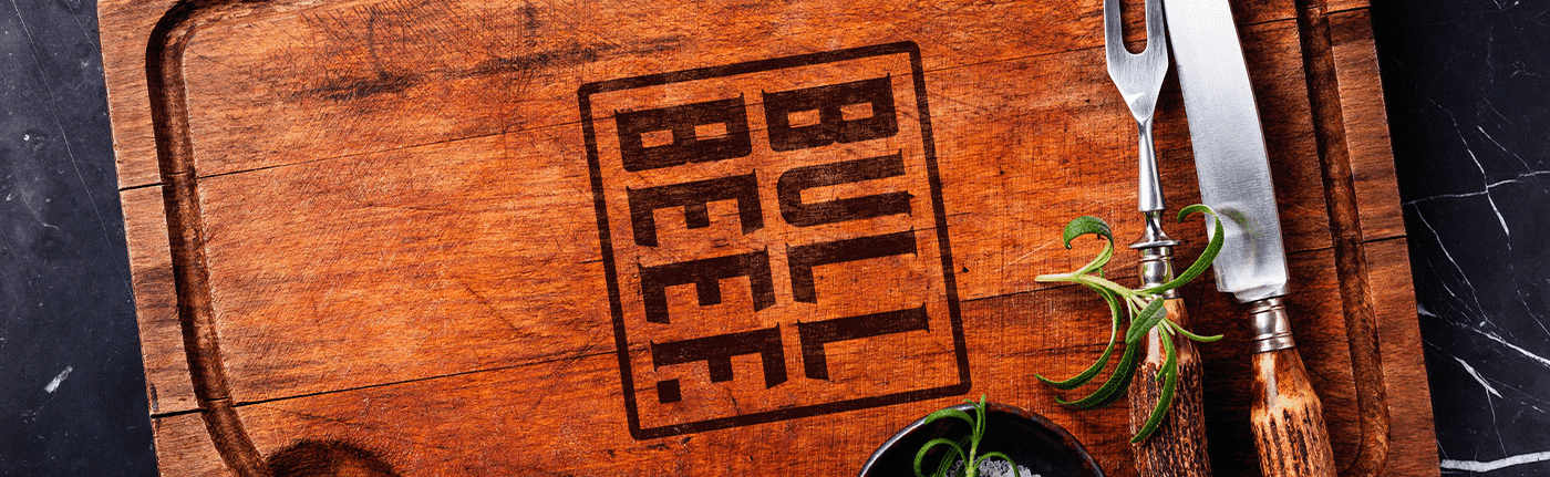
The proposal was to do something that referred to a stamp, shield or seal. In this way, a rectangle is found around the name that delimits the mark.
The tipography was designed exclusively for this brand, where each letter is presented in a strong and robust way, referring to the personality of an BULL.


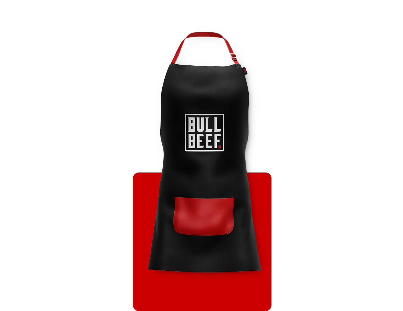
To harmonize the project, strategic colors were chosen.
Red was used to refer to the color of the freshest meats. According to color psycology it is an emotionally intense color. It increases human metablism, increases breathing rate and increases blood pressure. In addition to arousing emotions and motivating us to act, to buy.
White was chosen to maitain the clean aspect of the project and also to mean safety, purity and cleanliness.
Black was used for referring to power,security, elegance, causing and impression of authority.