Caught in the Net
Client: Hypermarket
Designer: Zuzana Lednická
Cooperation: Zdeněk Trinkewitz (3D graphics), Jonatan Kuna (illustrations), Jakub Spurný (typography)
Font: Rhymes
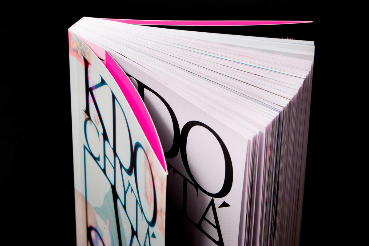
Type: Poster, Book
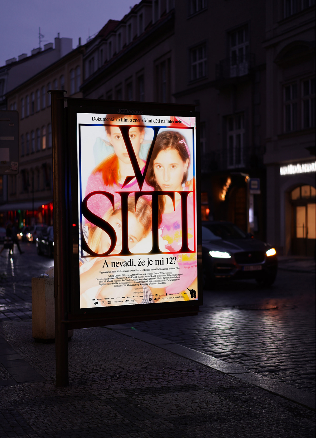
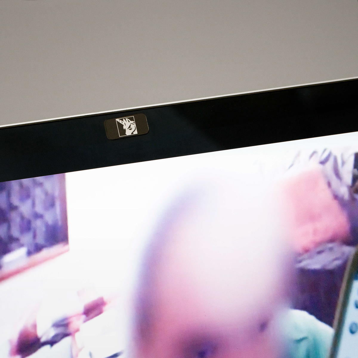
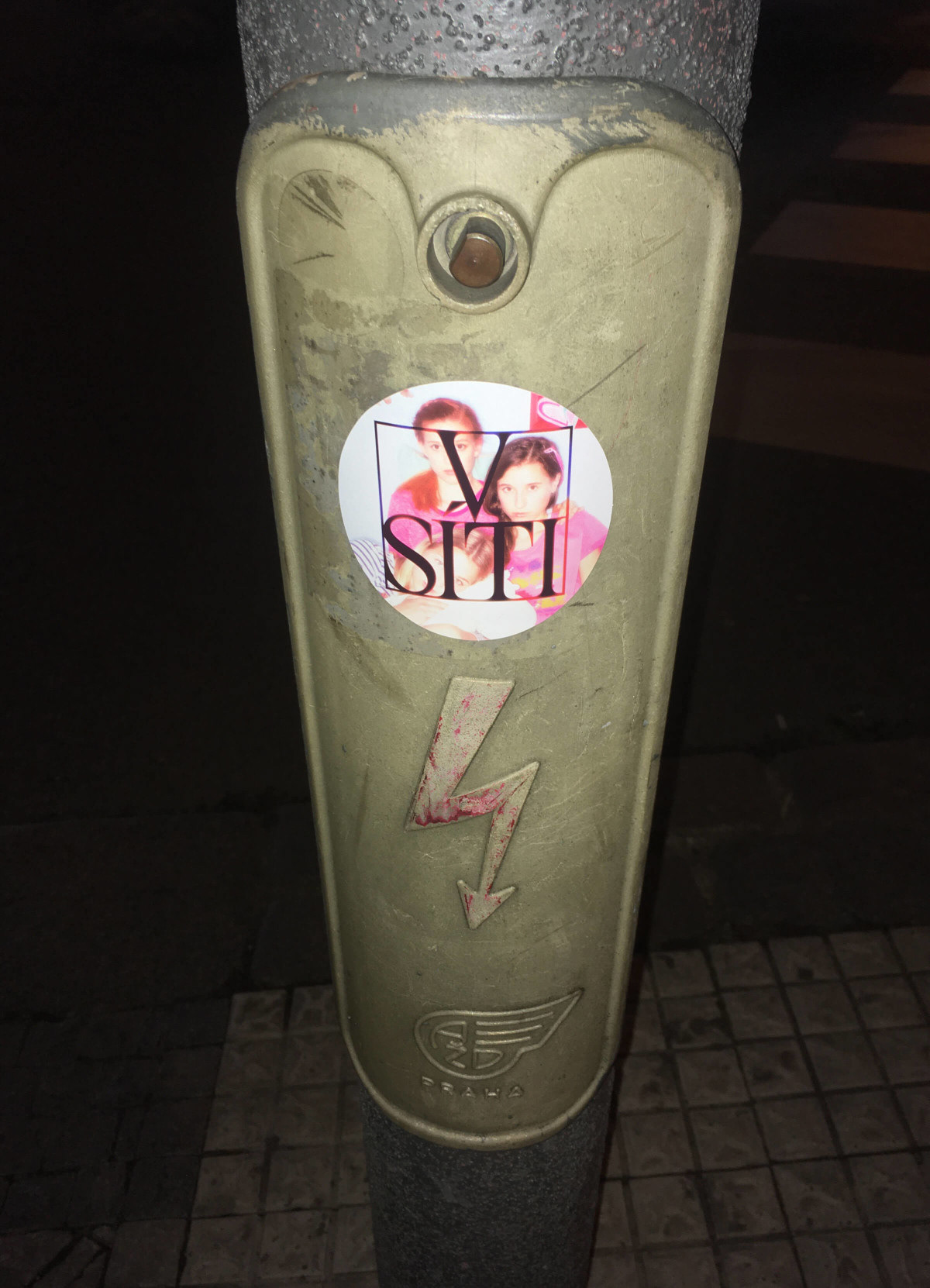
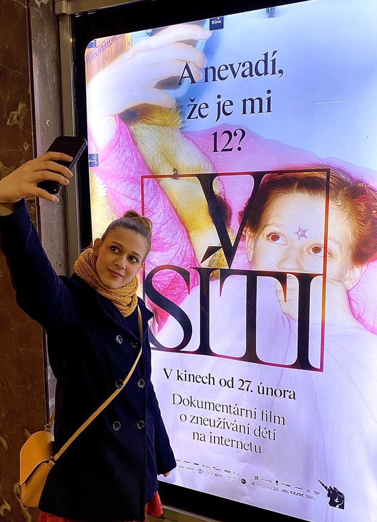
“Agent provocateur trash by the way of a viral YouTube video – yuck,” commented someone aptly in the discussion on the net. The aesthetics of the poster confront the über-filtered virtual world of the Internet with the relentless spider grid of a classically strict logo in an Instagram square overflowing with black slime. The net is an archetype – a dark Little Red Riding Hood forest hiding a variety of desires, now only accelerated by the Internet. A space that children enter with curiosity, usually utterly unprepared for the fight over innocence of their body and soul. It is also home of the movie’s “mascot”, a small unicorn, an ancient symbol of power and virginity with a phallic horn on its forehead, quietly inhabiting children’s rooms in the form of plush toys. For us, it guards the computer camera covers – discreet back doors for predators from the net.