Overview
채온은 국내에 이미 팬층이 두터운 "꽃차" 브랜드이다. 기존의 이미지를 좀더 세련되고 단아하게 탈바꿈하고자 브랜드 전반적인 리뉴얼 작업을 진행하였다.
특히 이번 프로젝트는 기존의것을 버리고, 완전히 새롭게 바꾸는 작업이 많이 이루어졌다. 심볼, 폰트, 컬러 모두 기존과 확연히 다른 새로운것들을 사용하였다.
Chaeon is a "Flower Tea" brand that already has a large fan base in South Korea.
To make the existing image more refined and elegant, the brand renewal was carried out.
This project, in particular, was not about transforming the existing one, but about throwing away the existing one and starting anew.
Symbols were also newly developed. Brand colors and fonts all used distinctly different things.


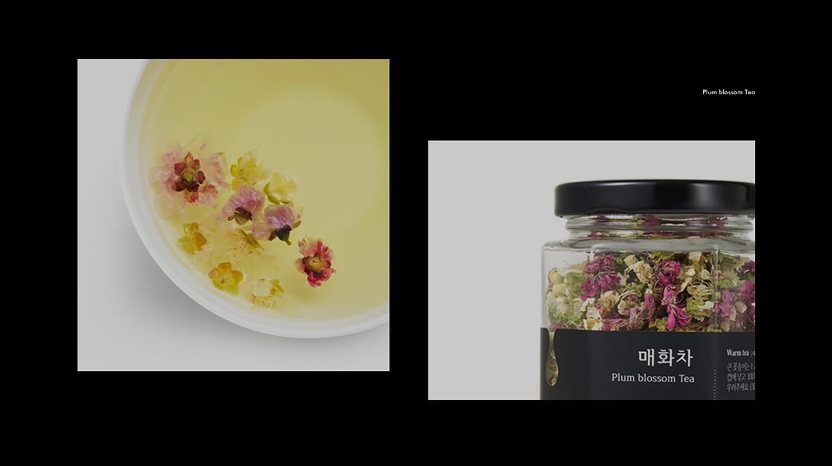
Motif : 차를 우릴 때 사용하는 다양한 다기들을 모티브로 "채온" 의 한글 표기 "획" 들을 표현하였다.


Structure : 패키지 구조는 "보석" 에서 영감을 얻었다. 정확히는 "보석함" 이라고 할 수 있다. 아름다운것을 담는 상자. 꽃차를 담는 용기와 상자모두 좀더 특별하길 원했다. 각진 주얼리박스를 떠올리며 채온의 병과 박스를 디자인 했다. 병과 상자 모두 "육각형" 의 구조를 사용하여 보다 소중하고 특별한 무드를 잘 느낄 수 있다.