Client: Aki-To (Self-initiated)
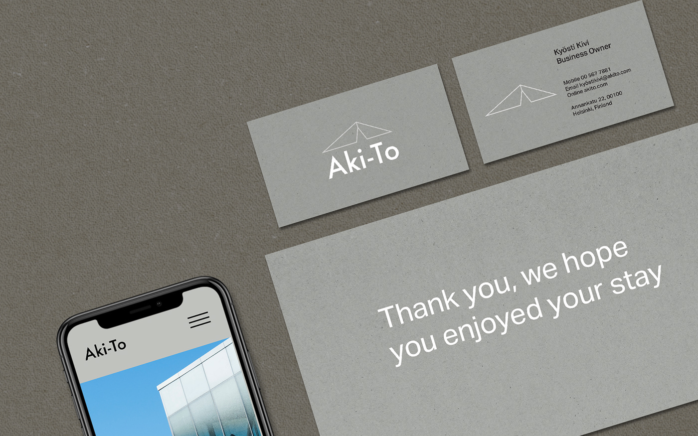
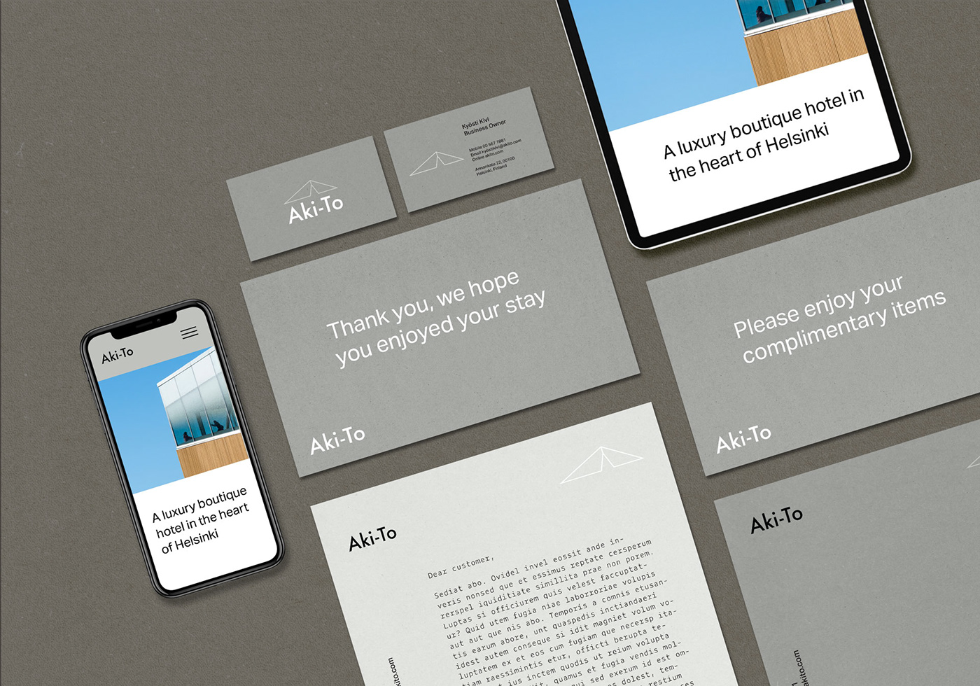
A luxury hotel is to be opening soon in Helsinki, Finland. Owned by two young Finnish architects, the style of Aki-To is sharp, minimal, modern, and distinctly Finnish. Following a full design process I created branding for the hotel that is minimalist, clean and refers back to the architectural foundations of the Hotel.

In the initial stages of the project I grabbed a notebook and a pencil and sketched out all my ideas for the logo design. Using pencil and paper is really crucial to getting ideas out quickly and efficiently. Next I moved into Adobe Illustrator to develop my best ideas, then narrowed it down to a final three.


Option One. This direction uses a simple geometric symbol that follows the sharp arches common in Finnish architecture. Paired with a sans-serif font the overall mood is Scandinavian minimalist.Three refined logo options
Option Two. In this version a sans serif font has been customised to create a unique wordmark.
Option Three. To emphasise sharp edges I created a version that has outlined text with a customised letter A. Paired with a vibrant yellow this direction appeals to a contemporary audience.


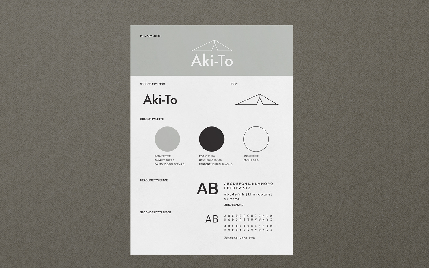
For the final logo design, I decided to use option one as it aligned well with the values of modern simplicity, and luxury. It also has an architectural style, which sets the brand apart from other luxury hotels and provides a memorable point of difference.