TASK & SITUATION
A small family business called “Kilkų ūkis” was in need of a rebrand. A client had a request for a new, clearer, a way more suitable name for an international market. A large number of product types they produce needed a system to be applied using the packaging solution. Besides a client requested to gain a modern, minimal and attractive look.
A small family business called “Kilkų ūkis” was in need of a rebrand. A client had a request for a new, clearer, a way more suitable name for an international market. A large number of product types they produce needed a system to be applied using the packaging solution. Besides a client requested to gain a modern, minimal and attractive look.
SOLUTIONS
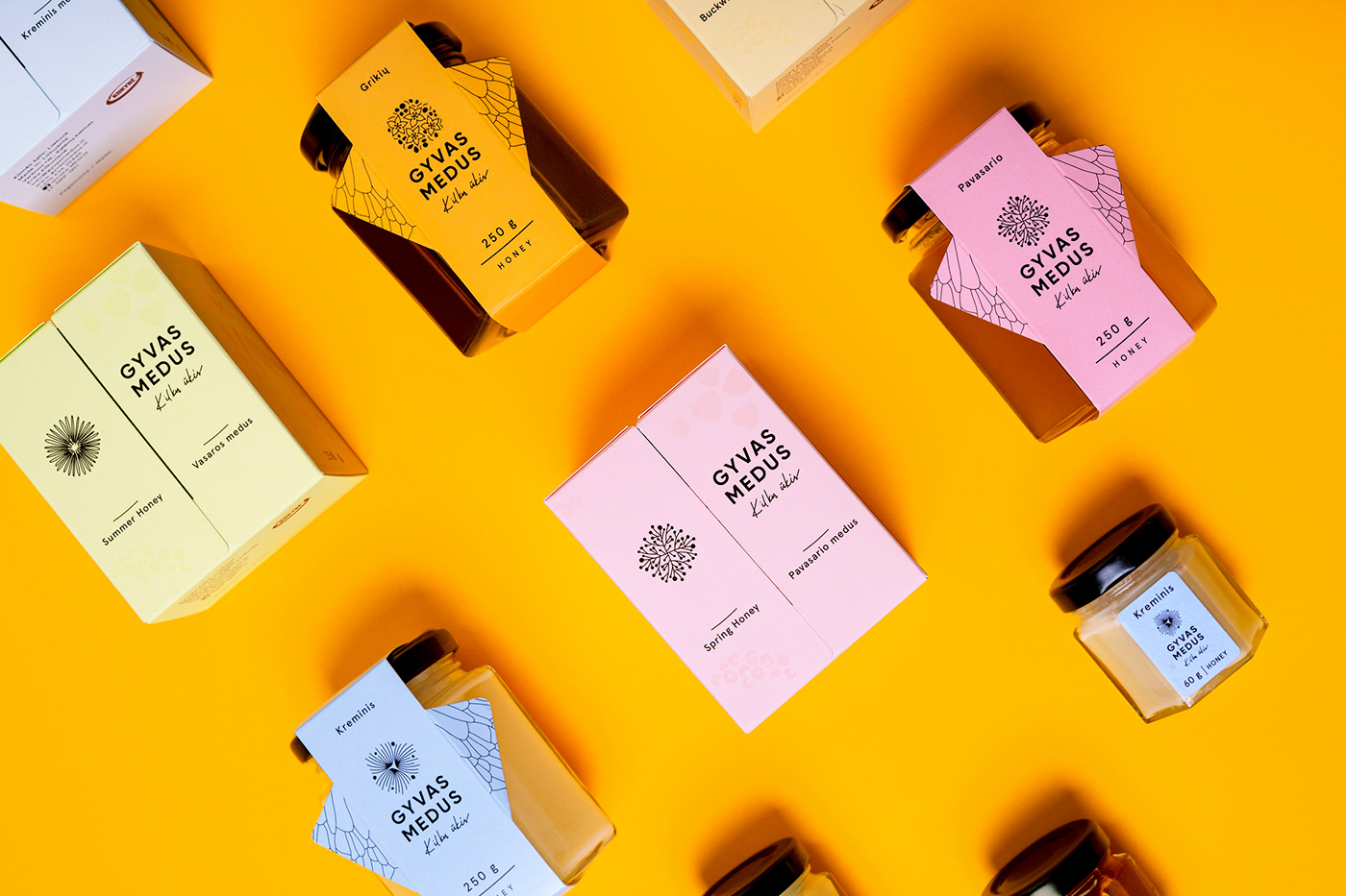
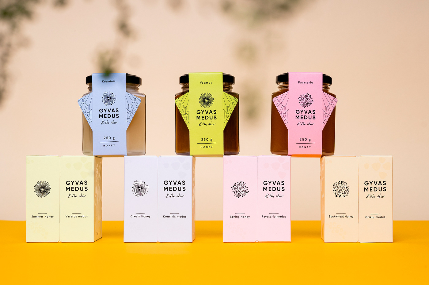
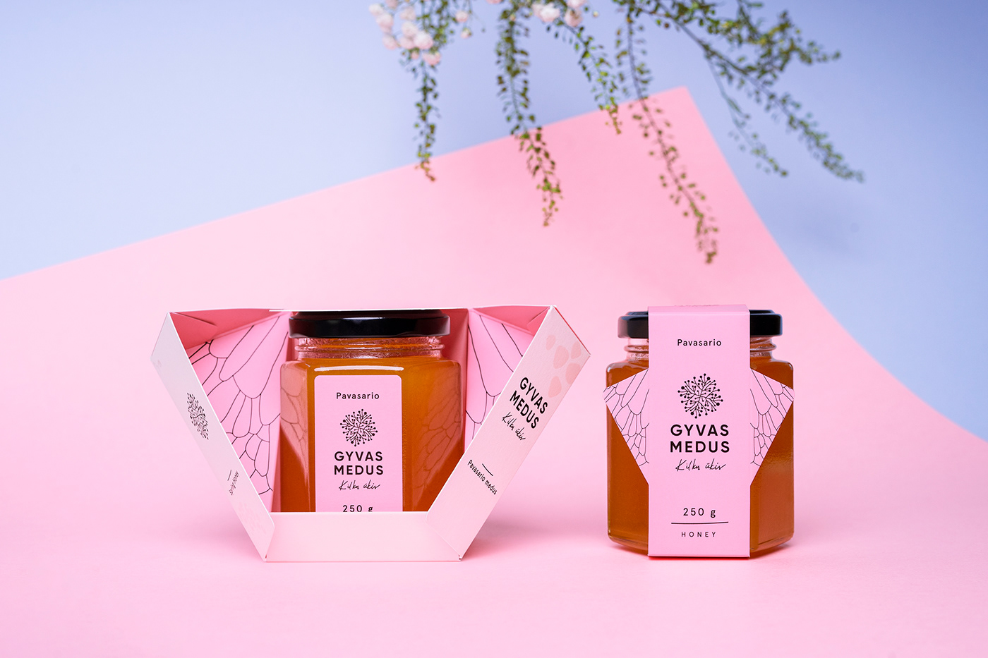
First of all, we developed a unified system of boxes and paper wraps to match every size of a jar used. Four types of honey are identified with distinctive colours. Four symbols for the logotype were created to portray the flower common for the type of this particular honey.
Then we decided to create packaging that would stand out with its unique and specially created structure. It has only a few gluing parts and is made out of one paper folding construction. It is light, yet calculated to be suitable for holding the weight of each product.
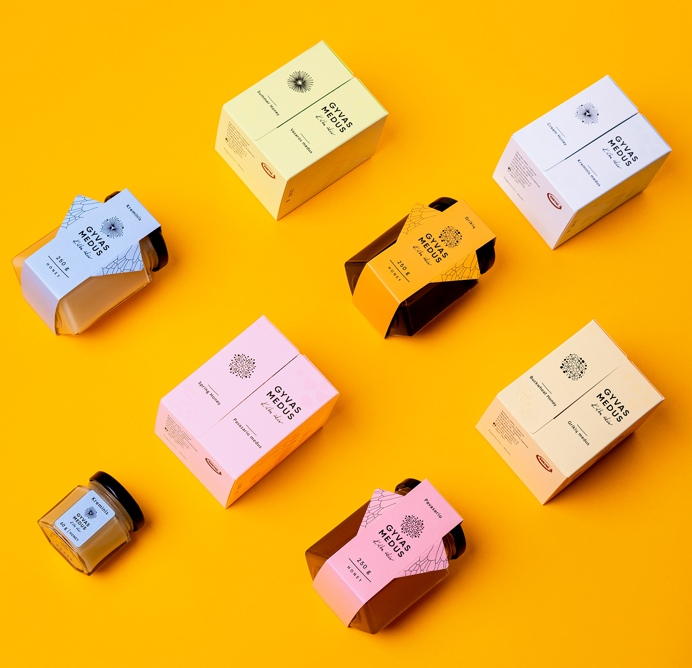
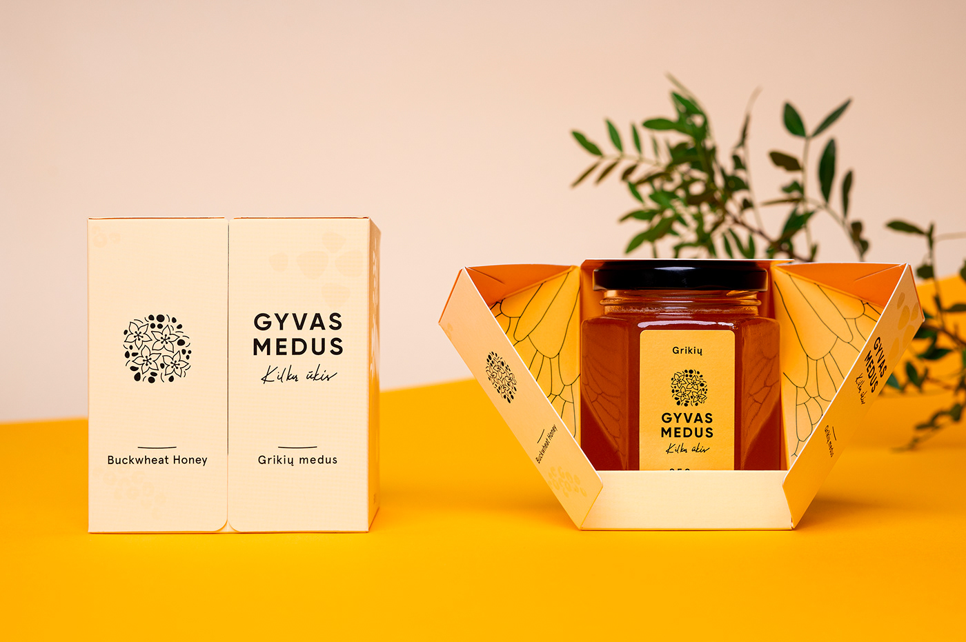
What is more, we aimed to depict a bee as a symbol of honey, though not straightforward. Therefore wings appear in box construction, while the body stays with the product itself. Paper wraps were also created as the economical version of the boxes. To keep everything in one line, they also have wings of a bee, the construction is foldable for better transportation.
Finally, the selected colour scheme is bright and light to convey the feeling which comes naturally from the origin of the product itself. That is why the design is enriched with subtle and tactile details such as UV lacquer.
Finally, the selected colour scheme is bright and light to convey the feeling which comes naturally from the origin of the product itself. That is why the design is enriched with subtle and tactile details such as UV lacquer.
