SITUATION
There’s no other beer of such importance in Lithuania. Changing its look is the same as changing the identity of the nation’s favorite sports club. You can be sure that everyone will have an opinion.
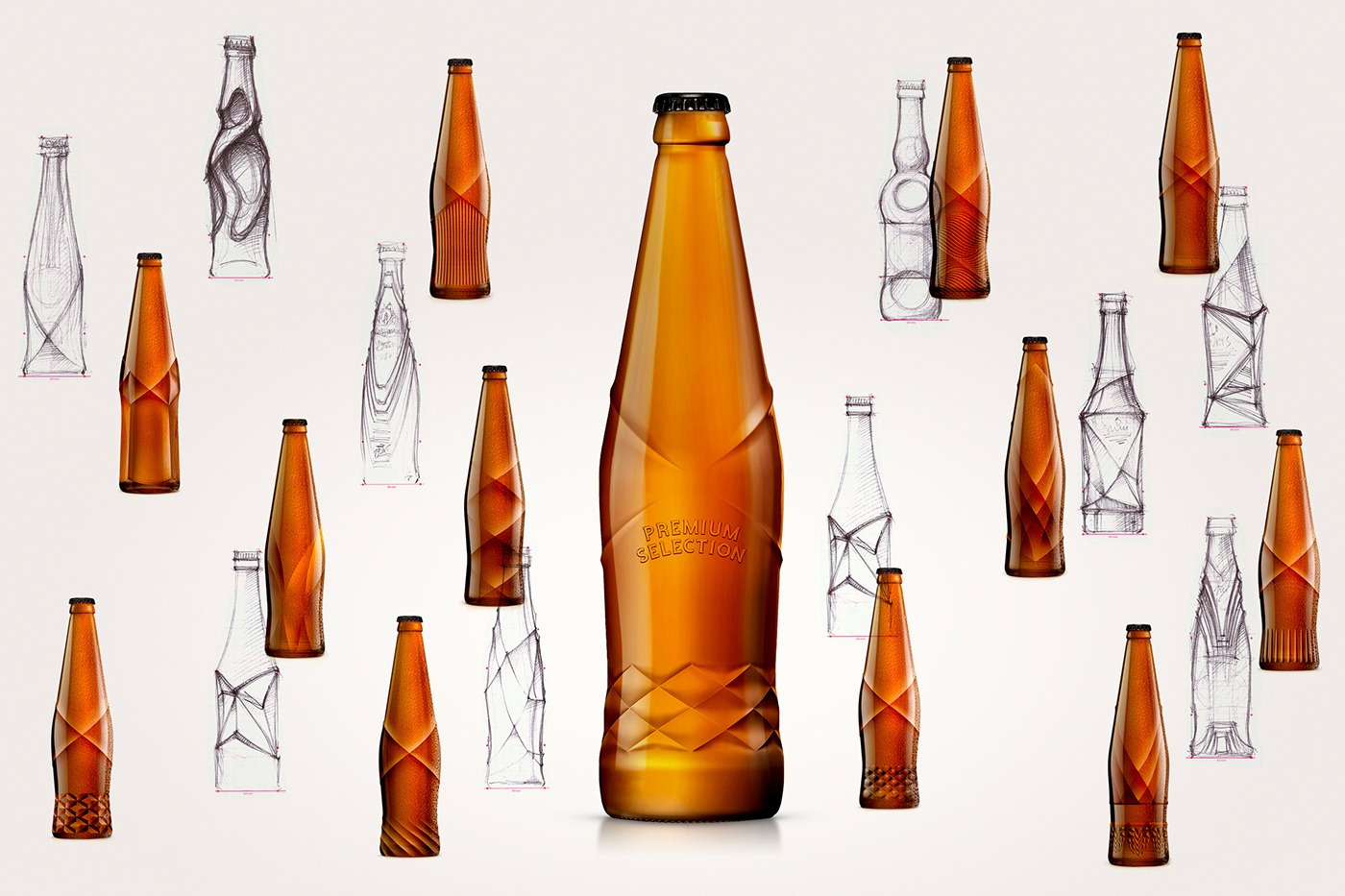
We’ve been asked to create a new look & feel of Švyturys Ekstra beer. From bottle design to the primary and secondary packaging. From the Ekstra logo to the Švyturys visual assets playground and POS material. The challenge was to look contemporary but not to follow trends.
SOLUTION
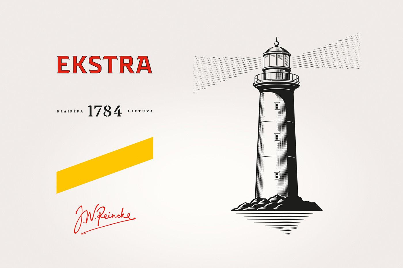
We’ve called the strategy – Future Classics. We have designed the bottle with a unique label position. Every detail was redrawn: from the custom Ekstra logo to typography and a brand new yellow lighthouse ray. We chose a color palette and a typeface for communication.
The lighthouse illustration has become more refined and suitable for use on light and dark background. The new design has spread across POS: beer fridges, taps, umbrellas, etc.
What was the market reaction? Even haters gave positive feedback.
The lighthouse illustration has become more refined and suitable for use on light and dark background. The new design has spread across POS: beer fridges, taps, umbrellas, etc.
What was the market reaction? Even haters gave positive feedback.



Marketing manager: Andrius Bagdzevičius
Brand manager: Ieva Račienė
Agency: étiquette
Design strategy: Edvardas Kavarskas, Valerija Žilėnienė
Art direction: Irmantas Savulionis
Graphic design: Irmantas Savulionis, Gabija Platūkytė, Remigijus Matukaitis
Account management: Rita Dargytė, Algirdas Orantas
Printing manufacturing: Ardagh Group, Ball, Garsų pasaulis
Product photo shoot: Irmantas Savulionis
Video Production: Avelė Production House
Video Production: Avelė Production House
-
-
© étiquette, 2019, Vilnius

