A step by step I've prepared for an article at 3D Total some time ago.
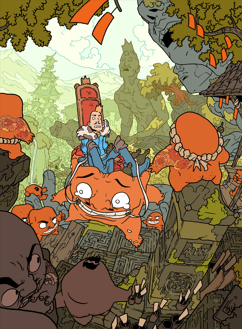
I like busy illustrations telling busy stories. In this tutorial I'll go through my process of creating personal pieces and make some sense of it. I put a lot of emphasis on composition and perspective. This particular picture tells a story of a clueless king meeting with reality.

Getting the idea
I'm big on details and my illustrations are cluttered, so proper planning is the key here. When I have the idea, I start with a bunch of super quick sketches, just to find the initial composition and the point of view. Sometimes you'll go through dozens of those before finding your ideal, so there's no place for lingering on any details. Even if the piece is commissioned, this isn't something you'll show your client yet. Kind of like writing in your own language.

Fleshing it out
Still rough, but now I have an idea of what I'm doing. I usually start with the super rough sketch from the previous step on a very low opacity, just to get the exact setup as there. My two main characters are in the middle, so sometimes in situations like this I like to set up the entire composition in a spiral around the point of interest (green arrow). I start with the top-left corner with the closest object (tree branches) and go counter-clockwise around the characters, using both the foreground with smaller objects and background with big ones. I like to think this pulls the eye in.

Perspective and the fisheye
Contrary to what most perspective tutorials teach, I believe this is the moment you start really working on the perspective (and not at the beginning). I can find the clues to the proper perspective in the initial sketch I did in previous steps. I usually start by finding where my left to right lines should go (blue) or back to front (purple), kind of building them according to the sketch. With a few of them found, I see where they meet and that's how I find my horizon. After that, finding the rest is easy.
Second thing I like to do here is add a little organic liveliness to the whole thing by bending the view in the 'fish eye' style. Most of the time, when you see a perspective grid, you see straight lines cutting through each other. To get the effect I want, instead I join lines of the opposite sides together, making them go in a curve. Because it is a distortion, I freehand it most of the time and don't really care if it's 100% accurate.

Details and all that clutter
With composition in place and perspective established, it's time to bite into the details. I like to make my illustrations seem very busy, so I try to not think about any object or character as separate thing, but more as parts of bigger shapes molded together, creating the environment. I achieve that by always stacking object on each other, building layers of things and making sure the characters interact either with each other or stand/climb/touch something.

Storytelling
This step is something you should have in mind from the very beginning, but only now is really the moment to fulfill it. The story in an illustration is told by the character’s expressions. Here I establish the main interaction between the king and the leader of the 'head people' by making them look at each other (blue arrow; even if the head guy is turned away from us, our attention is on him, because the king is looking at him). The secondary interaction is happening between the side characters and the kings steed (which also help closing up the composition around them).

Final sketch
At this point I print the sketch drawn digitally in a very light, blue color, and add details and finishing touches with a pencil on paper. It doesn't really give me any sort of advantage, I just feel more comfortable with analog tools.

Inking
I ink using Unipin Fine Line black ink pens, sizes from 0.05 to 1.0 mm. The only rule to follow here is the closer the object is to you, the thicker its lines should be. I also add side notes for mistakes I want to fix later.

Fixing the lineart
I scan the illustration as a pure black-and-white, 1-bit image, which speeds up the color filling process a lot. Here I fix everything I screwed up on paper with a round, no anti-alias pencil. I also separate the lineart of the foreground from the background ones.
Flat Colors
I mainly use flat, simple colors without textures or gradients, to balance the detailed nature of the lineart. To guide the viewer’s eye I try to use contrasting colors between the main focus and everything around it. Sometimes it takes ages moving the color adjustments slider, trying to decide what looks decent, but the end effect is usually worth it. Here I also put color on the background lineart and any unusual lineart (tattoos in this example).

Hide in the shade
The image could most of the time already stand on its own with just the flat colors, so my main goal with drawing the shadows is adding a new level of depth to the illustration. Shadows are amazing at bringing out the 3D on a flat plane, showing its various curves (as the leaves on the orange guys or the reins of the middle orange dude). The best color for shading is usually the color on the opposite side of the color wheel, but sometimes it doesn't exactly work so you have to push it a little to fit your overall color scheme.

Finishing touches
The fun, last part. I'm adding little effects, touches of light, stuff like that. Now I'm either excited to show it off or can't look at it and have to hide it from myself for a day or two before I start to like it. Finished! Now only to figure out a cool caption...