

Client
MSN UK
Brief
Provide concepts for homepage redesigns
I was asked to come up with design tweaks on the current MSN page (first image) and provide a more radical redesign for the site home page (following images).
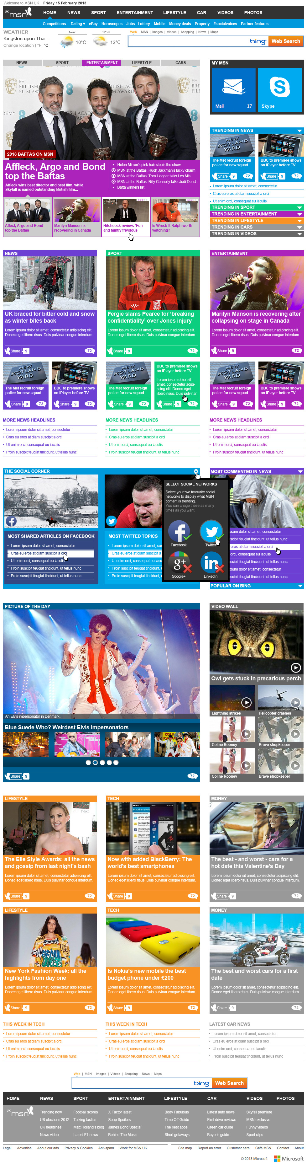
For the first option, I chose to make use of the various channel colours to provide a better readability on the page and provide visual cues to the type of content. I also redesigned the top news carousel to integrate it better into the page.
For the first option, I chose to make use of the various channel colours to provide a better readability on the page and provide visual cues to the type of content. I also redesigned the top news carousel to integrate it better into the page.
I based the more radical redesign on Microsoft's Metro style which was rolled out with Windows 7 Phones and with the various Windows 8 OS by using a bolder approach to channel colours and a system of tiles which allowed for a fully responsive version of the site for mobile (last two images).
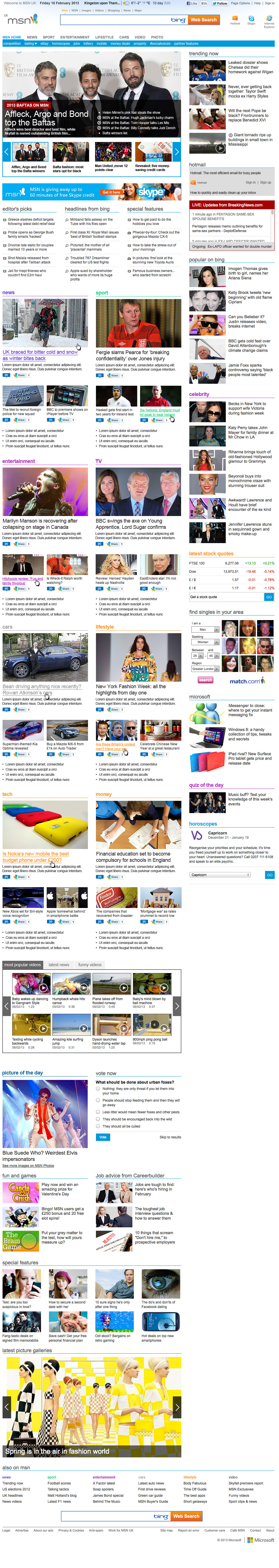
This concept only offers minor tweaks to the live MSN site, adopting a stronger use of colours to differentiate between channels. The navigation was also tweaked to make identifying channels and sub-channels easier, and was designed to be static, as opposed to the one used on the live site which continuously changes from channel to channel, making changing channels virtually impossible.
The top info pane was also redesign to make better use of pictures and appear less heavy than on the live site.
This more radical redesign retained the overall structure of the original website but introduced a bolder use of flat colours and a tile concept based on the Window 8 Metro UI to highlight the connection between MSN and Microsoft.
The navigation was rethought so it would remain static throughout the whole site and would also work on mobiles. As on the previous example, the info pane was designed to make better use of pictures and link picture and content in a more efficient way. A new social module was also introduced to highlight shared content.


