

BRANDING
CRETA Náutica it's a fractional yacht ownership system in the south area of Rio Grande do Sul.
────────────────────────────────────────────
Logotype | Design: Andrés Soler Bíderman
Agency: Uru D'Sign
Location: Porto Alegre, Brasil
Year: 2019
▼

LOGO
1.1 • ICON CONCEPTION

A Letter C | Our initial, who defines our monogram.
B Letter T | Initial letter of the second syllable.
C Waves | The main element where we navigate.
D Anchor | What defines our departure and our arrival.
E Compass | The element that marks our course.

ID
2.1 • PATTERN

ID
2.2 • CHROMATIC SPACE
The colorimetry of the visual identity was inspired by one of the nautical highlights of Rio Grande do Sul and perhaps Brazil:
the sunset over the Guaíba River.

ID
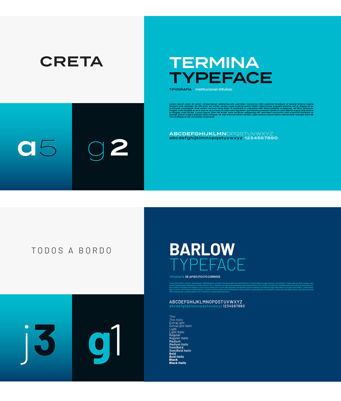
2.3 • TYPOGRAPHY
ID
2.4 • PHOTOGRAPHY
The photographs are unified by the general tone of our chromatic universe, pulling the levels of blues and skies to our environment. Skin tones obey the same rules. The acting of the models is natural, without forcing the eye and "always" with a relaxed attitude. The close-up framing with details of the vessels predominates, but without losing the human element (people in a leisure attitude).


ID
2.5 • NOMENCLATURE
System for the writing of the boat names.


THANK YOU FOR VISITING!
Leave your feedback here, please ;)


