
Macs Bollards Header & Menu Re-design
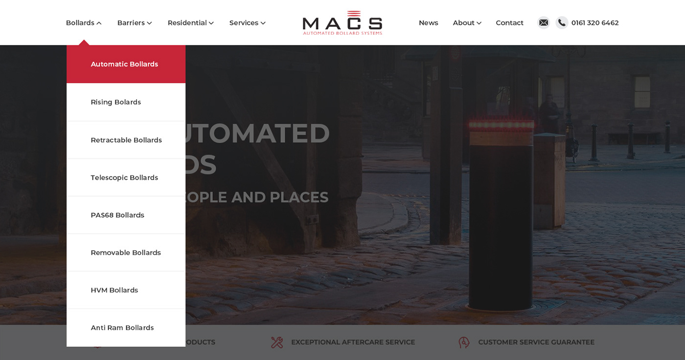
Final Menu Dropdown Design
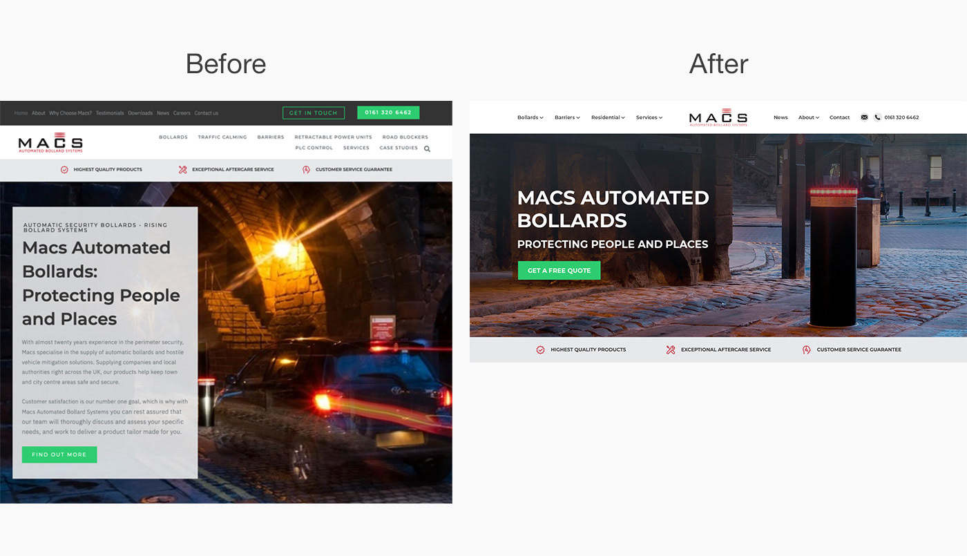
Before vs After
Alternative Navigation Mock Up Design
(The two designs below were not used/not final version)


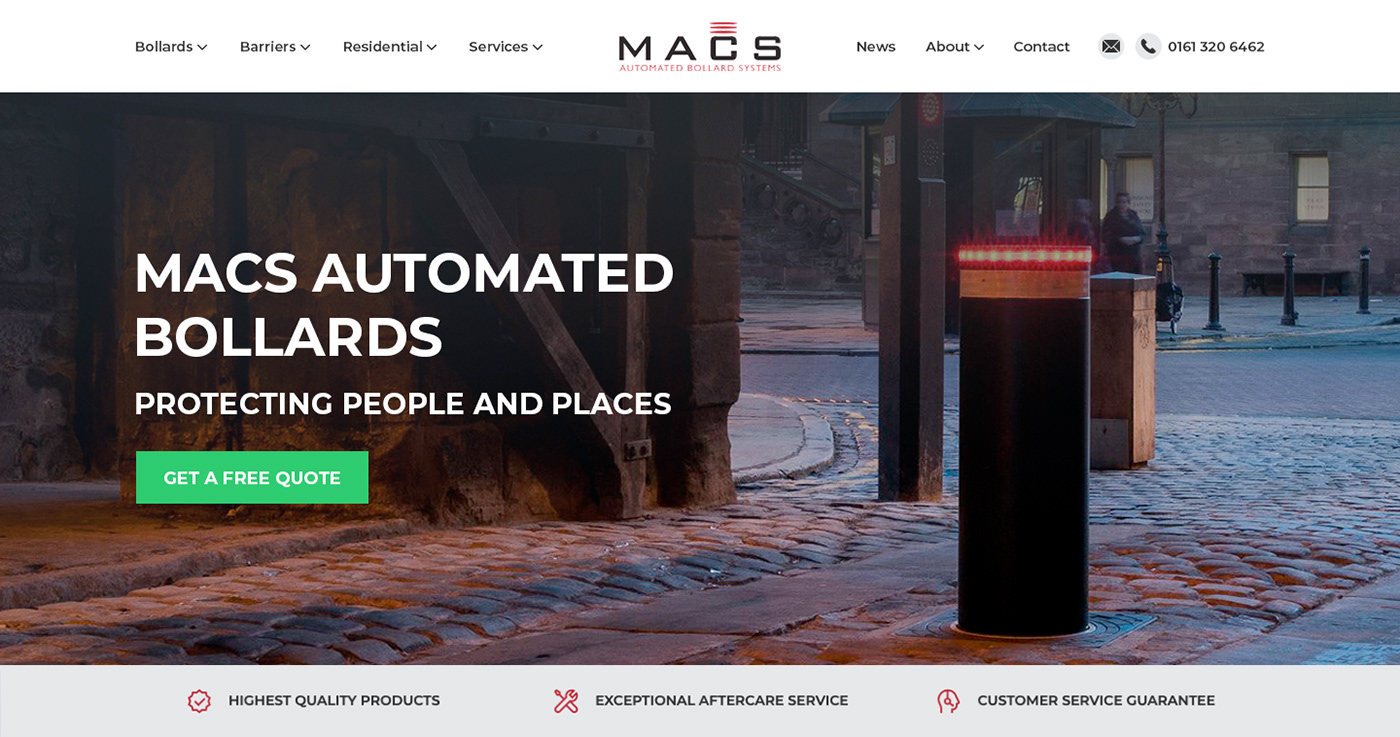
Final Desktop Design

The aim of this project was to re-design the homepage header section of the Macs Bollards website along with the navigation bar and drop-down menu throughout the whole site to simplify the user journey and give a professional look and feel.
You will see in one of the images above (the before and after image) that the header and several navigations were previously very cluttered which gave too many options to website visitors and created confusion. There previously was far too much text overlayed on the header image and the copy was from an article which is a huge error unless you run a blog. The article was replaced for a clear beneficial CTA (call to action/button) and a descriptive title of the company. Having a "free quote" button as soon as visitors land on your website will convert far higher than an article "read more" button, as you are offering them something of value that they potentially need/are looking for along with generating leads for your business which is generally the overall goal you want to achieve with your website.
You'll also notice that the before image, is far longer than the after, this meant that before I re-designed the header section it previously went below the fold (was longer than the first section you see when you click on a website). It's important that everything you see in this section is visible and stops before the visitor scrolls down the page.
I decided to replace the header image as I didn't feel the previous image was a clear enough representation of what the company did. It didn't feel like I was on a website for bollards when I looked at the previous image, the car made it seem like some kind of automotive website. From the gallery of images available to me, I decided on the image you can see above (the bollard with the red lights around the top). I felt the positioning of this image was perfect for what was needed, which was a photograph that displayed something subtle on the left so I could overlay text what was clear and readable, and then on the right a prominent image of a bollard.
During the re-design process, the menus and overall navigation were completely restructured. Macs Bollards went from having what looked like three cluttered navigation bars all very close together, to one clear navigation that has now been simplified and is easier to navigate. The three highlighted features were also moved from the top of the header image to the bottom so that they were no longer confused as part of the main navigation.
If you are interested in working together contact: