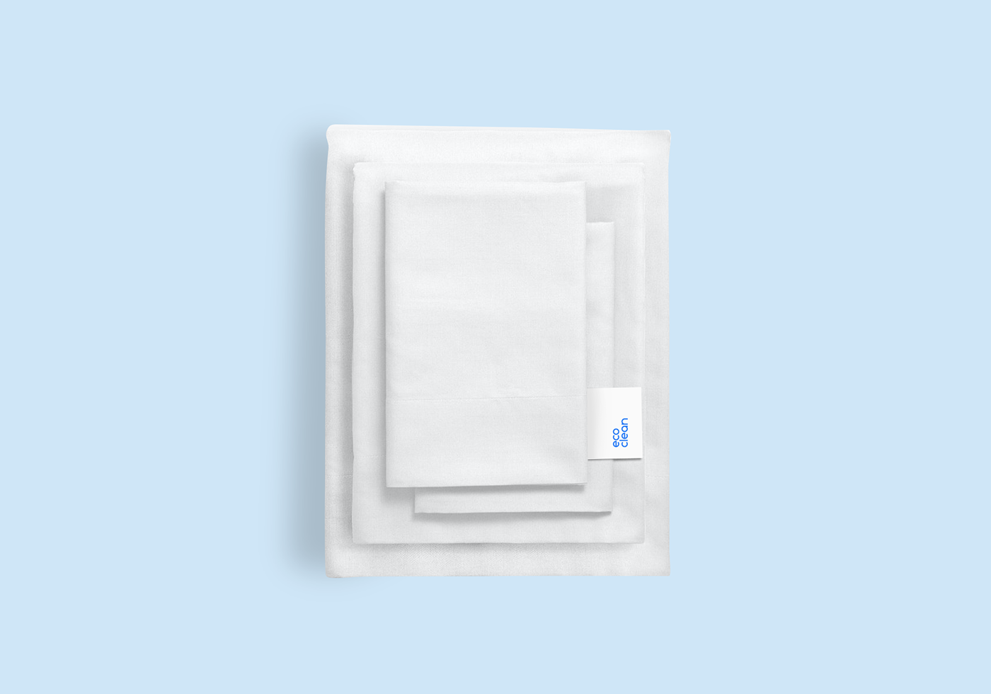
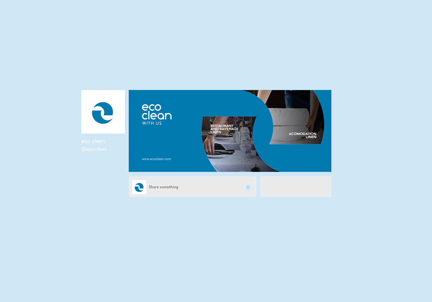
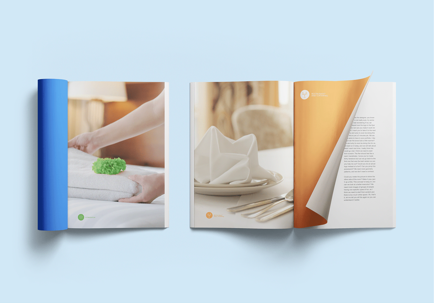
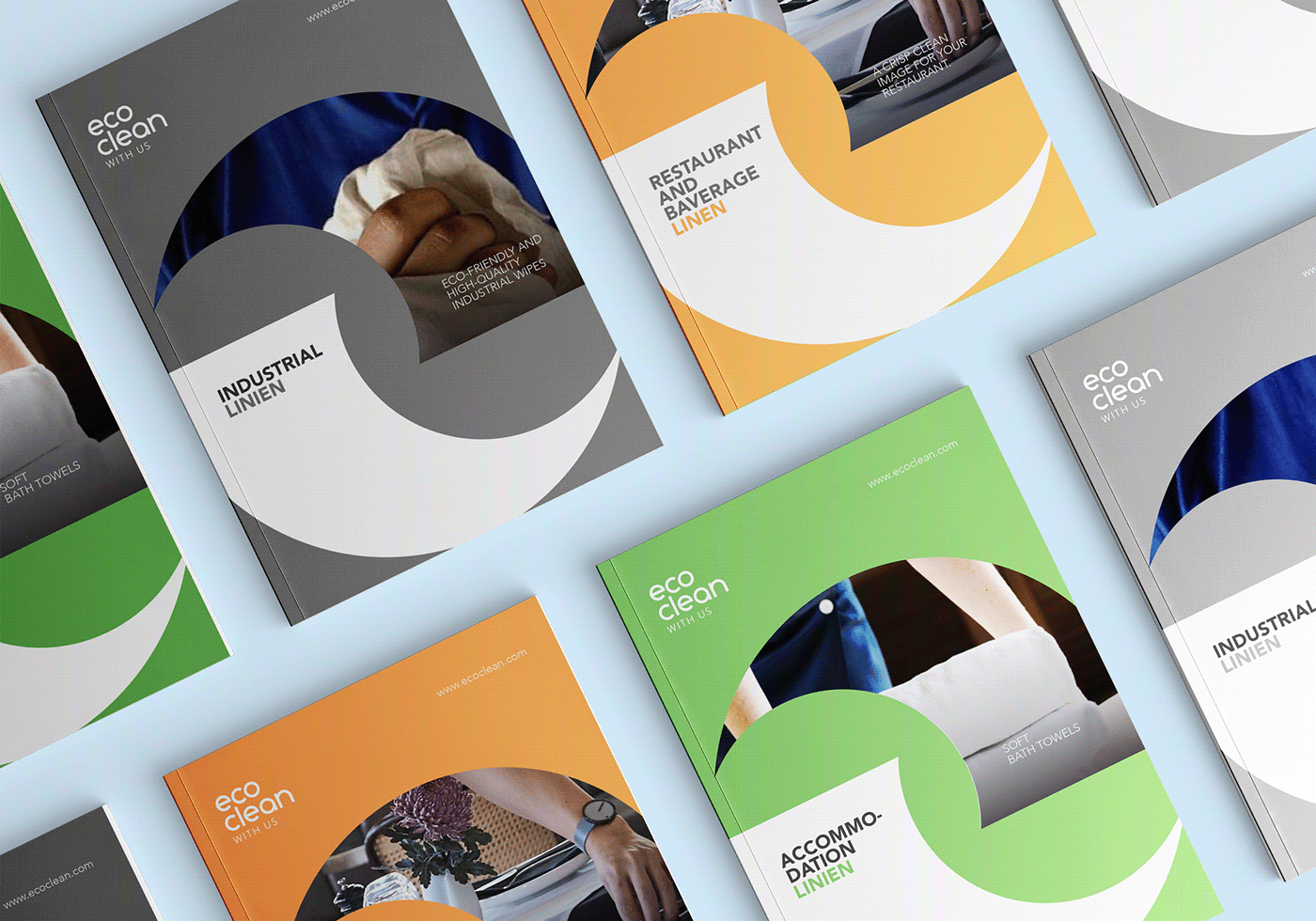
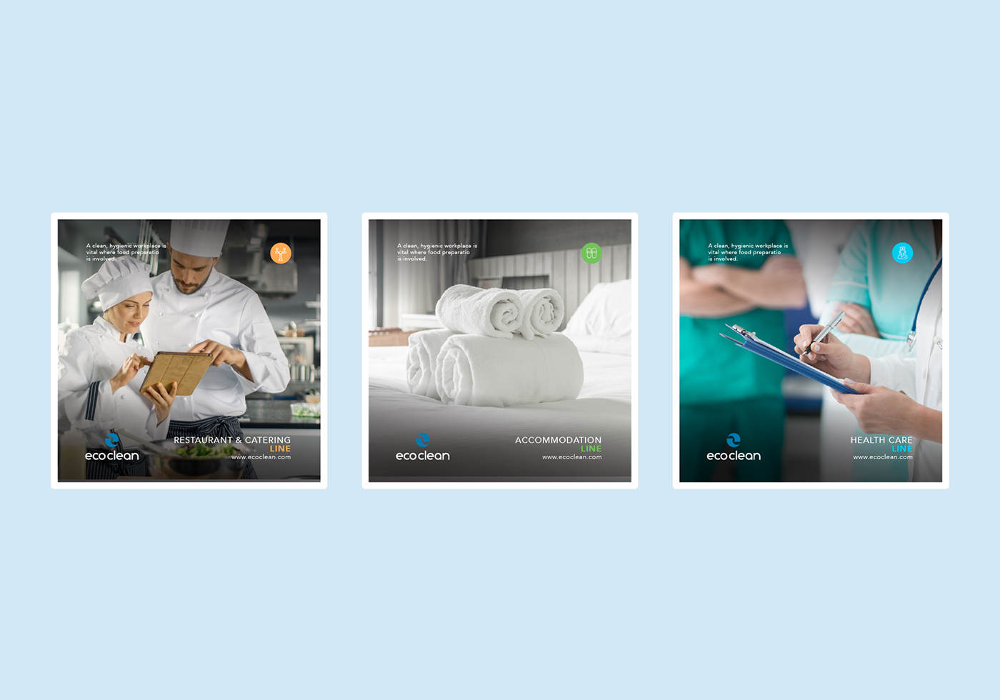
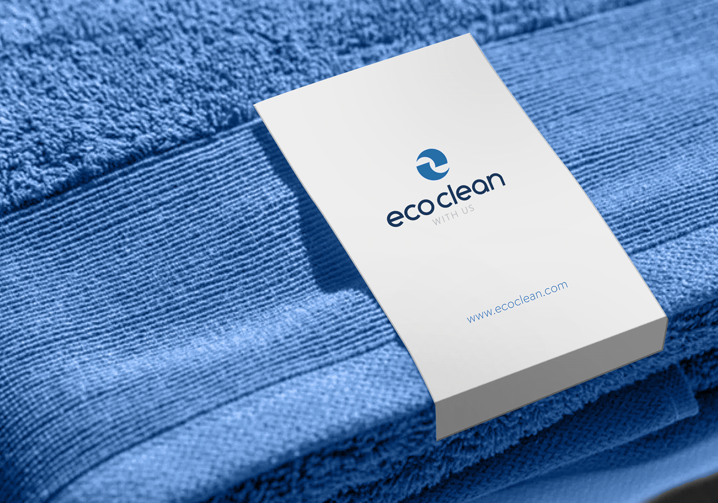
The logo created below is made for “ECO CLEAN” a company that offers linen services in different sectors such as food industry, beverage, accommodation, healthcare ect. They aim to be a leader in this industry where the success will be based upon quality, efficiency nonetheless professionalism.
Our starting point was to create a symbol that is simple visually at the same time meaningful and corresponds beautifully with ECO CLEAN company services. The visual trick created is simple- lined, creating a powerful and meaningful message.
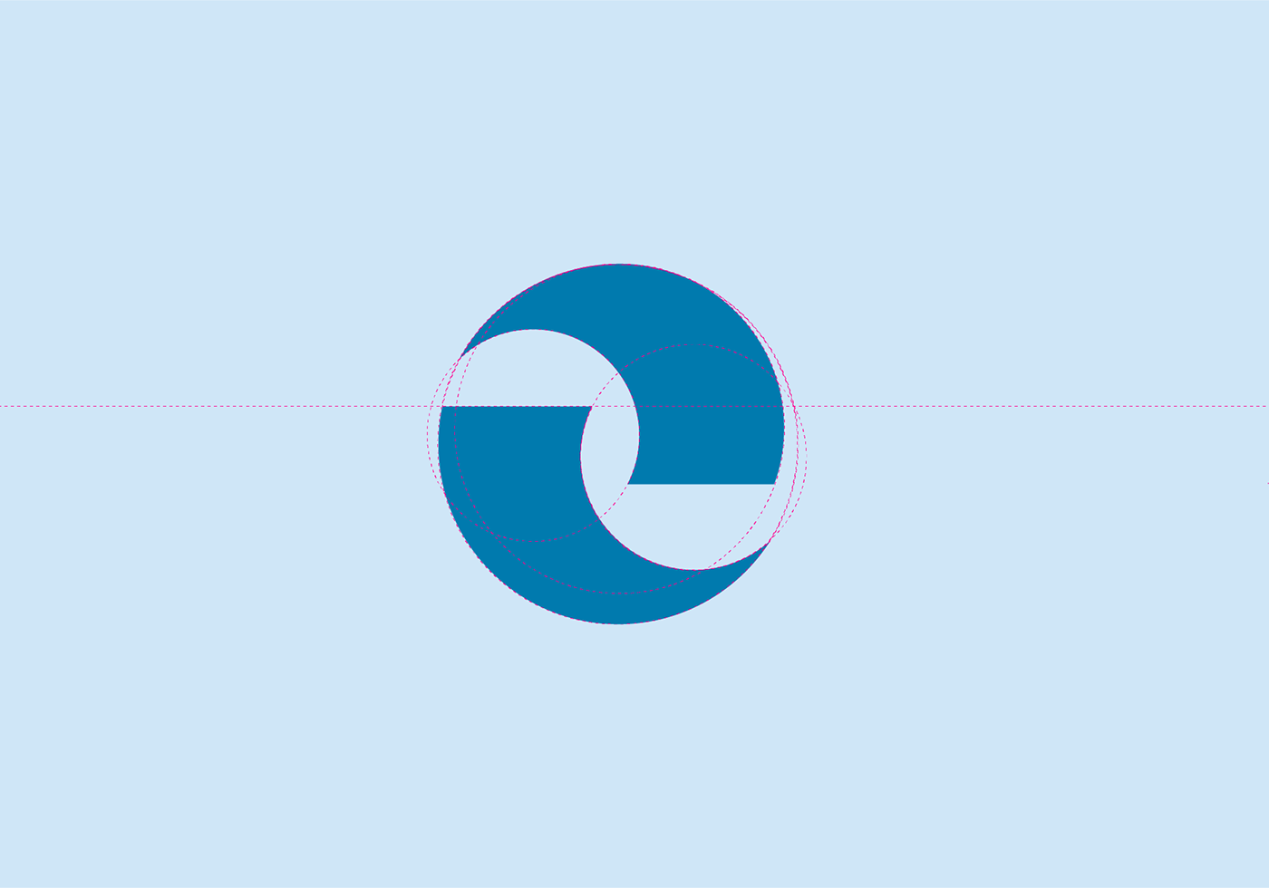
Throughout the research phase we identified that ECOCLEAN is offering a unique service: They deliver clean linens and take the used ones.
On this wise we created a Water Swirling symbol by combining two similar, clean, sharp shapes to represent: Power, Strength and Fast.
The two shapes created above at the same time represent the linens: Products, Material, Towels that give the logo even more character.
Managing these shapes in a circle we gained a symbol that portrays rotation and explains the ECO CLEAN company in a simple line: New in / Old out.
Combining these meaningful elements all together we made possible to create an abstract at the same time clean - lined “e” letter that represents the first initial of ECO CLEAN company.
The brand values brought to life even more through sky and sea color: BLUE which is well associated with trust, loyalty, wisdom nevertheless strength.
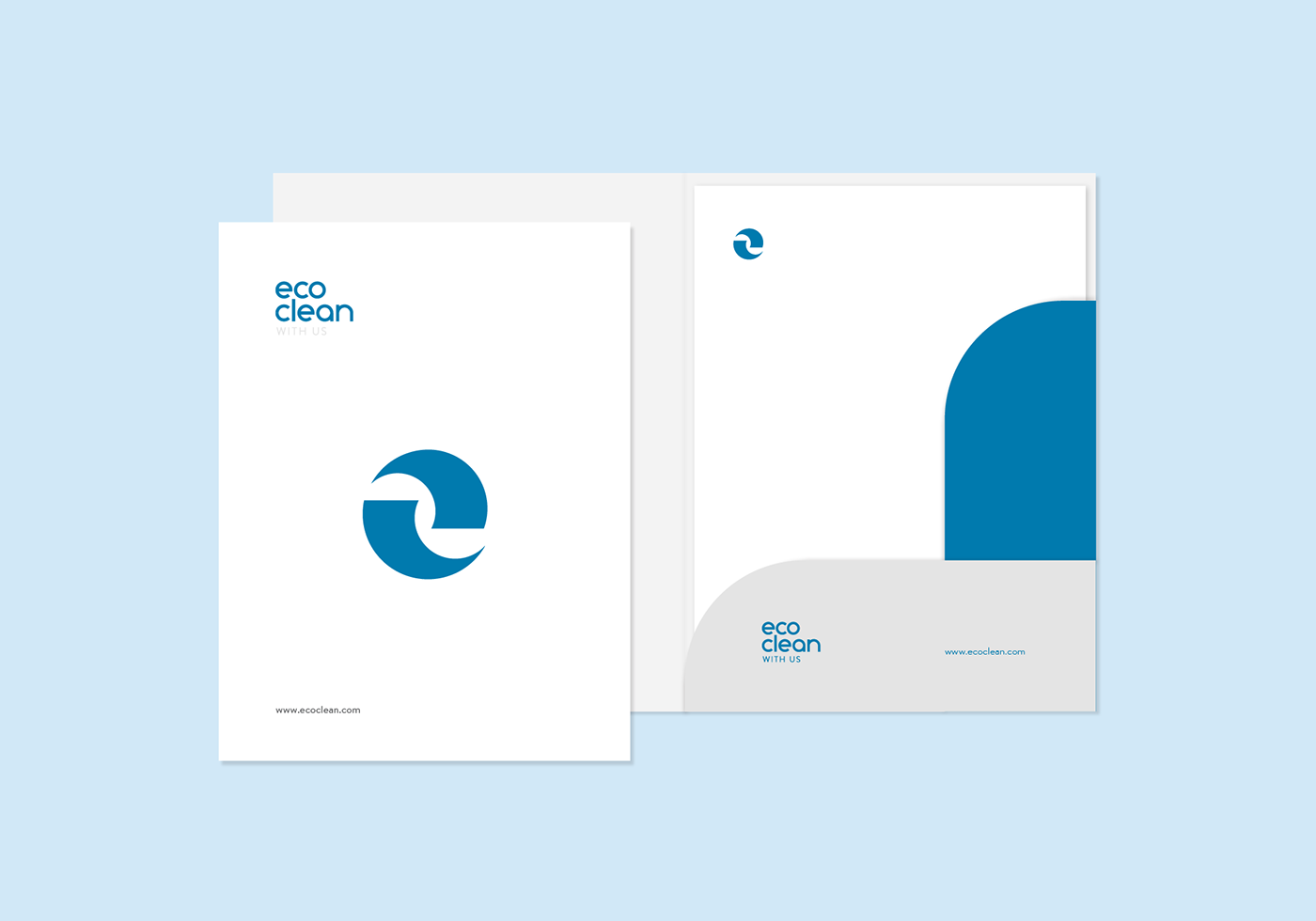
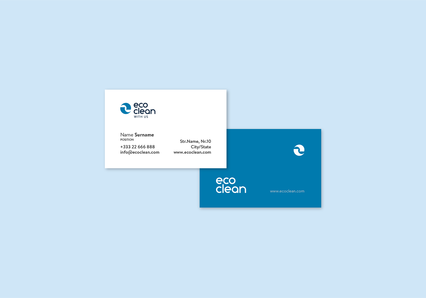
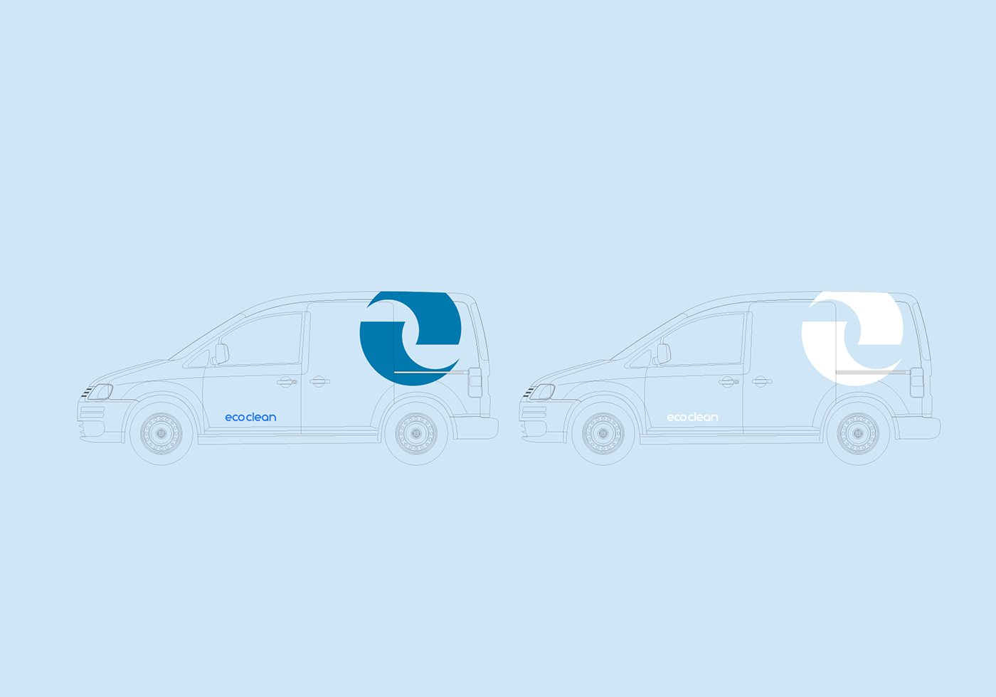
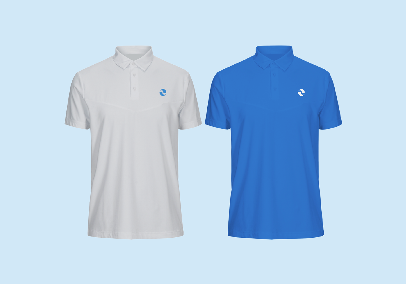
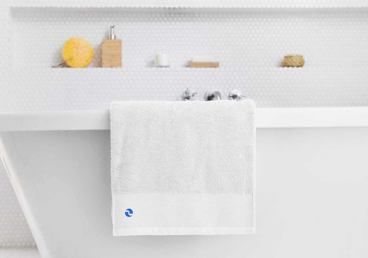
The rest of the identity matches the services in quite playfulness and sophistication. The logo offers a great flexibility for further attractive use in other brand parts.