Volvo Cars' first try at a Vehicle Function Pane (VFP) that was easily accessable to the driver was a failure. It was 2012, and Volvo had just released their first-ever touch screen in the new XC90. Most of the Sensus System was quite nice, but the VFP was hard to discover, hard to use, hard to see, and hard to understand. The buttons were too small to hit them accurately while driving. The labels were almost invisible with their 'refined subtlety' and text-based design style. They need to be bigger, brighter, and easier - yet not blatant, childish, or colorful.


The other challenge was that there was a growing number of vehicle functions. We had recently redesigned the Sensus Settings System, and part of the task was to evaluate which items were vehicle functions (driver assist functions) and which items were vehicle settings. This meant that as we reduced the number of settings, we increased the number of driver assistance functions.
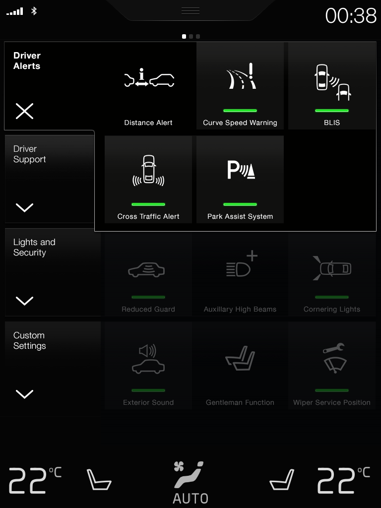
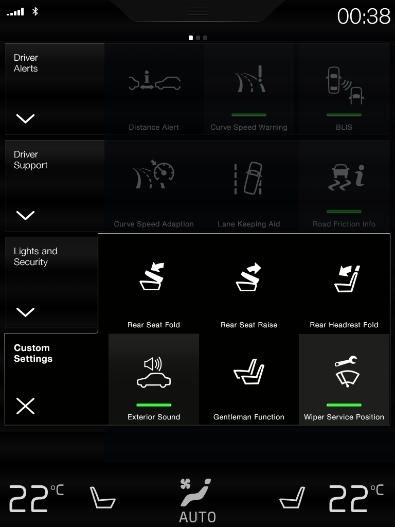
We had only one page to work with. We wanted to avoid scrolling at all costs. And we needed a scalable solution that we could expand in the years to come with an ever-growing list of new features and technology. At the same time, it was not an option to reduce the size of our touch areas - we needed to retain our driver safety requirements.
The solution was huge square buttons with discoverable large icons and small support labels. I used tabs to create the ability to expand the amount of functions on the page. The old, original design allowed for 21 functions to be available to the driver at one time - albeit difficult to see or to use - and without the possibility to expand that number in any way. The new design allows for 12 easily accessible functions at one time - and an overall total of 30 functions within the tabs, and as many as 48 functions possible in extreme cases.