Non-traditional Design for Vida Wine Brand
The Project
Vida is a brand new small family-owned wine project named after the medieval Baba Vida fortress in Vidin, Bulgaria. Based close to Gradets, Vida is one of those wineries that are located alongside the Bulgarian part of the Danube River – location that reflects either on the terroir, the climate, and even the culture.

The Challenge
Starting from ground zero is always a challenge but it is also great privilege to be part of a new beginning. The good news in Vida project was that it was entirely based on the story of Baba Vida Fortress. This narrowed down the choices I had but it was all for good. From the first moment I started my work I knew I would have to somehow use the fortress image in my design. Fortresses are archaic facilities built mostly in middle ages so they usually implement an old-fashioned look in the design. I wanted a modern feeling in my wine label and it was a challenge to use the fortress image without losing the fresh look of the design.
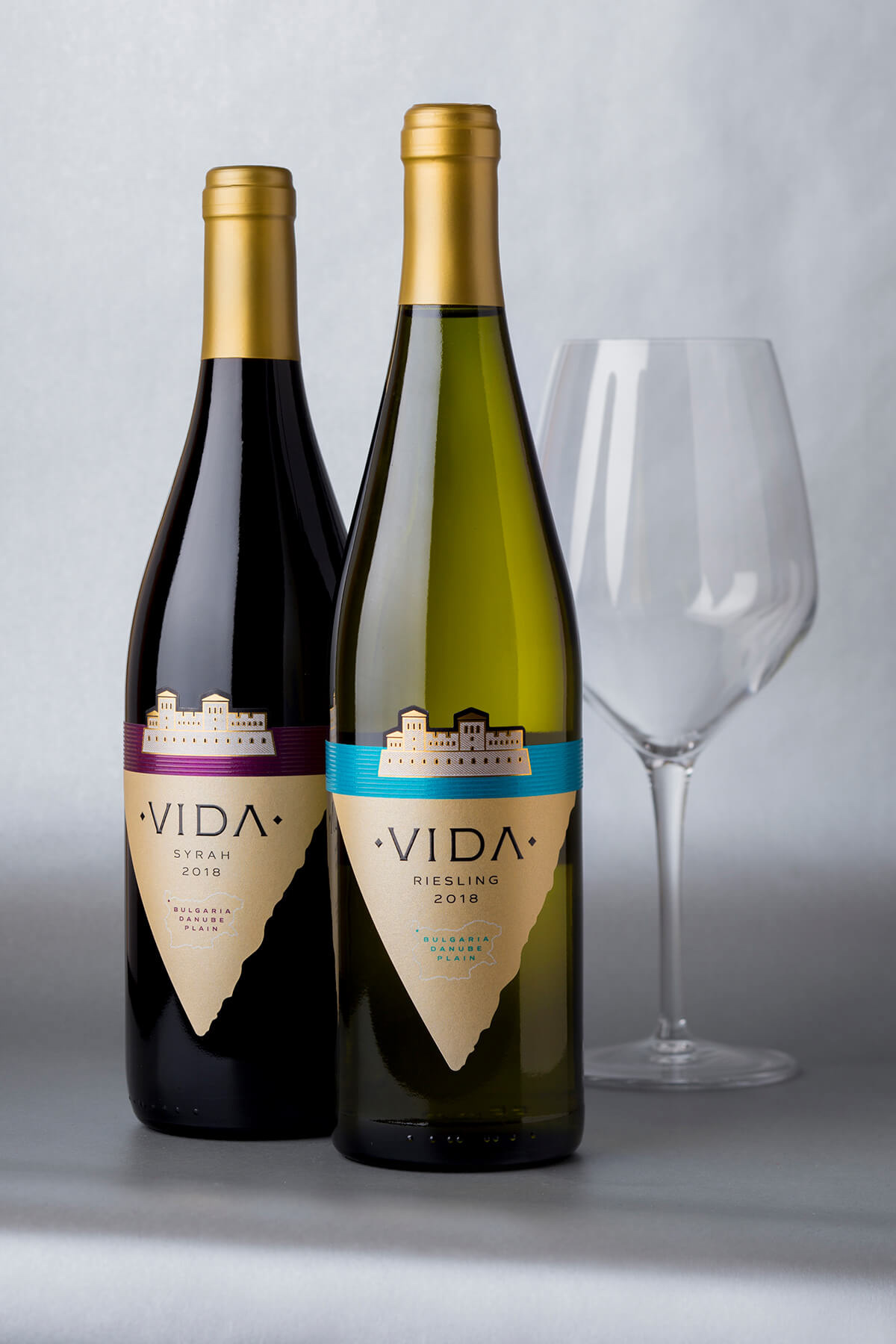
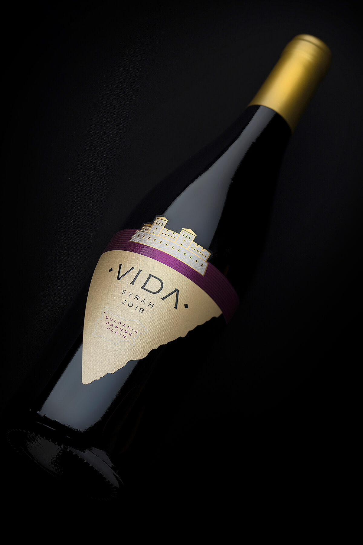
The solution I found was in the non-traditional label shape featuring V letter from name Vida. This new approach made the whole packaging stand out and above all – look very different and fresh on the shelf.
The solution I found was in the non-traditional label shape featuring V letter from name Vida. This new approach made the whole packaging stand out and above all – look very different and fresh on the shelf.
The Execution
Bottle – We picked Rhein type bottle because the first wine we launched under the Vida brand was Riesling. The second one was Syrah and we picked same style bottle but a bit shorter than the one we used for the Riesling wine. Elegant and taller than the rest on the shelf these bottles always steal the show with their classy look.
Sealing – We used traditional gold capsules on all wines to match the gold hot-foil on the labels.
Paper – I picked one of my favorite papers by Arconvert, the Constellation Jade Raster. I used this paper many many times before and I still love it for its grained structure and pearl reflections.

Print – Print extras have always been my specialty and probably the most significant part of my work after the idea behind each design. As I mentioned above, I used unique V-shape of the label and a modern image of Vida Fortress stamped with warm gold hot-foil on the top of the label. The fortress is positioned on larger color stripe symbolizing the Danube River. At the bottom of the label I put small map of Bulgaria because I wanted somehow to emphasize to the consumers the origin of these wines.
The Result
The result is a very modern packaging featuring a taller elegant Rhein bottle and a label with unique shape that makes it look different when placed among other wines on the shelf. The color stripe on top of the label is also very important as it provides enough space to change the color code of each wine and thus make the whole range look more colorful and different yet very consistent at the same time.
Credits:
Client: Vida Winery
Wine Label Designer: the Labelmaker
Printer: Rotoprint
Paper: Arconvert
Photo: Jordan Jelev
Client: Vida Winery
Wine Label Designer: the Labelmaker
Printer: Rotoprint
Paper: Arconvert
Photo: Jordan Jelev


