
A co-working, cafe, childcare, and community center joined forces under one roof. The identity and brand developed for the project used colors and patterns to distinguish each individual service from one another. A sense of whimsy, yet sensibility was created by having a modern take on primary colors, playful illustrations, and retro fonts.


Ta-Da & Company’s logo combines nostalgia with whimsy.
The spark in the center of the logo represents the magical feeling of accomplishment, that “Ta-Da!”moment. The logo’s retro tone is a nod to the history of the building and to the surrounding Waldo neighborhood.
Competition and demographics were continually referenced while designing to achieve a brand that stands out from the crowd while also maintaining approachability to both women and men.


A color scheme was designed to distinguish the programmed spaces from each other. This is helpful to create way-finding for members while telling a story through the brand.
Marigold Yellow represents the work space, Poppy Red represents the play space, and Robins Egg Blue represents the gather space. Each color is to be a unifying element within spaces and throughout the brand identity.


A set of icons were created for each of Ta-Da & Company‘s uniquely programmed spaces. The icons are a part of the visual identity and designed to help members and future members understand the space better. The icon set utilizes the spark in Ta-Da & Company logo to create a comprehensive brand.
• Work is represented by a light bulb, great ideas are created!
• Play is represented by it’s mascot Houdini the rabbit, it’s where magic happens!
• Gather is represented by a coffee cup or wine glasses/beer glasses clinking, memories are made!


Products are curated and designed to reflect the Ta-Da & Company lifestyle.
The kidswear features the mascot, Houdini, and utilizes items like backpacks, sippy cups, bibs, and other applicable items.
The women and mens merch focuses on subtly branded clothing that can be worn casually everyday.
Everyday items like drinkware, bags, notebooks, and other utilitarian products are sold for the convenience of the members.


The building has been divided into three distinguishing spaces : work, play, and gather. The designated brand color is used for each spaces’ entry and along a soffit that spans the areas’ ceilings creating intuitive wayfinding. It allows for individuality and uniqueness within each space, but also creates continuity and brand storytelling throughout the building.
A lit blade sign on the corner of the building creates wayfinding to the front entry from the parking lot and Trolley Trail. The icons will be used as a teaser of what programming is inside. Planter boxes are used to create green texture and visual interest. A green wall screens the back patio from the traffic on Wornall Road, but still allows for some interaction.

Upon entry, the member is greeted by a branded concierge experience. The cafe (gather space) entices the member to venture in by a feature-wood screen-green wall in the back, along with comfy furnishings and open entry. The co-working space has glass door entry that allows separation from noise and distraction, while maintaining inclusivity with the rest of the building. The play space is tucked in the back corner, allowing for kids’ excitement to build while they adventure to the back.

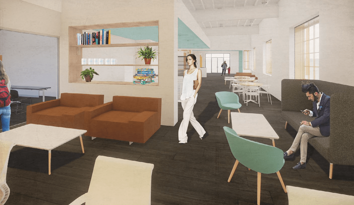
The cafe uses Robins Egg Blue throughout the space to create its identity. The materials are simple and modern to allow the personality to shine through the space in color and texture. Warmth and home-iness is developed through wood screen walls and residential furnishings.

Individual nooks and cozy spaces are created through furniture and dividing spaces with half walls. The community room is accessible through the cafe for classes, conferences, yoga sessions, and other activities. The community room spills out to the back patio allowing flexibility to expand for events and gatherings.
The play space uses Poppy Red throughout the space to create its identity. An interactive wall allows the children to create and imagine through magnets and lighted peg boards. Cubbies and play spaces reflect the Ta-Da & Company brand while creating an exciting place to play and learn.

The cafe uses Marigold Yellow throughout the space to create its identity. Subtle brand elements appear throughout the space to create cohesion throughout the building, while maintaining sophistication. Meeting rooms and offices coexist with flex and designated desks to build a dynamic and co-sharing environment.

Soft seating areas enable flexible work meetings and comfortable chill-out zones. A self-serve break room allows co-working members to store and make food, enjoy coffee, and feel at home.


