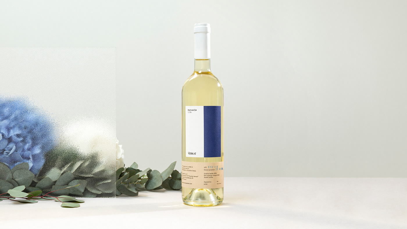
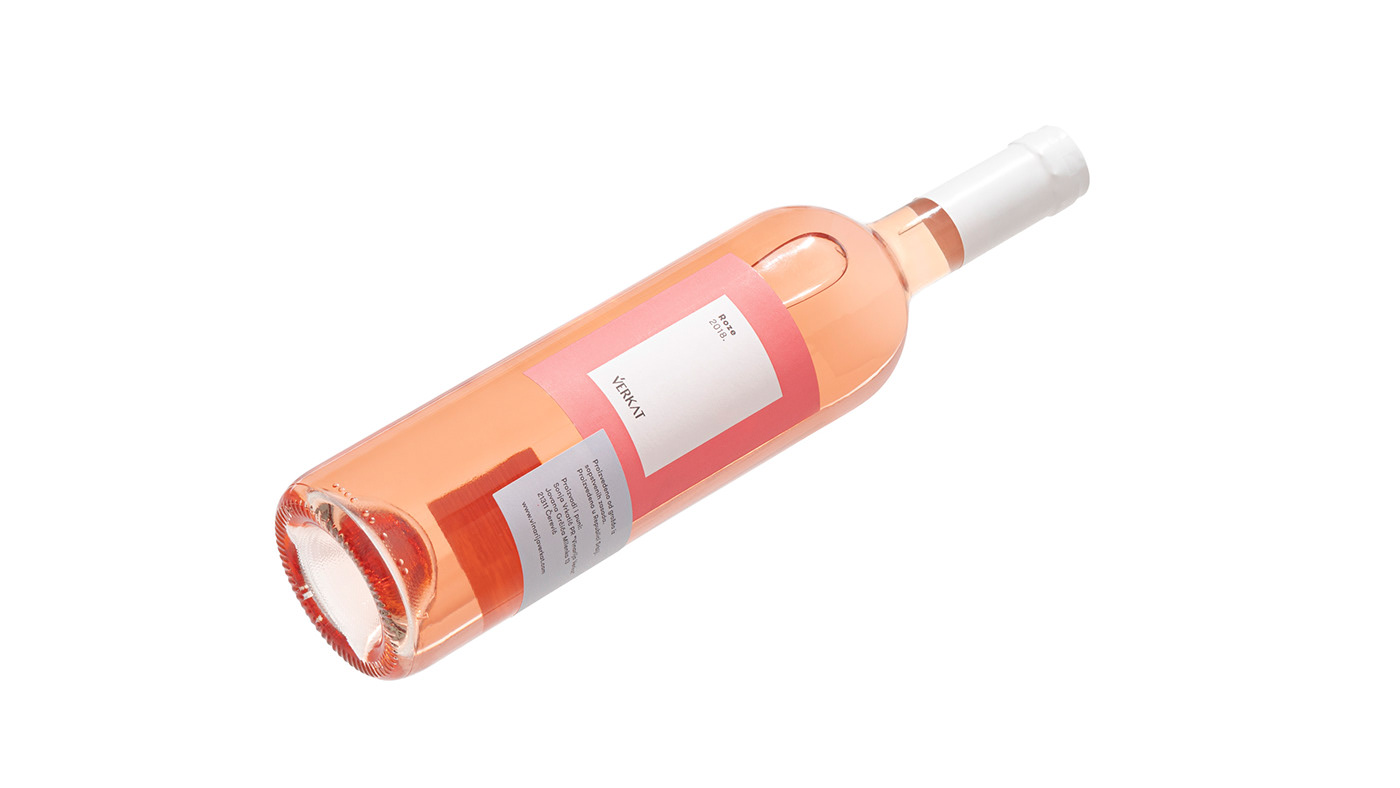
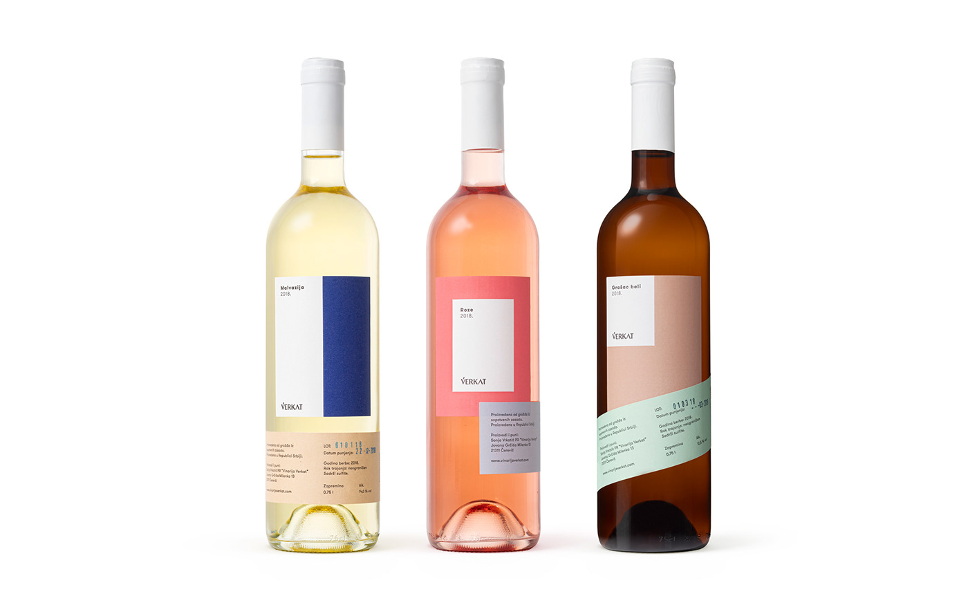
Verkat is a small family winery, whose wine originates from the privately owned vineyard. For Verkat, we designed bottles for Malvasia, White Grashac and Rose – wines full of fruity and floral notes. We wished for the visual identity to represent their pure and refined taste.

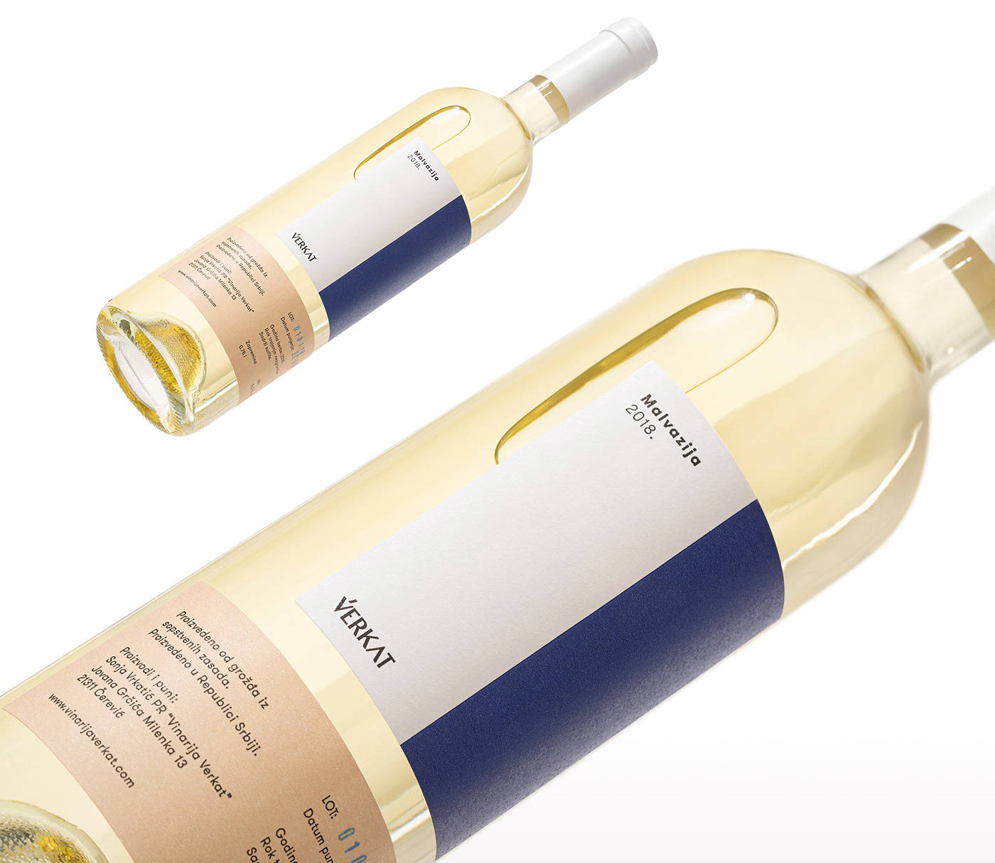
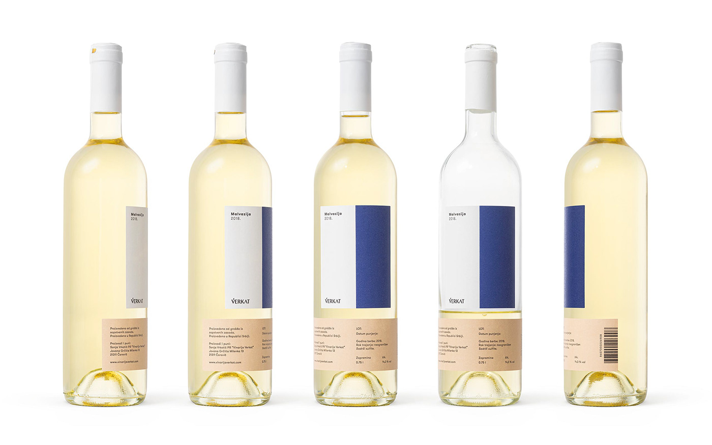

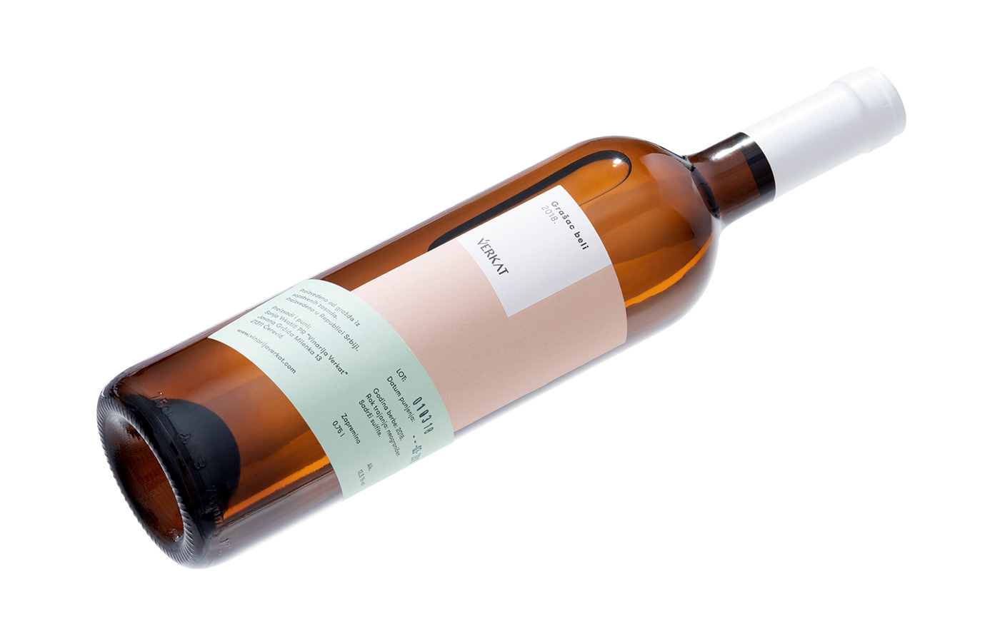


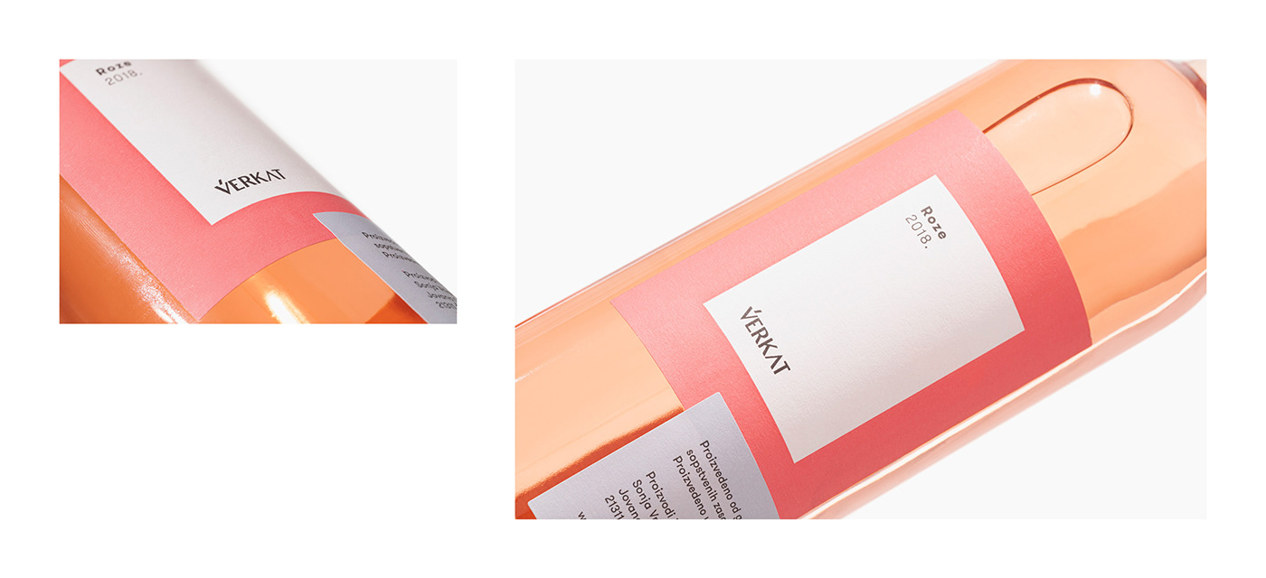
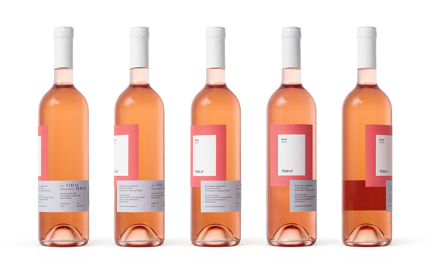
The concept is inspired by modernist forms and shapes, while the very packaging represents a sort of a play of these forms. The bottles contain two labels, one of which is always in its designated central place, while the other changes positions.
We created design which is intended to represent the subtle and layered aroma of the Verkat wines. The color palette we used is derived from the colors of grapes and wine.
The logo is designed typographically and is intended to demonstrate the simplicity of taste and balance of different shades. The logo captures the complex bouquet, where every low-key detail serves to emphasize some other striking aspect. The typographic simplicity embodies the wines of full, fresh and sophisticated taste.


Client: Verkat Winery
ACC: Marina Nikolić
CD: Nenad Trifunović, Lazar Bodroža
AD: Nenad Trifunović
D: Nenad Trifunović, Sandra Milanović
Year: 2019


