

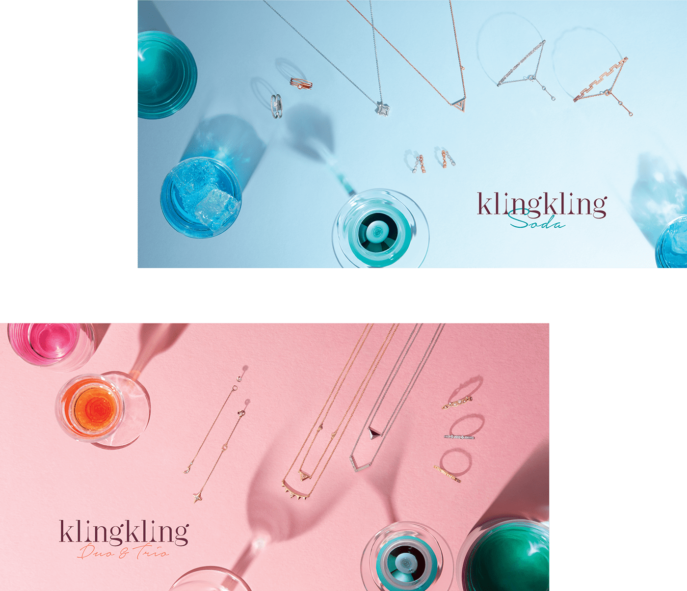

"Kling Kling” is a fashion jewellery series with emphasis on its charming mix-and-match accessories.
The name “Kling Kling” is the onomatopoeia of clashing ice cubes.
It represents the magical moments of people getting together,
It represents the magical moments of people getting together,
the delicious savour of a cocktail, and
the delightful uniqueness of your own mix-and-match “Kling Kling” jewellery.


“Minimal and stylish” is the message behind the logotype.
We designed this serif logotype by exaggerating the contours on the strokes to highlight its fashionable and elegant femininity.
Special details embellish the logo with implying messages.

Two Kling Kling sub-series logos (Kling Kling Duo & Trio & Kling Kling Soda) were developed,
based on the original logotype.


Three different color palettes are used for these three series.
Simple and matchable tone are used on the main series,
Simple and matchable tone are used on the main series,
while a more stylish approach is applied on the sub-series.
_____________________________________________________________

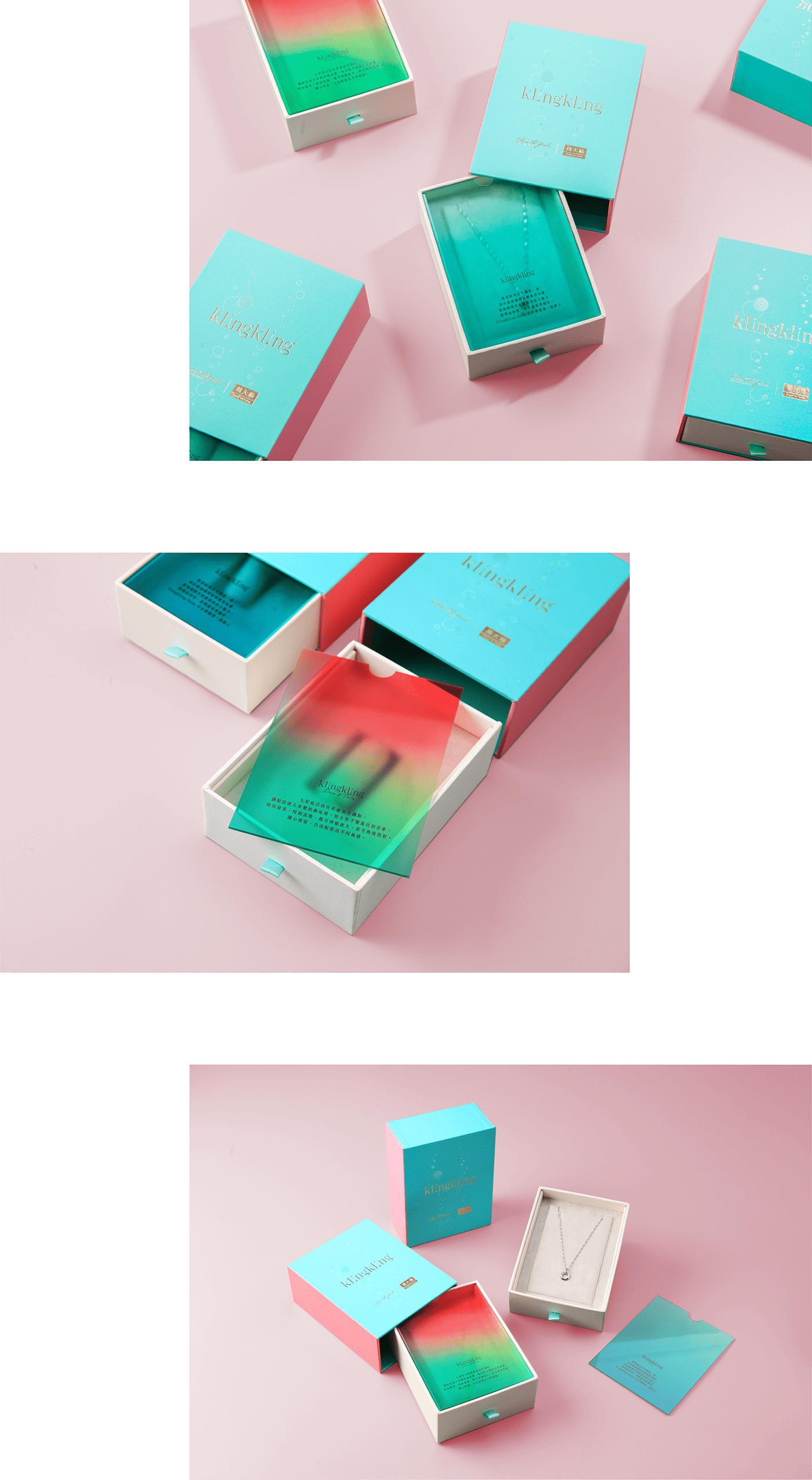
A drawer structure is applied on the packaging referencing women’s accessory containers.
A cocktail-like gradient, with mixing colors, is used on a partition, threading the concept of the series.
A cocktail-like gradient, with mixing colors, is used on a partition, threading the concept of the series.

Considering the large amount of accessory items shown on the in-store display,
a modular system and drawer structure were used.
Various display components were designed in line with our theme.
For example, a unique structure was designed for earring display in cocktail glasses.
For example, a unique structure was designed for earring display in cocktail glasses.


