Hubbards Ban-ola
This ain't your grandma's bran!
Refreshing the local hero brand to speak to a new generation. Hubbards has been the No.1 muesli brand in New Zealand retail since 2014, re-establishing the iconic name in the breakfast food aisle. The launch of Hubbards Granola saw the brand create the category. It is proof that you can get bigger and better while still harking back to humble beginnings.
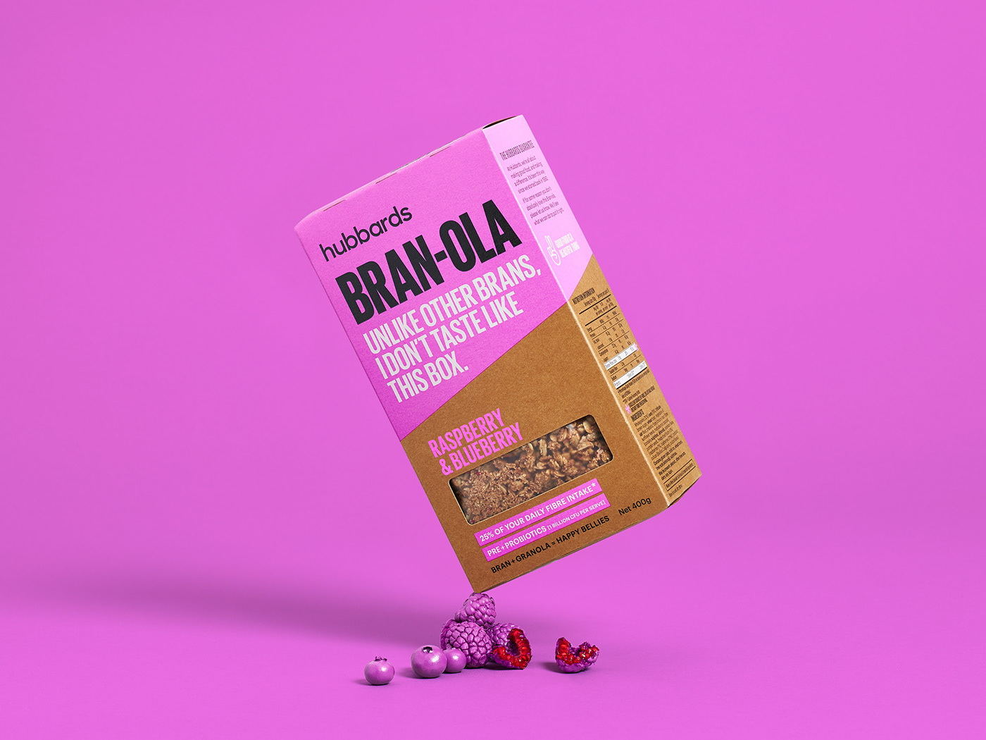
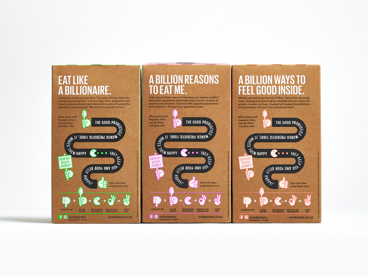
With a new business strategy to further develop and grow the brand, Hubbards needed to evolve its challenger story. To launch this next phase, we were tasked with refreshing the Hubbards brand and design new packaging for Bran-ola. A product that combines Hubbards breakfast food expertise with their flair for making amazing granola’s.
Retaining the existing unique pack shape was vital to help build this next stage. The brand mark was modernised, reworking the typography to achieve simplicity and clarity. A new architecture was developed to create a pack that challenges the pre-existing idea of brans bland cardboard taste, and the taste experience that this new product offers. A simplified colour palette of black and neon colour disrupts shelf. While big typography with short, punchy copywriting establishes it’s no-nonsense mission. Using a brown card packaging stock reinforces the key message - cardboard on the outside, taste on the inside.
Hubbards is still all about making good food and making a difference, but with a new confident Kiwi mentality.
Range of work: Packaging, Branding
Awards: Silver, World Brand Design Awards 2020
For more about this project visit: https://www.weareonfire.co.nz/design/hubbards-branola-packaging-design/
© All images are copyright of Onfire Design and cannot be used without prior permission.