

I used a small company that already exists and re-branded their design. Cannoli Castle is a small company owned and operated in Henderson NV. I wanted to the branding a more modern look and feel. (Real company, fictional project)

Initial sketches of the logo. Was torn between using the shape of the cannoli or using the unique initials of the company name (CC).

After finding the strongest logos, I brought them into illustrator and used grayscale to find which compositions work the best.
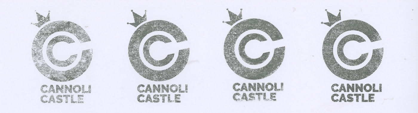
After narrowing it down to one logo, instead of using a simple vector image as the logo, I decided to print out of the logo and use a transfer marker to give the logo some character and texture.

After about 40 logo transfers, I found this one to be the best out of the bunch. The texture isn't too heavy that it's overwhelming but not to minimal that it gets lost. The crown is also recognizable, so it can be used as a stand alone icon.

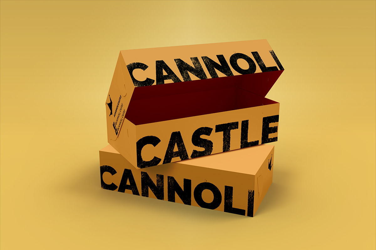
I chose the orangish-yellow color because it's light and airy like cannolis. I wanted the text to be bold and in your face, but to also have the same texture treatment as the logo. On the side of the box is Facebook and Instagram advertisement to get people more engaged with the company and their product.

I also simplified their menu to declutter and show separation between categories of food and drinks they offer. I decided to go with black ink on white paper because the menu will constantly change due to creating new cannolis and other tasty treats, so it'll be cost efficient in the long run.


