


[ R O O F ]
Is an architectural studio specialized in the design and development of projects.
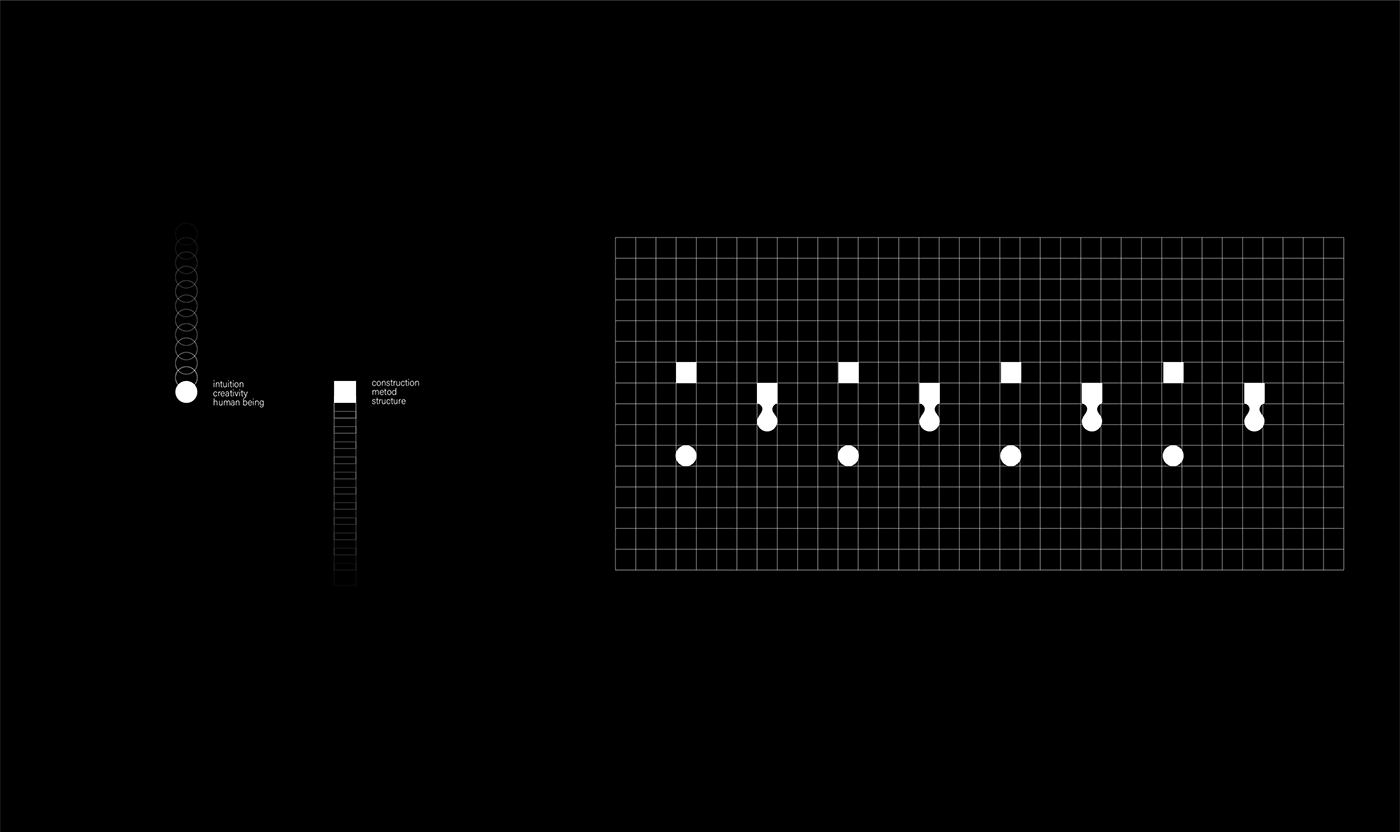
We developed the graphic identity by joining two geometric figures, the circle and the rectangle, representing intuition and work execution.
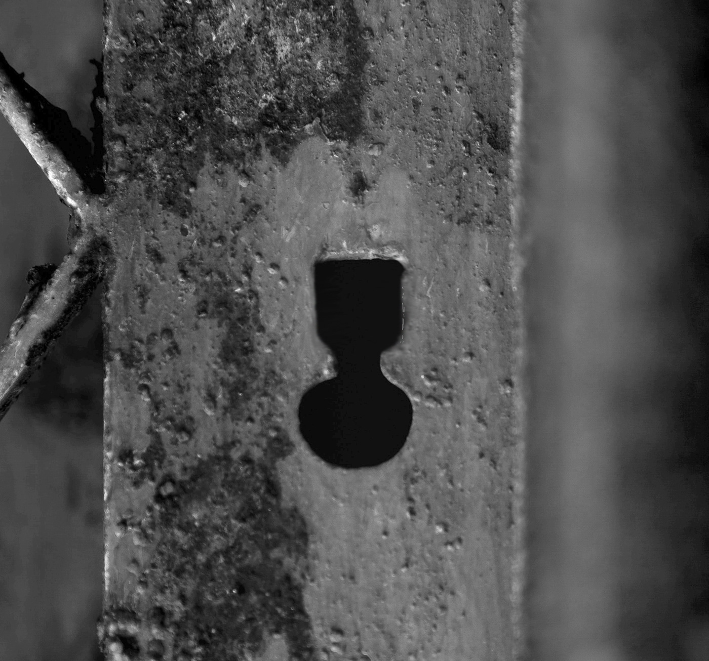
An isotype that reminds us of the lock of the old doors made by hand, referring to the construction of the house.
The identity invites the user to see the context through it, which is why it is perforated with the isotype in some of its applications.
We developed the graphic identity by joining two geometric figures, the circle and the rectangle, representing intuition and work execution.
An isotype that reminds us of the lock of the old doors made by hand, referring to the construction of the house.
The identity invites the user to see the context through it, which is why it is perforated with the isotype in some of its applications.


GRACIAS
Thanks for trusting in design
Follow us
Instagram : hiestudio
Facebook : Hi estudio
Twitter: hi-estudio
Instagram : hiestudio
Facebook : Hi estudio
Twitter: hi-estudio


