DESIGN SHARK CREATIVE STUDIO
Studio Branding
Design Shark® is a Philadelphia based branding and illustration studio with 10+ years of experience working with a variety of brands worldwide. With a focus in the sports industry, I specialize in helping sport organizations level up their branding, from intramural to the most competitive leagues. Whether you’re looking for a more modern identity or to develop cohesion within your brand, I’ll help you create a memorable visual identity that’ll instill a greater sense of pride. Together, let’s brand a champion!
This studio was started with the intention of not just providing you with high quality branding services (quality is expected after all), but providing an experience that will help instill you with a great sense of pride for your brand. That can be achieved by: Listening to you share the knowledge about your business and together identifying your goals and the problem to solve, collaboration (As the saying goes: “Teamwork makes the dream work!”), and a proven creative process that is refined to help solve your problem. In the end, You’ll not only gain a well crafted visual identity, but a clarified purpose of vision for your brand. This approach means your brand is built to last and flourish in the wild for years to come.
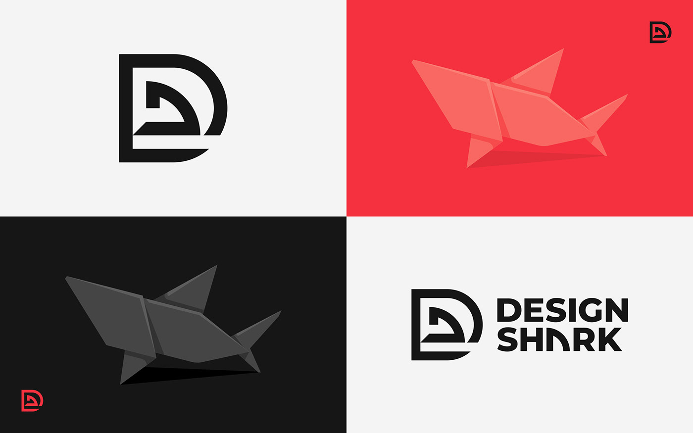
I’ve had a fascination with sharks for as long as I can remember, about as long as I’ve been drawing actually. It was only fitting to create my visual identity by incorporating these majestic animals into my brand. On a more technical level, Merriam-Webster defines shark as: “one who excels greatly especially in a particular field”. Beyond that, I believe sharks to be swimming metaphors of great design: Sharks have been icons of the ocean for over 65 million years, which renders them timeless. They have done this by being functional in their environment, versatile and adaptive. Sounds like traits of a well designed logo to me!
Project Scope
— Logo/Brand Identity Design
— Mascot Development
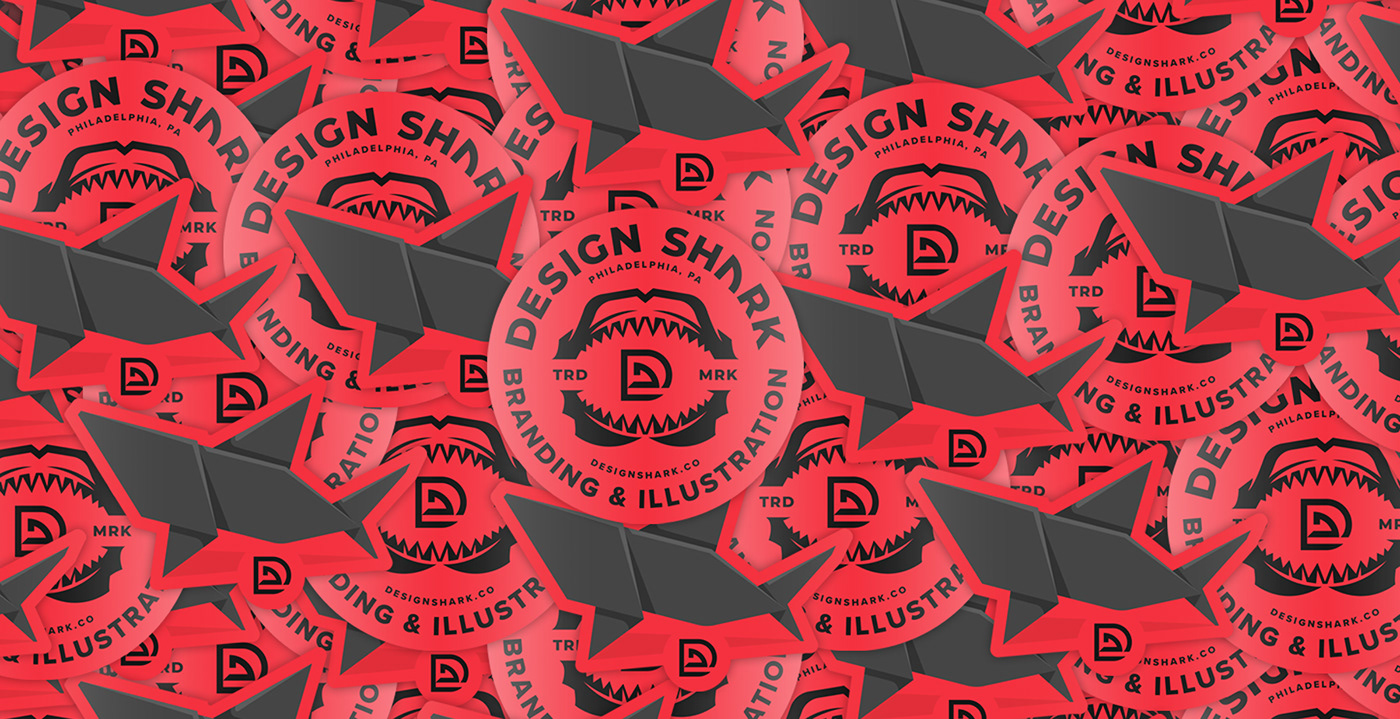
— Badge Design
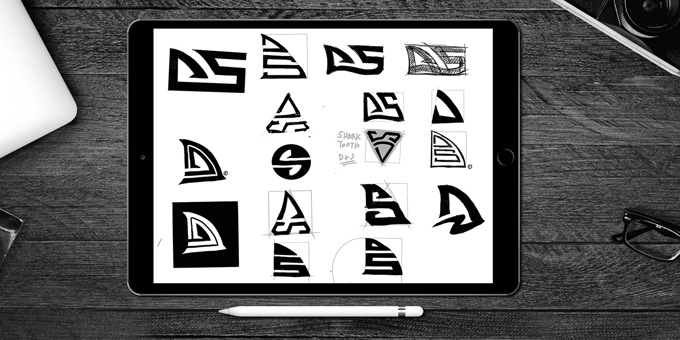
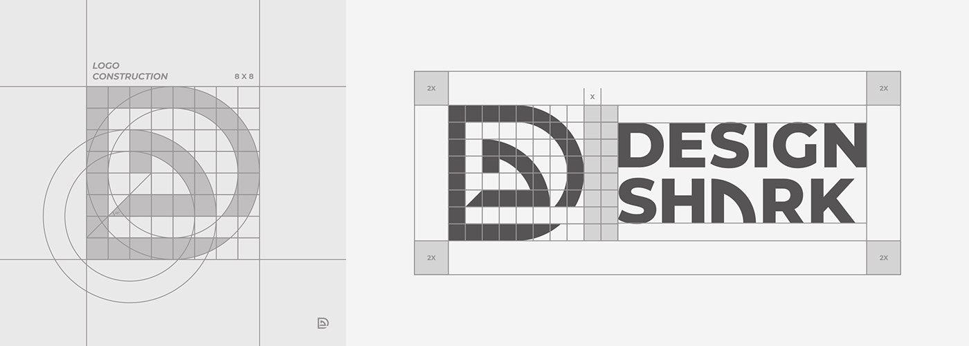
In the past few explorations, I’ve tried to fit All 3 elements of D+S+Fin in one mark and it was difficult to make all the elements stand out while integrating together in a smart way. So the idea behind this concept (Seen below) was to strip down the elements a bit by eliminating the “S” and just allowing the fin to act as the shark component while making the “D” more obvious and prominent. The goal was to create a mark that is: bold, balanced, simple, flexible, and of course has the ability to be memorable. By no means is this a flawless design, but I really believe it’s a functional design piece that accomplishes the goals I’ve set out.

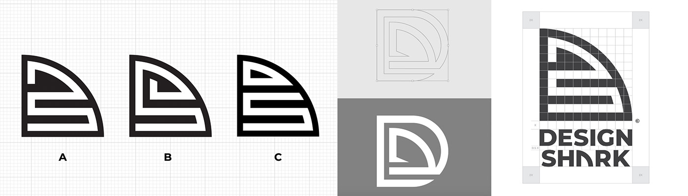
Quick video showing the process behind the Design Shark concept. Basically, the process to build this thing consisted of: a grid (8x8), squares, circles, pathfinder tool and the shape builder tool.