
PROBLEM
IKEA evokes simplicity and minimalism in its product design, however, the current website is neither responsive or accessible with overwhelming channels of information.
IKEA evokes simplicity and minimalism in its product design, however, the current website is neither responsive or accessible with overwhelming channels of information.
OBJECTIVE
This project strives to optimize the IKEA website design experience similar to the store’s showroom experience and making it clearer in layout and hierarchy. The objective of this project is to not focus on the visual rebranding of elements, but more so the responsiveness between mobile, tablet, and desktop breakpoints.
This project strives to optimize the IKEA website design experience similar to the store’s showroom experience and making it clearer in layout and hierarchy. The objective of this project is to not focus on the visual rebranding of elements, but more so the responsiveness between mobile, tablet, and desktop breakpoints.

IKEA sitemap proposal
Mapping out primary, secondary, and tertiary pages to design a better information architecture hierarchy, including cleaning up the footer links as archive.
1. Primary — Home feed
2. Secondary — Products (bedroom), Rooms, Shopping Cart
3. Tertiary — Product display, Showroom (bedroom)

The Redesigned Pages & Information Architecture
Keeping the goal in mind to make the IKEA website more sophisticated, simplified, and integrated, here is how the online digital shopping experience works from the opening home page to final checkout.
HOME NEWSFEED
Designed minimally with simplified newsfeed displaying featuring seasonal collections and best seller products.

PRODUCTS (BEDROOM)
Opening with a mood-setting page with organized categories based on personal preferences and filtering. Featuring bedroom ideas and essential bedroom kit/products.

THE ROOMS
Designed with the IKEA's store showroom walkthrough experience in mind, each carousel gallery displays room furnishing ideas with accessible tag callouts for featured products.

SHOWROOM SPECIFICS
Enter into a showroom and view the design behind the decorated space. A great method to grab inspiration and learn more about IKEA furniture.

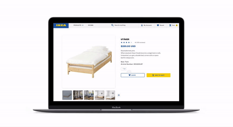
PRODUCT DISPLAY + ADD TO CART
See a product that you like? Look through additional information like customer reviews and the intent of its structural design. Hit "save" to mark it on your wishlist or hit "add to cart" and move forward to the checkout process.
IKEA web redesign — dev. hand off
Creating a visual style guide and adding specifications to padding and dimensions of the user interface for software engineering hand-off.
IKEA VISUAL STYLE GUIDE
Establishing color, font, and typographic scales on each different breakpoints. This guide is useful to act as a reference for a developer to transform the design into reality in code.


Typography scale for headings, subheadings, paragraph, and footer styles according to each mobile, tablet, and desktop breakpoint.

The master page of breakpoint dimensions specifics including mobile, tablet, and desktop.

Adding specs for width and height of elements along with margin and padding details.
Final web design prototype
PROJECT DETAILS
CONTEXT
2 week research/sitemap
7 week breakpoint refinement & iteration
1 week specs & dev hand off
2 week research/sitemap
7 week breakpoint refinement & iteration
1 week specs & dev hand off
DURATION
10 weeks, Spring 2019
10 weeks, Spring 2019
CONTENT DELIVERABLES
Sitemap
6 pages — 1 primary, 3 secondary, 2 tertiary
Visual style guide
Spec-ed file for deve hand off
Sitemap
6 pages — 1 primary, 3 secondary, 2 tertiary
Visual style guide
Spec-ed file for deve hand off
TOOLS
Sketch, Principle
Sketch, Principle


