


Experience Púchov
The motion graphics spot for the town's travel exhibition stand at ITS SLOVAKIATOUR 2020 held at Incheba, Bratislava, Slovakia.
Our hometown approached us with the project of motion graphics spot, which was quite challenging. Under tight time restrictions and non-existent footages, they wanted us to get the attendees of the travel exhibition excited about visiting Púchov, Slovakia.
Title in Slovak reads Experience Púchov.
Time was running up, but we were up to the challenge. We based the central theme upon the idea that you can experience Púchov to the full during every season; at every age. Púchov is, relative to other Slovakian towns, empty of historical buildings. Most of the experience, therefore, is based on social synergies of sports and arts, monthly gatherings, or annual markets and festivals. Púchov is also a vibrant spot on the map of the underground and counter-culture.
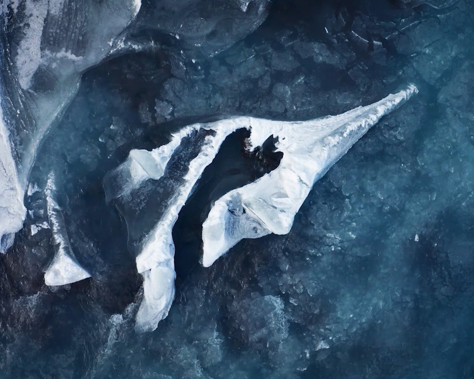
We choose to tell this story in pictures. There was no time to make video footages. Still, we managed to shoot aerial footage, because we got one day of unlikely beautiful weather. All of the scenes were cut into the rhythm of Silver Jubilee from Stuart Roslyn.
Title in Slovak reads Púchov: Thriving culture.
Since Púchov, up to this day, doesn't have any visual guidelines, we tried to distil it from as many touchpoints as we got our hands-on. The colour palette was based on indigo print, typical for the region, and sun yellow from the coat of arms of Púchov. Monochromatic shades of blue played the dominant role, with one yellow tone as an accent from not-concluded triadic harmony. Red was an option denounced by the client. Also, the pattern originated in the local indigo print tradition.
I want to elaborate on the colour grading. The drone footages were shot in the middle of winter, albeit with clear skies. Never the less, there was not a hint of green to be found. We stood before a dilemma. Either to move yellows to greens and look like the middle of summer or to move the yellows toward reds, for the autumn look. We choose the latter because of the greens on the buildings seemed otherworldly; not believable at all.
Aerial shots were colour graded to an autumn look.
You can decide by yourself whether we succeeded under these restrictions because without further ado here I present the finalised spot from our in-house team. The spot got a lot of positive feedback at the exhibition stand.
Studio: Lemon Lion; Púchov, Slovakia
Copywriting in the spot: Kristína Lišková
Copywriting in the spot: Kristína Lišková
Photography: Slavomír Flimmel, Daniel Brezničan
Storyboard: Martin Faktor
Animation & Motion graphics: Martin Faktor, Matej Pobežal, Andrej Cibík
Drone aerial shots: Daniel Vaško
Music: Stuart Roslyn
Case study: Martin Faktor
Storyboard: Martin Faktor
Animation & Motion graphics: Martin Faktor, Matej Pobežal, Andrej Cibík
Drone aerial shots: Daniel Vaško
Music: Stuart Roslyn
Case study: Martin Faktor
Thank you for reading.


