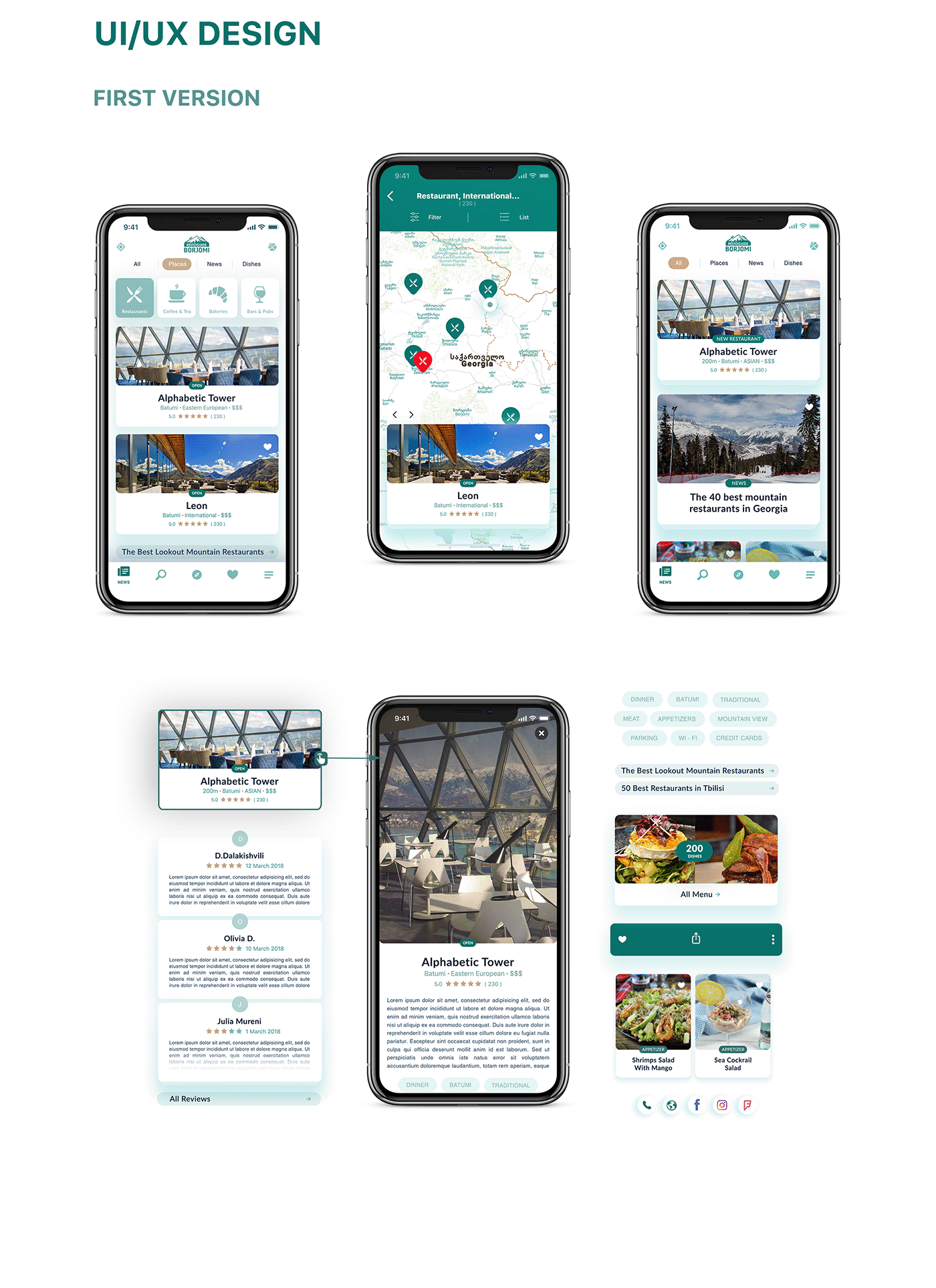
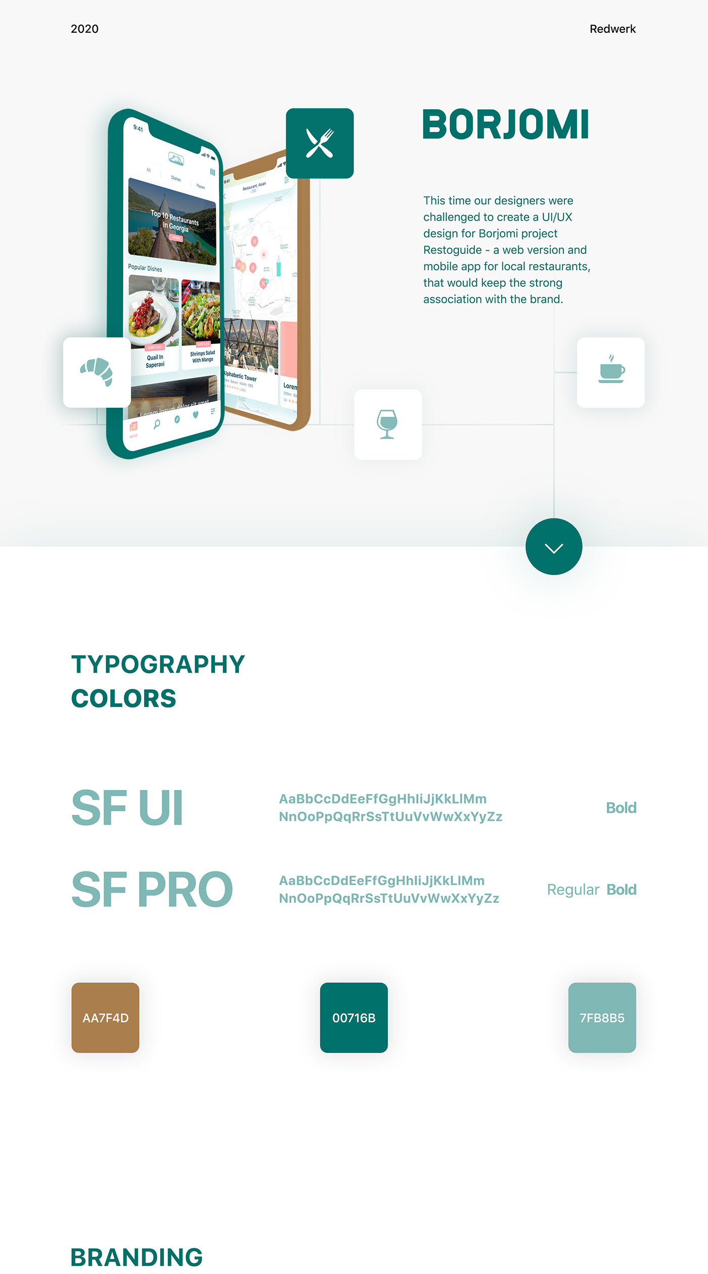
Branding is of highest importance when you talk about visuals. It is always the part, that is being remembered by user - non-verbal images and corporate fonts and colors. Our designers did their best by bringing up imagery evoked by Borjomi brand, combining a familiar mountain with cutlery.

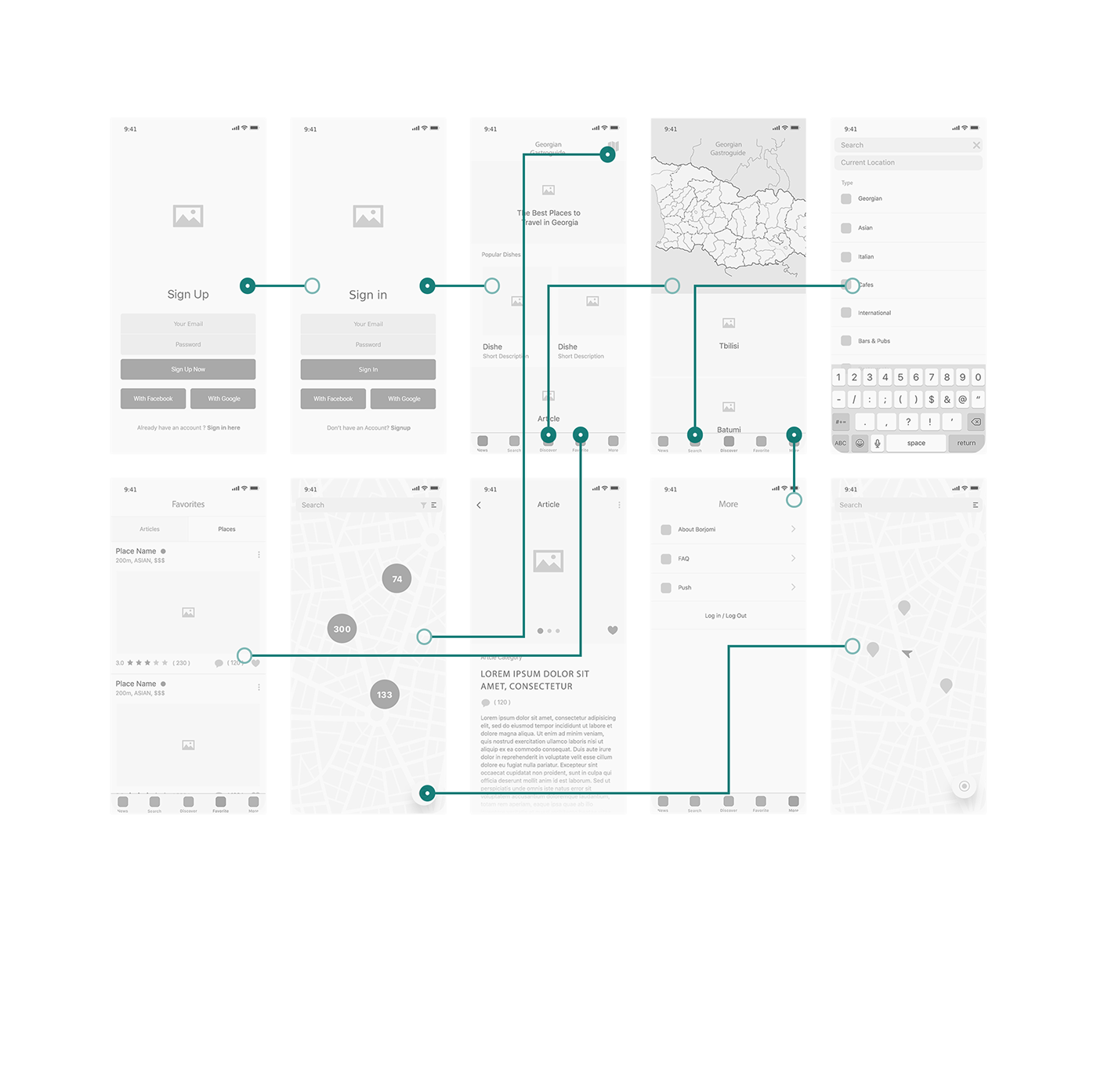
Then our designer team created wire frames to get to know our client better and
map out the functionality of the pages. Further, custom styled, brand matching Google map was integrated into the project in order to support brand assistance idea. We are very proud of this project results!